Poll results
Save to favorites
Add this poll to your saved list for easy reference.
Which design do you prefer and why?
19 Responses to Option A
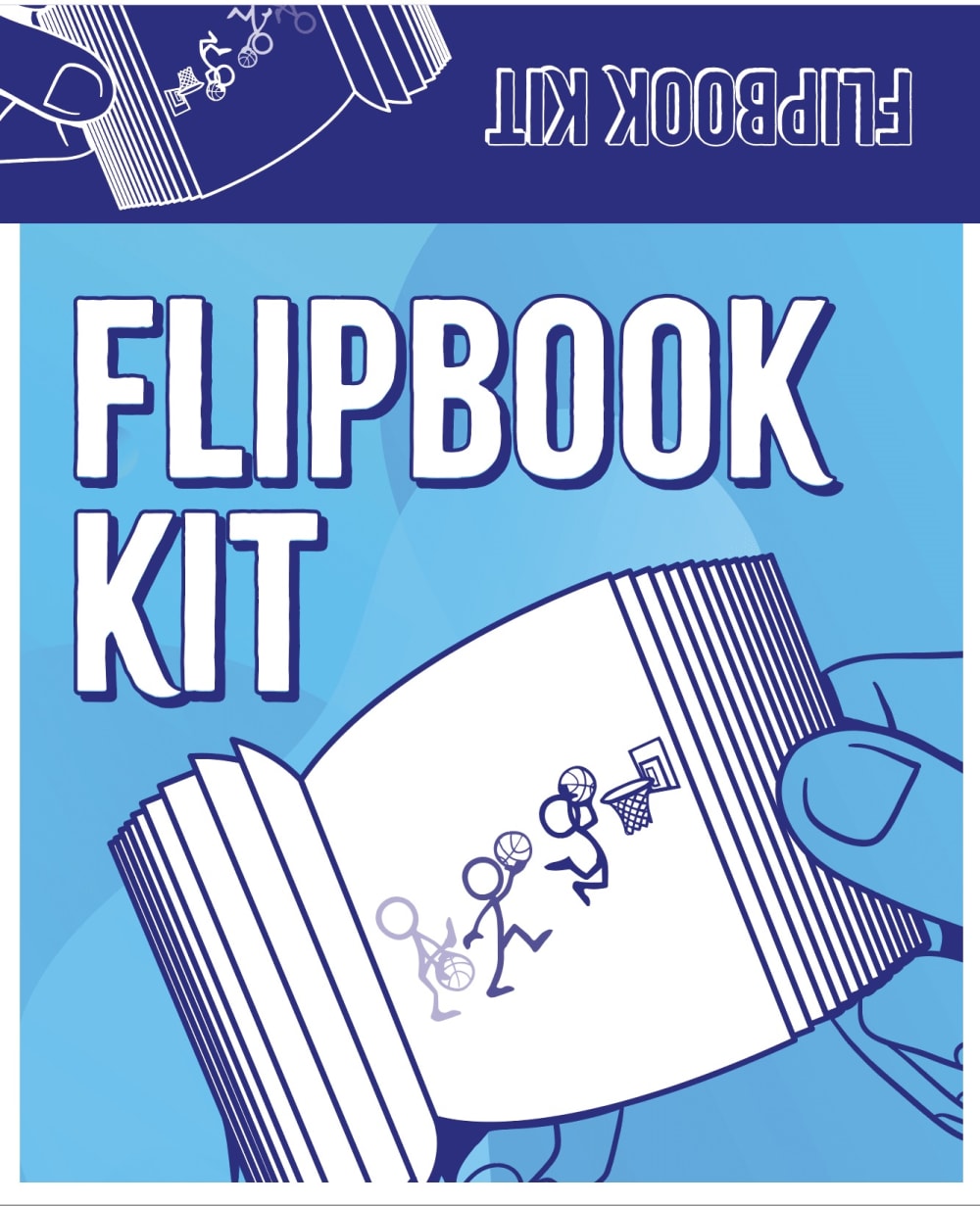
I prefer option A because the picture of someone drawing in the flipbook in option B seemed excessive and took up space that could have been better used for the text "Flipbook Kit" as seen in option A.
I think it's more to the point.
I like design A better because the name of the product is very clearly written in large, bold font. Also, the illustration gets the point across without needing extra distractions.
The image looks less cluttered.
A seemed less confusing and I understand what the point is. Option B confused me since it looks as if you are using it on a tablet and I'm not sure how you make a flipbook on a tablet and if you can it takes away from the joy of flipping through the physical book.
This zoomed in version is full of details and the colors are presented in nice fashion.
The design of Choice A looks better overall.
I like the bigger picture of the book. It stands out more and it catches my attention more.
I like the design from option A because the design from option B is slightly confusing. The picture at the topright corner does not add to my understanding of the product but rather confuses me.
i like that this one focuses on the end product and how cool it is
Having "Flipbook" as one word looks better than "Flip book" and showing the tablet on the front cover in B looks out of place.
I think overall the title on A is better suited on one line than the split as shown in B
I prefer option A because I feel like option B looks cluttered and thrown together. There is enough spacing with the words that it doesn't seem crammed.
It looks so much more professionally designed
Reads as FLIPBOOK KIT instead of FLIP BOOK KIT
less stuff to look at and not as overwhelming to look at
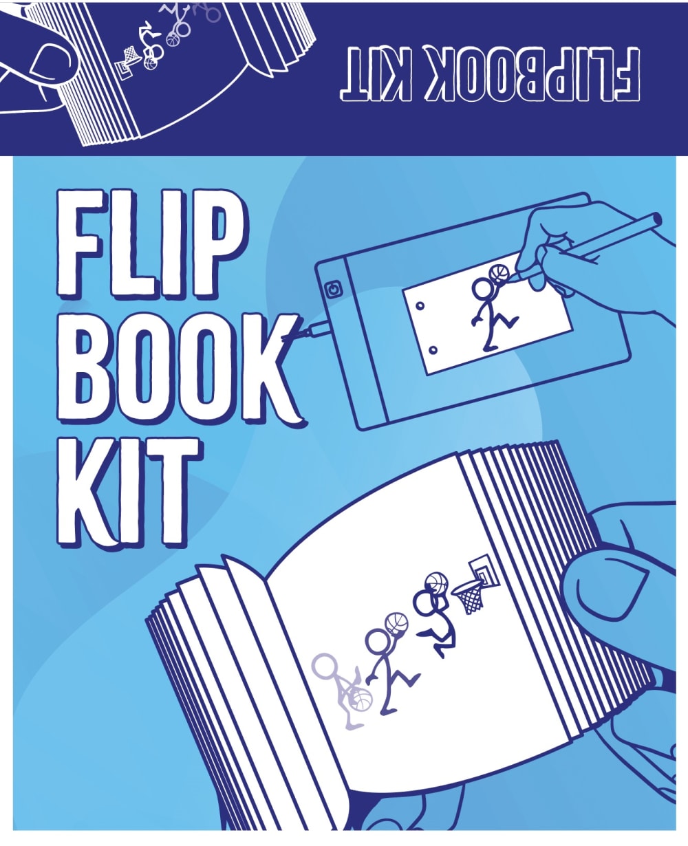
though both Ads are identical at first sight, option B is larger in print, emphasizes the purpose of the app, by making the book bigger, makes the eyes travel to it immediately, eye catching, bold, and easy to see what the app is meant to be. bigger is better.
I prefer A . Its much more simple and clean looking
it looks better when flipbook is together otherwise it could like 3 separate words.
31 Responses to Option B
I like Choice B because of the extra pic with a hand drawing.
I like how B shows the user creating/drawing the flipbook in the ad.
I like Option B more because the graphic depicts the product better. I do like the word placement in option A better though. Other than that B is better all around.
I like that the writing in B doesn't look like it's yelling at you because the font is so large. I also like the additional smaller picture in B.
I like the drawing to help sell me on the product
I like the little extra illustration of the hand drawing the flip book and I think the text has a more balanced look.
I think it's fitting to have the words "flip" and "book" separated since all the pictures of the flip book are separated
I like it better on the left hand side
I like B because it looks more neater than A
I like the setup overall it's better. I like how it has the little drawing on the top right.
I like B more because it has a photo of the illustration being created.
I like B for more illustration on the cover.
I like the additional drawing on the upper right hand side.
I like the drawing "action shot."
My choice is B when I look at both choices my eyes seem more drawn to B.
I like that it shows that you can draw and add to the book
I like the words flip and book split up and the extra drawing picture in the top right adds to the description.
I voted for B because it quickly grabbed my attention and got me interested. Then after studying each image I liked how the design clearly shows that the consumer is the one who gets to create the images that go in their Flip book! There is no confusion about how someone will use the kit with design B.
They look too similar to care for one much more than the other
The photo is clearer and makes more sense in relation to the product
The seperation of the words makes each word pop out more. Looks like a stronger and nicer design.
It makes more sense to see the person drawing
I like option B because it shows the act of an artist drawing in the background, shows more detail about what a flipbook really is. I also like how the text " FLIP BOOK KIT" appears on option B more so than A
While A is more attractive/cleaner, it is missing an important detail that is found in B (and thus why I voted for B): the fact that you can use a tablet/electronic device to draw the items that get turned into a flipbook. If I misunderstood that this is what you can do (draw on an electronic device and have that turned into the flipbook, when in fact you can't), then I would vote for A because B is misleading.
show how it is being made too
Choice B markets the product best because it's showing the consumer that you will be drawing the flip book.
I like this one because it also shows how it works or what you are supposed to do, based upon this I would find out more.
I like the extra image in Choice B.
voted for b because it illustrates that you need to draw it in the top picture
I like the additional image that shows the art being drawn.
I like the composition of B a lot more than A. It has a lot more detail without being overwhelming or cluttered. It shows the action of making the flipbook as well, which is cool. The color scheme of both is blue which is a calming creative color so that is a good choice.
Explore who answered your poll
Analyze your results with demographic reports.
Demographics
Sorry, AI highlights are currently only available for polls created after February 28th.
We're working hard to bring AI to more polls, please check back soon.

