Poll results
Save to favorites
Add this poll to your saved list for easy reference.
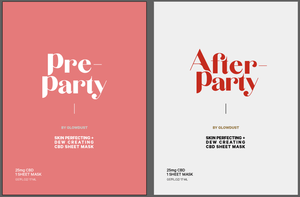
Which design do you prefer? What does each design make you think/feel? These are options for a duo of pre-party and after-party face masks for a girls nights out, and revitalization afterwards.
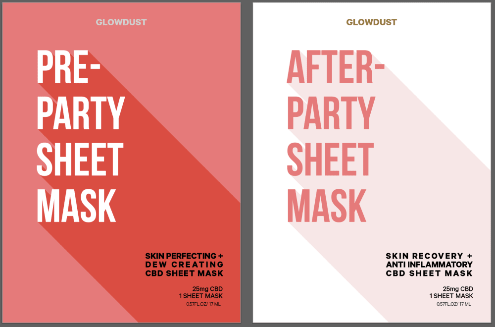
29 Responses to Option A
b is too bland
A is more visually appealing and the font is easier to read. The word "Glowdust" makes me think of Asian skincare products.
I like A because the text is bold and looks high end. I like the text displaying the item contents is crisp and readable. I think B has text that is not professional enough and looks low end.
I like the pattern of the background and the wording on the package. It makes me think about pampering myself.
Great idea! I think the package is more clear about what it is and what it does in A.
I like the cool effects behind the text, like it's a superhero mask.
The titles are more explainable.
I prefer A because I can easily tell what the product is. It is difficult to determine what you would be buying with B.
It is easier to read and looks more exciting than the other option which seems a little boring.
more fun font
I like both but A is easier to read. A has a trendy, confident vibe with the bold font and the background shadow. B however feels sweet and retro, which I do like, but it's just slightly harder to read and the delay is unsatisfying. Also A has "Glowdust" more prominently which makes you think of fairies and magic and loveliness which I prefer to B, where it's small enough that I didn't notice.
Choice A is my favorite but just barely. They're very similar. I like the extra info being in the right corner of Choice A. I like the directional quality of the graphics. Both choices have great colors. Choice B makes me think of some films like Valley of the Dolls and Kubrick movies. Choice A reminds me of pulp novels. It's more accessible somehow. Simple graphics are good but the best part is the clarity of the additional info, anti-inlfammatory and dew creating. Pops out at you.
Easier to read the font
I like the font in option A. The other one was too feminine for my taste personally.
Option A leaves no doubt what kind of product it is plus the design really pops.
Option A seems more modern and Option B seems older. Option A seems like big city and looks like Instagram posts.
I like choice A because of the extra detail. It is more appealing to me because of the design and descriptive title. I feel like the extra description helps explain what the product is for.
The huge bold lettering just jumps out at me and it looks more modern so it makes me more interested in buying it.
Having the words "sheet mask" in big letters tells you what the product is. the other packaging, the letters are too small to really see what it is.
The product was more obvious, and the ad made me want to read the smaller print
Choice a looks like a murderer mystery book! The second I can see the product
I think A just reads easier. I would be more likely to pay attention to it because the the font is easier.
I Like this design because the description of it's use stands out and catches my attention . The design is bold .
I like the way the typeface is set up. B just feels too vintage for this, more like trashy vintage romance novel. It's a terrible reasoning but the style of A just speaks to me more like the cover of a self help book and if it is a face mask I think that the self help feel is better for it.
i like the font better and it's easier to understand what the product is
B almost looks kind of 70s- it seems outdated
A is much preferred over B. The graphics and design of B remind me of the '60s or '70s - it looks much more dated than A which is a more modern look. Some of the letters on B (like the "r") look odd/weird. I was also drawn to A because it explains clearly in bold print what it is (sheet mask). I would just breeze by the graphic for B without taking the time to read the fine print to identify what the product actually is.
I feel like the layout matches the size of the packaging more.
Option A shows more of what the product actually is, and is easier to read.
21 Responses to Option B
this font is cute, and feels more playful and fun
The stripes in A are distracting.
I prefer the font. Don't like the shadows on the other one either.
The script font is more attractive on Choice B, it attracts the eye a lot more. Choice A looks more like an advertisement for a movie in the 70's.
I chose B because it has a very chic and minimalist look to it. It's not overly flashy. It's just very simple.
prefer the font
I like the font better.
i like the design better than option a
I like the design of the lettering on the front of option B. Its more of a fun look! It makes me feel party!! The other is too plain.
this is the one i like best. The writing itself looks more for a female
Thinking of women as the target audience, I just thought the girlier font was more eye-catching.
the font is very nice! has a bit of a 70s vibe to it, which i really enjoy. it's very pretty and honestly just makes me feel really mellow and chill while looking at it.
It seems more adult themed, like it would be good for a bacholorette night out. The option A seems too wordy, and almost like it was made by a third party.
I like the font better on this one. It makes it feel more upscale and fancy than the other. It would grab my attention more.
I think that these look more festive. I think the text on these reminds me of a lounge or club. I think the other text looks too clinical. The text also reminds me of an Audrey Hepburn movie. I think these would be fun for a girls night.
I choose option b because it's a very clean sleek look. Option b makes me feel very grown and sexy but reminds me that i can still party even through I'm grown.
I prefer the font used on B. It is more relaxed and in the party spirit than A.
Option A looks like a Netflix Box. The font on option B makes it look like a fun luxury.
i don't like all the extra text/font..not necessary especially after a night out,, i may be too tired or tipsy to really read alot..so the less the better.
I prefer the designs for option B because it reminds me of a party that would have happened in the seventies which seems sort of fun to think about past times. Option A reminds me more of a horror movie and you don't know what's going to be around the corner. The nice soft ages of the wording in Option B is far more appealing than the sharp edges of the wording in option A.
I chose B because it looks more feminine and sexy. This is a face mask for a girl's night out, so this label it provokes thoughts of cuteness, sexiness, girlie. The font looks much more attractive. Choice A looks more like a magazine cover.
Explore who answered your poll
Analyze your results with demographic reports.
Demographics
Sorry, AI highlights are currently only available for polls created after February 28th.
We're working hard to bring AI to more polls, please check back soon.

