Poll results
Save to favorites
Add this poll to your saved list for easy reference.
Which design is best?
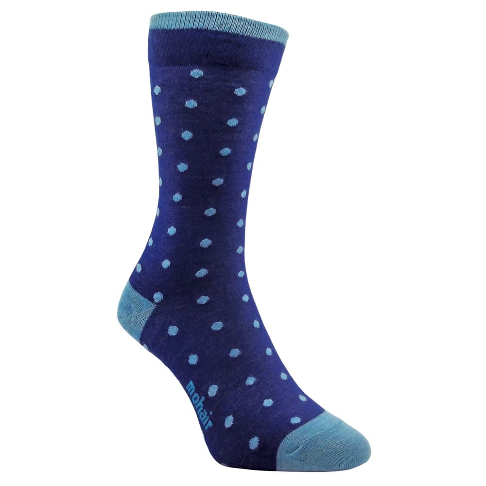
Option A won this Ranked poll with a final tally of 28 votes after 5 rounds of votes counting.
In a Ranked poll, respondents rank every option in order of preference. For example, when you test 6 options, each respondent orders their choices from first to sixth place.
PickFu requires a majority to win a Ranked poll. A majority winner differs from a plurality winner. A majority winner earns over 50% of the votes, whereas a plurality winner earns the most votes, regardless of winning percentage.
If an option does not earn a majority of votes, PickFu eliminates the option with the lowest number of votes. The votes from the eliminated option are reassigned based on each respondent’s next choice. This process continues in rounds until a majority winner emerges.
Scores reflect the percentage of total votes an option receives during the vote counting and indicate the relative preference of the respondents. If there is no majority winner, look to the scores to see how the options fared relative to one another.
| Option | Round 1 | Round 2 | Round 3 | Round 4 | Round 5 |
|---|---|---|---|---|---|
| A | 30% 15 votes | 34% 17 votes +2 | 38% 19 votes +2 | 44% 22 votes +3 | 56% 28 votes +6 |
| E | 28% 14 votes | 28% 14 votes | 32% 16 votes +2 | 40% 20 votes +4 | 44% 22 votes +2 |
| D | 14% 7 votes | 16% 8 votes +1 | 16% 8 votes | 16% 8 votes | Eliminated 8 votes reassigned |
| B | 10% 5 votes | 12% 6 votes +1 | 14% 7 votes +1 | Eliminated 7 votes reassigned | |
| F | 10% 5 votes | 10% 5 votes | Eliminated 5 votes reassigned | ||
| C | 8% 4 votes | Eliminated 4 votes reassigned |
Age range
Education level
Employment status
Gender identity
Options
Personal income range
Racial or ethnic identity
Sexual orientation
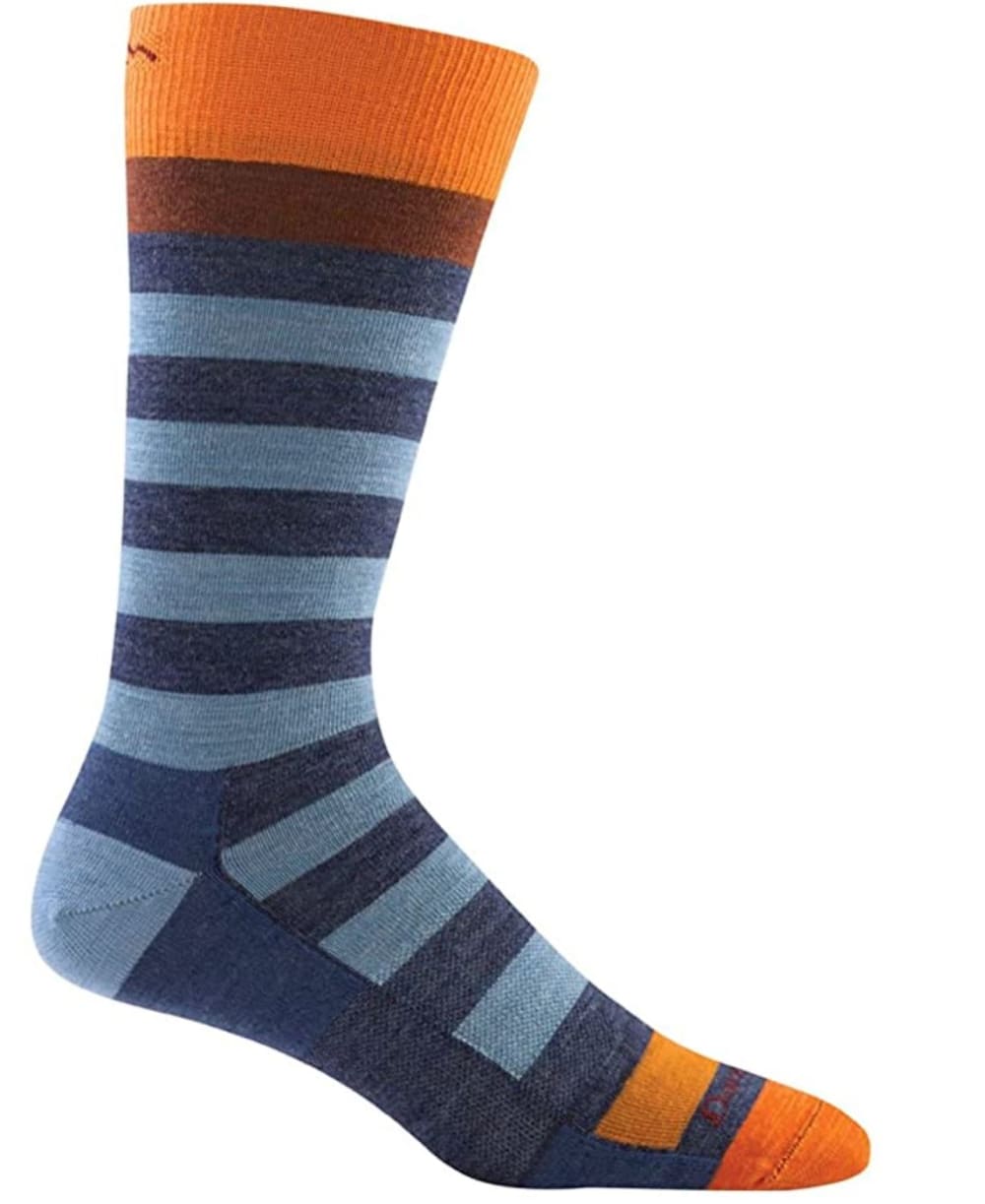
15 Responses to Option A
I love the poka dots, they are unique and different and stand out from the other choices.
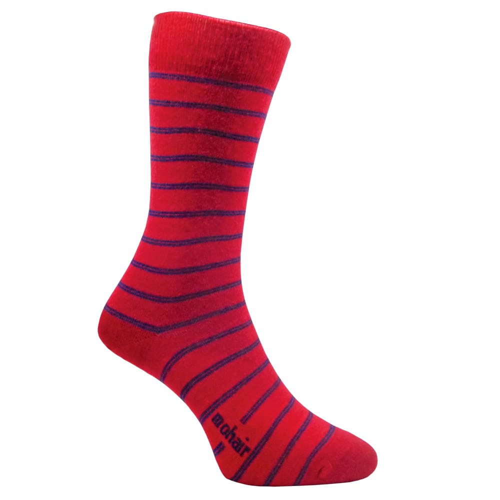
I liked the blue ones best and the ones with the goat next. I don't like the red one.
"A": pattern and color combination are the most neutral so this would work with most clothing choices.
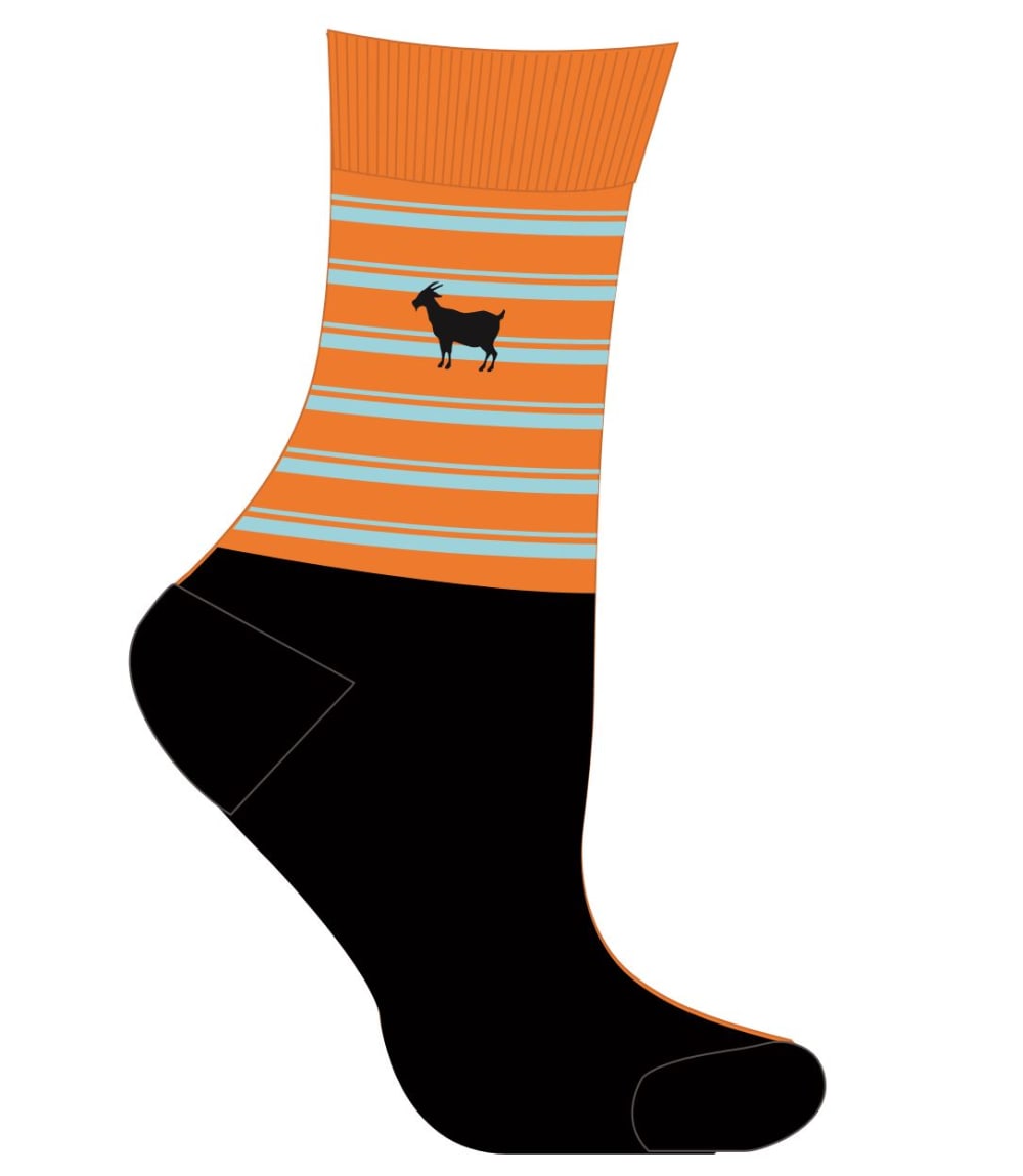
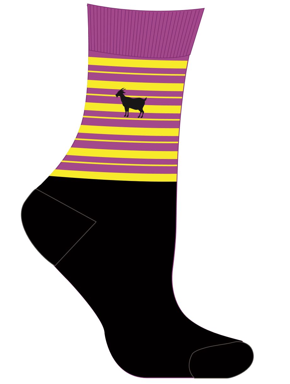
The polka dot design on "A" is very cute. I love the colors. The goat (I think that's what the animal is?) on "D" and "C" is stylish and memorable. In all honestly, I think the colors on "B", "E", and "F" are all equally unappealing. I would never buy those.
I personally really enjoy blue and the blues of A look very pleasing to me. I like the dot pattern as well. The different colors of browns in F also look pleasing to me because there's a lot of interesting shades in the stripes. I like C because the orange and blue in the top part seem to be really flashy and pleasing to the eye. Those colors contrast well with each other.
I like A the best because I like the dark blue with the light blue dots. I think it's the most attractive. I like F and E also because I like the stripes and also the orange on E. C and D are cute, but I don't really care for the solid color on the foot. B I don't really care for at all.
I ranked A as my first choice because I enjoy the blue color and the polkadots. I picked choice B second because I like that the sock is primarily red and not too busy. I picked choice F third because I do not love the earthy colors, but I enjoy that the colors are muted. I picked choice E fourth because it isn't colorblocked like choices C and D, but I really don't like the colors blue and orange together. I picked choice C fifth as I don't like the color block design at all. However, the blue and orange combination is better to look at compared to the yellow and purple in choice D.
I like the polka dots the best, then my selection was based off the colors that worked best as well as the design of the stripes. The last one is just ugly.
Options A, F, and E (my top 3 choices) are all choices that would be easy to pair with a wide variety of clothing. Options D, C, and B (mu bottom 3 choices) are all more whimsical and fun in nature. I would want to wear these socks in shorts that they can be seen.
I dont like the goat but I like the multi color color schemes the most
The preferred options, in order, are colors and patterns that would work best with a variety of outfits and would not clash with commonly worn colors and styles of pants.
A and B are the most common colors and designs which I believe I would enjoy more than the others in my opinion. E would be interesting and would wear those as well
First and foremost, I picked designs that I would picture myself wearing. Following that, the colors that I find most enjoyable to look at were selected, even if those colors wouldn't be appropriate for myself. The fashion elements may be somewhat outdated (alternating stripes are kind of 70's), but they still look pretty good for the most part.
I liked option A the best because I love the color blue. I wear a lot of blue so they would match my wardrobe. I also love the red color of option b. Option E a was not crazy about the orange but it was different. I chose option F next, not crazy about the colors but they would match up with great fall colors and also because they did not have a goat on them like the last two options. I don't like goats. I would never wear something with a goat on it, even if you couldn't even see it under my pants legs. I would have to look at them every time I put the socks on and off. No...just no.
Choice A was my top pick because I liked how the design stood out from all of the others. I really liked the blue color it has and the dots on it are nice. Choice E was my second pick because I liked how the striped blue look with orange at the end looked. It was unique looking. Choice F was third because I like the striped look of it as well and the variety of color that it had to it. Choices C and D were my fourth and fifth picks. The dark bottom with colorful striped top is interesting. I like the goat logo as well. Had C ahead of D because I like its colors better. Choice B was last because I did not like the red color of it at all. It's too much for my tastes.
5 Responses to Option B
i love the blue and red one the most a solid color with a design is catchy
They all look fine, I just chose based off of what color would fit most of my outfits and which ones looked higher quality in my opinion.
I chose B, F, and A as my top three choices because I strongly prefer sock designs that have a consistent pattern rather than sections that look separate from one another. Among those three, I ranked B higher than F because I like the lack of a heel patch more than a heel patch. I chose F over pattern A because I prefer the pattern. I placed E fourth because the sections looked consistent and less separate. I placed C above D primarily because I like the color scheme a bit more in the former.
I like the darker colors better and the goat is kind of odd to have on a sock.
I like a kind of classic look. The red is a simple pattern and looks classic. The same for the polka dot blue. It is classic and professional. The others get louder and less classic ones. I don't like the stripes only at the top.
4 Responses to Option C
I like the orange sock in c, with the goat on it.
The designs with oranges and reds really stand out and are striking! I like the blue one too, somewhat. I picked the gray one last because it's a bit bland compared to the others.
This is the most cohesive and unique color combination. The other striped socks have a strange color combination
Not going to lie in terms of socks I would not want to wear these due to the really out there color designs but a simple black on orange sock design in choice C would work
7 Responses to Option D
Option D and C are different and cuter
I vote chose on simplicity and color. I did not like the orange color option so I ranked those last.
If you put a goat on anything, I’ll probably buy it, but the one with the goat and orange stripes looked too much like Halloween. The blue on blue polka dots was cute and fresh looking. Didn’t care for the colors on F, looked kind of drab.
I like choices D and C the most because they have goats on them and the colors are nice too. I liked all the bright colorful socks and had a hard time picking just one but the goats won me over. The blue color in choices A and E are also very nice.
Purple and gold represents my school, Geaux Tigers! Those colors will always be worn by me, especially on game day. The blue polka dots are more in line with my wardrobe. They would match my work trousers well. The red stripes would give my work wardrobe a pop of unexpected color, which I like to have when wearing primarily dark tones .The blue stripes are a bit more conservative, but would also work well for me. They would most likely be work with jeans. The brown stripes are very dark. I would only wear them when I wore boots or wanted to be conservative. The orange goat is my last choice and would be for sleeping or warming up.
I chose the order I did because I prefer a more minimalist design.
i really prefer this order of colors
14 Responses to Option E
Option A is the best because it looks like a suit sock, but it's not.
I love the striped prints the most. These are fun and can match several outfits. I like the blue and orange tipped sock a lot. The brown sock is fun also. I am not as crazy about the goat emblem but others may like it a lot. I feel these are good choices across the board and excellent socks.
i love so much the color blue
I like Choice E the most. I think the design is gender neutral and suitable for a variety of consumers. I also really enjoy the color combination of the design.
I like bold bright ones that ho all the way to the toe.
I'm not a huge fan of the black bottom with the really tight stripes at the top, so I put D and C as last. These socks aren't really my style in general, but I would most like Option E because the colors are the nicest and they're still not too dramatic. I don't really like the colors in Option F, but I like the stripes.
I really like the color scheme of E. The orange and blue go together well and it's not too distracting. I think the red in B pops and I like the stripes as I think it fits well. For C I really liked the orange and thought it was clearly better than F A or D. The last 3, I had no real preference, I wasn't really a fan of any.
I choose them in this order: E, F and A for dress. I like all three of these equally, it would depend on what you are wearing. I chose B, D and C for sports wear or when you feel playful. All of these designs have their place in a wardrobe.
E - the orange at the top is super catchy! I like these the best due to thatC - The orange throughout the sock is the second most catchy - I guess I just like orange!B - The red is also very vibrant, though not as much as the orange would be so this is 3rdF - The green in this makes it somewhat attractiveD - Yellow is a neat color at times. I like this more than the A optionA - I dont really like this one too much
I this order they are the most stylish in my opinion yet have a flair of something unique that can be a talking point or something to brighten the day
I like the wider stripes on choice E, and the pop of color on the top and toe. The colors look nice together.
Personally I chose the first three because I like the higher socks, and than the last two because of the lower style. I rated my first two options because of color preferences for the long socks, (E and F) and than I picked B third because I liked the poka dot less than the stripes. Than for C and D I chose them in order of color preference as well.
I love the orange and blue together in E so that's by far my favorite choice because it just looks hip/modern. Then A because I I absolutely love navy blue and it looks of better quality/more like something that I would wear. I honestly did not care for the rest of them, they did not fit my personal style and felt outdated to me.
E has a really good balance of solid colors and pattern, meaning that stripes thickness is wide enough that it makes the colors pop but thin enough that it shows a pattern. Also it uses the complimentary colors orange and blue which really helps draw attention to it in a pleasing way but the main color is the monochromatic striped blue which is conservative, which is what I would want to wear in most settings so its versatile but has personality. A has the classsic monochromatic color choices around blue but does so in a fun pattern. Its mostly dark blue which makes it versatile in a lot of situations but has the fun pop of a small circle pattern which gives it a touch of personality, its not 1 because it really is pretty traditional.B is a bright red with a dark blue which arent complimentary colors so they sort of blend together in the eye making it a look a little odd to the eye. I still like the bright red pop that gives it a nice look but the blue stripes really drag it down in my rankings.C Has a fun goat characture on it which will get you comments but the background of the goat is what i would describe as a burnt orange with light blue stripes and those colors arent really in style right now, yet when you look at it as a whole it does pretty okay.D has that fun goat character again but this time with complimentary colors, I would have ranked this higher than the other goat sock but unfortunately the purple and yellow chose are the colors of the local NFL team and I wouldnt want that to get confused when people saw me in that so i ranked it lower.F really is brown with some distastful stripes on it, I cant think of an outfit that I would wear this with and it would totally clash with anything that i tried to wear it with. I dont have much else to say other than change the main color from brown to maybe more of an ashy brown to bring some darker shade to it and it might look at little nicer.
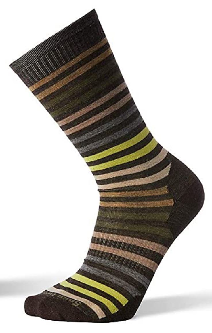
5 Responses to Option F
I really like that choice F has a great color mix that seems to make it very durable.
I chose F for number 1 because the muted color palette makes it feel more mature and easier to pair with a wider variety of outfits. I favor the thin striped design across the entire sock. The slight ribbed texture of the sock also increases the feeling of sturdiness. I chose B as number 2 because it, similar to F, is a versatile design that has a classic feeling. In my opinion, Option B has the most masculine feel of all the sock designs so it may be well suited as a gift. The thinness of the stripes also keeps the sock from being distracting, it doesn't lead your eyes all over the place. I chose design E for third place because it also has the feel of socks you can wear when you are working. The orange accents at both ends of the sock help it stand out but aren't too vibrant as to be distracting. Here, the thick stripes suggest a certain ruggedness. I would say this sock is also suited as a gift for men. I ranked option A fourth place because its subtle color palette is appealing but its design doesn't stand out and it doesn't have any charisma. I believe the polka dots here also make the sock appear somewhat juvenile and flimsy. However, polka dot socks are rarer to find so it's possible someone would really like this sock design. I ranked option C fifth place because I prefer the orange and blue design to that of option D. I do like the goat logo on the sock but the contrast between the colored stripes and the black part of the sock is too jarring. Depending on what shoes the person is wearing, it could look very awkward. I also don't know what situation I would wear this sock in, it doesn't seem very versatile. I ranked option D sixth place because the purple and yellow color scheme doesn't appeal to me. I also believe most people aren't looking for purple and yellow socks. It has the same issue as option C, where the contrast between the stripes and the black of the socks is too abrupt. I also think the goat feels unnatural against the purple and yellow background because those colors are too bright.
Choices F, A, E, B, C, and D are ranked in order of styling which can be worn in the most number of situations. That is, F is more conservatively styled than the other options because it will not stand out as much and is likely to be chosen by the most people and therefore is ranked the highest. Conversely, Option D is ranked last as it contains the color pink/magenta and is will fit the least number of situations and is likely to be selected by the least number of people.
Option F has the best colors and would go with most of my clothes or outfits. Option A has nice colors but is pretty basic. Options D and C are kind of fun, and I ranked them according to my color preferences. Option B is not terrible but I don't like the colors. I really dislike the pattern and color combination of Option E, although I'm not sure why. It just annoys me.
I chose option F because I usually wear more neutral socks and this was the most like what I would wear. I do like the stripes, though.
Explore who answered your poll
Analyze your results with demographic reports.
Demographics
Sorry, AI highlights are currently only available for polls created after February 28th.
We're working hard to bring AI to more polls, please check back soon.

