Poll results
Save to favorites
Add this poll to your saved list for easy reference.
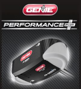
Which design to you like better
Age range
Education level
Gender identity
Homeownership
Options
Personal income range
Racial or ethnic identity
Type of residence
U.S. geographic region
288 Responses to Option A
I like the zoomed in image better.
I like the bold design of this. It fits the product better and stands out more. The text is bolder
This design looks more sheek and elegant to me.
The header seems to match the product, looks like a tough golf club, and performance is paramount for a club.
The tagline "bold design" doesn't add anything to the product- it's not something you look for to be particularly bold or trendy, as you're the only one that sees it. Maybe something usage related rather than style? Performance is much more preferable in this case.
A seems better. B makes it seem like there is nothing special about the product. A makes you think you are getting something high performance.
the font and simple design is better for this case
I like the more simple design in choice A. It really stands out and I love the bigger and more exciting font as well.
For what I think is a garage door motor then I feel that the wording performance + is a better choice for it.
I am sure there is no difference between A and B but seeing the "Plus" in option A makes the product look way more appealing to me.
I liked choice A the best since the picture looks more uniformed and flows better together. Choice B feels separated and not as appealing to look at since it has the bar that separates the title and product image.
A has the best design
good looking and relatable
I like the design in A better. I think the "PERFORMANCE PLUS" badge on the packaging is a nice touch as it emphasizes the technical capabilities of the product.
I chose option A because Performance + makes me think that it must have extra, added features. It sounds like the higher end product to me.
I prefer A. It gets my attention a little more, especially the bolded, all caps text with the large plus sign. I also think the look of the text fits the product better on A.
The tag line stands out a lot more with A
I like 'Performance Plus"! It sounds like I'm getting something extra. And who really cares about "bold design" on a garage door opening. What we really want is GREAT PERFORMANCE!
The text at the top seems excessive on B.
I like the zoomed in photo of B better, but I like the font and writing of A best. I really like the "performance plus" a lot more than the writing on the other box. I also don't like all the unused black space of B at the top.
I would go for the product design. It has the PERFORMANCE PLUS on it and it make me feel that this is the best product available from them. It assures me that it's going to be the best choice and maybe even perform at a professional level.
The one I chose is simpler, there is less text in it and it makes it easier to look at.
A caption is very attractive that performance plus its will definitely attract people
I think the Genie logo in B is too large compared to A
This is not what you would call a luxury product, so it's better to sell the product with the appeal of the performance rather than the style or elegance of the product. It's not as though people are attracted to it for its aesthetic quality.
They're both so similar! But I'd purchase "Performance Plus" before I'd even consider a signature series!
I picked A as my top choice as I like how the word "Performance" on the top makes it look like the item is gonna be effective.
I think the font used for "Performance Plus" matches the bold background and design used in the rest of the ad.
A garage door opener should be strong and solid like the bold font, not formal and fancy like the script font.
I like the "Performance" tag and the font that it is presented in more, it feels like it's more industrial.
this draws my attention more and is easier to read
Option A, just sounded more powerful with the "performance plus." I also liked the more bold style font style.
The Performance plus sounds more durable and reliable to me.
Performance Plus makes it sound like it's a better quality product. Signature Series doesn't mean anything to me so I wouldn't pick the product with just that on it.
"Performance Plus" sounds more appealing than words relating to aesthetics. Functionality trumps all.
The name tends to imply to me that it will last longer and be more reliable.
I see absolutely no difference in the product images other than that A is somewhat smaller than B. But based upon the names, I think Performance Plus sounds better than Signature Series Bold Design. I would rate performance higher than design.
I like it saying "performance+", it gives me confidence it works better.
I liked the design of Option A better because I felt like the word "Performance" conveys that the product is reliable and durable. I don't feel like the other option is bad but it really only made me think about the design of the product itself and not the functionality of the product. I would probably be more likely to take option A more seriously because of this. Thank you.
I like A better because the Performance Plus makes it sound like a better product.
I like option A because it makes it seem like the item performs at a high capacity than the other.
More concise is promoting performance rather than being expensive due to being some fancy edition.
I like choice A because it says performance plus so it makes me think that it's going to work really well and as I expect it to. The description on choice B doesn't really tell me about the product, other than the design.
I don't like the cursive font on B. It doesn't seem like it goes with the product.
I think the font is easier to see/read
Bold design is non descriptive and does not appeal.
not sure what this product is, but I dont really need to know it has a 'bold design'
I like the bolder, easier to view Performance + font and product name which suggest strength and durability of the door opener much more than the cursive Signature Series name which seems like an elitist affectation rather than a reliable and well functioning product.
I like choice A better because I like how bold the word performance was and it makes me think that the company is comfident behind their product.
A looks strong, durable, and powerful.
I prefer A because I feel like the bold words actually make more sense with this kind of item as this item seems rugged and strong which the font for A represents.
B is too busy; the added text is annoying. Also, the exact language used is meaningless buzzwords; the image shows the design--no need to call it "bold," and I'm not even sure "bold" is something you want in this type of product.
I like A because its bold and eye-grabbing. B seems more bougie with the script lettering.
nobody cares about a bold design on garage doors but they do care about performance.
I like the plus symbol, and I don't need the image to tell me it's a bold design. I can see this for myself, I wouldn't want them leading me on, I would want to make this decision on my own.
I really like the font and size used for the performance plus logo band. The theme of the logo reminds me of panasonic battery logo, for some reason, making me trust more the brand Genie.
Option A sounds better with performance plus
The tagline on "A" looks better and stands out more. The tagline in "B" feels generic and doesn't stand out.
Permformance Plus is better attraction words to use to make it seem more best of the best
The performance plus in A makes it clear that this is high end.
The "PERFORMANCE+" font bit in A looks modern and fresh. The cursive on B looks dated, like it's from a company that's possibly outdated, not innovative.
When it comes to something electronic and that has to life a garage door I want something that is performance driven not a signature series of it. It is about me thinking it will work and work well
I like A. B looks like a golf club box.
The design of the advertisement is more appealing.
I like the font better
Well I guess it's appropriate and also clever that the signature series has cursive style writing, but it seems kind of old-fashioned and I like the cleaner more modern look of A better.
I like option A better because I like that it says performance plus and has the plus contained in an actual plus sign. I think that is much more creative than option B which seems awfully boring.
The font and as well as the word "performance" imply a little more professionalism and high quality.
B looks too old fashioned with the signature series text. A implies higher capacity and performance the performance plus text.
I prefer the strong looking font. It seems more bold.
A emphasizes the enhanced performance feature
I think the font design in A seems much more bold and strong. The design on B does not seem to match the product, it also makes the product seem a bit unreliable.
I like the bold graphics of the word "PERFORMANCE". I think this really makes the description pop and makes the entire design seem brighter.
I prefer A because of the phrase "performance plus" which was included, it gives me some sense of confidence about the brand.
I honestly like both designs, but slightly prefer A. I like A because if I am buying anytime of electronic/device I want it to last and I know just by the name it should live up to my standards. The design also matches the ruggedness of the device.
I picked A because the lettering was bold and powerful. Made it seem a strong product.
I think the performance is the most important part of a door opener. Performance plus sounds strong and efficient. Although signature series sounds good, the bold design is not really a crucial part of the selection.
it seems more powerful and strong. i don't care about bold design, i just want my garage door to open
I think option A is the best because of the wording. "performance" is a buzzword in my opinion, and makes consumers want to purchase the item
The "performance plus" sticks out to me.
I chose option 'A' because I like the design better. I also like the fact that it shows the word 'plus' in the advertisement which gives me a feeling that it is that it say's it is and 'MORE'.
I like that the picture in B is bigger, but A is still big enough for me to see the product. I like A better because when I think of the Genie garage door openers I don't think of fancy writing and signature series, I just need it to work consistently, so Performance stands out to me.
I like the "Performance Plus" looks better than "Signature Series".
I think the addition of the plus sign is very important as it signifies that it is something that is of high performance.
I like Option A looks good then B
The wording "Performance Plus" indicates a workhorse unit, able to do the job and then some.
Option A implies it will make my performance in golf much better. Option B implies it is just for status.
I think A is cleaner and crisper. Bold design should not be included in the design
I don't think the extra text ads info or purpose to the design.
The Performance Plus title is bolder and goes better with the design of the item. It should have weight to the name in order to show durability and reliability in the product.
Choice A is bold, eye popping/catching, more noticeable then choice B. Choice B is classy and elegant, but for this product I think you need a more bold logo like choice A.
Option A is bit more cleaner looking with the less cluttered top design. And the phrase "Signature series" is way overused already as it is.
I like A because it looks a bit more balanced with the words performance plus being one line with a banner look to it. It's more attractive and gets my attention first.
I like the performance plus better than signature series. I've bought products before partly based on a "performance PLUS" description.
I think this looks lighter and brighter. It catches my eye more
I do not understand what this product is based on the picture. Not sure what I am missing. However, I do like the text performance plus, better than the text in the other option.
This highlights the product and enhanced performance without being overwrought in the text on the box.
i like the performance plus branding. the slogan and the image of the + on the product is more appealing and eye catching for me
Without really knowing what it is it's really hard to tell but I think that both designs look upside down to me
I want a garage door with good performance - I don't care about it being fancy or "select"
I choose A because I think the product is seen in better detail. I like the Performance Plus title, this tells me this product is going to be very powerful and reliable.
Choice A image implies this item performs better than others
I have to say that "PERFORMANCE PLUS" was the first thing that got my attention when I accepted the hit. Using the word "performance" is a word that I want to see on a garage door opener. Option B, the "Signature Series Bold Design" did not interest me or get my attention. I do like that the banner is larger.
A to me just stands out more. I like how the make the word performance stand out
I chose A because i am a performance guy i like when things advertise stuff like that .. i think it shows the product will work well or even better than intended
I think that the design used in option A looks a lot better because overall, everything is scaled on the packaging much better and more importantly, I think that the text used in option A fits a lot better with the style and use of the product whereas the font used in option B looks almost contradicting to the product being displayed.
I chose A because of the words "PERFORMANCE PLUS." These words would give me more confidence in the product.
I like option A because PERFORMANE PLUS is written in all capital letters and it stands out better then option B.
When I am buying something like a garage door motor, I would definitely lean toward the idea that it would "perform" better. "Signature Series" implies that their design hasn't changed much in the course of the company. Choice A definitely gives me a better impression.
This image looks more professionally designed than the other image. I like the font and the placing of the font.
I noticed the plus sign better on the top of option A, and for some reason, that is what sold me. I trusted it better and more than I did the more serious and plain version of option B. Signature series makes it seem like it is more expensive and exclusive, but option A makes it seem more powerful and longer lasting and doing its job every time. option A is my choice out of these two.
The name makes it sound more premium and stronger.
I voted for A because of the label Performance Plus because performance would be the most important thing to me in buying the product.
I think that the PERFORMANCE text stands out a lot more in this image and makes it look more bold as a product.
Option A, because I can clearly read the advertisement, the style of the text is much more striking.
The 'Performance' version give me more confidence in how it will perform. I would buy this.
Not a lot of difference - but "A" is a little bit simpler and less cluttered in design, always my preference.
I think this packaging is better due to the type of font. The size and type makes it easier to read everything.
Highlight performance for this product
I like the way the "performance plus" looks with the plus sign.
I prefer choice A because it's simple and to the point. It has less frills and the way B is formatted makes it look more like a craft item than what it really is. Choice A is more aesthetically pleasing than choice B.
I think that the plus used in the logo here provides a lot of detail over the kind of product that this is, it inspires some level of technology and control, which I like.
Definitely A as the words "Performance Plus" are comforting to have on a garage door opener. I really dont care about "Signature Series" or "Bold Design"
I chose my option because i like the performsnce word boldly dudplayed.it instills more confidence in me about the produxt
I don’t like “bold design” it just doesn’t sound great.
I like the plus, and I feel like the cursive doesn't match the rest of the design.
It appears to be a garage door opener, so with that in mind, I chose A. I'd prefer a garage door opener that's powerful and consistent (a la "performance plus" -- description suggests it performs well) rather than one with a "bold design." I need functional, not prestigious ("signature series") or cool-looking, and B seemed to be more focused on being the latter.
I don't care at all that it's in some made up "Signature Series" I just want to know what it looks like. Less is more.
I like A better since it says "Performance plus" versus "Signature series". Signature series means nothing to me but Performance plus does.
The "Performer Plus" gives me the impression that it is a more effective product.
Perforamnce plus is a more aggresive use of wording. Signature series sounds like a line of furniture.
I like image A the best because of the Performance Tage in the image. The device is big enough for me to see the details, but the Performance Plus makes me think top tier.
It is more compact, and displays better. It makes the product itself seem like its more compact and easier to use.
A emphasizes performance over design. You don't buy something like this to admire its sleek lines. You just need it to get the job done.
I would rather have purchase something that claims to be high performing than option B which seems to be referring to the design of the product.
Performance sounds better than signature.
"Signature Series" is a overused marketing phrase that doesn't really say anything. In addition the logo on the right is more compact and demonstrates a nice bit of imagery with the + and "plus" term, and it just "hits harder."
IN OPTION "A" TEXT CONTAINS "PERFORMANCE PLUS" WORD. THIS WORD MORE APPEALING TO ME. SO I CHOOSE "A".
I like the word performance in this context. emphasizes a better performance.
The writing on the product is larger and much easier to see.
Seems like a stronger logo an done that would make me feel confident in the quality and longevity of the product
I chose A because it says performance plus. May be this product performs better than the other.
This was hard. I feel like B does have a slightly better composition, the only problem with it is the script. Maybe if it was one solid color it would look better, but it gets slightly lost. Also maybe if you took out "bold design" the composition would work better because there is too much space at the top. Choice A I think has a better composotion.
I find both of the designs a bit confusing. In Option A, I thought "Performance Plus" was the name of the product because of the way it's featured in the ad. I assumed, after looking at both options, that the line or lines under "GENIE" were descriptions or attributes of the product. I selected Option A because "Performance Plus" is a positive description of the product. I'm not sure what "Signature Series' is supposed to convey. And "Bold Design" seems like an odd thing to state in the ad.
I voted for choice A because the design is streamlined and simple. Not much else is needed in my option. While option B add more details I'm not sure what those differences entail without a description.
The performance plus is featured in the design which makes it sound superior. I don't think most customers are interested in it being called a bold design. It's a garage door opener and the design is fairly basic.
I'm going with A because I feel that, for a garage door opener, performance is the most important thing. Performance Plus is very enticing. I'm ok with B as well, but "Signature Series" seems more like a razor or a golf club than an opener.
I think the one 'i picked looks more premium and better quality than the other one but they are fairly close and I would be happy with either
Performance plus makes it sound like it'll do extra work and is high quality.
A looks more clean and more high def then B. The text on B ill i little blurry and small.A looks perfect to me
The performance plus really stands out in this design. Both the size and boldness of the font, as well as the colors. Option B seems a bit generic while Option A has the look of something you would expect to be of quality. The PLUS at the end of performance has a really nice finish, both lines on top and bottom of performance having that plus sign with the word written on it looks real smooth. It doesn't look exaggerated and is a nice creative touch to "performance plus". If I saw both of these on a shelf, my eyes would instantly look at Option A because of the performance plus design.
This one tells me exactly what it is and how powerful it is going to be to use. That possibly it should last longer than you would expect it to last.
I choose a because the product description says performance plus so I feel like it would give the best performance
The two garage door openers are very similar save for their catch phrase. I chose 'performance plus' over 'signature series' because it demonstrates more of a benefit to me. I don't know whose signature they are referring to but I would have an interest in how the machine performs.
Option A: The caption suggests a superior performance.
The wording makes me think this would be stronger and would work better than others.
The wording Performance Plus makes the product sound tough, strong and very capable of doing it's job. It sounds like the product would last a very long time and like it is a product that I can put my trust in. I like the name and how the two words compliment each other. It is a name I would not forget
I choose A as my first choice. I like the wording "Performance plus" very much. It shows that it is a quality product.
I chose A because the words "Performance Plus" really stand out and attract attention to the product. The "Signature Series" in B seems to fade out and get lost.
Same thing in both pictures
The bold letters of Performance stand out.
A lot more eligible than the other.
I think its a cleaner design without the Signature Series / Bold Design text, which doesn't mean much to most people
Option A makes a promise. Option B claims to be some kind of prestigious product, which makes no real claims other than the company makes products considered more basic.
The word performance means everything to be when it comes to a garage door. If you have ever had a garage door not open or be stuck when you're trying to get some more important that is the absolute worst feeling in the world when you have to call and try to explain it. I would take performance over a so-called Signature Series any day and just make sure it's something I can rely on.
they both look pretty much the same to me so i had to pick equally for i liked them both the same
design with Performance plus is highlighted
I like A with performance plus because I want a garage door opener that I can rely on and this sounds like that.
Performance Plus says this is a hard working Genie garage door opener while a signature series with bold design just seems to talk about the look and not the performance of the product.
I chose A - I choose a garage door opener for utilitarian reasons. Choice B the font makes it seem too fancy. I just want one that works
I like to pick vote for option A, Than the signature we need a product to perform faster and give a great experience. Genie performance plus is appealing by the product name and the structure of the product is extremely decent. Hence I prefer performance than the other product.
The design stood out more to me and caught my eye
Prefer A I like the performance plus
It relays the same information as option B. I like the Signature Series title better yet it does not have to say Bold Design. It seems unnecessary.
I would select option A because it conveys the message that this is a higher quality product because of the "performance plus". Option B makes me think the design is just more aesthetically pleasing.
I'm not sure what the product is? but I'm attracted at first glance to A because of the word "performance" all in caps and the word "plus" which would make it seem it is a better more advanced version.
My eyes were drawn to option A first, I believe its due to the added silver colored Performance at the top.
I prefer the text on A because it sounds like the product will work better. "Signature Series bold design" doesn't say much to me.
performance is important for equipment, bold design not important to male buyers.
The wording performance plus really stands out and it makes me believe that it is very effective at what it does. The words signature series makes me believe that it would pricey.
The font looks more professional, durable, and lasting in option A
I like the look of the logo much more and it less wordy
I think that choice b the signature series doesn't really grab me like the big bold performance plus wording does. IT feels like a stronger and longer lasting product in choice a. I think that the words bold design aren't really bold on choice b. They don't follow with what it says. I think that I would like to see the product a little larger on choice a.
I like a as the text in B is harder to read. I think the overall visual appeal of A is more attractive as well.
I like the compactness of the second one. The first one wastes too much space. What does BOLD design even mean?
B makes me wonder about the different designs and series available
"bold design" is as vague as "+" but the + implies it is an improvement to a base model.
B looks like an ad I would have seen 20 years ago. A looks much more modern. The phrase “bold design” is quite meaningless to me as a consumer. What exactly is a “bold design?” “Performance Plus” indicates this is an improved version of a previous product. This means something. Finally, the plus sign around the word “plus” provides a meaningful logo.
I prefer the design in option A. Although I do like that the overall picture is larger in option B, the design for option A stands out a lot more. The "Performance Plus" is eye catching. It's bold and it drew me to that picture before option B. The labeling on option B is not unique and is rather boring.
A is better and I like how is says performance Plus It makes it sound like it does more for you
The plus on the packaging makes me believe this is an enhance product as if there is a basic product and this one offers more or better function.
The signature series seems like a more dated style vs. the performance plus
I like this one better because it just seems to say that it is the better option. "Performance plus" just sounds better.
I think the "Performance Plus" is definitely more clever and unique. The little plus sign logo works and the font on performance looks strong and sturdy. Gives off a good impression all around.
Option A is more visually appealing and grabs your attention more right off the bat. I also think the wording is stronger and gives the viewer a better sense that the product is quality and has something of value to offer. The wording gives you a higher first impression and would make people want to know more about what the product is all about. Option A would appeal to a wider audience of people and would make them more likely to dig deeper into what the product has to offer.
I like the design of the image comparing to option B.
for a garage door opener i am more concerned about performance, not about it's design
I value 'Performance' more than a value a less meaningful notation of something being a 'signature series' with a 'bold design'.
Choice A looks has easier to read font on it. It easier to tell what the product is.
I like the more simplistic design and i also like that it denotes that the performance is better as signature series only makes me wonder what makes that model different
I prefer the reference to performance (performance plus) more than that of appearance (design).
I like the size of the image and the caption with Logo A the best. They all go well together. The image for option B is a bit too big. The performance Plus logo of option A is simply stated.
I like the performance name better because it speaks to the longevity of the opener. Bold design doesn't really mean much because I rarely look up at garage door openers. So performance is much more relatable.
The plus sign was different and nice and liked it for the most part. B is fine and decent layout. Could use a little more sprucing up
to me choice A stands out more with the logo and its more simple and to the point.
B feels overly large and threatening. Additionally, I do not like the font used. It contrasts with the logo and looks a bit too fancy for such a mechanical product. The product picture is also a bit large. A is much more compact and has a simple, easy to understand design. The purpose is clear and it speaks for itself.
I like A because the words Performance Plus in bold and larger letters look better. I am not really sure what this product is. Maybe a tool. The bold words make me think it is stronger or more powerful and effective.
I like the performance + much better than the bold design saying.
professional performance makes the product stand out more
i chose option a because i like the performance plus as opposed to signature series. performance plus is a bigger font and commands my attention.
I think the name of Option A - Performance Plus - indicates that I'll be getting reliable performance from this garage door opener. That's what I would want from a product that is most likely getting daily use and operating one of the entrances to my home. The tagline on Option B focuses more on the design of the product to make it sound higher-end. These aren't things I would really prioritize when shopping for this product.
It is more compact and I like the plus in the the headline.
The performance logo looks better than the signature series one. I like the two silver lines containing the logo.
I like the bold look of the text in this one. It is easier to read and stands out more.
Signature series might make some people shy away because they think there is a non-signature (less expensive) option, whereas performance plus makes it seem like it performs better regardless of price
The text is bolder and catches the eye.
I chose "A" because of the design and caption on the design.
I think this one seems more durable for some reason. I guess because of the word 'performance' and it being in bold lettering. I think the font used in choice B would be more appropriate for bathroom/kitchen fixtures such as sinks.
The text is sleeker and more interesting/eye-catching.
This design is labeled such that it is more informative. It relates that the performance of this model is better than what might normally be expected. The other option has the label "Signature Series" and "BOLD DESIGN" which does not tell much about the product and is not very informative.
Smaller = quicker to load
Both options were good but I liked option A better because the of the bold lettering. I didn't like the script on option B, it seemed a bit to "fancy" for the product and because of that made the product unappealing to me.
When choosing something like a garage door opener I am more concerned about its performance than its design. They both look the same, but I like that A mentions the performance that I would be getting.
The "Bold Design" in option B feels too wordy.
I like more A because it tells me that the product as high performance and the other focus in highlight the bold design. for me performance has a bigger impact in my decision
I feel like the font in performance plus better matches the font in the company logo. The entire thing flows better. In B I don't really know what bold design could stand for.
I prefer the font selection - all CAPS better matches the brand logo, and it is closer to a single font style than the variety used in B, which I find less distracting and more enjoyable.
A - feels concise; B - too much wordingWhen I read ads, I look for simplicity. I don't want to have to think or read. If I do, just simple words. I want to understand what the product is in just one word. A looks better visually too. B has too much black space in the top logo
I tend to think less is more. Performance Plus is bolder than "signature series bold design". If I can see the product image, then I don't need to be told if the design is bold or not...I will make that judgement for myself. The other thing is "Performance plus" is quicker to read and if I'm just browsing through stuff quickly, I might not take the time to read the other one. The one thing that option B had going for it was the image was bigger.
The word PERFORMANCE is why I chose A. That is what we want in a garage door opener.
A looks more professionally designed, I don't like the cursive on B,
Performance Plus (a) sounds like it works better & is of higher quality, while Bold Design (b) just sounds like it looks better, isn't necessarily better to use.
this one i feel will persuade the viewer/customer with the performance plus mentioned
Design A is simple and straight forward.
I like they way the word performance is enhanced with lighting in the entire word, opposed to Signature Series being shaded.
I like that it says Performance. That makes me feel like it works better.
I think Performance+ sounds more thought out. I think the other one that says "bold design" is being to obvious, and it just sounds like a weird thing to say.
Performance Plus Is the New Model
I think it appears to be a higher quality item based on the wording on the package.
I like the wording and picture of this one better.
When it comes to tools/technology, I like the font choices in option A more.
I chose Option A because of the wording "Performance Plus". This indicates to me that this is a better performing item than Option B. Option A seems like it would be a better investment.
I LOVE THE WORDS PERFORMANCE PLUS BECAUSE THE PRODUCT IS MECHANICAL IN NATURE AND HAVING THOSE WORDS BELIES PERFECTION AND CONSISTENCY IN THE PRODUCT.
I don't like cursive on the sign, I want something that looks strong and manly.
I like the idea of "performance plus". "Signature series" implies to me that I will pay more for the same product because some celebrity put their name on it. I don't care what celebrities like or dislike.
I like the performance + below the name. The photo should be as large as the other one. Don't care for the script typeface in the other photo.
I like A. I don't know what signature series means for an opener that I don't really see.
"Performance" means more than "signature" to me. Also, the design on B makes it look like the header is separated from the image rather than part of it.
Having replaced our garage door opener several times, I'm looking mostly for performance.
Performance Plus gives me a better feeling about this product's overall value. Signature Series and Bold Design don't tell me as much information as Performance Plus does. That phrase really drives home that this is going to be a quality product. And I think that font suits the product and its branding a lot better.
Some products I enjoy a more compact design. I want more information on a personal product.
I like the all-caps type and the font choice for A. Not sure if signature series is a good choice for this product.
Clearer picture, better detail
I choose option A for the saying performance plus.
I choose option A as the design was so cool and the name 'Performance plus' was so catchy and the style of the font and the theme was so adorable . even-though the image B looks big but the name was not so catchy. so, I choose option A as the best as it looks small but has a good design and so I choose option A as my best design.
I chose A because I like the tagline of "Performance Plus." It sounds very reliable, and the focus on performance itself gives me more faith in the product and trust in the brand. Something about the way that logo is designed also makes it feel like a guarantee; I think it has to do with the plus icon all the way on the right. In B, I feel like "Bold Design" says nothing, since I can see the design in the photo image. And "Signature Series" also really doesn't tell me anything if I'm unfamiliar with the brand's product line.
The font on the other option looks a bit cheap.
I like this choice better because of the font of the PERFORMANCE title, it looks great and gives the product a sense of being high quality. Both designs are great.
I like the proportions better in A
The word performance stood out and that is what you want from this product. The lettering too is bold and it further enhances the performance aspect.
The main difference between the two designs lies in the fonts of texts. I would prefer the fonts used in design A. Texts are clear and easy to read.
Option A is more precise
THe print is bolder and stands out. Doesn't have hazy appearance
I like performance plus. It seems like it would be more heavy duty.
EASIER TO READ..EASY ON THE EYES
The smaller packaging gets all the same information across.
I voted for A because Performance Plus sounds like a better catch phrase than signature series for me. Performance Plus definitely caught my eye faster than Signature Series did. Besides, I'm not even sure what Signature Series even means.
I prefer A. I like the phrase Performance Plus, because long-term performance is what I most look for in a garage door opener. "Performance Plus" indicates to me that I can count on it to perform well and be durable. With the other option, they are emphasizing a bold design. Not sure what that means. If by design, they mean how it looks, I really don't care. What I care about is a garage door opener that is reliable and will not not need to be replaced for several years.
I actually like the larger picture of the object, but prefer the working Performance Plus. I do like stylish things, but if they don't function I have no use for them. I think that adding Signature series to option A would be okay, but from the two options, I prefer option A.
I chose A because it seems more durable.
The performance + logo looks more high tech and consumer savvy.
A seems like a better opener. Looks sharp, nice design and name.
Performance plus is active....verbs...sounds like the product works well, better than others. Action words are good for products.
I chose Option A for ease of readability. Also, I don't think that it is necessary to include "bold design."
I am more impressed by the phrase "Performance Plus" than "Signature Series - Bold Design". I like performance.
I choose Choice A because of the simplicity of the packaging. Choice B looks great as well but I think having it say "Bold Design" after the Signature Series seems a bit too much. It makes the packaging have too much words and I like that Choice A has Performance Plus. With these types of products, I think any extra information is better for the back but for the front part of the packaging it has to be-easy to understand and simplistic. I think those are things I look for when I buying a product at a store/online.
I prefer design of option A. The bold font of 'Performance PLUS' make the product appear durable and masculine. The words also imply that it will have great performance over other products.
Calling it Performance Plus makes it seem like the product is top quality, not just good-looking. I'm more interested in the performance of a product than whether it's good-looking.
The term Performance Plus stands out to me more. While the Signature series sounds good it also sounds a little snobbish.
It seems to me that this is a garage door opener. As such it makes no sense to talk about signature series or bold design. It sounds almost comical. Performance plus is not the best, but at least it conveys something that indeed is desirable for a garage door opener.
Choice A uses the space efficiently. Choice B has too much negative space, taking away from the product. The increased size compensates for this to negative effect. Choice A also looks sharper with the Performance Plus, as it spans the width of the image, also making use of the image area.
Performance seems better than signature just by value
option B is harder to see the sub logo
The font is uniform and similar with each other. It's direct and bold to the eye and gives it a sense that it's a good quality and well performing product just like it says. The other choice just wasn't as cohesive and had too many different font types, not appealing.
The hard rigid text fits the product much more closely compared to the cursive text. It is a great image combined with the powerful text that relates directly to performance.
it more like a car object
I feel that this one would appear to be a more quality product with the Performance plus logo on it
More simple. Performance plus is faster to read and understand.
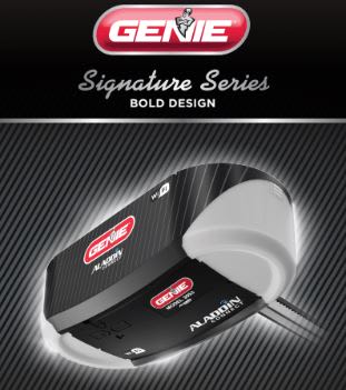
212 Responses to Option B
I think the use of the word bold design helps strengthen the product. I like option B better.
i like the signature series aspect, it makes it seem like it's higher quality
I think "Signature Series" makes it sound more exclusive and elite.
Option B provides a better picture of the product with much more appealing text along the top. I just really appreciate the size of the photo of the product on this design.
I think Choice B looks more professional and polished, it's probably because of the sleek apperance of "Signature Series" and the way the title catches your eye.
I like the font on the choice B, I think it makes the packaging look nicer! The other design is a little too boxy because of the lines on top and bottom of "performance".
I like choice b because it is more zoomed in.
The writting style makes it look more classy
The design at the top just looks better to me and more easily understandable at first glance.
this is good and innovative.
Honestly, going with my gut here. I don't really have a preference, but I suppose B just looks a tad bit more professional.
It could open up a whole line of product. So that it could continue on with several more products.
I prefer Design B, because I like that the garage door opener is from a signature series. I like that the signature series is probably better quality and more durable than Option A.
I like option B better: it's easier to read and understand characters, title is better, as well as overall appearance. Option A should be improved.
It has a bold design
I think Signature Series is a better motto than Performance Plus
I like this one better because it gives a larger, closer up view of the product.
B is a little bit bigger so it gives you a better, more clear view of the product.
I like the overall packaging better in B and the phrases and slogans work better for what the item is - a garage door opener.
I like B best, you can read the word Aladdin on B. I like the Bold Design listed at top also. I've installed dozens of these units (at my former job) and Aladdin is important because you might want to replace your existing unit and you'll feel comfortable swapping the same product if you are satisfied with the previous one (usually people are, Genie is a quality product over all).
i can read the text more clearly of the company name. had to squit to read "plus" easily
I like the "signature series" addition. That and limited edition things always make me feel like I'm getting something more, something special, something that I otherwise wouldn't be able to get. I like that it says bold design and that it literally is closer and bold and up front and it's bigger in the picture so you can see it more clearly.
I chose option B as the product being displayed as "signature series" gives the product a depiction of something that is above the rest and something that is special. I also feel like the font that the words "signature series" are wrote in also make the item seem of higher quality as this is a font that is typically used to display products that are fancy or high quality
I chose B because anything that says signature series screams quality and uniqueness.
This one is more sleek and just looks better.
I like the script lettering of option B more than the block lettering of option A. It might be that I equate the script lettering to old and reliable, which is a good trait in a garage door opener.
I like the design of B better because it is easier to process.
I like the bigger logo better
Everyone knows the term Signature Series and believe its a luxury name and would pay more for it
I like option B because I feel like the wording “signature series” makes it sound exclusive and special.
The products looks bigger, signature series and bold design caught my attention
I chose my selection based on my personal preferences and what I can picture myself choosing. I like my selection because it seems like it's more details and convincing. Thank you kindly.
Far more bigger and bolder than the other one.
Seeing "Signature Series" in cursive text makes it look better.
I like that option B has a sharp packaging and is easy to understand the contents.
B looks elegant and classy, which makes me think of it is more effective and of higher quality.
I like the "signature series"/"bold design" more than "performance plus" taglines. The product appears to be the same thing, but I trust the one I chose more than the other. I think this is a well designed product, and would consider it if I needed a new garage door opener.
I like the subtitle on the package: "Signature Series". It feels like choice B gave me more information of the product and even feels like a more trustworthy product due to the title.
I prefer Option B because I really like the cursive font that the words "Signature Series" are written in.
i like seeing the words more clearly. the other design has tiny letters in the words plus and it's harder to see.
The inclusion of the words "signature series" give a luxurious and limited feeling to the ad. I find this much more appealing than the ad without this addition
I chose option B. I like option B becasue the image of the product is much larger and easier for me to see. I also like the caption a lot more. It makes the item feel more premium in quality than in the other image.
B is a little bigger and more attention grabbing. I like the use of the wording "signature series".
SIGNATURE SERIES MAKES IT SOUND LIKE IT IS MORE RELIABLE AND WOULD LAST LONGER SO I WOULD PICK THIS OPTION
I chose choice B because Choice A looks very generic. The "performance plus" sign looks like any other product's design. The "signature series" design for Choice B looks classier, cleaner, and simple.
I like both the pictures, but the Bold Design got me on Choice B. Both look strong and like good products. But choice B tells me it is a good product and emphasizes it. And by saying 'signature series' , it makes the product look more high class. Marketing works.
Garage door openers don't really need to have that much performance, so I think signature series fits the product better. Also, I'm generally against adding "plus" to the end of product names. It makes it sound cheap to me.
I like the larger photo of the product that is shown on choice B. I also prefer the script font B has because it appears to be more of a premium or top of the line product.
Close up is good. The sedate font is attractive and does not detract from the picture.
B's script isn't as bawdy and the product is a little larger.
I like the overall look, appearance and description of Choice B. I like how it Signature Series Bold Design.
Option B has great design layout and more product details with bigger image .
If I'm correct in assuming that I'm looking at a garage door opener, I like option B more, with the "Signature Series" text. Although that seems a bit cheesy for the type of product, "Performance +" begs the question even harder, about what's so special or tuned for performance about this product. Does it have a turbo installed?
It is more descriptive of he model.
I chose B because it is a closer view so you can see the product details more easily.
i like the tagline better.
I chose option B because I like the term "signature series" because it makes it seem special. I would think that it was a higher quality than the other.
The bigger picture makes it easier to see what the item is.
I feel that the Signature Series looks like a better headline here. That seems to feel more upscale and that there are multiple products that would fit this category. It feels more established using that headline. Looks good otherwise.
I think B looks better. I think "signature series" makes it look classier than the graphics in A.
Signature series sounds exclusive and makes me think that not many people have this version. The font is fancier and adds to an elite image. The other option looks sportier and geared toward a professional garage and not at a home.
The item is too large and takes attention away from the text
The fancy script of the words signature series make me think I am getting an upgraded version of the product.
Option B image looks more powerful while communicating the brand being an established brand for openers.
THE IMAGE IN B STANDS OUT MORE AND SAYING IT IS THE SIGNATURE SERIES MAKES IT SEEM SPECIAL AND HIGHER QUALITY
I liked B better, the signature plus make be think it was more expensive or more exclusive. Performance + though looked nice with the plus.
THe writing looks good with the image.
This option feels special and unique because it's part of an exclusive and elite "signature" series.
I like option B the best mainly because Signature Series sounds better and even looks better on the box compared to option A.
I like the divider for the logo at the top instead of it all being the same pattern. The other blended in too much
I prefer this one because it lets me know exactly what series that this is from.
I think the words "Signature Series" really makes the product seem more special or unique.
This design seems rather competent and ideal for marketing with the extra details.
I like knowing that it's from the "Signature Series" and that it's a "Bold Design," makes it more appealing to me.
I like B because it seems like I am getting a more substantial product. I like it is part of a signature series and that it says bid design. I feel like I am getting more value and a better product.
I choose B because the photo of the Genie is larger and it specified that it is a signature series.
up close is jumping out at you, a better design
I prefer the picture with the signature series emblem. The font on the text makes me think of a luxury car brand, maybe Porsche? I also like the slightly larger Genie logo on option B.
I like them both, but think B is a bit easier to see. I like Signature Series too.
The colors makes it look better, plus the item looks bigger
prefer the picture
"signature series" is very classy.
Which design do i like better is option B it is because it looks attractive as it is bold design
I like the use of the cursive font on this one so much more than the big bold font of the other one. These one feels more classic and very on brand.
I somewhat liked the design of A better because it was eye catching and looked cleaner. However, I liked the idea of “Signature Series” much better. That really made me curious about the product, how it might be better than other products, and it made it sound very high-end.
Option "B": The appeal of a larger photo in this selection aside, the use of "Signature Series" has an inherent prestige immediately on viewing and mentally parsing; the "Bold Design" however feels like a strapline and could actually be removed entirely without effecting the overall appeal.
Option B shows the production batch of the product indicating it is a signature series
B articulates that it has an unique design, making it more stylish than A
I picked B because it said signature series. It made me think that it is a luxurious model!
I chose B. The pic makes it seems more elite, better quality, special. A, (even though it says "plus") just looks ordinary, generic, typical
the reason i choise this one because it shows that is a bold design and i think thats good
I liked option B the best. It really stood out more than A did. Better description of the product as well.
I like the fact it says signature series in option B that seems to add a level of class to it
genie signature series bold design see,s to be great design compared with another one. i would choose option B as the best option.
I chose B first because of its design and it says signature series. The picture is also bigger the option A.
I chose option B because I think when you hear signature series you always think that its a higher end model so better quality plus it just looks more elegant.
B because it looks bigger and the font design looks classier to me.
looks bigger and i like the font with the signature edition text
I prefer the option with the"plus" not incorporated into the verbiage. It makes it harder to read and is distracting.
Option N lets the image of the product dominate the ad and the font doesn’t compete with it. It looks classy and somewhat simpler, which I like. It feels like Option A is trying to hard to be aggressive and/or masculine.
I chose B because it is larger so I can see more detail on the sensor. The label also offers more detail available on it. If you are the kind of person who saves your rappers or books knowing that you have the Signature Series can matter later if a problem should arise.
I get the impression that B is giving me more information than A. It really isn't, but the impression is that it is and I am more likely to stop and click on the ad.
i would choose the option B..Because this design is very innovative and it look like an professional and give a good look..So the image of the design is much better
Option B indicates a series... a series that may have options that fit my needs better. Option A doesn't give that possibility.
In my opinion the "Signature Series" brings a first-class vs coach feel to this Genie model. It has a upgraded feel that people who expect or pay for the best are looking for.
Although I am not exactly sure what this device does, option B provides a clearer view of the item. I liked the "signature series" and bold design header and the lview of the product. The lettering on the product in option B also seemed crisper and cleaner.
I would like to buy B. This is a good design.
The title text is easier to read in this layout, even with the script font. In option A, the text 'plus' inside the plus sign feels busy and crammed, and is hard to read.
I would pick option B design is easy on the eyes and compelling.
The description caught my attention for this choice. Also, the picture is blown-up so you can see the product better, even though it's the same exact picture; A few extra words can make a big difference.
As I see the difference between the two choices is in the tag line. I choose choice B as I like that I am getting something premium as 'signature series' indicates in the design. Choice B focuses on performance and that to me would be more ideal for a tire ad. Choice B gives off a subtle but clear direction on what type of product I am getting as a consumer.
I slightly prefer B, because I think the whole image looks well balanced visually, but also because "Signature Series" gives me more of a feeling that the product is special than does "Performance Plus" in A.
The font looks a lot better and fancier for B.
Catches my eye. Like the fonts used.
I choose Option B because i like the design and it is attractive when compared with other, it expresses its boldness design and I am more likely to choose this, it also shows everything starts with the signature series, it is an apt design design and it is very creative.
I picked Option B because when I see something that has a "Signature" version, to me it is a better version than the base one. Option A's "Performance Plus" doesn't really stand out for me.
Option B looks more premium
B is a lot better, because it tells me more about the product. I already know it's a garage door opener, but come on, give me something that really stimulates me! A does not do that. Very bland and meh for my tastes.
I chose option B because I felt the phrase, "signature series" implies that this item is one of quality, and carries on the tradition of durability genie openers are known for.
I like the larger image because I can see more product details. And I like the font better.
Signature series sounds like it has more prestige than performance plus. What does performance plus mean anyways? It performs and more? I would rather have a fully endorsed product offering.
B sticks out more
I chose B because the using signature makes the product sound elite and better than the other option.
I like B because it shows the series name in a fancy font as well as the label "bold design" below it, and the contrast is really good making it easy to read. The "signature series" written in cursive, and the "bold design" in bold matches well.
Option B is the better option in my view because the product is zoomed in more compared to option A. Also, I like the "Signature Series" as opposed to performance plus because it sounds and looks better to me.
The signature series indicates to me to be of top performance. It tells me the company has given its stamp of approval and this is the ultimate in this product.
Choice a gives you more info inbreeding type of garage door opener it is
Looks a little bit nicer and like a higher end product with the scripted "signature series" in the middle of the panel.
This option B is preferred because it is shown larger and bolder so you can see the overall design much better than you can in the other option.
I like Option B because the product seems closer and looks bigger. Gives you a better idea of the item.
I voted for B because it is more subtle and inviting. The font in A is a little too bold and intense for me. I'm drawn to the script font.
I chose B because it's a larger design and I can make out more of the product. Also, adding the word "PLUS" to a product has been overused so much these days, so that turned me off of A also.
Option B looks more professional and higher quality
can see the product clearer than the other version
B isn't as cluttered as A, and I also think the "Signature Series" text evokes high quality.
B seems a little more clean, the performance plus in A seems a little gimmicky.
I like the texted lay out it makes it look more sleek
I like option B best because it says "signature series" I have a Genie garage door opener and it love it. It works great.
I like that it says signature series and bold design. It makes the product seem new and improved.
I like this choice most because it gives more of a close up of the product.
This option looks like it is newer which implies that it is improved.
"B" is bigger overall so the design caught my eye quicker. I also like the words "Bold design" and "Signature series". It tells me there is something special about that one. Although A says "Performance plus", I think the words used for B are more compelling.
It just seems to tell you more on B than it does on A.
More sharper and more bolder in my eyes I like the font of signature series and it doesn't take away from the picture.
Having the ‘signature series’ on the label makes it more marketable and eye-catching to the consumer. Though it may not make any difference in the quality of the product, people like to feel special about anything they buy.
I like the bigger picture of the product. The Signature Series sounds like it is more of an elite product design.
It give the brand a more sophisticated look about it. The other look has been done over and over again. This a bit new and different.
The larger focus on the product speaks more to me and it shows it off better as opposed to the adjective
I like the larger size and the "Signature Series" text. I could do without the "Body Design" text.
product looks more expansive
Signature always looks more elegant.
The branding and product photo are larger and clearer
I like the fact that the image was large which made it easier to look at and to read when compared with the other.
I like the term "signature series" on option B. If I was to buy a garage door opener, I would want to have an air of sophistication to it, rather than be wooed by the "power" of the opener. I don't see why having a more powerful garage door opener would be of any advantage
I think the cursive"signature series" elevates the design of B.
I prefer option B, Signature Series, because this appears to imply that this is the high end, really nice, best performing of the product offerings.
i like this one with the cursive font. it seems more stylish or vintage-like.
I choose the B option because i find the design more appealing.
i like this one because I can see more details seeing it up close. I like when I can see products enlarged to see small details without looking more into product information
I feel like it focuses more on the product rather than the text, and has a bigger image of the product.
I chose Option B because the image is larger and easier to see.
I like B better because I love the fancy cursive writing used in the ad. It really sticks out and draws me in.
The product image is larger and that makes the product look a lot better
More classic look and feel than the other. Option A looks tacky with the PLUS in the plus sign.
I love how big and bright this image makes the light look.
I like B because the image is larger. The wording on both designs is just hype and cancel each other out when it comes to choice
the cursive writing on this option makes the item look more sleek and like a high quality brand.
Bold, enlarged, clear and draw my attention toward it. A does not show the detail as much as B.
I like the cursive writing. Makes it look classy. I like the bigger picture. Makes it look more realistic.
It is a little difficult to explain why, but I was attracted to Choice B right at first glance, and that preference didn't waver. I even tried to like A more but had to stay with Choice B as being better. I think I like the "Signature Series" name. The line below that "Bold Design" doesn't really mean anything to me. I'm pretty sure I was just more attracted by "Signature Series" compared to "Performance Plus".
I like the "Signature Series" statement. It makes the ad stand out more than the other option. It also makes the brand seem larger.
B is more eye-catching thanks to the additional space. It pops because it is less cluttered. Also, "Signature Series" suggests to me that this is the top of the line for this company, which is what I want. I always want the best. "Performance" is overused as a marketing term so it doesn't draw me in the same way.
I like option B better because the image is larger and in regards to option A, I don´t really need a garage door opener focused on performance. So I went with the signature series / bold design description. Performance is more about cars, computers, etc. It is a bit overkill to use it with garage door openers!
I chose B because it looks more detailed and less congested as far explaining the features of this certain product.
For me the text description depicts it must be a top of the line product from this company.
The picture is bigger and because of the words bold design.
I like the ad design better because I could see more due to the size.
I think the signature series stands out more and looks better.
B was more descriptive. “Signature series” and “bold design” are better than “performance plus”
I get more information from the package here. Makes it seem like I get more from my money with the wording on the box.
The signature series font looks fancier.
The phrase "signature series" catches my eye and makes me think more highly of the product.
I think the phrase "signature series" will attract more people.
I prefer B. I like the larger picture so I can see for sure what it looks like.
signature series usually means a higher end product. The photo used is larger and enhances the beauty and details of the product. better picture quality also insures the product you are receiving.
The signature series looks eye catching and fancy, compared to the other option.
I like the bigger photo so I can see the product slightly better. The difference is product/box title does not make a difference to me.
I think both are great designs however with this I am going with signature series. For me, when something says signature series it makes me believe that this is the higher quality product. Performance plus isn't bad and people may think there are getting something better than average however signature tells me this what they want you to focus on.
I like B because it is larger/more eye catching and the font on the signature series make it look more like a premium product.
B looks cleaner and more like a classic automotive design. The logo of option A is busy and takes attention away from the product.
Seems like a more classic design and I like that. Shows the brand has been around a while and isnt trying to be something it's not
I like option B better because signature series sounds like an elite product rather than option A.
The terminology of "signature plus" provides the idea of exclusitivity, showing top tier, premium product.
Option B is somehow more striking, tempting and trustworthy.
I like the fancier font of the words "signature series." The words "signature series make the product sound more top-of-the-line. I like the overall variation in fonts, and this would appeal to the most people.
The script on the device is more clear on B. I don't really like either of these though.
I like the cursive writing with Signature Series . I also like the bold in the design because it is rather bold. A is good but doesn't stand out like Signature Series.
I like B, it looks more prestigious with the cursive.
Choice B is more modern and would be more attractive in my home. It seems to be a higher quality than choice A.
I prefer B given the Signature Series logo and larger photo of the product. More visible and appealing.
The look of the product is better in B
Feels more classy and classic, like it's been around for a while.
The cursive looks nicer and less aggressive, which I prefer. I also don't associate "plus performance" with something like a garage opener. What power could it have over a standard one? Whereas signature series sounds like it refers to upgraded features and not just power.
i think this image looks more attractive
The phrase signature series makes it sound like a higher quality product. Also the text and product image are better defined in option B.
It has a more premium image and the image is larger. I like the cursive writing.
I think performance plus on the box of option A makes the product look very generic. Signature series makes it seem like option B is very reliable.
Signature series sounds like a higher end product. Performance plus doesn’t elicit the same feeling.
I like the fact that the font doesn't seem to be "screaming" at me.
I like this image because it is bigger and a lot more clearer than the other choice. I prefer the font used a little bit more than Option A as well.
It mentions it is the signature series, I think that appeals to me more than just the regular advertisement.
signature series makes me think that it is exclusive and of better quality than normal i would buy this if i saw it
Explore who answered your poll
Analyze your results with demographic reports.
Demographics
Sorry, AI highlights are currently only available for polls created after February 28th.
We're working hard to bring AI to more polls, please check back soon.

