Poll results
Save to favorites
Add this poll to your saved list for easy reference.
Which email would you purchase from? What element stands out in your choice?


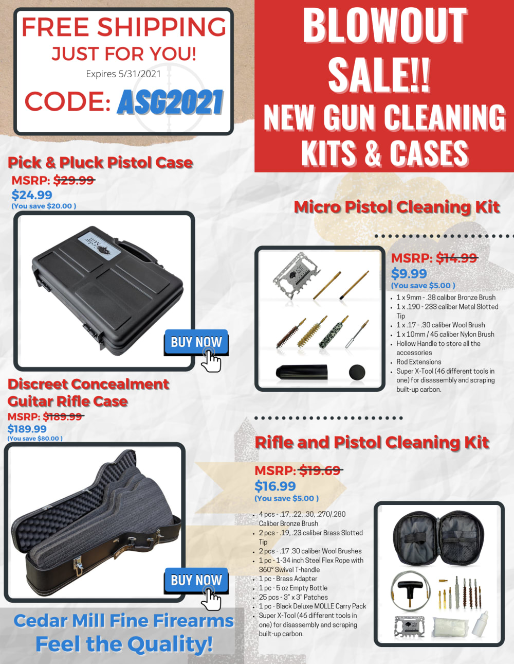
32 Responses to Option A
I would go with A because it's a lot easier to read on the white background. "BLOWOUT SALE" and "FREE SHIPPING" really stand out.
Looks like a more professional, higher quality ad overall which gives me confidence in the store.
More professional, trustworthy and appealing as an option
The red is just bad on the eyes to look at for the infographic
I think the background of option A makes the gun cases look a lot better. It is easier to focus on the actual product in option A.
This one seems more bright and readable.
I would purchase from Option A because the other choice with the intense red background looks suspicious and tacky
This ad option is easier for me to read and looks 'cleaner'.
I think a page of red isnt quite appealing from a gun seller.
I like that this ad features the blowout sale text in white font with a red background. Also, I like that the coupon code is right on the top left so that it is easy to find for check out.
The free shipping and sale were the first things I noticed. The ad seemed easier to navigate.
I like the mainly white background. It's a better feel and more readable. Also, it's easier on the eye. You can see the headings much better and that makes it the choice for me.
i like this one the best. it is more organized and looks more appealing than the other one. i like the color on the other one but its too jumbled and unorganized. i would add the color red to the one i picked and it would be a lot better
I do not like the red background in B. It is too bright to me. I like the white background in A.
the white text jumps off the color background better than the darker text
the other picture has way too much red and it hurts my eyes to look at it
The text regarding the deal, and also the overall text just stands out and allows me to read more easily about the product.
The white background makes the text easier to read versus the red background of choice B. The “blowout sale” advertisement is also more eye catching.
I chose A because its the easiest to read. B is so difficult on my eyes with the bright red background.
I like the layout on this one the best
I prefer option A because the white text is easier to read than the black. The free shipping statement with code jumps out at me right away and would make me more interested to read through the rest of the email.
I prefer A as the lettering is in a larger font so easier to read the sale prices and the details of each cleaning kit and pistol case. It is a better made ad.
option a has a better lay out and the color scheme is better
Not so in your face and easier to read when there is not so much red background.
Everything about A stands out more than B to me
I like choice A because it is more informative and organized.
I think the font is easier to read and the red is distracting in the other image.
I chose A because it stands out better with the bigger font and also the free shipping ad is right up at the top, easy to see.
I prefer the more neutral colors -- the red in B is just too much for me. The product listing names and MSRP's also stand out more.
I like the larger fonts to be honest - its a little easier to read
I like option A the best because some of the text is larger and I like how the color layout is with the colored text and white background.
The titles on this ad stand out much more than the other choice including the Blowout Sale portions which is a very important part of this advertisement.
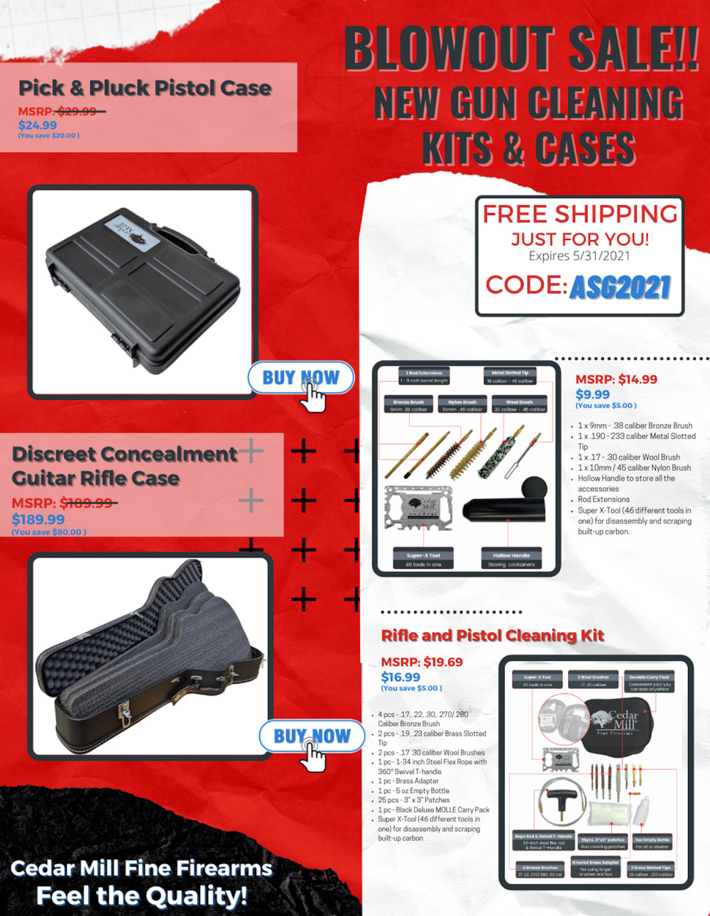
18 Responses to Option B
I like option B the best because it stands out the most and grabs my attention with the red background.
i think this option is more creative and eye catching
Free shipping code stands out to me.
Better contrast and more eye catching than the other option.
B has a brighter overall user interface which got my immediate engagement and actually got me excited for this product.
I thought the bold red color palette of option B was much more visually appealing than the color scheme in option A.
I would purchase from the email in B more because the content is more eye-catching and appealing. Option A looks too rustic and outdated to me.
I like B because it’s clean and looks more professional to me. What sticks out to me is the red. The red makes it blend together and makes it less stick out. Without the red like it’s in A it makes it looks like a regular advertisement and the items looking just places. Definitely the red makes all the difference.
I liked choice B since the background is more plain and direct. I also liked how choice B is easy to focus on the images and information are grouped together. Choice A feels too busy and unappealing to look at.
I like the design and color scheme. I especially like the red section because in highlights the product better than the other one.
It is easier to see the coupon code on this image
I like the contrasting colors of B better, it makes the flyer look more professional.
I think that red is something that catches peoples eyes a lot more than the white background of option A. I also think that RED means URGENT or FIRESALE, nevermind the pun. I think that just having the red box on the top right in option A for this BLOWOUT SALE just isn't enough. Go with Option B. IT stands out more.
This ad just looks better to me. The colors are more vivid and attractive and it just catches my eye more.
B because the big red background makes my eyes go to this email image more and want to know what its about and view the contents more than A
I like this one. The red color stands out. The way the page is organized overall looks great with predominately red. My eyes go to the right and upper right hand side where it says blowout sale and free shipping easier on this one. I just think it looks more enticing.
the red behind the pictures makes it stand out more! The contradiction between the colors really catches your eye.
I would rather have been sent choice B because choice A looks gimmicky and just very jarring in that sense. I think it's the white sign that looks like popups.
Explore who answered your poll
Analyze your results with demographic reports.
Demographics
Sorry, AI highlights are currently only available for polls created after February 28th.
We're working hard to bring AI to more polls, please check back soon.

