Poll results
Save to favorites
Add this poll to your saved list for easy reference.
Which Fat Burner Would you buy?


There was no majority winner of this Ranked poll after 2 rounds of vote counting. However, Option C and Option B had the most votes (25).
In a Ranked poll, respondents rank every option in order of preference. For example, when you test 6 options, each respondent orders their choices from first to sixth place.
PickFu requires a majority to win a Ranked poll. A majority winner differs from a plurality winner. A majority winner earns over 50% of the votes, whereas a plurality winner earns the most votes, regardless of winning percentage.
If an option does not earn a majority of votes, PickFu eliminates the option with the lowest number of votes. The votes from the eliminated option are reassigned based on each respondent’s next choice. This process continues in rounds until a majority winner emerges.
Scores reflect the percentage of total votes an option receives during the vote counting and indicate the relative preference of the respondents. If there is no majority winner, look to the scores to see how the options fared relative to one another.
| Option | Round 1 | Round 2 |
|---|---|---|
| B | 40% 20 votes | 50% 25 votes +5 |
| C | 32% 16 votes | 50% 25 votes +9 |
| A | 28% 14 votes | Eliminated 14 votes reassigned |
Age range
Amazon Prime member
Education level
Gender identity
Options
Personal income range
Racial or ethnic identity
14 Responses to Option A
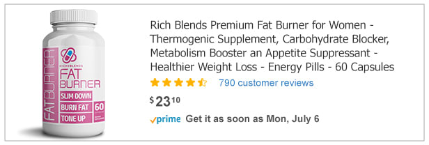
The words fat burner stand out to me and also that it is a carbohydrate blocker.
If I had to choose one, I would choose choice C because it has two of my favorite colors. Pink and white are my favorite colors.
I like the white color scheme better than the black because I feel it gets my attention quickly. I also like the lettering to be larger because I don't have to click on the actual listing to know what the pills are for, especially because the listing title is so long and small lettering.
Would like to buy option A based on the product which is more quickly to click on
I would buy A because I like the packaging/label the best.
I prefer the white bottle in choice A, and the text is easy to understand.
I think that A looks the most real and like something that would work. I definitely would not buy B because it completely looks fake and like a gimmick to me.
Option A looks modern and has a bright and pretty design. Option C also looks more modern than Option B.
I like the white bottle the best. It looks clean. Then I choose B next because I can see the label very well.
I chose the fat burners that stood out to me the most, the label that grabbed my attention and captivated me.
I chose A as my first pick because the white bottle is easier to read. I prefer the design of the logo on C compared to B.
I prefer the white labels, they look more familiar to me. Otherwise, this first black label is kind of cute.
I will be 100% honest and say that I would absolutely never buy any product called "fat burner."
Honestly, they were all really close. They all have good reviews and are the same price. I ended up going with which label I liked the best.
20 Responses to Option B
I chose B first. The type of pill it is, is plainly stated on the labeling and I like the color of the label. I chose C next. I chose C next because the label is less descriptive, but I still like the color of it. I chose A last. A is descriptive of what it is, but I prefer the color of B.
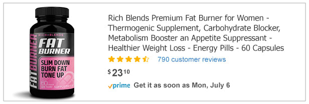
After considering the options, I prefer the Option B. It looks better and it attracts me to it. I love its design and appearance. I would rather buy the product based on its design before the other options. Its beautiful to behold and looks so appealing to me.
My top choice was option B, because I liked that the text 'fat burner' was big and bold so it pops out from a glance. My second choice was option A, I just preferred the contrast of the pink and white in packaging design over the black and pink in option C.
B is nice black and pink combo.i love the fat burner in white and pink block displaying slim down burn fat tone up. I like the color choices for words on side it works. A is good due to bottle being white and the pink thru bottle nice compliment.its easier to spot bottle cub bards . C is ok with the black bottle however its like a but with black where white is and it doesn’t work very well. I dont like the photo either in c its not related to product.
I would end up buying the bottles that are the quickest and easiest to read. I thought Option B was easiest with the white text on black.
I would choose Option B as my first choice. All options seem to have the same ingredients but the label on Option B is more attractive and would get my attention.
I chose B first because the font was easy to see and the purple and black label is very eye-catching and appealing.
Option B's label stands out the most to me because of the white font on the black background, and the pop of pink is attractive.
I think the bottles with the black background and pink added look really cool, trendy and high quality. I slightly prefer B to C because it tells me in large letter that it is a fat burner. I think the light pink writing on white used on bottle A looks faded and easy to not notice.
I do not, and would not, use weight loss pills. Design wise though, the purple and black works well together
B is first choice because I like that the black contrasts well with the pink. I also like that it makes it loud and clear that the product is a fat burner. I also like that the text is bold and easy to read.C is second choice because it too has the high contrast of the black and hot pink. I prefer the logo image of C over A. The white text on the pink is also easy to read if a bit small.A is my last choice because it's white and I feel like it would blend in too much with other products as white is a very common color. I do like that it is easy to read with larger font than C. The logo has a nice blue pop in it but I like the logo on C better as it feels more flowy.
The label for A caught my eye the most.
I honestly can not enlarge the pictures bigger so I can see what the bottles say on them. From the distance and what I am able to see, I like choice B is a dark bottle and it says straight out Fat Burner. I do like choice C for the similar reasons to choice B, but the words Fat Barner are not as big as choice B which is maybe I would lean away from that bottle. Choice A while it does say Fat Burner, I don't like white vitamin bottles as much as I do the darker bottles. Choice B for the reason of the bottle color, being able to read Fat Burner, the design of the label as well.
B - Clearly states what it is on the bottle in bold. C - Looks professional, but is difficult to read.A - Looks like something out of a video game. Not appealing. Makes me think it is cheap.
The black bottles are superior. I would find them on the shelf or they'll stand out if searching on the web. I chose B because the pin portion of the label and the feel is a lot nicer
The large print on choice B would catch my eye, so I would go for that one first. I like how it explains what it does in the description. I like choice C too because it looks like a good quality brand. Although choice A has a good description of what it does the design of the label seems a little cheap looking so that one would be last because I might not feel it is a trustworthy brand.
Since price is the same on each I would buy the one with a clearly designed label and good product description as in option B
I prefer the black bottles over the white for this product. It helps me keep my supplements separate from my vitamins. The label on B is more bold and clear, which makes it easy for me to grab and know exactly what I am taking. I like he vertical writing on the black background better than in the pink box of C.
I think the bold but visible logo stands out more.
The black bottle definitely looks great. I ranked B first because I like the way the label pops out. C looks good, too. But, the label looks a little washed out and dull. A is last because the pink and white looks really generic---like lots of other bottles on the shefl
16 Responses to Option C
The package design and overall look is good. It catches my attention over the others
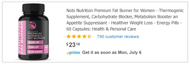
I would choose the pills in C. I like the black and pink label and that the amount is listed.
The bottle for Option C is the most professional looking. I like the black bottle on B better than the white bottle on option A.
i did not mind the pink and black, i just felt like option C did the best job of looking professional with the way the information is listed on the bottle. option B has too much big block of pink and option A was too white it almost felt generic.
I ranked C first because it has "fat" in the most discrete lettering. If I were using this fat burner I don't want it being displayed too loudly and being reminded that I am fat or telling others that I am fat. That's why I rated the most discrete labeling the highest. B is the least discrete.
I liked the look of the label better than the other options.
I like C the best because the bottle doesn't have "Fat Burner" just screaming at you front and center. I feel like that makes the product seem more professional and more pleasant to look at. I also like that it is dark colors with a little bit of pink, I think that makes the packaging pleasing to look at overall. I like A second because I find the packaging appealing. I like the bright colors and think the bottle is nice to look at but I don't like how it just screams "fat burner" at me. I like B least because along with screaming "fat burner" the packaging is just too pink and I don't find that as appealing.
I liked Option C best because the design is very organized and clean. It's easy to see the information you need very quickly. I chose Option B 2nd because the large font helps me glean the information very quickly. However, I'm not sure if I can find all the information I need to know. I picked Option A last because the pink on the white background isn't as good of a contrast as pink on black. It's harder to read the information that way.
I like the black and purple packaging best, it is eye catching and feels sleep and professional
nice color scheme and informational label
I like the design of the first bottle the best. All else being the same, it would look nicer on a medicine shelf.
The black background on the bottle makes it seem tougher and stronger at what it does, which is burn fat. I really like how organized all the descriptions are on the bottle too for C.
The black bottles are more attractive, and the design of Option C is more feminine, so I feel like it would attract more women.
The black colored bottles look like they are going to get the job done.
I really don't trust this stuff and they kind of all have the same vibe. But C looks the best.
I chose "C" first because I like that the label is black. I also like the font and image on the front. I like the font and image of "A" also, which is why I chose it second. I do not like the font of "FAT" or the large pink square in "B", which is why I chose it last.
Explore who answered your poll
Analyze your results with demographic reports.
Demographics
Sorry, AI highlights are currently only available for polls created after February 28th.
We're working hard to bring AI to more polls, please check back soon.

