Poll results
Save to favorites
Add this poll to your saved list for easy reference.
Which Fat Burner Would you buy?
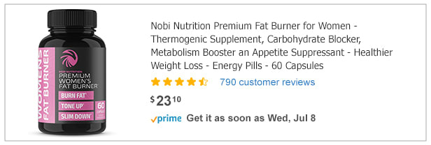
23 Responses to Option A
I feel that Option A would be better suited to what would work for me, as a woman.
I would have to choose choice A because of the labeling color. The words that pop out are larger than choice B.
When it comes to vitamins I am more likely to choose one that is formulated for what a woman needs. I also prefer the design of the pink and black. I eat a lot of carbohydrates as well, so that definitely boosted my interest in A in edition to preferring the look of it.
The options were almost a dead tie for me but I ended up with option A because it said it was for women and I'm a woman. I suppose the bottle label design is a little catchier too. Overall the choices seemed almost exactly the same.
This was a tough choice. I feel like B might give me more energy since it states that. However, I think A says the same thing but worded different since it says metabolism booster. What really stood out to me was A said it was specifically formulated for women which B does not state this. So, I feel A would be produced to help a woman's body so I would think it would work better for women.
I prefer A because I feel that the pink is softer and the red feels a bit too intense for me. I also like how A seems to have more of the 'benefits" listed on it which is very helpful for me.
because i like this ad
I chosen based on the color.
I chose the option A as it is specially mentioned for women and so I think this is the best one for me.
There are several reasons that I chose Nobi, option A. First, I like the name a lot better. Burn XT reminds me of the workout videos of the 90s. I think of muscley men. Second, I prefer the package design of option A. It's a cooler tone than the orange of B. I also don't like the fire imagery. That's not what I want for my body. Last of all, the description of A sounds like it's better for my body than the other product.
Option A is the best
Pretty similar product and exact price, i chose Choice A as it doesn't immediately come off as a scam or fake product. The pink packaging also help catches my eyes on the product.
The option A fat burner is more attractive. I love the color of the product and its label. It's well designed and looks so appealing to me
I WOULD CHOOSE A TO BUY THE FAT BURNER BECAUSE IT IS FOR WOMEN SO,THERE WILL BE NO SIDE EFFECTS AND LESS HARM IN IT.
This one looks more "gentle" to me, in the sense that the aggressive looking font on the other one make me fear what's in it-- I know that sounds weird, but it just looks like something that would contain more than caffeine or have tons of energy herbs or something that might be bad for me. As a woman, I like the purple one and the more subtle font, the other seems to masculine and aggressive. This looks like a good and decenet product and the colors are more relaxed to me.
I would buy option A fat burner. Option A is well titled and the title helps to describe the product. The design of option A is also appealing.
Option A looks like a legitimate vitamin/enhancer, while option B looks like a knock-off scam that is trying to lure people in to buy the product.
I liked the pink color. Although the other bottle has bolder colors, I did not care for the brown color.
I would buy A because it looks more feminine. I like the pink color.
This product explicitly states for women and the bottle conveys this message because the pink color is feminine.
This bottle looks much more professional, although I can imagine the use of pink would come off as too feminine for some men.
Both are these are about the same to me in terms of package design. I went with A because of the item description listed on the ad, it uses more advanced wording on the package, B description is more common and generic.
option A looks as though it was designed for women, as it says in the title. option B does not say anything about women so I feel this would be something a man would notice right away.
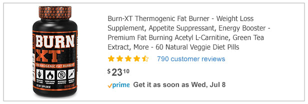
27 Responses to Option B
I am not a woman so I cannot pick the other one
Choice B is more descriptive, they note the pills are veggie pills, and overall has a better explanation.
Choice B looks much more effective at burning body fat. The packaging looks intense like it would be really strong. Choice A looks like it wouldn't have as much of an effect.
BurnXT sounds and looks more effective and sporty. I like the ingredients as well. Looks like a true fat burner visually
I chose B because it has "BURN" on it with all caps making it more appealing.
It looks more energetic
The outward appearance of the bottle seems more professional and appropriate given the targeted demographic for this supplement.
I wouldn't buy A since it says for women
I picked b because I did not like the pink bottle in the other picture.
I like the design of B because it looks bold and powerful
Choice B because I feel like the traits for this fat burner is more bang for your buck than what option A has even if it is the same price.
I am a man and the other choice said it was for women.
I chose option B because I am a male and would choose the genderless product. I wouldn't pick the woman because I am not sure if it would be as effective for men. Also the ingredients in option B I am more familiar with then product A.
The bold title of the label.
its good for health
I chose 'B' because (although 'A' looks a little "prettier" as far as the label and bottle) the prices, reviews, and delivery times are the same for both products. So what's left is the text describing the products, and 'B' spoke to me a bit more than 'A' did.The text is quite similar for both, but there are some noticeable differences. Namely, that 'B' specifies Natural Veggie Diet Pills. This isn't mentioned in 'A' , and it makes me wonder what 'A' is made from (and suspect it isn't natural). Another thing noticeable about 'A', and unfortunately not in a good way, is the grammar/spelling error of "an Appetite Suppressant"; I believe that should say AND. The poor editing comes across as frankly a bit sketchy and I'd want to avoid putting something in my body made by a company that can't take the time to proofread.
Not a woman, so this product would work best with me.
I think as a man I have to take this one over the other.
The big bold "BURN" on the bottle had me boned up from the moment I seen it. It just reaches out and slaps you upside the face, demanding your attention.
because the other one is for women. I really won't want that right?
I chose option B because it's not specifically for men or women. With that being said, it also has green tea extract which is an antioxidant which is a big plus for me.
I like B better because it has the word burn in it so you would know what it's for.
orange is catchier
Since the tablet is applicable for all i like it.
I like the bold text and the other body is pink so i think it's not for men
I chose B because it seems to list ingredients such as green tea extract on the front label, which is helpful to me in picking a product. Also, the large size of the bold font on this bottle clearly shows someone buying the product what the product does. The large font makes it more eye catching and conspicuous.
This option is vegetable based and possibly vegetarian.
Explore who answered your poll
Analyze your results with demographic reports.
Demographics
Sorry, AI highlights are currently only available for polls created after February 28th.
We're working hard to bring AI to more polls, please check back soon.

