Poll results
Save to favorites
Add this poll to your saved list for easy reference.
Which Fat Burner Would you buy?
Option A won this Ranked poll with a final tally of 29 votes after 2 rounds of votes counting.
In a Ranked poll, respondents rank every option in order of preference. For example, when you test 6 options, each respondent orders their choices from first to sixth place.
PickFu requires a majority to win a Ranked poll. A majority winner differs from a plurality winner. A majority winner earns over 50% of the votes, whereas a plurality winner earns the most votes, regardless of winning percentage.
If an option does not earn a majority of votes, PickFu eliminates the option with the lowest number of votes. The votes from the eliminated option are reassigned based on each respondent’s next choice. This process continues in rounds until a majority winner emerges.
Scores reflect the percentage of total votes an option receives during the vote counting and indicate the relative preference of the respondents. If there is no majority winner, look to the scores to see how the options fared relative to one another.
| Option | Round 1 | Round 2 |
|---|---|---|
| A | 34% 17 votes | 58% 29 votes +12 |
| C | 38% 19 votes | 42% 21 votes +2 |
| B | 28% 14 votes | Eliminated 14 votes reassigned |
Age range
Amazon Prime member
Education level
Gender identity
Options
Personal income range
Racial or ethnic identity
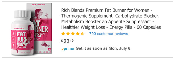
17 Responses to Option A
If I had to purchase a fat burner, I would choose choice A because the bottle looks nicer than the other bottles. I like the pink and white contrast.
I voted for Option A .I like the list of benefits especially energy and appetite suppressant. I realize A and B are similar other than color but I do like the pink better since it is for woman.
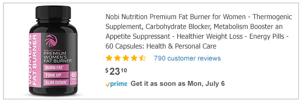
I like c best, but I feel like it's too nice for me - it's for people who look nice and are attractive. I personally would choose the most generic/vitamin-like look, because that's how I feel about myself now.
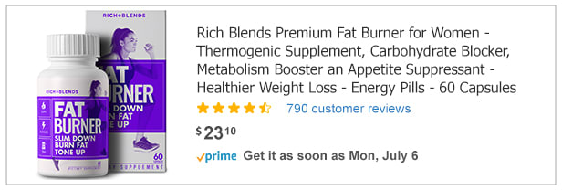
a/b: Although i prefer the colors on bottle c i feel as though option a and B bottle and packaging design resinate more with what the product is used for compared to option c. I prefer the pink on option a compared to the purple on option b. I feel as the logo on the bottle really stands out well.
I like the background with the woman exercising. The pink caught my eye first then the purple.
The lighter colored bottles are more attractive to me. I especially like the pink against the white background. It looks feminine yet strong and powerful at the same time. The pink color is bright and stands out among the other choices
My top choice was option A, because I think the light red tone really pops out more in the packaging design than option B and C. Option B, I liked the overall packaging design but I leaned towards the color of option A more. Option C, I thought the packaging was the most basic and least eye catching hence I ranked it last.
The label immediately stuck out to me plus the words "carbohydrate blocker".
I liked the colors and designs better than the other ones
I like the white bottle on choice A, and it gets right to listing the benefits.
I chose A B C in order based on the look of the bottle. I really like the layout in A and B and prefer pink over purple. I chose C last because I really didn’t like the black bottle.
I chose A and C because I thought the pink colors were a better fit for the label. I then chose A first because the product name was easier to read.
I like the white bottles and white boxes of Choices A and B, they look the cleanest and most put together compared to C's packaging. I also like that they feature a woman getting in shape / or who is in shape; maybe if I take these, I will also have a body like hers.
The white background on the bottle makes it look better for health reasons. The black and pink bottle actually reminds me of sex enhancing pills for some reason. I like the pink better than the purple which is why I chose them in that order. Pink is the color that is most associated with females.
because pink stands out to me and its the same as B
I like choice a because if the color.
The clear and easy to read labels are compelling and informative and make me far more interested
14 Responses to Option B
I wish I could see the close up of these, however based on what I could see, I prefer B. I like that it says fat burner and is an apealling purple color. A is good as well. The pink bottle makes me think it is for women like myself.
I would purchase the fat burner option shown in image B. The price on all is the same as is the star level, so it really came down to the bottle design. Purple is my favorite color, so I would chose that. They pretty much have the same benefits.
I like the purple in B. C looks high class but not as eye catching as B. I don’t like the bright pink in A.
The purple looks friendly and trustworthy. Black bottles kinda look sketch.
I like B best because I think the blue color on the label looks the most attractive. I also like that it shows the bottle and the package. I like A almost as much but I don't like the pink quite as much. C I think is just okay. I don't like the dark bottle nearly as much.
In my top choice, option B, I like the purple label: it looks dynamic and strong, yet feminine. I like the image of the woman on the label too. In the text, I like the words "rich" and "blends" -- it sounds food-like or nutritional somehow. In my second choice, A, the text is the same and I like that, as well as the photo on the label. I just don't like the pink color as much. In option C, I dislike the black bottle: it looks masculine or "bro"-like.
I chose B as my first choice because of the eye catching purple label.
I prefer option B because I prefer seeing the box an the purple color. Pink is too girly for me. The picture with just the bottle is not as easy to see what the product is.
Product description that is most appealing
these seemed easier to use
I prefer options B and A. I really like the colors of the bottles. They are eye catching. The runner on them draws my eye in more. I think there is sufficient information on the bottle to give me an idea of the product. The writing is large and easy to read. The bottles look modern. Option C is outdated. I feel like the bottle looks generic. It doesn't look trustworthy.
I like the first two designs because they easily captured my attention. The description is nice and concise. The third choice didn't capture my attention as much and the description was longer which tends to make me wander elsewhere.
Actually, I wouldn't buy any of them. However, I chose B first because the purple color on the packaging caught my eye quickly. I chose A next because I prefer its packaging over that of C.
I like the purple label for a fat burner as well as the image of the woman running.
19 Responses to Option C
I prefer Option C for a fat burner product because the main color is black, which is slimming and represents the look I am trying to achieve when purchasing this product. Next, I chose Option B over Option A because purple is closer to black than pink is, but I don't like the main color of white for either of them because it has the opposite aesthetic effect of black.
I'm voting on packaging alone, and choice C has the most appealing packaging. It looks like a luxurious, well made product. The final two were equal in my mind because they looked identical besides color.
I prefer this one the label pops out against the black bottle as well as the fact that it looks more modern.
Would like to pick option C is the best which is given detailed information with great label, great to buy
I dont like the pink. it looks to girly and i dont take it seriously. The purple and black look strong and makes me believe in the product more.
I liked the black bottle of option C. I prefer the pink graphics of option A over the purple graphics of bottle B.
I like the first one's package the best.
I like how they're all the same price, but ads with people always weird me out so C is best.
i will buy any of these because it has same amount of review and ratings
I do not believe in buying diet pills, so would not buy any of these, as far as bottle design goes though, the black and purple stands out the best
I’m not really a fan of the white bottles which is why I picked c first
I chose Option C for #1 because it say Health and Personal Care in the description. The pink and black bottle is also easier to read.I chose Choice A for #2 simply because the pink label would assure the consumer that it is targeting women.Choice B is #3 is similar to Choice A except for the label color.
C because the Black Bottle inside catches my eye. B because even though it's in a white bottle the purple accent is pleasantly noticeable. A because the bottle just looks boring and and doesn't look like it's anything special
I chose "C" first because the black bottle makes the contents look more official and more expensive. For some reason, the black package also seems to signify "exclusive item", which is something most people want to have. The hue of the purple in "B" is what made me choose it last. I like purple, but I don't like that hue of purple.
option C seemed the most professionally created and the labeling felt like something i would see at the store, the other 2 options seemed more cheaper and something you get on amazon may not be as good
I would not buy any off these products. I chose them in this order because the packaging on the first one was the least about weight loss, but I think that all three are horrible and damaging products.
Doesn't look like any difference, so without being able to read the ingredient labels, I went with the black and pink as my choice (option C.) For second, I chose the pink (option A) and third I chose option B the purple. Pink seems more of a fat burning color.
Since they all have the same amount of pills and reviews and are the same price I choose my favorite colors, which are black and pink. I do not need to see a woman on my fat burners.
Since the descriptions are the same, my choices are based on the bottle. C is not as obvious. At first glance, you would not know what type of pills it contains. If I left the bottle in my kitchen and had company, I don't think I would want them to know that I was taking fat burners so I prefer the label with smaller writing. My next choice (B) is based on color preference. I love purple, so if it is going to have large print, then put it on a purple background and I am happy! C is last because it is pink.
Explore who answered your poll
Analyze your results with demographic reports.
Demographics
Sorry, AI highlights are currently only available for polls created after February 28th.
We're working hard to bring AI to more polls, please check back soon.

