Poll results
Save to favorites
Add this poll to your saved list for easy reference.
Which "Fireproof Bag" images are more appealing if protecting your valuables at home? How do the images appeal you and what would you do to make the images more appealing?
Option E won this Ranked poll with a final tally of 52 votes after 4 rounds of votes counting.
In a Ranked poll, respondents rank every option in order of preference. For example, when you test 6 options, each respondent orders their choices from first to sixth place.
PickFu requires a majority to win a Ranked poll. A majority winner differs from a plurality winner. A majority winner earns over 50% of the votes, whereas a plurality winner earns the most votes, regardless of winning percentage.
If an option does not earn a majority of votes, PickFu eliminates the option with the lowest number of votes. The votes from the eliminated option are reassigned based on each respondent’s next choice. This process continues in rounds until a majority winner emerges.
Scores reflect the percentage of total votes an option receives during the vote counting and indicate the relative preference of the respondents. If there is no majority winner, look to the scores to see how the options fared relative to one another.
| Option | Round 1 | Round 2 | Round 3 | Round 4 |
|---|---|---|---|---|
| E | 25% 25 votes | 28% 28 votes +3 | 30% 30 votes +2 | 53.61% 52 votes +22 |
| B | 25% 25 votes | 32% 32 votes +7 | 43% 43 votes +11 | 46.39% 45 votes +2 |
| D | 25% 25 votes | 25% 25 votes | 27% 27 votes +2 | Eliminated 27 votes reassigned |
| A | 13% 13 votes | 15% 15 votes +2 | Eliminated 15 votes reassigned | |
| C | 12% 12 votes | Eliminated 12 votes reassigned |
Age range
Education level
Gender identity
Homeownership
Options
Personal income range
Racial or ethnic identity
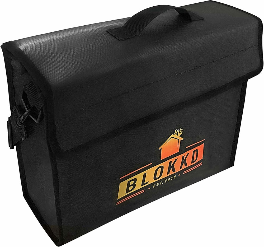
13 Responses to Option A
looks of better quality
I really liked these three the best. I feel that the graphics on these three caught my eye. I really liked that option C shows three levels of insulation. I would like to see option A and B mention that as well in the advertising.
I like the dark colored bags the most and am immediately interested in them the most. I like the colors of the logo on A, and I like the hi-vis stripe on B.
First option shows a front pocket which would make it easier to get most often used items. I like my options because they look better made, are stylish (even though no one would ever see it but me) Quality overall looks better.
I chose based on how clean/nice they look. I think simple is better. A picture looks nice and hd and you can see the bag well.C looks good you can see the bag well and the white color is cool/clean. E was last choice but it its also easy to see what it looks like.
I like the look of A the best
Option A looks really sturdy and like it will really protect from fire and having that BLOKKD on the side makes me think it will block my belonging from harm. I like Option B because it has a pocket for getting things you might want to grab quick and a big bright stripe to see it easy if you need to grab it if there's a fire. Option D looks strong and since it says that it's premium quality it should hold up well.
I liked option A the best. I like that it shows what the product is used for, rather than trying to look like a fancy suitcase and/or messenger bag. B was my second favorite because it reminded me of a fireman's jacket with 3M lining. Option E was my third choice because it was simple and boxy.
Choice a is more appealing because of the small logo. I think it would look more appealing if the picture was further away.
I would prefer to see additional images or positions of the fire proof bag in order to more accurately assess the quality of something so important in protecting your valuables at home. I would especially like to see pictures of the interior and separations of the fireproof bag.
I opted my first and second choice because of the colors that stood out I figured with these contrasting colors would enable you to find the cases easier in a burned situation
I like it when the bags say they are fireproof as this is helpful when the years go by and you cannot recall if it is or not
Even though I think it's boring color I think it's probably the cause design. I think the that that it has something else all it is very useful rather than just straight black and I think the white design is just silly
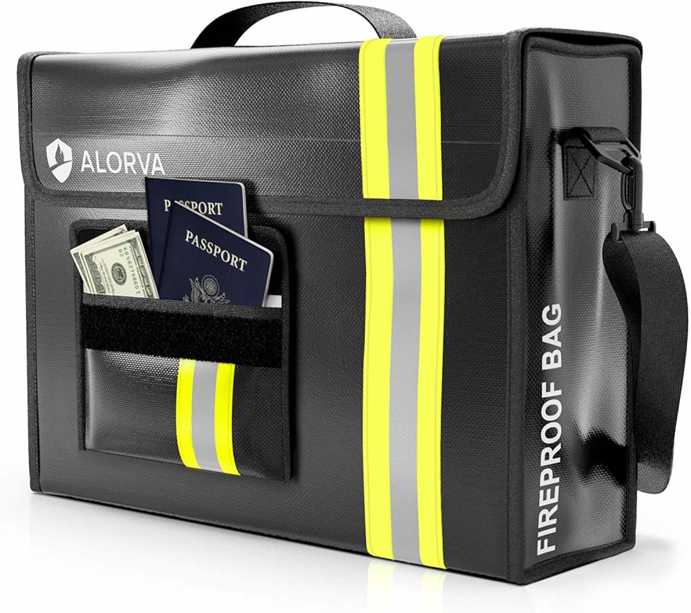
25 Responses to Option B
Having the extra bright reflective helps identify the bag and know it is of importance.
I didn't even know that there were fire-proof bags. I will look into getting one. I think that this is a novel concept so it is best if the bag is labeled "fire proof", that is why I liked B the best. The image on A is pretty effective as well, but I think that having fire proof written out is more effective than an image. C shows the open bag with different layers which I think is good, probably A and B would be more effective images if they showed the different layers in the bag since with a new product the more you can show the better.
because of lot of pocket
I choose B as #1, first, because of the cool yellow racing stripe. It gives the bag a 007 vibe and secondly because it says right on the outside of the bag that it is fireproof, showing important documents in the outside pocket. I choose C as #2 because even though it doesn't look as cool as B, it is also fireproof and has a tri-layer thermal insulation.I choose A as #3 because even though it doesn't explicity say so, the name on the bag is Blokkd with a picture of a burning house, so it implies fireproofness.
I like B because it actually says fireproof bag on it. I will probably forget over time that the bags are fireproof if it doesn't actually say that on there.
I like the ones that look designed to withstand a fire, the marks and labeling. The images could contain pictures that include the important documents we may want to protect, birth certificates etc. The phots do look nice as is already.
I like the emergency stripe to be able to spot the case in the midst of disaster, to use as intended.
I like the bags that look a little bigger than the others
Option B is best because it looks like a fireman's suit. I like the more simple and black ones
B by and far looks the most sophisticated and slick. I like the dark leather and yellow straps. It also looks rather tough from that angle. It also shows me carrying valuable things safely in it.E is very straightforward and traditional. It looks very basic but trustworthy.D is also interesting, although premium is an overused word at this point. It also looks pretty slick and sturdy but doesn't stand out as much.
I wanted the best looking ones
I like the photos with the bags having some color to them. I think that makes them look more sustainable and better made.
1. B I picked this one because of the distinctive stripe. The front pocket defeats the purpose of fireproof, if were actually in a fire the contents of the pocket would surely burn. 2. E I picked this one for its sleek design good handle and shoulder strap 3. C I liked the white color. I liked the shoulder strap, but it could be a bit wider to make it easier to carry. The graphic is too big I feel a smaller graphic would make it a bit classier.
I like B the best in case I had to describe it to someone else to grab. I also like the convenient outside pocket, but am not sure if that would be as fireproof as the rest. A also has a recognizable emblem. E is attractive, but may be hard to describe. I typically uses metal fireproof boxes and haven't heard of fireproof bags before.
Option B is easily the best choice because it features a yellow strip indicating the bag is resistant, as well as displaying a passport and money in a pouch on the side, next to the word "fireproof." I feels as though this bag would be the best for protecting my valuables. Option C features a small "thermal regulation" sticker near the top, while option A's "BLOKKD" lettering, along with a flame, indicates a fire resistant bag, but neither C nor A are as enticing as Option B.
I like option B the best because I like the yellow stripe on the side which makes the bag easy to detect in a fire emergency. I like option E second simply based on it's smooth black finish design. I chose option C third because I like the white look of the bag. I would put some kind of fireproof rating on each picture. For example, put what is the max temperature that the bag would be able to protect the contents at.
B is stylish and looks fireproof
I picked the white and black one cause of its colors it stands out more
I like seeing the application in use. I like seeing the items in the pockets.
I chose B first due to it's highly visible stripe. It would really grab a fireman's attention if it were in a fire. Option A also has a large logo on it, so that would be noticed too. Option C is bright and would stand out in a fire lit room too.
I like the visibility of these choices, which is important during an emergency.
This is an interesting type of product, I had never heard of them before. I like the designs that had obvious highlights on them because they need to be locate, more than likely, in the case of a fire. This is why B was my top choice. I think a tag stating how how long these bags last in a fire on the picture would be helpful in catching my attention.
Bag B looks the most sturdy if I were looking for a flameproof bag. the image needs something on the bag that states it's purpose
I chose B first as it had reflective stripe to find easily in a emergency. I chose A second because the logo on the bag is descriptive and it looks like it will hold a good amount. I chose C third as it White and will stand out in an emergency. It also looks like it will hold a good amount.
To make all of the images more appealing, I would like to see inside the bag. I always like for the first picture to show me what I’m getting and how much room id have. I like b the most because of its outward appearance but would still like to see inside.
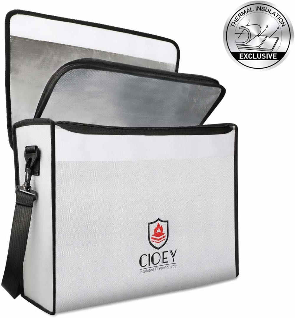
12 Responses to Option C
The silver color of C at least makes it look high tech, space age and fire proof. I seriously doubt any if these work, but the black ones look so nondescript I wouldn't even be hopeful
It came down to the design elements. I simply like the way they look.
I chose these in the order of which the product is photographed the best to least best
Option C was my first choice because it had a minimal but strong looking design. The color of the bag drew my attention to it as did the logo. It looks unassuming yet functional and high quality. Exactly what I want in a fire proof bag. Choice E was a close second for the same reason. It is minimal in design but looks well made. The strap in particular I like as it is large and thick. Option A looks about the same but the logo is very distracting. I would remove the logo and it would make it look far more professional. I found it hard to trust when it is so prominent and colorful.
I chose the bags that I would be able to find more quickly in an emergency. Anything in solid black would be harder to find. I was looking with something that had bright colors or features so it would be easy to spot.
Option C is my first choice because I really like the sleek look of this white bag. To make it look better, change the lettering on the front.Option B is my second choice because I like the yellow stripes which will make it easier to find when I need it as they will reflect the light. I also like the pocket in the front. Not sure what can be done to make it look better.Option A is my third choice because it has no reflecting properties, but I like the logo. It would look better if the picture was taken from a straight on view.
The pleasing color of C really jumped out, although I'd like to see a pic of what the inside of the bag looks like from above, and something inside of the bag to show me some scale. This is the same issue with A as well. B does have the money and passports inside of it, so I get a good idea with that one. I don't like the funky stripe on that one, though.
My top choice was largely based on the color option. I believe that in a potentially dangerous situation, the bright white color of option C would make it easier to find in a relatively dark environment. I also like that option C appears to have two layers of security with the opening. Option B looks like another great choice because of the bright reflective stripe and separate pouch for small important items that may otherwise get buried. I would, however, want to see more data that shows that the outer pouch is just as secure as the inner pouch. Option A was my third choice because the bright logo looked as though it would be easy to locate in an emergency. I wondered if the logo may be light reflective as well, which would be a huge plus.
C- I like the lighter color of this bag over the other options. I also like that the is open so you can get a better idea of the size and how much will fit inside. I would also prefer a shot that would show the inside of the bag. B- I like the colorful accents of this bag and also appreciate seeing the side pockets and how much more they can hold. A- I like the design of this bag and the angle of the shot but the other shots are more interesting.
I liked choice C the best since it shows me what the inside looks like of the fireproof bag. I would like to see most of the inside of the bags so I know how the bags are going to protect against a fire.
Option C looks the most professional. it has a nice design/color and the silver logo looks quality. Option E looks very 'rich'. While simple it still is photographed in a way that looks good to the eye. Option D is very simply design with no logo seen on the front of the product. The gold logo takes away from the image a little bit. I couldn't pick option B because I really do not like the design though I feel it would stand out a little more in a fire. Option A has a nice design but it photographed at an odd angle.
The design looks good on C, with the double closure clearly shown. The other bags may also have this double closure design, but it is no shown. A is a nice design and the logo helps identify the bag as fire resistant. D is similar if a design without the bright logo is desired. And please, don’t use B with the exterior (not fire resistant) pocket shown holding cash and a passport. I would instantly dismiss B with a laugh and turn the page.
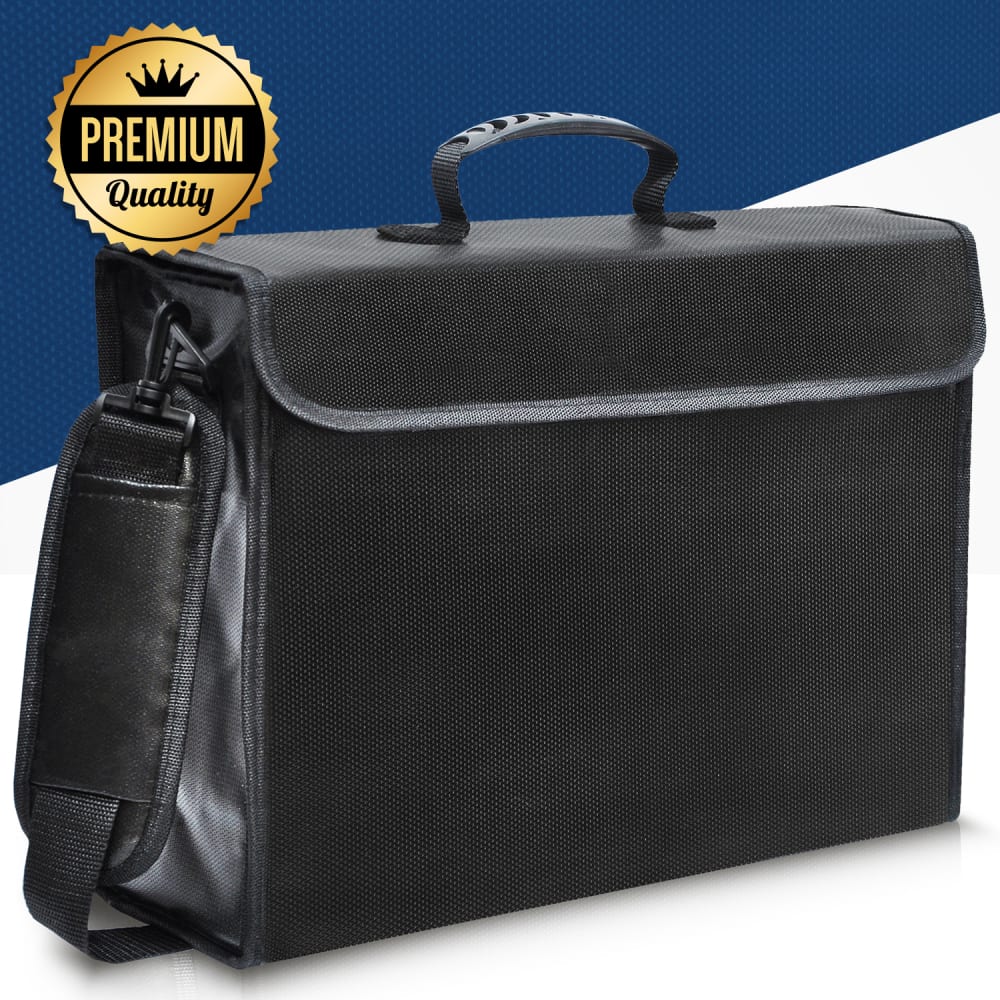
25 Responses to Option D
Shows the various awards they've been given as well as the function.
The premium quality label along with the fact that the briefcase looks most professional made me choose my first option. I like black the best because it is a classic briefcase color followed by silver
I feel like D, E, and A all have a more solid and sturdy design when compared to the other models. They look like they could actually last in the fire where some of the other one looked like they were nothing more than a common cooler. I also like the straps, because it makes me feel like I could get out of the house with it if I had time. To make the images more appealing, may ad the burn time for the product. I would also like to see what one looks like after it had been in a fire.
I'm not big on prominently displayed brands, I like low-key brand badges or none at all. I like solid colors, especially black. I chose the ones I did based on these criteria, and eliminated the ones where I didn't like the colorschemes.
For products such as this I prefer the most simplistic product design and the best quality. Option D is of seemingly very high quality in terms of material, and that can be seen by the pattern on the material, which seems to be of high value in general. Option E is also quite simplistic, is plain black, and is ideal in product design. In terms of material it is smooth, shiny and sleek, so it comes second. Design A is of a nice product design and color, however the logo is rather unfavorable compared to the first two, in terms of size and orange color on black.
I like the design of choice B the most but choice D has the best presentation. Choice E as a standalone looks solid, fancy and high quality.
I like the basic black in choice D. It has no ugly logos or writing on it, and it can fade into the background of my home decor. The next one that I like is the one with the attention grabbing yellow stripe, so I can always find it. The remaining 3 options, I honestly did not care for the way any of them looked, but I chose Option E as the lesser of the three remaining evils.
The Option D fireproof bag caught my interest the most from the list. It looks more quality and appears to have levels of technology to protect my valuables from the unexpected. The color is adorable too. I'd don't feel anything else is needed to make the image more appealing. It appeals to me already and I'm so interested in it. I love the bag design. It's sleek too.
I chose D because you can see the handles and where the case opens and it has the quality label above it and looks as if it is made of a durable material. I chose E because you can see the handles and where the case opens and the material looks durable. I chose C next because it shows the case open and the one handle/strap. It also has the exclusive label above it. I did not chose A because the case is at a strange angle making it look awkward. I did not choose B because it has money and passports on the outside of the case where they will quickly become damaged in a fire and I wondered why there is even an outside pocket on the case.
D was the most attractive design for me, A was second, and i really liked the colors and ad for c
D and E have a clean look, which I appreciate. B i like for a different reason, namely that you can see how the bag can be used.
I liked D and E because they are more professional looking with the solid black. For B I liked the yellow and grey strip
other are too flashy
i picked the ones that were the most sleak and less bold.
I liked the blue color in the background of choice D & the quality symbol. Listing what makes it good quality & giving some different angles of the product would be even more helpful.
I prefer a plain bag with no logos, though I do love the striped one. Just wish the striped one didn't have text on it.
Option D provides a great picture showcasing the product that looks stong and appealing to me. The addtion of the symbol showing premium quality also grabs my attention and makes me want the product more then the others. Option E looks nice with the design and colors used, but D looks better with the premium quality label. Option A looks well built and strong , but the use of the big logo is distracting and takes away from the overall design of the item.
I find the darker colored bags to be more appropriate and the level of detail on the logo is appealing to the eyes.
I prefer much more standard and plain aesthetics
Choice d doesn’t stand out as a fireproof bag which if I had my valuables in I wouldn’t want it to say that’s what it’s for
I find the more simple designs more appealing and easy on the eyes
I chose D first because I really like the all black look. It blends in with the rest of my house and doesn't stand out. Because this said 'premium' I chose it first. I then chose E for the same reason but because it doesn't say premium I didn't rate it as high. I chose A next because of the remaining bags it stood out the least, although I wouldn't want the bright orange wording on it.
I prefer the images that are black in color, and ultimately made the selection with the word "premium" on it. Before selecting a product of this type though, I would want to read product reviews and read some specifics. I would not choose this product based solely on the image.
This is a plain (no icon/company ads) and stylish looking bag. I like that it has a shoulder strap and appears large enough to hold a lot. I picked E second because it is very similar to D in its utilitarian use, but it does have a small logo on it which I don't like. I choose C last because it does look good that it appears to have two inner compartments, but I strongly dislike the large advertisement for the name of the company on it.
I like that the first 3 I picked are stylish and do not look like something a firefighter would carry, however I'm not sure it's easily identified if you need to get it right away.
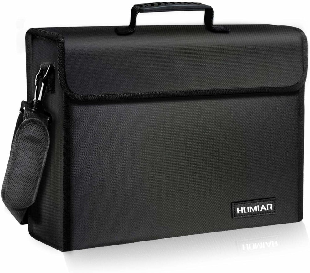
25 Responses to Option E
Focused on the most attractive colorings. The one I could see myself actually using.
Simple, sleek, and straight to the point. If it's something that's supposed to protect your valuables, it doesn't need to look fancy, just be practical.
My first option was easy to choose. It looks secure and strong. I trust that I would be able to put my valuables in this case and not have any worries. The black color with the black piping makes it look like a powerful bag that would not be able to be penetrated so I feel trusting about keeping my valuables in it. I like the shape and the design. My second choice is a close second but the grey piping does cheapen the look of it a little bit. It should not look like an upscale briefcase and that is why I like the all black version.
For protecting items at home I prefer options E B and A because they look sturdy. The other 2 options actually look quite nice just not for something to try and protect valuables. I basically just looked at how nice the bag looked as well as if they looked compact and option E was the best out of the 5 options.
I like the flat black but I also like the emergency colors on display. I would improve them with more fluorescent highlights.
I like the bags that have a thick material because they look more secure. I also like a larger bag with a lot of room for important objects.
I like these three designs because of the clean design. The product has a sleek, minimalist look.
I think the plain black ones look to be the highest quality
Option E has the best color design for protecting valuables at home. The whole design is good and it reflects quality.
I prefer choices E & D the most, especially choice E...the case looks like it has some thickness to it, and it also makes it look sturdier and more rugged. I prefer the simple black design of choices E & D, I don't really care for the reflective stripes or logos on the cases, as I feel they just draw attention to the bags, especially if the say "fireproof" on them, one may get the idea there may be something valuable in it.
3 and the two i didn't pick are horrible because the logos are too busy and bad. I watn a simple bag with one or two simple colors
The material in choice E seems really solid and I love the camera angle of the product as well. I also think the black color looks the best as well.
I found most appealing the bags that are rather plain and don't have obvious logos and aren't obviously holding important documents. This is why I like the plain, black bags the best. I think that photos could be better if they somehow showed more details of the bag, such as the interior.
My first choice for "Fireproof Bag" images is Option E. This image is more minimalistic, no lots of colors and beautiful design.All these things make the image visually likable and appealing for me and the image overall looks very compact and perfect. My second choice for "Fireproof Bag" images is Option D. This image is appealing if protecting my valuables at home, because the image of the bag looks strong and very solid. The image again does't contain much colors, which make the image more appealing and visually nice. My third choice is Option A, the bag in the image contains small bright color text on black color, but nevertheless it's also minimalistic and looks perfect on bag and makes the image appealing.
E has a nice and classic luggage look. Nice and sleek and black. C is nice to have a white one for variety. D is also black but is a different material.
The less that is going on with the bag the more professional they look. People would not be interested with the flash of the other bags.
Option E was the best hands down. It seems like it has the best quality and a more upscale feel to it. It’s not necessarily obvious that it’s a bag used for valuables which I think is a good thing. Option B was also a good choice. It has a clean design and I liked the neon stripe as it seems like it would be easier to find quickly if one needed to. Option C was okay, I liked the nice silver color to it. Option A’s logo was not appealing to me and Option D seemed extremely cheap and low quality, mostly because of the handle or at least the way it was pictured. Option D seemed like it would not even work and saying it is “Premium Quality” feels like a lie and this brand can’t be trusted.
I like the sleek look and black styling. More details and specs would be nice.
i am a simple person and do not look to put my valuables in a bag that screams "i contain expensive things". the first two choices, Options E and Option D are basically the same. they look simple and they look like they can do the job i need them for. if i chose a bag with color to it and there as a fire, my OCD couldnt handle seeing the scorch marks. Option B is a different choice. i do like that addition of what looks like reflection tape and since it isnt overly bright to the point where it is distracting to the eyes, the colors fit well together.
I like the ones that are plain and don't have the giant logo on them. It is easier for them to go unnoticed in a room if they aren't labeled with a brightly colored logo.
Looks simple, clean lines and sturdy
I think the main thing the ad should overcome is the question of whether or not a bag like these can be fireproof. To me E looks the most like something that might actually protect from fire. I like how B has a "bug-out" bag quality to it with secure documents ready to go. A is ok. For the other two, C looks like a cooler bag and D just looks like a leather bag - they don't look the part.
The preferred options are black to hide dirt and have minimal outside markings to look more serious and professional for this important security purpose.
A and B have an obnoxious design that I didn't care for at all. E is sleek and simple looking enough so it appealed to me more. D does a good job doing the same thing and sometimes simple is better
These seem to be much better than a safe because hopefully you can grab and go with them. They are more compact than a safe plus they are portable.
Explore who answered your poll
Analyze your results with demographic reports.
Demographics
Sorry, AI highlights are currently only available for polls created after February 28th.
We're working hard to bring AI to more polls, please check back soon.

