Poll results
Save to favorites
Add this poll to your saved list for easy reference.
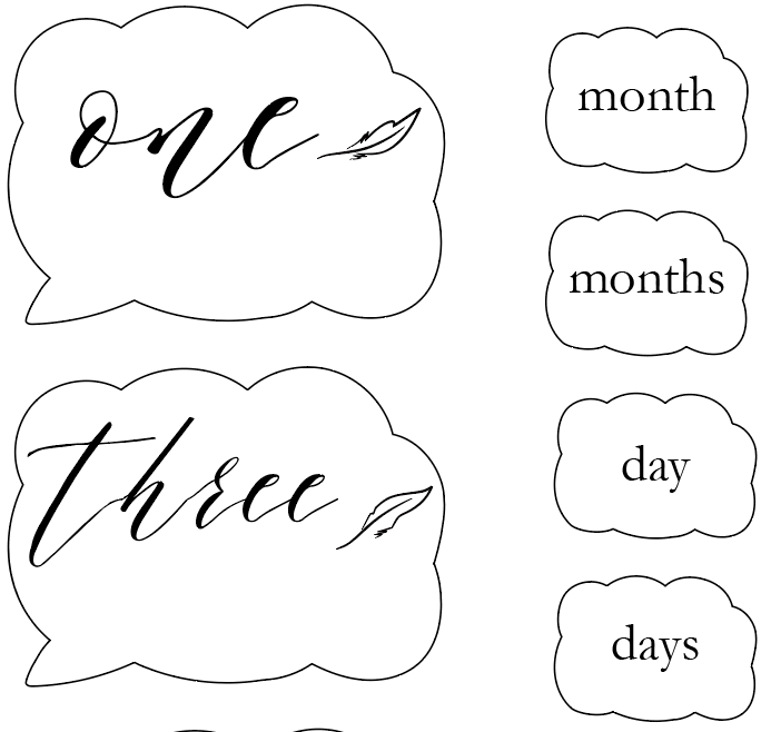
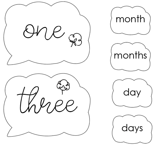
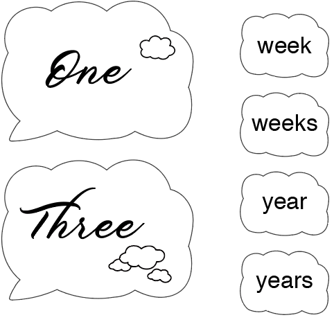
Which font/design you think will be the most suitable for a baby product?
Option B won this Ranked poll with a final tally of 26 votes after 1 round of vote counting.
In a Ranked poll, respondents rank every option in order of preference. For example, when you test 6 options, each respondent orders their choices from first to sixth place.
PickFu requires a majority to win a Ranked poll. A majority winner differs from a plurality winner. A majority winner earns over 50% of the votes, whereas a plurality winner earns the most votes, regardless of winning percentage.
If an option does not earn a majority of votes, PickFu eliminates the option with the lowest number of votes. The votes from the eliminated option are reassigned based on each respondent’s next choice. This process continues in rounds until a majority winner emerges.
Scores reflect the percentage of total votes an option receives during the vote counting and indicate the relative preference of the respondents. If there is no majority winner, look to the scores to see how the options fared relative to one another.
| Option | Round 1 |
|---|---|
| B | 52% 26 votes |
| C | 46% 23 votes |
| A | 2% 1 votes |
1 Responses to Option A
I like having extra space and these are in order of free space.
26 Responses to Option B
Choice B is still easy to read and the font isn't too bold
this one looks more like you would hang in a babies room. it has that kid feel to it.maybe add some color or baby items would help.
I chose the selections in order of how legible i thought the fonts were, with a little emphasis on simply how much i liked the fonts as well.
Option b looks more appropriate for a baby. Option c is a close second. Option a doesn’t look like it’s for a baby at all.
B is easy to easy but still child like and cute. C is also okay, but a bit bland. A i dislike as it is overly stylized and hard to read
A is unreadable. C is too mature. B is cute, friendly, and age appropriate
love the more legible font
I like the font on the words in option B much better. They are easier to read and just seem better for baby products. The font in option a is just too messy for baby products. Option C is too bold. Overall I like option B much better than the others.
OPtions B and C are the most whimsical. Option A is a little tough to read.
The typeface in B suits a baby product - it's sweet and a little whimsical. The typeface in C looks more formal, so it doesn't suit a baby item in my mind. I don't like the typeface in choice A at all - it's difficult to read and not very attractive.
I liked the option b font best because it was the easiest to read and less intense because it wasn't in a bold font like the other ones. I chose option a last because to me it was the hardest to read.
I think choice B is the most cute and whimsical in style, so more appropriate for baby items.
I prefer text to be legible and easy to read at first glance so font B is nice
B's font is the easiest to read.
The little flower that can look like a duck (depending how you look at it) makes the design more baby-ish and the font is more rounded, curved.... softer than the others which make it better for a baby product
The letters where clearer in the first one
B is far and away better
Softer lines and curves seem to be safer, which is the environment you want to keep a baby in, so I think Option B seems most suitable.
option B seemed the most simple and usually with baby stuff simple is best and unisex as well. option c was bold which i though made it pop a bit, i did not like A at all.
The best baby font is in option B. I would choose that as the best choice and think it reflects what you would want in a baby product. That seems the most fitting and very playful. I would use that first.
Ranked by how unique I find the font
this cursive looks more childlike and appropriate
B looks more simple and childlike. A is also peaceful looking and would be a good choice for a nursery. I don't really care for C at all.
Option B is the best here. It looks child-like and is definitely relatable.
I felt like option B was easiest to read, option A was too flowery for me
This one looks the most simple and baby like.
23 Responses to Option C
I based it on the visual appeal
Option C is the most legible of all the options that are presented. I feel that Option B is also a good option as it is legible, but due to the fact t hat it is not bold is less attractive. Option A is just too stylized for me and therefor is not an attractive option.
C looks the best to me. I like the font and the dark color. I think it helps everything stand out. Option B is nice too. I think it looks appealing and fitting. The font is okay on A. I don't think it stands out as well as C or B.
I like the font better in panel C. I think it is very clear and I like the darker print.
C is the most suitable because it is lovelier than the others. It's elegant!
option C looks the most appealing to me
C is clearly legible which is much more than I can say for A which looks like chicken scratch.B was very close to A and I almost went with that but prefer the boldness of C
i choose based on personal preference and visual appeal
Elegant, easy to read, bold wording.
made my choices based on which fonts will be the most suitable for a baby product
My favorite out of the three is option C. I feel like the writing is easy to read and it looks better because of the capital letters on the numbers (example One and Three). I also really like the clouds and it could be used for boys and girls. My second favorite is option B because the writing is easy to read and it is also cute. However I would prefer it if it had the capital letters like in option C. The tree or flower on them is also nice and could be used for a boy or girl. I did not like option A at all. I think the writing for the numbers is a little hard to read. I also am not a fan of the leaves. I don't like option A.
The font on c is playful but not messy. Works better for projects.
C is nice and bold but also very readable. B is nice but too thin and A is a little less easy to read.
I think it looks the most cute the way it's drawn out
I choose C because this is my preferred font. It is easy to read and nice and neat. B would be my second choice, the little duck is a cute touch. A would be my last choice, the writing it too sloppy.
I like option C the most because I feel the bold font is the easiest to read and I like cursive style. I then like option B the second most because it is still easy to read. I like the cursive style of A, but it is difficult to read the letters.
I think option C would be the most suitable because it has cute gender neutral clouds.
c is legible and semi professional. b looks childish. a is illegible
This quality is very nice.
I like the bold the best, I honestly would probably keep shopping around
C looks bold than the others. so i ranked 1. And B looks clear then A . so i ranked 2. and the rest ranked 3.
I choose fonts based on their legibility as some of the bigger words are barely readable.
I can read cursive to be clear - I was taught going into school, however I could understand that modern schooling doesn't offer it so for me, C ranks highest first because it's easy to read, but really because it offers years too. The choice of years is quite nice. B is also a good choice, because it's easier to read and cute designed, but lacks the years feature. A is ranked last. I can read it, but I could see how it would be hard for others.
Explore who answered your poll
Analyze your results with demographic reports.
Demographics
Sorry, AI highlights are currently only available for polls created after February 28th.
We're working hard to bring AI to more polls, please check back soon.

