Poll results
Save to favorites
Add this poll to your saved list for easy reference.
Which image are you more likely to click on in Amazon search results?
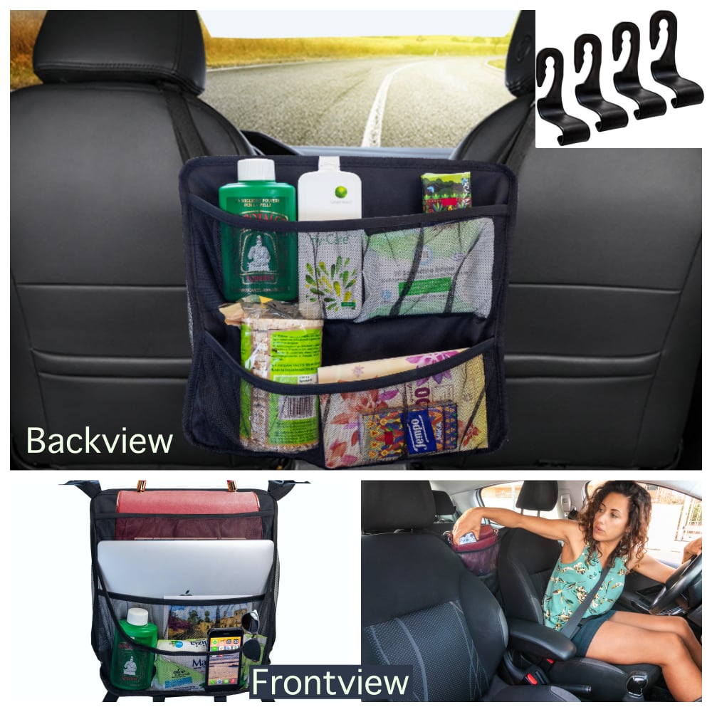
24 Responses to Option A
This shows you what it looks like when it’s in use fully. You get a better idea of how to place it.
prefer the picture
I'd click on A because the top picture doesn't look as cluttered and I probably wouldn't notice the small image of the hooks in image B.
view is more professional and I feel it tells more about the seller/promoter/business
The back view seemed have a much clearer picture.
I prefer the language "back view" and "front view" (though I would recommend a space in each word as I have written) in comparison to "backside" and "frontside" as it feels more natural and intuitive, so I selected Option A as my preference.
They are both really great and you can see what it does and how it works.
I would like to see how they attach to the seat and option A is the closest thing that shows that to me.
When the product is zoomed out more, as it is in option A, it gives me more of a clear picture on how this organizer would look inside my car between the two front seats. It also allows me to see how it is going to connect to the headrests. In option B, the organizer appears to be overwhelming in size compared to option A. In option A, it does not appear to be as large, while still remaining a good size.
A has a very open and bold design mix.
This one seems like a less chaotic more organized image that makes me want to click on the product
I prefer option A because I like how its position to determine if it blocks the view out the front window from the back seat.
The wording is easier to understand as far as the placement of the product.
I think the hooks stand out more in this option and the overall collage looks more appealing to the eye.
Option A gives a little more visual information about its proportional relation to the rest of the car. I'm not fond of the closeup in B or "backside" and "frontside" as descriptors, either.
This option markets the product as something that would be really helpful on a road trip and that caught my eye. I think this product would be helpful for everyday life but is more exciting to think about how to prepare for a fun vacation on the road that we're all missing right now.
I would click on A. I think A showcases the product better than option B. I also like the use of "backview" and "frontview" as opposed to "backside" and "frontside". "Backside" just doesn't sound great. I think the zoomed out picture in the main image of option A allows you to see how the product is used better.
I like A because I think the word view sounds better and clearer.
Honestly I don't have very much preference. I like the farther away image on the top of A because you can see the product better in reference to the size of the car seats and how it hangs from the back.
Sorry, but the word "backside" automatically makes me think of a person's butt. And I know I am not the only one who will think that. So, I am going with Option A, for obvious reasons.
At first I thought using side instead of view sounded batter but after taking time with it, it's not really a side you're looking at it's the view from the car. I also like the photo that isn't as close up, it's a better view. Otherwise, they are pretty much the same.
A seems slightly more helpful with the top image showing where the hooks are more.
easier to see product, features are easier to view functions and what can fit is space
The product look is thorough and informative. The product image is well labelled and is captures the on the move layout.
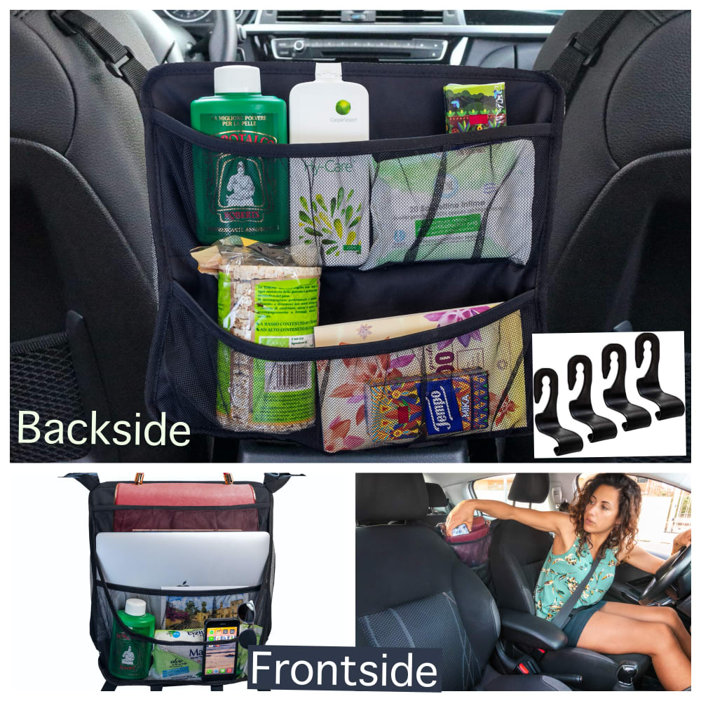
26 Responses to Option B
I like that B gives a bit of a closer view and doesn't include the obviously fake road.
B is a bit less visually cluttered.
Option B does a better job of showing the organizer actually hanging in a car.
Option A looks disjointed with the position of the hooks.
It's easier to see how the product hangs on this image
I like frontside/backside better than frontview/Backview. Sounds more professional to me.
The road scene in the background of Option A looks distractingly fake. The closer crop in B show more product detail.
They both look basically the same but I will choose "B" I think this is a interesting gadget. Everything in t he back if you have children.
I think B generally looks more pleasing and appealing. Whereas A might seem a bit messy and confusing for consumers.
It gives a more close-up look of the backside of the bag or storage pack than Option A. Also, I don't need to see a picture of the road to know that this is a product that's designed for use in cars. That's pretty obvious.
I'm more likely to click on B because it focuses more on the product than A does. I feel like I can see it more better and clearer.
This was appeals to me
This has more pictures to choose from.
We don't need a fake "road" to make the product look better. I prefer to see the radio dashboard.
I prefer Option B because I feel like it focuses more on the product and I can get a better understanding of it.
I liked that this option showed the pouch in a larger size since this indicated that it could hold more volume.
I choose B because it is more realistic and the placement of the hook photo is better.
B has a close up back view which makes the product look as if it can hold just about anything.
I would clic option B because it gives me a good view of the whole product.
It has a cleaner vibe to it do it would make me want to click on it
I would definitely be more drawn to Image b because you can get a better view of the green items, and green is my favorite color. There is also a better view of the products in B, as they are photographed closer up and you can make out the details better.
Choice B clearly gives better idead about the product and its usage. It is easy to see and decide about the product.
I like the larger picture so that I can see the detail in the amount of products it holds better.
I prefer Option B image because everything in it is more striking ans noticeable.
I think that this image shows off the product a little bit better than the other image. I also like the layout of this one better than the other image as well.
i like seeing the background of the car to make it feel like a more useful thing specifically for being inside the car. too much outside scenery is confusing
Explore who answered your poll
Analyze your results with demographic reports.
Demographics
Sorry, AI highlights are currently only available for polls created after February 28th.
We're working hard to bring AI to more polls, please check back soon.

