Poll results
Save to favorites
Add this poll to your saved list for easy reference.
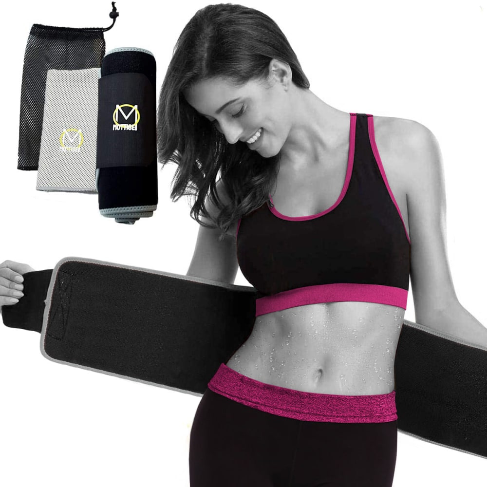
Which image do you prefer?
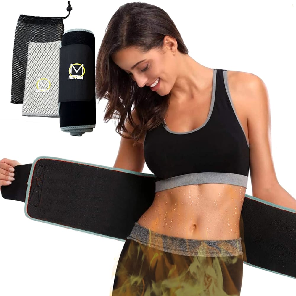
41 Responses to Option A
The colors were better and more interesting. I liked the look of the person more in the full color image.
I strongly prefer the color photo because the woman is very attractive and I would rather see her actual skin tone than a black and white photo.
I definitely prefer the color image, the girl is hot and the flames will entice males to look at your product more closely.
The color image looks better and seems like it shows the item better.
I prefer Option A because it is an unfiltered photo and allows you to see what the product actually looks like. I will feel more comfortable with an unfiltered photo because I won't think I might be getting deceived.
If the tone isn't there to accentuate the product then you might as well just keep the whole thing colored
Seeing it in a normal color just makes it more appealing to me.
The model looks like AI in both pictures or a heavily edited version of a real person but I guess the colored one looks better
I think the black and white image with color highlights causes me to focus on objects that don't appear to be relevant. Unless it's the exercise clothing that is the focus, it really misses the mark.
That black and white image look weird and out of place to me.
I definitely prefer Option A because it looks more natural and vivid.
Iike option A because the color photo makes the product more life like.
Full color gives more of an impression that what you are seeing is actually what you will get.
The color in option A is better and warmer looking
The black and white image is odd and the colored one looks much better.
I think the normal color picture looks better. It is natural and she is tan so show it off
the image shows real color of the diagram
The color stands out more and is more attractive and appealing
This makes the noodle look more lifelike and appealing
I prefer this image because it looks very lively and more appealing.
I prefer A because it's clear and vivid.
I prefer normal colors, especially for the model.
The image with color is a lot more eye catching, vivid, and bold and it helps me see the product better.
I like that the photo has more realistic colors because it feels like it gives a more accurate impression of how the product will look.
A is my preferred choice because of the uniqueness of the product and the display content of the image the product looks good and attractive and will call more attentions to it, it a beautiful color design on the product and it is pleasant to the eyes
The color version makes you relate more because it looks more realistic
I like the grey with flames better than the hot pink, there seems to be a lot more interesting content in the product that way.
I like option A the best because I would rather see the image in full color.
The color of the person has a greater impact than just black and white.
I like seeing her in full color, the black&white makes me think its a 'before photo' before a weight loss product
the color photo highlights the muscle tone better than the black and white photo. also you can see the stitching on the product better.
I prefer option A the best because the image in color stands out more and grabs my attention.
I prefer a more real look as opposed to a lot of effects. If someone is shopping for something to improve their physical appearance, real appearances matter.
I believe the image in color looks much better.
I like more lifelike color of A. The other choice is too artsy and distracts me from the product.
The full color really brings out the quality much more for me
I never like the partial black and white photo look. The models midsection looks much better in full color. However the skirt looks very weird and partially see-through.
A is colorful, bright, and eye catching.
I find the skin attractive, the black areas tend to catch my eye more, and the color makes it look much more realistic. I find the colors of the product matching the woman's clothing very appealing to me.
I find the color one to really pop. I also think that it shows off more of the defined adbs showing how well the product works in choice a. Choice b is a second best. I do kind of enjoy the pink color more than the grey but I still prefer the choice a over the black and white in the choice b.
I say A because doing the black and white image in B doesn’t enhance it. Just adding the color to the outline doesn’t show the product any better so full color in A is my pick.
9 Responses to Option B
B looks better. A would be the better one if it wasn't for that really cheap looking fire effect.
I chose option B as I the contrasting bright pink with the black is much more eye-catching than the camo look. It helps the product stand out from the page and helps you to see the product not the model.
This one has more drama and visual interest
At first I liked option A, but then I looked at her pants and the camouflage or flames or what ever are on them are weird and just say, nope this is not you and you will never have these abs back. OPtion B at looks like it could be my "dream" or goal and maybe possible since it is done in a sort of black and white and her purple stripes on the sports bra and leggings are the only color. I like option B better out of these two just because those pants in option A are weird.
The black and white background really make the color highlight stick out. It's the first thing my eye is drawn to and really compels me to look at the image.
I like the black and white
B in black and white makes the product the focal point.
I like that the pink breaks up the darker colors. It is more appealing.
The black and white picture makes the image look really weird in my opinion. The color allows you to see the product for what it is.
Explore who answered your poll
Analyze your results with demographic reports.
Demographics
Sorry, AI highlights are currently only available for polls created after February 28th.
We're working hard to bring AI to more polls, please check back soon.

