Poll results
Save to favorites
Add this poll to your saved list for easy reference.
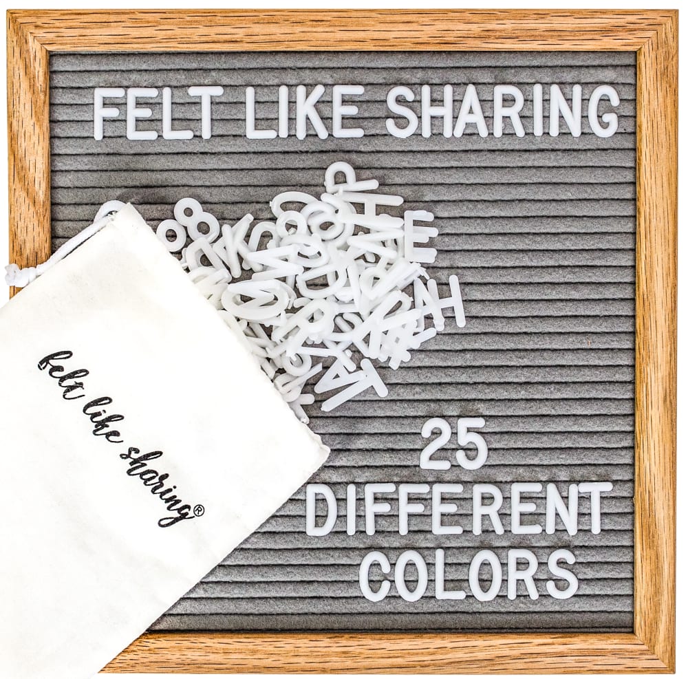
Which image do you prefer?
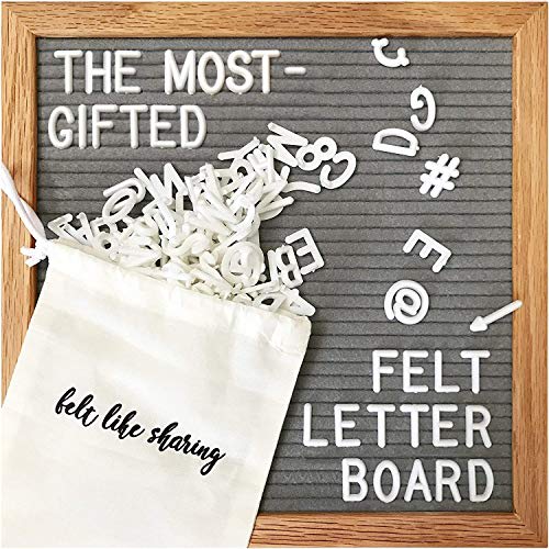
23 Responses to Option A
board is slightly darker and the letters look slightly bolder
The background color was more interesting. I enjoyed the look of the board more.
I think A makes more sense because B isn't colored at all so I would pick A.
I like the lighting on this image. It looks more accurate and I can trust this listing more.
I like A better since it is says it is the most gifted. I would be likely to gift this as well
I do not want to have to tilt my head to read it.
I liked choice A since the saying is fun and entertaining. Choice B sounds too generic and isn't appealing to read.
The message on the board is more relatable, and the board itself seems more vibrant in color. I think the lighting is off for image B.
The advertising of the felt letter boards seems to be more impactful
this one the actual picture is better lighting, but the other one i like the text better. also - 25 colors? i see one color. white. that is all. the board on B looks grayed out though and cheaply made
I think this arrangement of letters looks good and having the letters look more spread out after falling out of the package gave it a more organic feel. I think the text "the most-gifted" makes it stand out as something unique and popular.
The letters look a little more bold and defined in this image which makes the board look more effective
I like seeing bunches of letters, it makes me feel I am getting plenty for my money.
I like option A because it specifies what the thing is made out of.
The message is more clear about what it means.
The darker tone I think makes the board look like it's made better than the other one
I can see more letters and special characters with option A.
I prefer this one because the characters look like they stand out better on the board and are easier to understand.
Having "felt like sharing" on both the board and bag is overkill. A is more unique and makes more sense.
This one is cute and eye catching.
The color is way better and the way the letters are spread out looks way better.
This particular image is appealing because of the cool shades, placement of the product bag with lettering fully visible, along with an image that appears sharper with more contrast.
A because the contrast looks better and more premium and rich. option B looks like its very bright and high contrast and makes my eyes hurt
27 Responses to Option B
better quality looks like
option b because option a looks sloppy
GAVE MY HONEST OPIONION
I chose B because I liked seeing that there were 26 different colors. Interesting name.
I feel like this design is the nicest one out of the two. The words are cute and they make me feel like I have something to share with other people in my house.
I like seeing that is has different colors rather than it saying that it's felt.
I think B is the better advertisement for the available product and the text on the bag seems more realistic.
I chose Option B since it mentions the 25 different colors which makes it more versatile and would best get my attention and interest about the product.
I like the pun used in B, that is the "Felt Like Sharing." That made me smile and grin, and so I'm going with B on this.
Giving me 25 different colors is really neat, I like it.
I really like using the term "sharing" because it's a positive word you don't see a lot in ads; I like that it makes me think of other people. Also it's crucial that includes the number of colors included.
For the "Felt Like Sharing" board, I prefer image B because it includes the product name on the board itself, and it tells potential customers that it comes in 25 different colors. Also, I don't think that the text "The Most-Gifted Felt Letter Board" is accurate, as it seems like a claim the company is just making up.
I like the pun in B and that it also specifies the amount of different colors it contains. A smaller reason to go with B is liking the slightly lighter wooden frame.
I like choice B the best. I like the colors.
The letters in this one are used to tell you more about the product. It serves a purpose.
Between the two images, I prefer Choice B because it uses the company's brand tagline Felt Like Sharing and gives a small description of the item being purchased with the choice of 25 different colors. I also like the neatness of the compact letters in my choice because the chaos of the letters in the other image makes my eyes wander over it weirdly.
I chose B because it has more colors and color attracts your eyes.
The one in B sounds good to me, and with the 25 different colors sounds pretty exquisite to me.
I think this one makes the most sense since it has the brand name on the board.
I much prefer option B because it lets you know that there are 25 different colors included.
I love B more because I love how this one seems a bit more organized as I find it easier to read the words and I like that I learn the fact that I get more colors!
I like seeing that you can get multiple colors to liven up the display.
I prefer Option B. While both options seems a little busy, option B has a cleaner and more subdued appearance. I also like the "felt like sharing" saying. Its sweet and interesting.
This feels much more organized and straightforward than the other.
I like that it specified the colors avaialble- that there are 25.
There is more useful information shared in a clever way. It tells me I have color choices and it looks neater. It would be nice to see that you have the special symbols though like the other one shows you.
B's font is cuter
Explore who answered your poll
Analyze your results with demographic reports.
Demographics
Sorry, AI highlights are currently only available for polls created after February 28th.
We're working hard to bring AI to more polls, please check back soon.

