Poll results
Save to favorites
Add this poll to your saved list for easy reference.
which image do you prefer?
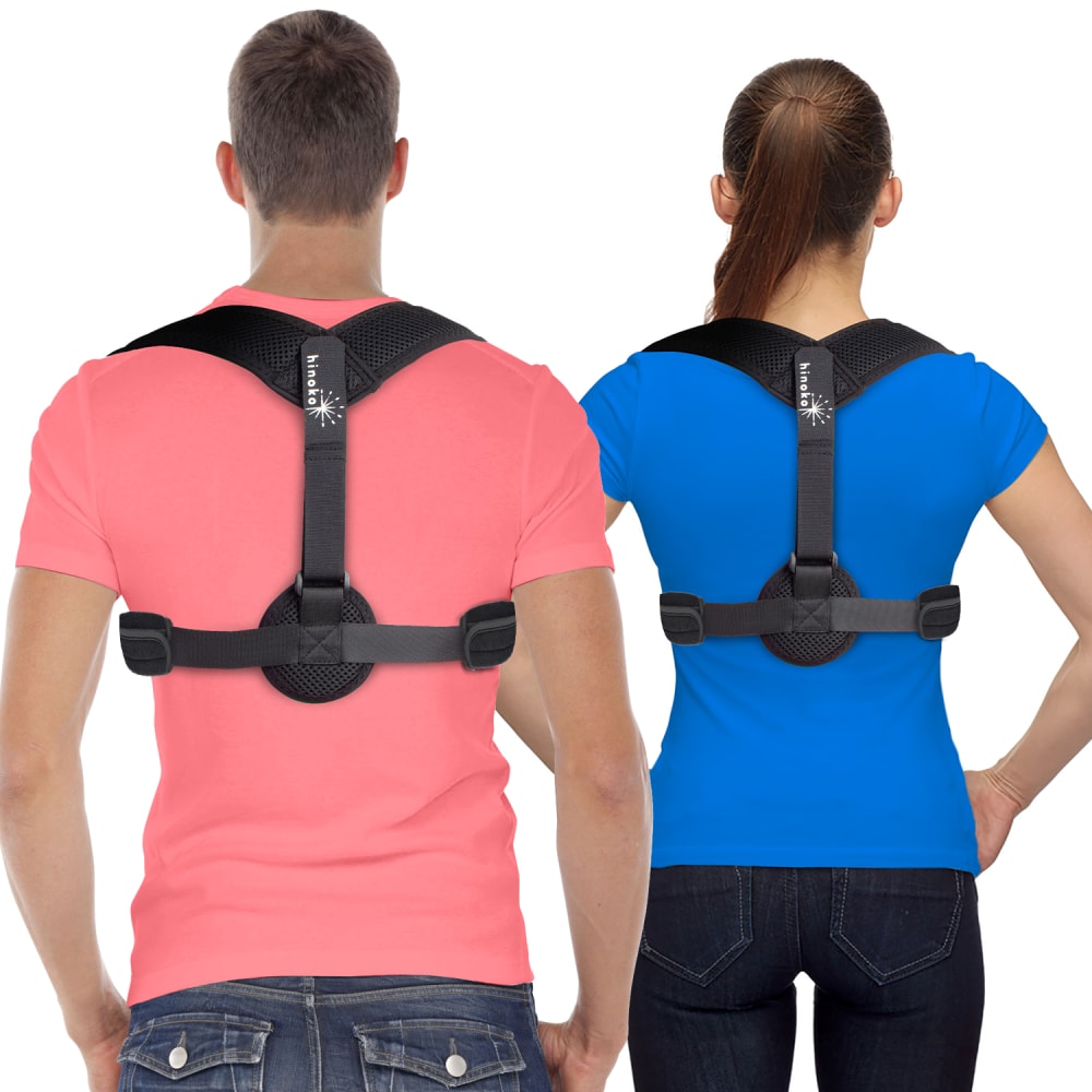
33 Responses to Option A
i like seeing multiple colors compared to both of them wearing white
I think the variety of colors on the shirts makes it easier for me to picture what the product will look like on different colors and styles which I like better
I liked the more colorful shirts the two models were wearing with the product, it just makes the product pop more or contrast well with the color shirts.
This image is more colorful and vibrant, it’s quite beautiful
It is colorful and catches your eye. I definitely like this one better. You can also see the product better on the colors. Thank you
I like the one with the colored shirts. The image is more appealing with the shirts.
Seeing the colored t-shirts makes it stand out more.
Choice A pops out with the colored shirts and brings more attention to the product and is overall more pleasing to look at.
I think the product is more clear with the colored shirts behind it
I prefer this image because of the colors, they look beautiful and interesting.
I prefer option A because the two colors make it more interesting and engaging instead of all white.
The colors in A grab my attention. B is boring
I think if I were scrolling through a bunch of these my eye would be more likely to stop on the brighter colors. Both images are done well. They showcase the product very well. But again, I choose the more colorful option.
There is more color in the photo. It adds a more cheerful experience than drab white shirts like the other photo.
The colored shirts make the item stand out on its own
I strongly prefer image A because I like the clothes they are wearing. It is much better to use the picture with the colored clothing htan the white clothing.
I preferred A because I liked how it was brighter and more active feeling. I thought B was too plain.
You can see the product in a more real world environment with the different color clothing.
I like this one better you can wear it with any color shirt and that is a good thing
I chose panel A. The shirt colors are very eye catching and lure me straight to this product.
The colors in A make this workout equipment look a little more fun and engaging. The plain white shirts are so boring.
I like the brighter color shirts. It makes the product look more distictive.
A is my preferred choice because of the uniqueness of the product and the display content of the image the product looks good and attractive and will call more attentions to it, it a beautiful color design on the product image displayed and it is pleasant to the eyes
The colored shirts create a bit more contrast that makes the visual more engaging
I like the fact that people are wearing colored shirts in the advertisement. It is easier to see how these products fit.
The colors make the product stand out more.
I think the colorful shirts make the product seem more eye catching.
I picked A as my top choice as I like how colorful the braces are.
The white T-shirts in 'B' are too bland.
I like seeing the colors here more. This is more bright and makes the image pop more. I would go with that as the better choice for the image. Looks good for a posture correction device!
The image with colored shirts holds my attention and gets it.
Pink is my favorite color. The pink and blue are vivid and eyecatching.
I like the non gender conforming colors in A. The man is wearing pink and the woman blue, which is the opposite of what I would normally see. That makes A more interesting and eye catching to me than B, where they are only wearing white. After grabbing my interest I am more likely to analyze the product shown in A.
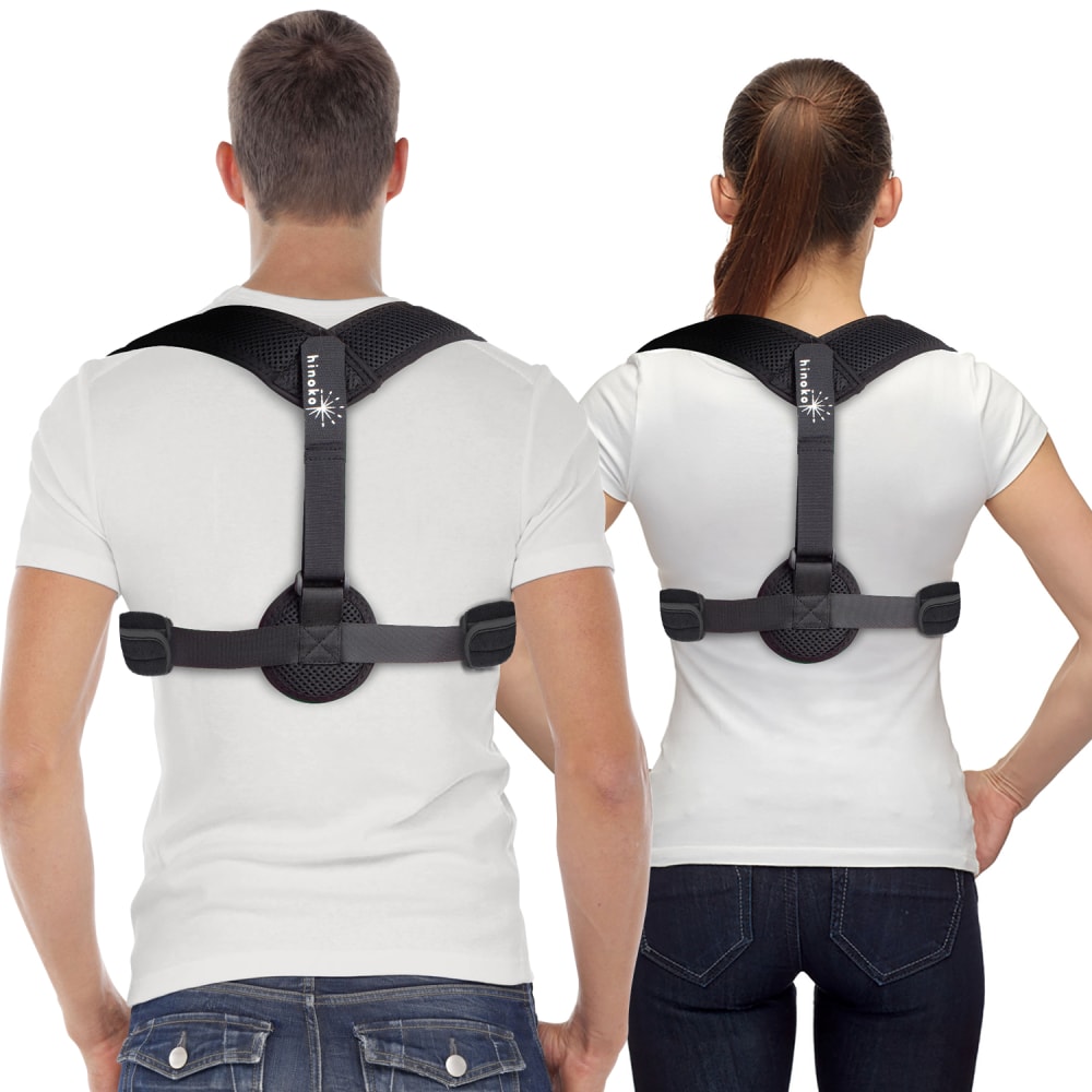
17 Responses to Option B
prefer the picture
The colors on the other option are distracting from whatever that product is.
the colored shirts have make it harder to concentrate on product
I think having the same colored shirts would make the image appears more coherent and united, and it would also make the product pop more.
I went with choice B as the white T-shirts better show the product in use. A - The salmon and blue colored t-shirts are a bit jarring in my opinion. I would go with the simple white Ts.
The neutral color of the white makes the product stand out much more. The colorful shirts is far too distracting.
I like the simplicity of choice B. The shirt colors in choice A are a little distracting. The white shirts allow for a better understanding of the product.
B is more neutral, the colors in A take away the focus of the actual product. In B, the product is clearly highlighted due to the contrast.
In B, the contrast is higher between the product and its background (the t-shirts.) It's much easier on the eyes to see the actual parts of the product and how they fit together. The colors in A are also very distracting to begin with.
Better contrast with the white background as you can really see it better.
i like the plain shirts because it makes the product pop better and shifts my focus onto the harness i can imagine myself better with a plain white shirt
prefer B because you can see the product better with the white shirts.
I like choice A because it puts the focus on the product, not the people modeling the product.
The color of the shirts in choice A looks fake (edited) and it just distracts from the product.
I think them both wearing white shirts keeps from distracting you and draws your attention to the actual product much more.
I chose B because the neutral colors are less distracting from the actual product being advertised.
colors are distractingoption b allows me to focus on product structure
Explore who answered your poll
Analyze your results with demographic reports.
Demographics
Sorry, AI highlights are currently only available for polls created after February 28th.
We're working hard to bring AI to more polls, please check back soon.

