Poll results
Save to favorites
Add this poll to your saved list for easy reference.
Which image do you prefer?
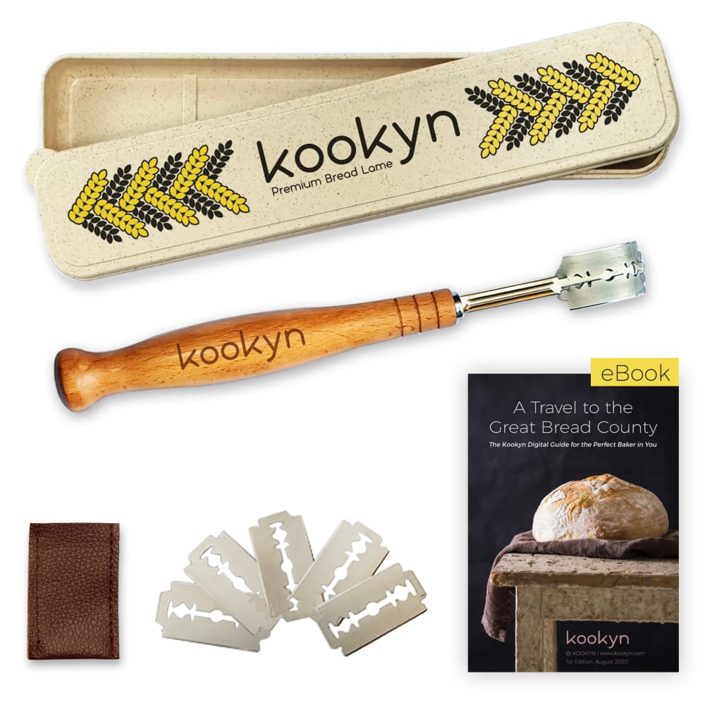
10 Responses to Option A
I prefer to see all the items clearly.
I really like option A because my eyes went to the logo straight away. It really established the brand to me in an attractive layout, where I look at the logo first and then move down to see the product and absorb what it is and what is being sold. I think option b is lacking in overall composition since the shapes feel all over the place, while option a is much more balanced and helps guide your eye to the next item you should be looking at!
I think option A looks the most appealing to me
I like option A the best because the bread lame is in the center of the image and is the focal point of the image.
It is easier to see the different components of the package on option A.
I feel that this image is more spaced out, and allows you to get a better view as to what is included when you order the product. The alternate view is too cluttered in my opinion.
A is my favorite image. I like the main product being the first thing I see in the image. The E-book is a nice addition, but that is what it is and it should not be the main focus of the image.
I think the items are laid out better and easier to see it all at once
I like this kookyn image is organized and clean.
I like the safety razors in a fan at the bottom of image A. It is an attractive layout but just barely bigger than the one on the left.
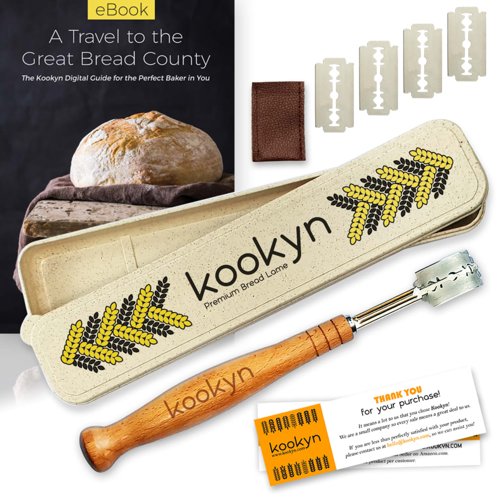
40 Responses to Option B
This image is more pleasant to me. I like the way the items are laid out, it has a more eye catching presentation.
I like that the book is in the top background, B's items are just displayed nicer in my opinion
Enlarging the cookbook and making the product bigger helps a lot . Also the arrangement helps see the itemsbetter too.
Even though he is a little more uncluttered, B does a better job of tying all the individual products together to make them look like a whole
I like the layout here. It shows all the components well.
I like how you see the book that it comes with in a closer view, as it really makes the whole set seem more valuable.
B- This image has a more pleasing layout and I prefer the symmetry of it. I also appreciate that it features the ebook and the thank you inserts.
I prefer option B because the way that it is laid out lets my eyes focus on the important details of what the package contains. I don't have to move my eyes around so much to take it all in.
Very artfully arranged with a good selection of images
B shows everything up close. A has everything zoomed out making it harder to see everything.
I chose option B because the product listing shows more of a clear image of the product and the other offerings, more detailed.
B is looks more organized and is layed out better than a
I really like and prefer the layout of option B as everything looked to fit better together than what was shown in option A. As a result option B was the superior choice.
I prefer B because it gives a vivid imagination.
I prefer Option B because I like that there is not much empty space but you can still easily see each part of the product. This makes it very appealing. I also think the thank you note in the bottom right corner is a really nice touch. It makes me think this company is caring and this influences my desire the purchase the product.
everything is visible but put together neatly. A looks like you are taking inventory. it isn't pretty to look at.
I like the way that everything is laid out in option B, it looks really nice and I like how it shows the eBook bigger. Option A looks like it has wasted space that could have been used to show the product better.
These images are larger which makes the text easier to read, and thus draws my attention in more immediately.
The image of option B is well designed and well arranged. The design of option B looks creative.
The items I feel are better displayed and has a good flow to it. With those thing it makes B better than A.
I liked choice B and the background picture to be on the top of the image. Choice B makes the most sense and flows the best. Choice A feels too separate and doesn't look as complete.
More creative, items look like they all belong together. First image is scattershot.
B looks more proper to me for some reason.
I prefer this image because of the design, looks more organized and interesting.
The layout in option B is nicer by a little. Just feels more put together with the way the bread tools are laid out.
A is my preferred choice because of the uniqueness of the product and the display content of the image the product looks good and attractive and will call more attentions to it, it a beautiful color design and the arrangement of the product and it is pleasant to the eyes
The display of everything included, is more aesthetically appealing.
I prefer option B because it uses the space better compared to option A. Having the eBook behind the product is a great use of space. Option B feels like there is more thought to the placement of the objects compared to option A. Since the eBook is bigger in option B it is very easy to read the title and the small text under the title compared to option A.
The image is composed in a more flattering way as to showcase the products for sale. It just looks a lot nicer than the other option.
I like the picture of the book up on top like it is. The thank-you cards are a nice touch/gestor. Would prefer to see blades n half circle or quarter moon shape
I really like how the tool is brought to the forefront in the image. I'm very intrigued by this product. I like that the image shows everything that comes with the purchase and it is very beautifully photographed.
The incorporation of food more clearly indicates what the product is meant to do.
Option b is a closer shot if the items. They appear larger and are more eyecatching
Better close up view of the whole package and better detail of everything included
Option B, looks that it has more options.
I like the more consistent angle of the items in B. Looks more polished.
Option B seems like it is well-composed, and it even suggests that all of these pieces exist in the same area together. In option A, it appears that different groupings are photoshopped into the same frame. Option B just feels more organic and real, and for that reason it is my preference.
I like the one where the item and accessories are closer and more prominent. You see what you buying easier. It is attractive and nice. I like the ebook on top too. Thank you
I feel more favorable towards the Option B image. looks better and it attracts me to it. I love its design and appearance. The arrangement is sleek and adorable. I find it more attractive
I like B better because the images are larger and easier for me to see.
Explore who answered your poll
Analyze your results with demographic reports.
Demographics
Sorry, AI highlights are currently only available for polls created after February 28th.
We're working hard to bring AI to more polls, please check back soon.

