Poll results
Save to favorites
Add this poll to your saved list for easy reference.
Which image do you prefer?
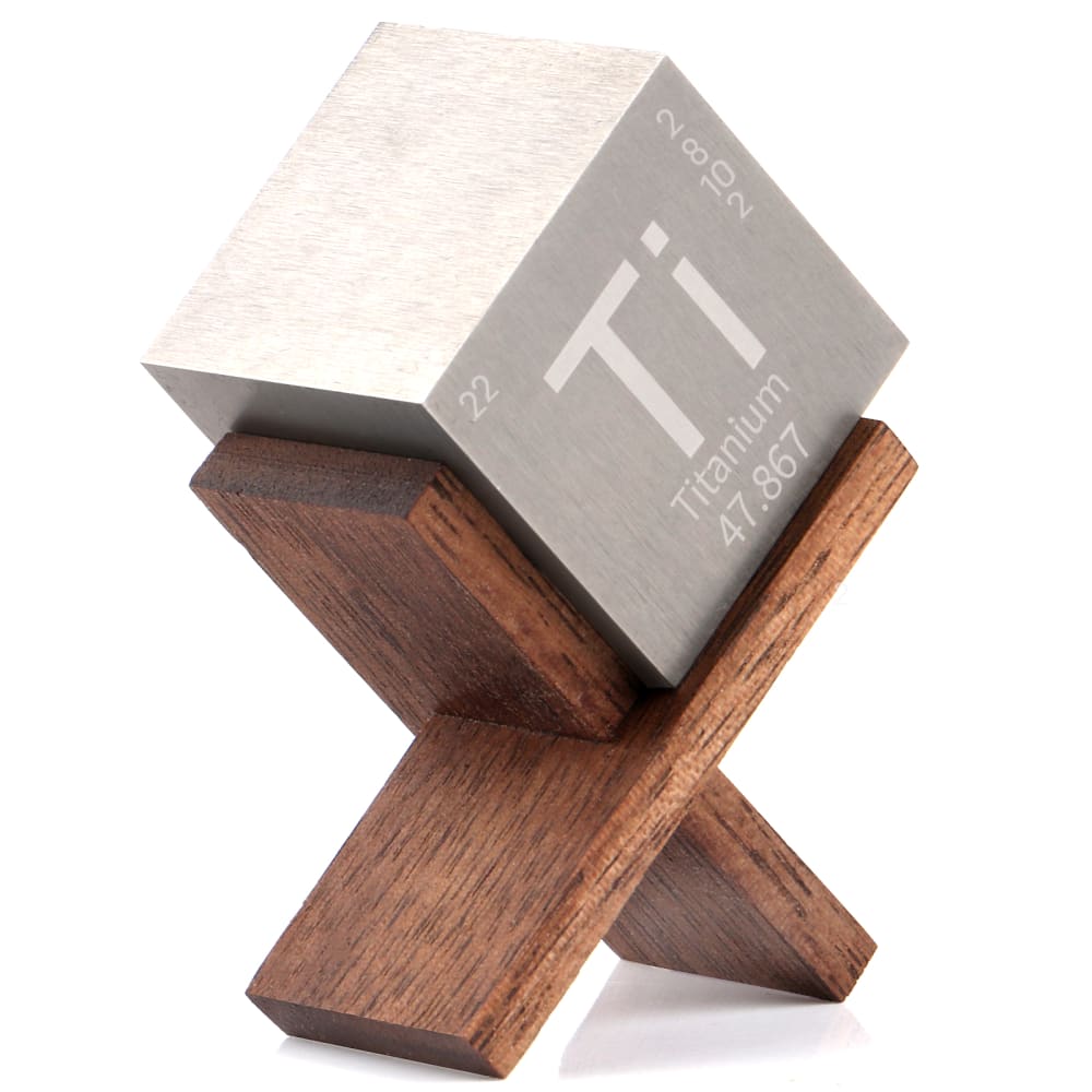
Option C won this Ranked poll with a final tally of 30 votes after 1 round of vote counting.
In a Ranked poll, respondents rank every option in order of preference. For example, when you test 6 options, each respondent orders their choices from first to sixth place.
PickFu requires a majority to win a Ranked poll. A majority winner differs from a plurality winner. A majority winner earns over 50% of the votes, whereas a plurality winner earns the most votes, regardless of winning percentage.
If an option does not earn a majority of votes, PickFu eliminates the option with the lowest number of votes. The votes from the eliminated option are reassigned based on each respondent’s next choice. This process continues in rounds until a majority winner emerges.
Scores reflect the percentage of total votes an option receives during the vote counting and indicate the relative preference of the respondents. If there is no majority winner, look to the scores to see how the options fared relative to one another.
| Option | Round 1 |
|---|---|
| C | 60% 30 votes |
| A | 20% 10 votes |
| B | 20% 10 votes |
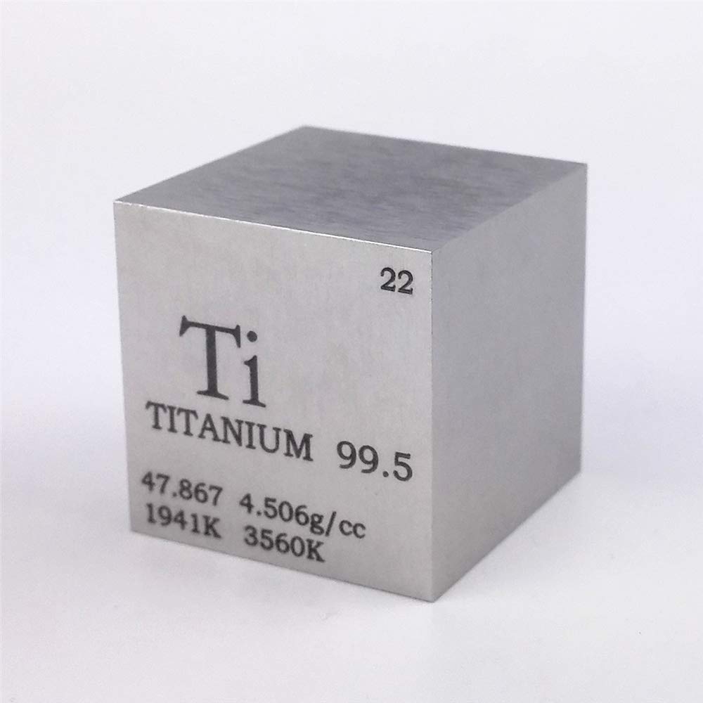
10 Responses to Option A
I like the image in option A the best. I like how it only shows the titanium cube because it makes it easier to focus on that. I also like how the camera is closer to the cube which allows customers to see the details better.
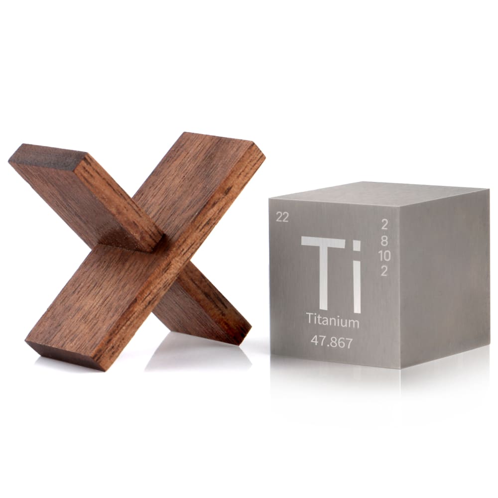
Option A was my first choice- it uses a black font that's easier to read, and the cube looks heavy like it could really be made of titanium. As decor, it's stands alone. My second choice was B. This cube looks decorative, sitting in it's wooden base. However, the cube itself looks like it could be made out of cardboard. It's neat but looks cheaper than option A. My last choice was C. The cheaper cube is not even sitting in the wooden base. It's just confusing, making me wonder if the block even comes with the base or if that is a separate purchase.
I like the ones showing larger and in the stand. I'm not sure if the stand comes with it but I think the one showing the block in the most detail (also the text on it) is the best.
I really don't like the wooden X; it seems very pointless and not congruent with the block of metal. I especially dislike C, since it angles the block to make it much harder to read. The simplicity and purity of A is best.
I chose A first, because it provides a clear view of what is written on the cube and is easy to read. I chose C as my second favorite, because it clears shows how the stand works. I chose B as my least favorite choice, because it doesn't really show how the stand works.
Not sure what role the wooden 'x' plays in this product - the block of titanium is clearly the star of the show. This makes A the most straightforward response. C does show a possible use for the 'x', while B just puts the two items together and says, 'You figure it out.'.
I like reading the information on the block right side up
The contrast is easier to read but I also like the stand.
I like A the most because you can see the product so clearly and the words or so bold.
I find option A very attractive. My eyes were immediately drawn to it. I mentally picture option A as great object complementing my work station.
10 Responses to Option B
I liked choice B the best since I see the stand and the product. Choice B makes it easy to see the product and how it looks compared to choice A which looks too plain.
The image of the products side by side is the best. It gives an idea of the whole package, so you can evaluate what you're getting. The quality looks higher.
I liked B the most because its presentation was clean, clear, and professional. I thought C was my least favorite because it was trying too hard to be cute.
I hate the font on option A, the color of text too. Option B is easiest to read with the better font.
I think having the x and the block next to each other makes for a good presentation and looks symmetrical and balanced. Looks like a really cool product for sure!
I think B is the clearest image of the three choices. C shows the product in use but seems a little cluttered and is less clear. A is boring by comparison.
I chose B first because it shows the components of the product in a way that they can easily be seen. C is okay but the lighting makes the top of the cube brighter than the rest and it detracts from the rest of the product. A is too plain.
My major in college was communications. And I feel that the choices of ranking the product images was based upon my experiences from course I took in my major. Image "B" seemed most pleasing and natural to me. Product image "C" was a little pleasing and "A" satisfied me the least and made me the most uncomfortable.
I'm confused about what's being sold here. Is it the titanium block and the holder? Just the block? If it's just the block, then leave the holder out. If it's both of them, then put them both in the photo
I chose Option B first as it has a symmetry to it. They work well next to one another. I chose Option A over option C because I liked the number info displayed so clearly on the front and felt that on Option C it was just not as interesting as the other two.
30 Responses to Option C
I like the set up of the 1st one but I think you can see it better with the black font in number 2 number 3 is not bad either
I like C and B the most because they show what the product in action and its size. A isn't bad, but there's just no context to what size it is and how it can be propped up on something.
I THINK IMAGE C LOOKS THE BEST AND GETS YOUR ATTENTION FAST
C is more visually interesting with the titanium block in the wooden display. B is alright, it includes the block and the display, but the image looks uneven with them sitting next to each other instead of having the block on the wood. A is last because it doesn't include the stand at all.
I think option C tells me the most about the product, so I prefer choice C over the other two options. Option C definitely makes the product look the most appealing.
The infographic is bold and interesting. I am curious. I will click.
I like having the wooden X in there and it looks good stacked on top of it. I like B better than A because it has the wooden structure
I prefer the one that shows the box and the X. It looks the best to me and has the best composition.
Made my choices based on which image i prefer and also based on which image best shows the cube titanium
C I feel shows off the product the best. B is okay, but does not stand out as much as C. A does not really help me understand about the product at all.
I like to see the product displayed in a holder so I can see how it looks better, because I'd likely use it that way.
I prefer having the wooden "x stand" in the picture, as I see it as added value, like in Options C and B. However, Option C showcases how the two items are intended for use much better, showcasing the product in a better light.
The white text helps over the black, not sure why just aesthetically pleasing. Maybe its because the gray and white go together more. Ranked that one first because it kind makes me think oh its not that heavy if that little wooden X can support it.
like hte angle of TI of hte first one. each one looks high qualiter and good to go
C is interesting looking, I think it has a sort of artistic sculpture look to it that's intriguing.
I found that image quality of option A was a bit too grainy and unattractive. Option B provides a nice visual overview of the two items next to each other, and the image quality is quite good, but I found that option C excelled at both presenting the two objects in a satisfying fashion, while also presenting them in an attractive relationship to each other.
I like how the block is set into tye wooden shape. It shows me how it can be displayed. I chose B second because you can see the 2 pieces and know what you get. I do like the way A looks very metallic but it doesn't have the wooden portion.
C and B shows of both things that comes with the product. A just shows off the cube itself.
C shows me the product and how it works.
C SHOWS OFF THE PRODUCT IN ITS ENTIRETY. IT ALSO LOOKS MORE ELEGANT
i like the block in the X, its kind of a neat visual
The item showcased in this wooden frame is different and trendy looking to me. I like the view of it
Choice C is the most satisfying to me, I just like the way the block fits in the crook of the holder. It's very symmetrical and flush.
I like my pick because of the box and the product are together. I get a better sense of what this is and how it functions.
I'm not sure what's being sold, but if the stand is included, I'd go with one of the pictures with the stand, especially if it has the block on it,
I prefer choice C because it shows how it is used.
I like the titanium sitting inside n the stand in choice C. It looked interesting. I don’t know what this is for. It was just cool to look at.
So the wooden X is actually really nice in my opinion, and you can see the grain in the wood very clearly. The zoomed in version of the Titanium block on the wooden stand, is definitely the most appealing. It just looks more familiar, higher quality, and is just more visually pleasing. It fits in there just perfect.
The layout was better in C and I felt it just had a slightly better design.
I picked these in the order of overall preference based on the aesthetics
Explore who answered your poll
Analyze your results with demographic reports.
Demographics
Sorry, AI highlights are currently only available for polls created after February 28th.
We're working hard to bring AI to more polls, please check back soon.

