Poll results
Save to favorites
Add this poll to your saved list for easy reference.
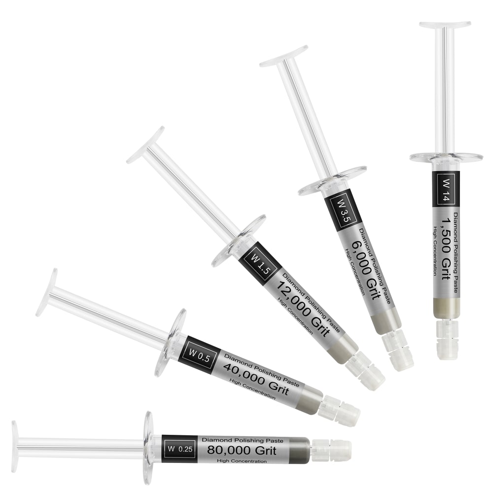
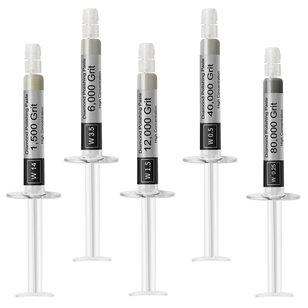
Which image do you prefer?
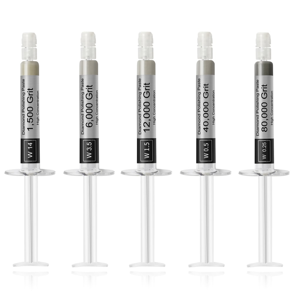
Option C won this Ranked poll with a final tally of 26 votes after 2 rounds of votes counting.
In a Ranked poll, respondents rank every option in order of preference. For example, when you test 6 options, each respondent orders their choices from first to sixth place.
PickFu requires a majority to win a Ranked poll. A majority winner differs from a plurality winner. A majority winner earns over 50% of the votes, whereas a plurality winner earns the most votes, regardless of winning percentage.
If an option does not earn a majority of votes, PickFu eliminates the option with the lowest number of votes. The votes from the eliminated option are reassigned based on each respondent’s next choice. This process continues in rounds until a majority winner emerges.
Scores reflect the percentage of total votes an option receives during the vote counting and indicate the relative preference of the respondents. If there is no majority winner, look to the scores to see how the options fared relative to one another.
| Option | Round 1 | Round 2 |
|---|---|---|
| C | 44% 22 votes | 52% 26 votes +4 |
| A | 40% 20 votes | 48% 24 votes +4 |
| B | 16% 8 votes | Eliminated 8 votes reassigned |
20 Responses to Option A
A. I like the look of them going round like that.
A is much more visually interesting because it is more dynamic than the other pictures.
I prefer A because it is the best laid out and shows the full entirety of the product because it is spaced out well.
A is neat, clear and has a nice fan pattern that is eye-catching. B wastes too much space, but is still visually interesting. C is generic and somewhat bland.
A seemed very whimiscal.
the arrangement of A looks unique and fun
I like the Inter pattern work. It makes it more intriguing to me
A puts the product colors closer together so it's easier to see how they compare. C lines them up so it's also relatively easy to compare, there's just a lot of whitespace around them which makes it a little harder. B's staggered positioning makes it difficult to visually compare the colors at a glance, though it feels less wasteful of whitespace than C.
I like the spread out version in A
I like the simple yet effective and reliable syringe design of this grit paste. I chose Option A and Option B as my first two favorites because I like the way the syringes are arrayed in an arch and switched up and down pattern. Option C feels less unique since they are just lined up symmetrically.
The circular or semicircular layout catches my eye the most
The semicircles setup seems more artsy.
Curved lines are generally more appealing to me that straight edges. They are also more appealing than alternating heights in a straight line.
The fan shape is interesting and they don’t seem crowded together. I like that there is some space in the top corner.
I chose based on flair and aesthetics. Image C was just boring, B was barely not boring, and A was fun and mildly exciting. It is eye catching.
I chose option A as I liked the way it was arranged in a semi circle. It is a nice design. Option B was also interesting and my second choice. I preferred the way it is staggered over option C in a straight line. To me that was a little more boring.
Its looking very interesting.
A is my top pick because of the fact that the angular pattern in which the product is shown makes it much more appealing to the eye and makes me more likely to stop on it and takes interest. The others are featured in a much more plain and less interesting manner.
These could use a little more variety with the images, I liked my first choice because it looks more elegant
C is just TOO plain for the main product image, A is good since its different
8 Responses to Option B
B has the best format, there is not too much white space. White space looks awkward
the round ones look a bit odd, although the others are both okay, but i like the staggered look better
The arrangement has the best layout.
Seems the horizontally aligned syringes make optimal use of the space. So I like those. The offset of the first choice makes it more interesting.
Option C is a little to boring and uniform. Options A is a little too big. B is perfect.
I like the staggered picture more than the others because it is more pleasing to look at.
I like the color of B a lot. The design is interesting and useful to look at.
Option B is nice and orderly without being in bad taste. That said, I don't like option A at all.
22 Responses to Option C
They're all pretty close, but I went with the image that shows everything in a good order. All pieces are equal and none is above any of the others.
I think it looks best having them all parallel and at equal height to each other.
I feel that it should just be laid out plainly. It does not really to do a whole much with and is why C is my top choice. A is okay and orderly, but not really needed. B I feel tries a little too much.
Made my choices based on which image i prefer and based on which image best shows the product
I like choice C because this option is the most neatly laid out. like how neat and tidy the image looks and I think it makes the product look the best.
The product is symmetrical and organized. The product is well displayed and is showcased.
I prefer the shot in C of them neatly arranged and easy to count.
Option c as my first choice because I like that it's actually evened out. A as my second because I'd prefer that layout of the injectors over Option Bs staggered look.
I absolutely hate the last option I ranked. Something about them not lining up is the worst.
I prefer C because I like how clean and uniform it is. B is my second choice because the offset design makes it more interesting to look at without being distracting. I put A last because I'm not a fan of how the product is arranged.
C. I prefer a straight ahead plain look at the items so I can see them easier without any distraction.
I much prefer the image where the products are lined up in order of capacity. When they are alternated or twisted like in the other choices, it's not obvious that these are different capacities and instead it simply looks like you are getting 6 of the same. When they are lined up evenly, you stop focusing on the arrangement and start focusing on the writing on the side of the product. This enables a viewer to see the different sizes which as said, isn't apparent in the other options.
C is a good straight forward image that displays the product well.
I really do not like how option A is displayed and I preferred options C and B a bit more as I think lining them up like that looks better.
It is easier to read the grit on the products in option C than in the other choices.
I prefer the uniform and neat arrangement in this shot.
C looks simple and not busy
I prefer the more straightforward presentation in image C. Looking closer is easy. B is okay, but I still prefer a standard presentation. Option A is just kind of awkward. It's difficult to get a close look.
Option C is the best. Clear, straight forward, and simple.
These are all fine. There is nothing wrong with any of these images. C is the best because it's the most normal.
I like it simple like C because it's easier reading what's on the product.
The items lined up horizontally is easier to read the labels.
Explore who answered your poll
Analyze your results with demographic reports.
Demographics
Sorry, AI highlights are currently only available for polls created after February 28th.
We're working hard to bring AI to more polls, please check back soon.

