Poll results
Save to favorites
Add this poll to your saved list for easy reference.
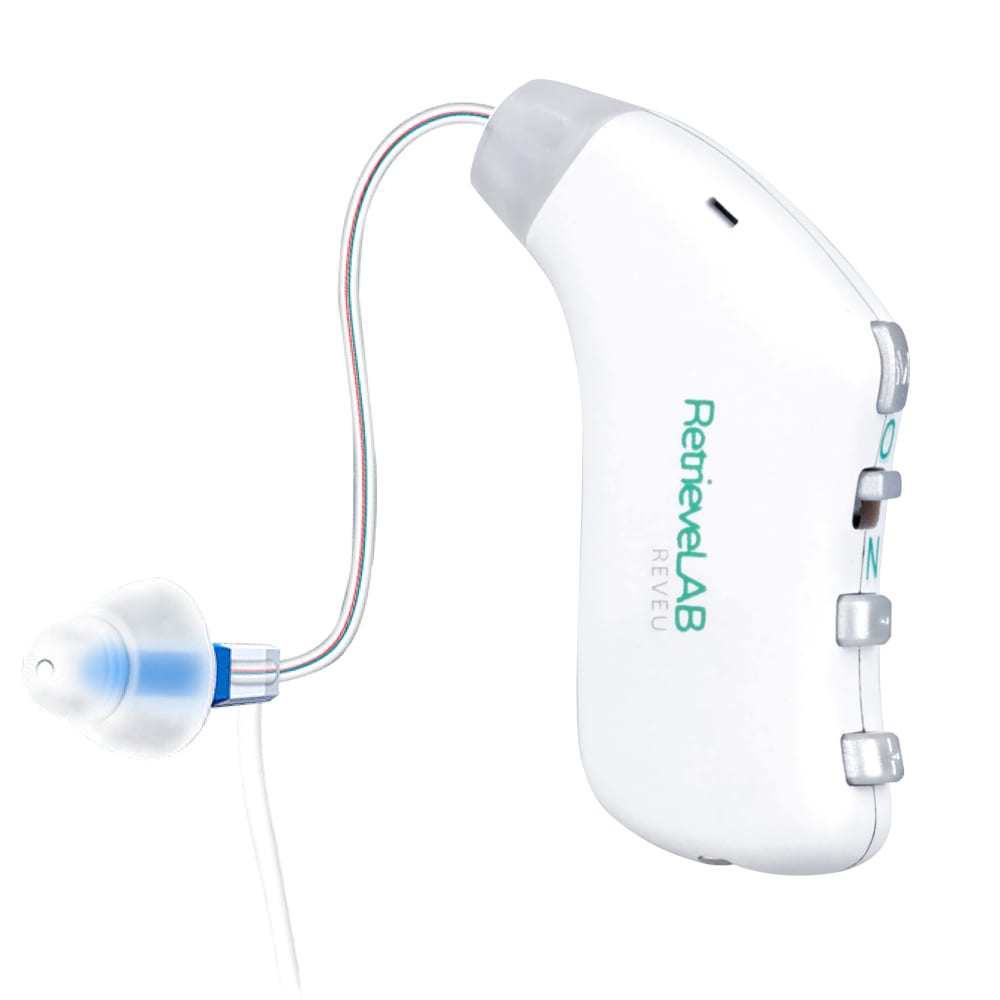
Which image do you prefer for hearing amplifier?
44 Responses to Option A
Image a looks more professional in my opinion
I like the blue color.
A lets me see the brand of the product. I would not by a product unless I know the brand and can do some research on it
This image is preferred. The brand placement is essential. The product is sensible.
Option A gives a better view of the product.
I think that branding printed on the side of the product in A is a net positive, the blue color is in A also attractive.
I prefer the blue accents. I think the color is more pleasing to the eye. I think the red color may make it look like my ear is infected.
I chose Option A because it has the name of the company right on it, so if anyone were to ask me where I got the device, or if I needed a product for it, I would know where to look for the brand name to get those answers/products easier. Thank you.
Having name on it which says "Lab" makes me think it is very scientific
I think I just generally like the blue better. Also I like knowing the brand name as well to make sure it from a reputable brand
Like the color better and seeing the company's information.
A is my preference because the style and colors meets my tastes well.
I get to see the logo which would help me reference this product in the future.
I like being able to see more of the product with option a. It looks like a solid product from this angle as well.
How you can see the logo. I want to know what am buy ing
I prefer the blue color as it makes the product seem more serious and therefore higher quality. This is my personal preference on the color overall and I am a bit biased as it is my favorite color as well. I genuinely feel that this fits the product better overall though.
I like the image of the hearing amplifier with the name on the side. It could be any brand with option B. I like the blue ear piece compared to the red/pinkish color. The red sort of looks like blood or some sort of trauma was done to the ear or in the ear. The blue is at least not a color associated with blood or anything. I would click on option A.
I liked choice A since the angle the product is in is more appealing and the blue color looks better. Choice B has an okay color but not as appealing to look at.
I like the blue colors.
Option "A": This version of design is visually more appealing with the earpiece color and branding on the control wand; I prefer this version.
I like option A because it shows the company name on the product.
I prefer this image with the brand name on it so I am able to refer and research it.
I feel it is better to have a label to make it easier to know what brand the hearing amp is from.
A is more informative and looks more professional.
I liked the logo and the blue earplug. They look nice to me.
I find the label on the side looks pleasant the green and grey contrasts the white color well. I also like the blue ear piece as its a more likeable color for me.
I choose A because I like seeing the brand name on the amplifier. I also like the blue color more than the pink color in Option B.
I prefer to see the brand name on the side
I am a man so I will always choose blue over pink in this situation.
I chose a because I prefer to see the brand name on the product so when people ask me where to buy it from I can look at the name.
I prefer image A because it shows how the brand name will look on the side of it and if I don't want that showing or think it's too big or brightly colored, that kind of image will help me make a purchase decision.
I chose A because it had more appealing colors and it seemed to flow better when viewed from left to right.
Seeing the label/product name gives me the chance to at least possibly research what the product is supposed to be used for
I like the blue better. The other color looks pink which some men might not want to use.
Option A is my preferred choice. Having the logo, and design on the product gives it more of an expensive, valuable look to it.
I prefer this image because I like to see the brand name and the entire device stands out more.
I pick A because I like that the name of it is visible. I think for showing this you need the logo or the name on it. Unless the other side that’s blank had special buttons or something else, I would avoid using the non logo side.
I think the front view is best
Option A has those little flourishes of color that make it more appealing and attractive. Option B seems very sterile, antiseptic and boring in contrast.
It looks like more of a professional product with the logo on it like it is in A, so I prefer that.
The products honestly look very similar. There is less written content on choice B but I suspect it is just because of the way the device is turned...I am assuming the two devices are exactly the same on the external case. So this became a hard choice. I chose A simply because of the blue color near the ear piece...I prerfer blue to the red shade in the other choice.
I like that you can see the brand name.
I pikced a because the blue light seemed more gender neutral then the pick light.
I like option A because it shows the brand name, which I think would be really helpful if you need replacement parts or need to contact them.
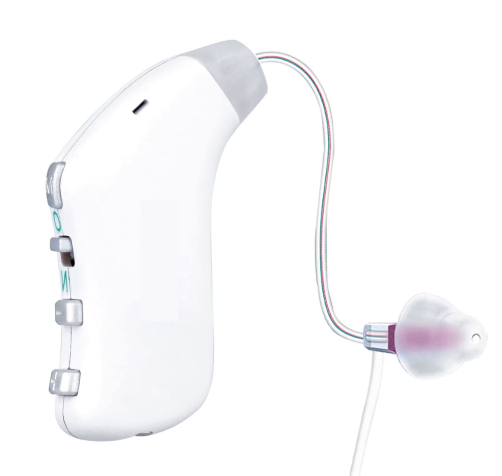
6 Responses to Option B
I like choice B the best because of the color of the ear bud and there is no brand on it.
Blue looks too clinical, purple is friendlier
I chose based on how appealing the options looked.
B is sleek and discrete.
I like pink much better than light blue. I don't need to see the name on the product but would like to read the box it came in.
the hearing amplifier option B is original more whitish and bold in color considering the picture.
Explore who answered your poll
Analyze your results with demographic reports.
Demographics
Sorry, AI highlights are currently only available for polls created after February 28th.
We're working hard to bring AI to more polls, please check back soon.

