Poll results
Save to favorites
Add this poll to your saved list for easy reference.
Which image do you prefer for Picture Frame?
Option C won this Ranked poll with a final tally of 60 votes after 2 rounds of votes counting.
In a Ranked poll, respondents rank every option in order of preference. For example, when you test 6 options, each respondent orders their choices from first to sixth place.
PickFu requires a majority to win a Ranked poll. A majority winner differs from a plurality winner. A majority winner earns over 50% of the votes, whereas a plurality winner earns the most votes, regardless of winning percentage.
If an option does not earn a majority of votes, PickFu eliminates the option with the lowest number of votes. The votes from the eliminated option are reassigned based on each respondent’s next choice. This process continues in rounds until a majority winner emerges.
Scores reflect the percentage of total votes an option receives during the vote counting and indicate the relative preference of the respondents. If there is no majority winner, look to the scores to see how the options fared relative to one another.
| Option | Round 1 | Round 2 |
|---|---|---|
| C | 43% 43 votes | 60% 60 votes +17 |
| A | 32% 32 votes | 40% 40 votes +8 |
| B | 25% 25 votes | Eliminated 25 votes reassigned |
Age range
Amazon Prime member
Education level
Gender identity
Options
Personal income range
Racial or ethnic identity
Relationship status
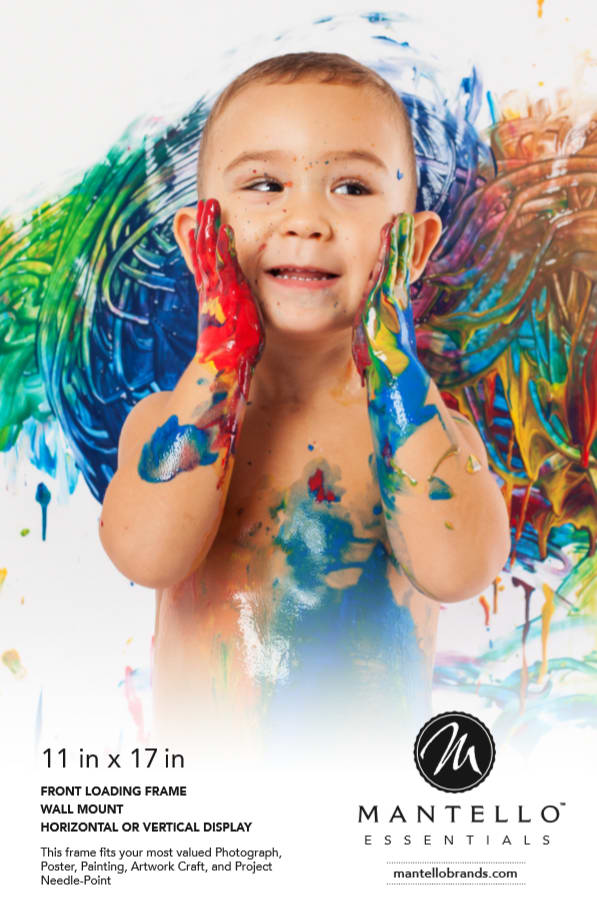
32 Responses to Option A
I think that option A is adorable and would be very fitting for a picture frame because I would be putting funny pictures like that in a frame. Option C is also more like something that I would put in a frame. Option B looks really cool, but doesn't remind me of things that I would be putting in a frame. I don't have any cool artwork that I would want to frame, but I do have pictures of the outdoors and my children.
I find the image of the baby to be most captivating and adorable for a picture frame
I've chose this order because its amazing art by this artist and love the picture quality.
A: More natural and brings smile.B: Love the butterfly effectC: The color doesnt give me positive vibes,its more like a halloween theme
I chose A first because I feel like most people purchase picture frames to frame pictures that are meaningful to them. In my opinion, there is nothing more meaningful than your child or family. C was next because it is an intriguing image yet comes off as professional and clean. The image in B is strange and ma only attract a small amount of people.
I voted A first because the kid with the paint is cute and more like a picture you would frame. I put c second because the door picture is nice and looks like something you would hang for decor. I picked B last because the picture looks too cartoonish and not real
I'm always going to pick the product that has the cute kid on it, no matter what the product is.
The one of the baby with the paint just made me smile. I'm more likly to look at that ad
option A is more appealing to me, option c looks so scary
I LOVE THE BABY PIC! The red door pic also, it stood out and is beautiful.
Option A is good in design.And the baby was attractive and colorful.
I greatly prefer to frame option A first, as the baby picture is really cute and how natural those colors are, this image is very natural and prefer to frame Option A, my second choice is B, the girl with butterfly theme, this can be related to all the positivism of women, and how the wings are compared to a women is the beauty of the pic, I like the theme being a women and the last option is C, this we usually see around in a all the art galley and doesn't grabs my attention, hence my choice is A B and C.
I think choice A is just adorable. I think just about anything with babies and toddlers is cute. C is nice, I honestly wouldn't put it in my home, but I like the way the picture is in black and white, and the door stands out. B, I just don't like. I honestly find it disturbing.
I think that little kid is really cute. And the butterfly hair is pretty, but the door is boring.
i love kids and especially cute antics. This would completely catch my eye and make me smile.
For a picture frame, the first image I chose was A because for me personally I have children so seeing this image makes me imagine hanging my own children's pictures in the frame which makes me honestly more likely to buy it. I also like the second option because I enjoy making craft things with picture frames as well and that was the first thing that came to mind so I imagine myself adding vinyl to the frame. The third option seems more like art based which I just did not personally relate to.
The picture frame of real life is the best picture frame that you can have.
Option C was difficult to read. Option A was definitely the most legible, which is super important when choosing a picture frame.
The baby because I can relate a lot to capture pictures with my kids.
I really like all the bright rainbow colors on choice A, it really stands out against the other two options. I chose C for my second choice because I really like the contrast between the red door, the white walls, and the dark steps and shadows. It creates an ominous illusion. Choice B is pretty and I like the butterflies a lot, but it was chosen last because it did not catch my eye the way the other two pictures did.
I liked Option A the most because it gives people a better idea on how the picture frame would look like when you put a personalized photo, and I like the cute baby with the vibrant paint colors. Option B is my second choice because the graphics look good. I did not really like Option C because the picture kind of looks a bit depressing.
i like the first picture b/c its cute and it has kids which i love kids. second i like that b.c its pretty and colorful. the last one looks dark and i domt like it
The little boy with the paint is very cute and would look great in a frame. The other images are OK, but I just looks the best.
The child with the finger paint is cute and sweet and the colors are vibrant.
The cute baby is the winner here. It would make me image all the baby memories of my own children that I can put on display.
i like these designs very much.
In like the way I chose because there first option had a child and I have a child so they would most likely be in the frame.
I find the image A more preferable. The picture of the baby made me feel more interested in the picture. It's very beautiful to behold and appeals better to me. The color combination is absolutely stunning. It would look good on my wall.
i chose A because baby picture in the pic is more attractive than others. and baby with colors also more attractive. next option B is a normal frame usually i can found this image on somewhere. A is most appropriate to the amazon prime frame for women. women likes baby
I like my child covered in paint I feel like this would appeal to families especially families of young children The red door is my second choice because it is very neutral but I catching the third choice is the Roman with her hair as butterflies because I feel like this speaks more to young women shoppers which is probably not the main demographic
just thought the baby was super cute and that it was clever that he was creating art, and he would be in the picture frame, just very sweet and fun. the other 2 are ok, but the baby definitely got my attention first
I like all of the colors in the baby picture, and the baby is cute
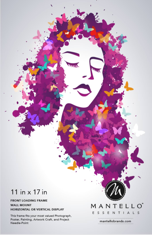
25 Responses to Option B
I like the purple hair and the butterflies around and in the hair with B. I likhee how she is touching her face.
I really love B I love the beauty of it. That it has different color butterflies around it. I probably would buy this poster. I like C because of the red door. It has a mystery to it. You are wondering what is behind it. For A I really don't like it I wouldn't have a random child poster in my house.
This one is pretty and colorful. It catches my eye the most.
I chose B because I like the color palette of the picture. I also like the butterflies in the picture. To me B is the most beautiful picture out of the three.
girls and butterfly painting so pretty ,the baby is very beautiful and mono color door is too different
I like the purple graphic the best. I don't like the kid with the paint on him.
Would like to pick option B is the best design which is more attractive and awesome
All nice for a picture frame, but B is simple and draws your eyes to the frame. A is super cute but my eyes only go to the photo. C looks a bit dark, but maybe bland and dark put more emphasis on the frame - I'm not sure.
I chose first b because I love butterflies. I chose C over a because a is way too messy and I wouldnt want to clean that type of mess up. Yes its a picture frame but thats what came to mind
Choice B is very creative and different. I like the choice of coloring for this image. It would easily go with anything, and is very attractive.
This feels very artsy to me. I like the feeling that it expresses personality. I love all of the colors involved.
I like image B, because this art is very whimsical and feminine. I think it would look awesome if I hung it in my living room. Its aesthetic is very pretty and I love the butterflies. Image C is also very modern and I think that it looks interesting. The colors within the image look very attractive to the eye and would match most decor. I don't like image A very much, because I think it would be weird to hang a picture of a child that isn't related to you on your wall.
I think the colors and the image in Option B draws the eye, but at the same time, the well defined blank edges make the frame it would be in stand out. The last photo give me a little anxiety to look at. The mess takes center stage, I would not be looking at the frame at all.
i like choice b best. the colors are girly and pretty
I rank them according to how beautiful they are
i chose option b because i love the vivid color purple that is used. i also love all the butterflies flying around. option c was my second choice because i like the boldness of the red door next to the white, black, and gray colors. option a was my last choice because i don't like messes that i have to clean up. all this paint on the kid and wall makes me think of work.
B- i love all the different colors in the photo and butterflies are one of my favorite things to look at. A- the baby is adorable. C- this door and buliding just looks dark and dreary to me, not something i would want to look at often.
B is most artistic. C makes me think why this door. A is someone else's child so it doesn't pull me in.
I personally like B because I like the art of it and it looks really nice. In option C the red door is a little bland but I definitely like it more than A. Option A is weird, with the baby rubbing himself with paint I don't know why but that is not cute but instead creepy for sure.
Love the innovative way of using color splatter and the inclusion of the butterflies. makes me want to know more about the artist. the color scheme is pleasant to look at, and the color shade is a gorgeous shade. I was automatically drawn to it, the others look like pictures taken by a phone there is no real effort into making them where as option B looks like it took time and effort to put together.
I most prefer the stylized artwork of the person's face framed by butterflies - it feels light, playful, vibrant, and artistic. I don't mind the exterior shot of the door - the red draws the eye right to the center of the product. I don't like the toddler with fingerpaint - it feels too cutesy and stereotyped for my taste (a bit of a 'mommyblogger' vibe).
B. inspires me that I could put art prints into the frames instead of just regular photos. Plus the photo is beautiful and brings me happiness. A. Is just a super cute photo the baby looks happy and it makes me happy in general. C is a beautiful picture but it's kind of dark. I just prefer the other 2 because they are more bright and happy.
This image is very beautiful and extraordinary painting I prefer is B
I hate images of strangers in picture frames. I don't find it endearing having a child in a frame I haven't bought yet, it's just annoying. I like B and C pretty equally. Honestly, I feel like it doesn't quite matter much since it's going to be removed for the actual photo the consumer wants to put in it. I think that the text (which is the most important thing on this product) is slightly easier to read on B than C.
i like this very much
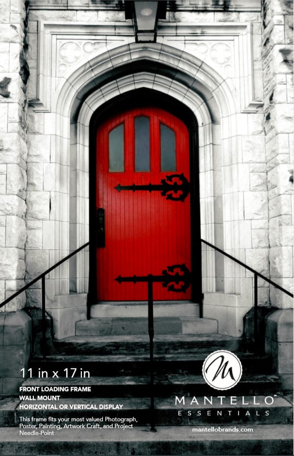
43 Responses to Option C
I chose Option C as my favorite because it appeals to me the most. It seems very dignified.
I like the image in C for a picture frame because bold red against the black and white caught my attention first, it's dramatic looking and still realisti, unlike the other two images.
I prefer option C because of the contrast from the red door to the black and white background. It is definitely my favorite of these options.
The red of the door draws the eye to the middle of the picture, which is likely what I want to display the most in the frame. It is easy to replace this image mentally with the one I want to put there. B is similar as the face is animated and the colors gentle. A I like the least as I tend to be drawn away from frames with a photo of another human. It makes the frame feel like it is not mine.
Choice C is both very inviting and highly engaging.
I chose option C because I love the contrast of the white building, the dark steps and the red door. But I also really love the colorful toddler because it more closely relates to the picture I'm probably going to add to the frame.
C is a image that will catch your attention immediately and B is very soothing and artistic. A just looks like a stock photo.
I chose C because the red door pops with the white background. It was the first one my eyes were drawn to. A was chosen second because of all the colors and the cute kid. B was chosen last because it wasn't as colorful and as eye catching as the other two.
I like C because I find this photo to be the most neutral and therefore will not overpower the picture frame which is what the focus should be on, when someone is in the market to buy a picture frame. I find B a little too feminine and may not appeal to everyone. I find A a little too loud and might overpower the picture frame, which is the selling point.
I chose C because I prefer buildings to persons for picture frame. I chose B because it's less realistic than A and feels better.
I love the red door image, it's beautiful and eye catching. I think it would look amazing on a store shelf.
C is modern and looks great, I want it for my home decor right now.
C was my first choice because it looks like an interesting piece of art that represents modern and class. B was second because it is interesting and artsy, which is still something I might put in a frame. A was last for me because it doesn't represent anything I would personally frame to put up in my house.
I think it would depend on where the image were to be hung. If I was hanging it in my home (living room, dining room, bedroom, office), I would choose Image C. I like the simplicity of it. It's a classic image. If the image were to be hung in a pediatrician's office, a kid's bedroom, a daycare, or a school classroom, I would choose Image A. It's more kid friendly and playful. Those are my two favorite images. I don't care for Image B at all. My first choice, for me personally, would be Option C.
I will prefer for picture farm option C looks nice ti me then B and then A.
I always thought it was strange that when you buy a picture frame, a picture of someone else came in the frame. I would rather have a picture of a building or landscape than a person when buying a frame
A photo frame picture needs to be neutral. The door is best. The baby is a horrible picture. Don't glorify bad behavior.
I prefer choice C because I feel it is most visually pleasing as well as it being artistic. I think this picture can inspire people to use the product as artisically as possible.
Choice option A would be excellent if that child featured were your own child's picture. And B is a bit too generic looking. While I find Choice option C to be very stunning and haunting.
I like choice c because it looks mysterious.
I chose option C because it could go with any color scheme a bedroom may have. It was pretty to look at and would not add chaos to a room. I chose A as the last one solely because it was a minor child and almost a bit awkward. B was my second choice because it was a generic design and I could see where it could capture someone’s eye.
cool and unique, nice professional ad
I prefer landscape and architectural prints as opposed to images.
I think the red door is really eye catching in choice C. I think that image appeals to the most number of potential buyers. It's gender neutral, its for people who might like black and white and also color photography, and it's good whether you have children or not which choice A isn't.
The first one appeals to everyone, and makes you think of framing fine art or decorating your home with something fancy. The second is just eye catching and cute, but definitely makes you think this is only for family photos.
I CHOSE THE PICTURES IN ORDER OF PREFERENCE. I LOVE THE DOOR ONE MUCH BETTER AND CAN IMAGINE IT ON MY WALL.
I don't like the kid picture, he has a weird facial expression. The door fits my decor more so it's easier to imagine.
I like the door I feel like it is relatable for a lot of people, and the photography of it is visually appealing. I think the picture of the women has less of a wide range appeal but is kinda on trend with things in art right now. I think there is a growing percentage of the population that doesn't want nor like children and therefore would avoid the frame with the baby in it, I know I would,push the mess he is making would give a lot of people headaches thinking about it
I love choice C of what looks to be a black and whit picture or a grey building with a bold red door. Very inviting and says come on in to a magical place. Choice B of the butterflies is nice and free. As if the woman is being freed from something. Whilc choice A is cute, I would prefer if it was my child in the framed picture and not a random child, that's just weird.
i choose c first because i love the contrast of colors between the door and the surround blocks, b is next because i think the contrast is really interesting between the purple hair and the butterfly and then a would be last because its just a bunch of colors and mess.
I do t like pictures of other people’s children
The artwork is much nicer and something you may have framed.
Option C is classy and professional. Option A is cute and colorful, as is option B.
C is a very classic and beautiful picture. The stark contrast of the red and white is beautiful. B is a little abstract with the placement of the colors but the painting is very clear. A is not something I would want displayed, it is messy and dirty, however, if it was a picture of my own child, I would change my mind.
My top choice more matches my decor, and I like the abstract look of the second one.
i like this picture very much and i want to frame this.
I like it not featuring a person- it is easier to picture yourself in the frame.
OPTION C IS BEAUTIFUL AND WELCOMING. OPTION B IS A LITTLE WEIRD AND NOT SOMETHING I WOULD CHOOSE
I selected C first because this choice is clearly a picture, and the type of photography used showcases the frame. Showing the black and white with the red illustrates a contrast which shows off the features of the frame. It is also universally appealing to all types of customers. I picked A second because the picture is very cute, but it may only be appealing to those who love seeing pictures of children and it could be a trigger for those who cannot have a child or who have lost a child. B was my last choice because it is not a picture, it is a drawing or painting, which does not show off the qualities of the frame as well as the other two pictures do.
I prefer option C for a photo frame. I like the way the red door grabs up it attention. It would make me look at a photo frame it was inside more than any other. The colors are vibrant. I also like that it has very light colors and very dark colors in the photo. It gives you a frame of reference for deciding how your own picture will look inside it.
I loved the first one. It looks a bit Gothic and induces a powerful feeling but it still appears more professional to me. The second one is cute and gives a fun playful vibe.It also make me feel like it has a family theme to it. The third is pretty but I don't really like it very much.
I don't like how much paint the baby has on himself in A. I use picture frames a lot for architecture, so I like C.
OPTION "C" LOOK MORE AUTHENTIC AND REAL THAN OPTION "B' IS MUCH CUTER THAN "A"
Explore who answered your poll
Analyze your results with demographic reports.
Demographics
Sorry, AI highlights are currently only available for polls created after February 28th.
We're working hard to bring AI to more polls, please check back soon.

