Poll results
Save to favorites
Add this poll to your saved list for easy reference.
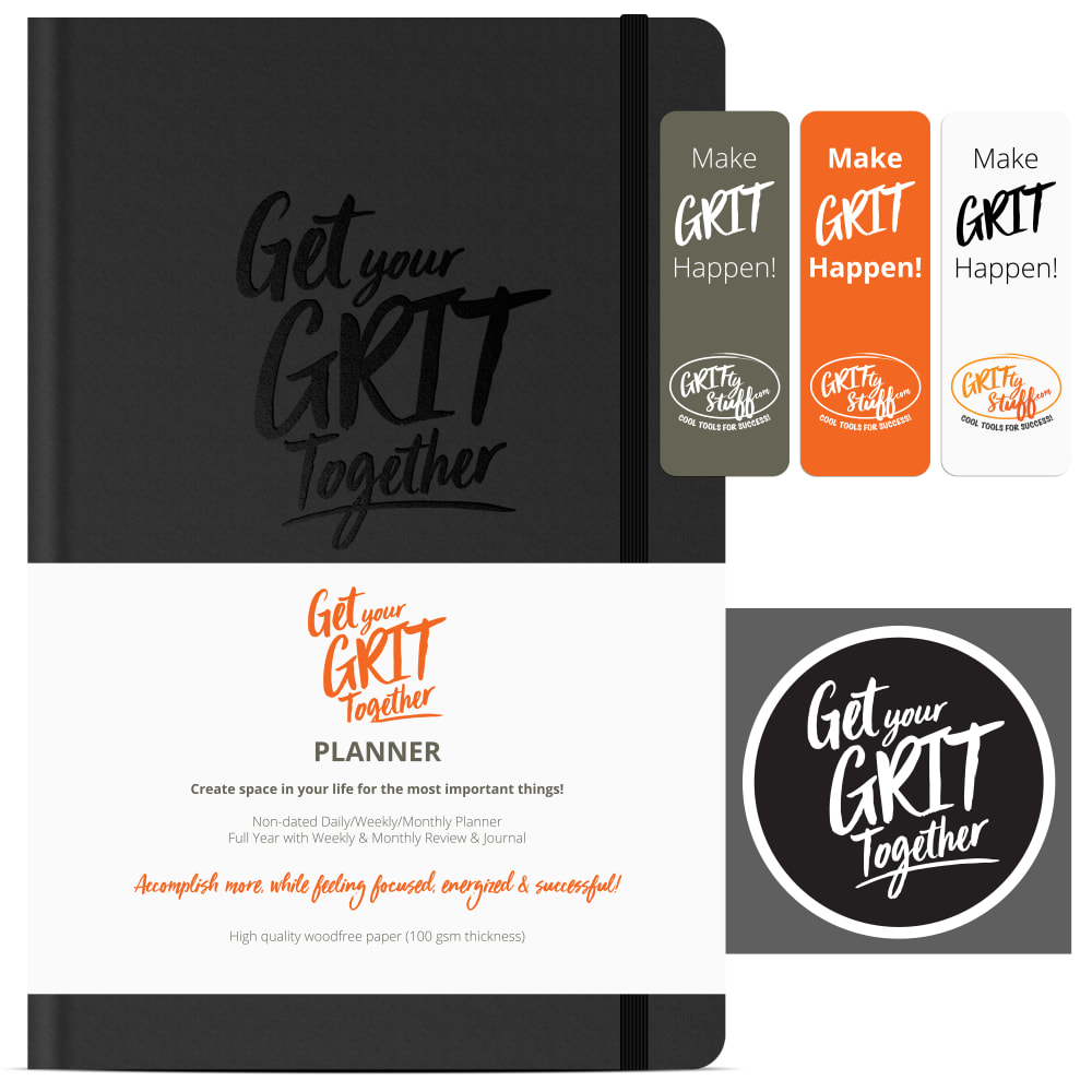
Which image do you prefer for this full year goal setting planner?

Age range
Amazon Prime member
Education level
Gender identity
Options
Personal income range
Racial or ethnic identity
28 Responses to Option A
I think Option A is the best describes what this product is
The three colors side by side were a more appealing look.
I chose A. I think the layout is done a little better. I notice the things on the side and are more apt to read them like this.
I prefer this image for this full year goal setting planner. I find it more appealing and easy to process.
I felt the layout was much easier to read. The horizontal layout seemed comfortable.
I like that I can see the icons a lot bigger and clear in this picture. So this is the one I would choose.
My preference is not significant, but the layout looks better in choice A.
I chose A because it has more information that is helpful when making a decision which to buy.
slightly prefer A's presented
The presentation is better in option A and the items are better laid out.
I think that option A's presentation is a lot more organized and friendly to the eyes. As a result it is clearly my favorite out of the 2 options. Option A clearly shows the brand and promotes it well.
I like the composition of Option A better than B, the 3 panels at the top flow better horizontally than vertically in Option B. Love the color combination of both.
This images selected for this full year goal setting planner listing are great to promote it and I think you could get a lot of potential customers if you use Option A. The wording: Get your Grit together is strong.
The way the white, orange and black cards are positioned, it is easier to see and read them
The placement of the blocks is just better and easier to read and see.
I think A is easier to read as I can do it much quicker instead of going down the page. The logo being bigger at the bottom also makes the product more appealing as I feel I can better understand what I am buying
I chose A because I like the layout of the bookmarks and the sticker better than B
I like a I liked how the pictures are laid out all neat and howI can easily see that is Make Grit Happen! Get your Grit Together planner, looks cool , so anyhow b si good too just like the layout of a better
I think this layout is more stylish and makes me feel better about the product and what it can do.
These are very similar. But option A feels better laid out with the three bookmarks there in a row. Seems that it flows better here.
The large sticker stands out and adds pop to the overall image
I like the organization of the information better on A. I also like the big circle at the bottom right of the image.
They are very very similar however A shows what looks to be a sticker that isn't shown in example B. Showing everything is better in my opinion.
I think the "Get your Grit Together" badger looks better in this version.
Looks like it has more features
Everything stands out in the pictures, all the extras for me to see.
i love A. is it available on amazon?
I like choice A better because of the circle design logo. It stands out as more modern and eye catching.
22 Responses to Option B
This one just looks more organized. As we're rating an organizer, makes more sense for the image to look a little neater.
I think option B is much more neat looking. I like how the product is laid out and it is much more appealing to me.
option B looks cleaner
The other option feels way more cluttered. I don't like how the little tabs overlap onto the planner. It feels all crammed together. The other option feels much more streamlined and easier to look at. It's also more symmetrical. I don't know if that helps, but I hope it does. BTW I don't like the orange color. It's too bright and bothers me when I look at it.
I like this option better because the information really doesn't take away from the product like the other option does. I like seeing as much of the product as possible, so this one helps.
This image is clearer to me because it shows the planner in full. It's easier to see what I get with it.
I find the equal sized bars of text on the side better than all of it on one row. It makes it easier to read and understand.
This layout has a much more balanced look it it and looks a little cleaner and simpler. The extra icon is not really needed in my view.
I like option B because it looks more streamlined with the 3 Grit icons lined up to the right of the picture rather than bunched up and overlapping the planner like on option A.
B is more organized appearing and more appealing to the eyes. A is very busy and it is distracting that what I assume is a grey bookmark is partially covering the planner, when the planner is supposed to be the main focus.
I chose option B because the other one has so many logos on it I can't tell if it is a planner or an add for stickers or a logo to be made. Personally I prefer the less cluttered look. Would like to know how thick this planner is so a side shot would have been nice as well.
I don't like the three book marks overlapping the black planner book.
It looks more symmetrical
Having the vertical icons on the right makes it easier to read and see. nice colors as well with the layout.
The more orange and white, the better, as that's a nice color scheme. Having more gray isn't as good...
Having everything separate without overlapping eliminates any mild confusion about what all of the various designs are.
no real need for the redundant phrase on the side, you can see it already on the main picture.
better picture organization. You can see the product clearly and none of the text boxes is overlapping.
I can easily tell it is the book and bookmarks where I am not sure as to what the extra item in A is.
Option B has a layout that allows for an easy and clean display of all the variations available of the planner.
I like to see the full cover of theyear planner, without any obstructions. I can see exactly what I am buying. I like the cover of the planner and th color.
high quality overall
Explore who answered your poll
Analyze your results with demographic reports.
Demographics
Sorry, AI highlights are currently only available for polls created after February 28th.
We're working hard to bring AI to more polls, please check back soon.

