Poll results
Save to favorites
Add this poll to your saved list for easy reference.
Which image do you prefer for this product?

Option A won this Ranked poll with a final tally of 28 votes after 2 rounds of votes counting.
In a Ranked poll, respondents rank every option in order of preference. For example, when you test 6 options, each respondent orders their choices from first to sixth place.
PickFu requires a majority to win a Ranked poll. A majority winner differs from a plurality winner. A majority winner earns over 50% of the votes, whereas a plurality winner earns the most votes, regardless of winning percentage.
If an option does not earn a majority of votes, PickFu eliminates the option with the lowest number of votes. The votes from the eliminated option are reassigned based on each respondent’s next choice. This process continues in rounds until a majority winner emerges.
Scores reflect the percentage of total votes an option receives during the vote counting and indicate the relative preference of the respondents. If there is no majority winner, look to the scores to see how the options fared relative to one another.
| Option | Round 1 | Round 2 |
|---|---|---|
| A | 50% 25 votes | 56% 28 votes +3 |
| C | 34% 17 votes | 44% 22 votes +5 |
| B | 16% 8 votes | Eliminated 8 votes reassigned |
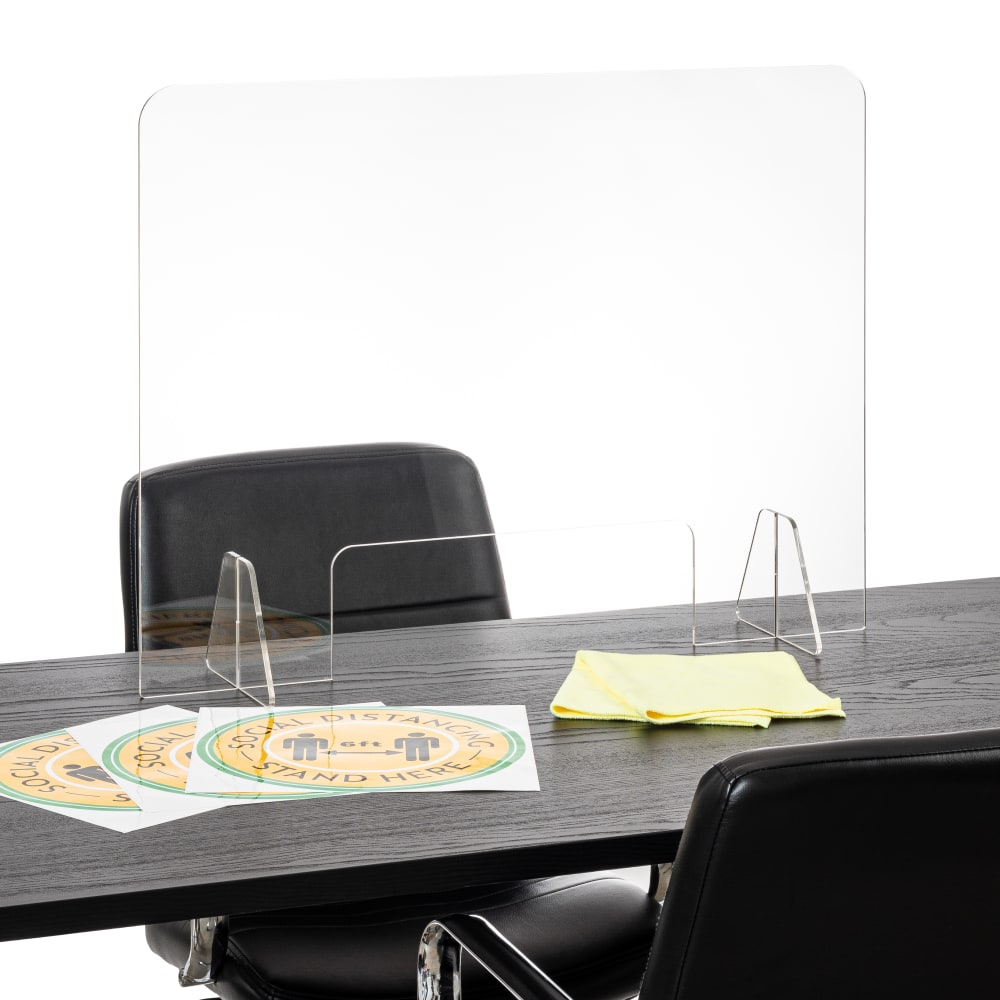
25 Responses to Option A
Option A shows what it might look like with a live person and how well an interaction might look.
Having a person and furniture as scale is helpful
I like seeing a person in the photo, which makes the product easier to relate to. Very nice for sure!
I like choice A because the person in the photo allows the consumer to see the actual size of the product.
You can clearly see what it is designed for and a comparison in photo A with a human for size reference
My top 2 choices better show the product's size, which helps when you are purchasing this type of product.
I didn't know what it was till I saw the doctor behind it, so A it is
I prefer the image on option "A". The image looks informative and descriptive.
I like seeing how the product is used. A is a good example of that.
It shows a reliastic example of it
I thought option A was by far the best as it is nice to see the item in use with an actual person. I thought option C was decent however I really wasn't feeling option B.
I prefer choice B because this image shows me the most about what I can expect from this product. I like being able to see somebody in the image because it gives me an idea of how the product will perform.
I like option A, with the person in the photo it gives a better understanding of how the product would be used.
Seeing it in an official setting that way makes it looks so much more legit.
I will be honest and I do not think any of them are great. They all do not show the product well and I cannot tell what it is does nor how it works.
Image with the model in it is definitely the best. Looks complete. The dark table design is ok and at least has good sort of contrast. The plain mostly white image though..nope.
no idea what's the actual product being sold here, but B is the worst because it looks blurry
The smiling man in choice A makes the product seem more friendly and relatable than the other two. I preferred option C to B as option B looks too plain in comparison to the other two choices.
B looks really generic so B 3. A > C so A 1 and C 2
Option A gives you a great visual of the product in action. Option C because you can visualize the product better with the dark desk. Option C is hard to visualize because of all of the white background.
I like A the most because I like that it shows someone on the other side of the divider and gives you what it will look like through the windows. I put C next because I like that it shows the chairs and how a meeting between two people will look like even if it doesn’t show someone. I put B last because it’s limited compared to the others. It does the basic views of what it will look like and small things near open but that’s about it. It needs more in my opinion.
I like that in A, it features a human. This to me, gives it a warm and more personal touch to it.
I like A the best because it does the best job of showing the product in use. C shows it in its natural environment which is better than B which just shows the product in isolation.
I chose the images that I liked best for this product based on my personal preference.
It's best to see the product in use.
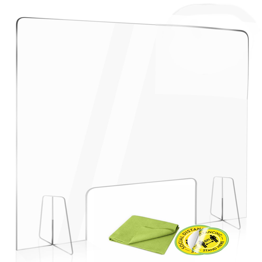
8 Responses to Option B
I chose option B. I think that is shows up better on the white table.
I like option B the best because it shows just the product included.
I like seeing the product by itself. It's easy to imagine already how it is used. You can use option A or C as a secondary image, though. Looks good here!
i dont really want to see anything other than the product i am buying the other images are not good
Option B is the easiest picture to see the shield in. The one sitting on the brown table is almost invisble to me.
On all of these it's a little bit hard to tell what the actual object is. The thing I liked about the 1st one is there's nothing to confuse it with the 2nd 1 does a pretty good job of that to the 3rd 1 not so much
I like B because I think just showing the product without any of the distractions that C and A have is the best visual.
My first choice was an easy one to make. I can easily see the divider and I can tell that it is something that I want for my office. I can easily see how it would be used and it has become a necessity in offices today. This is a useful product that will benefit many
17 Responses to Option C
I feel like picture C looks most natural and shows where you might see the product and its intended purpose and width.
I think option C allows me to best visualize the product in use and the product stands out better on a darker surface
Honestly, the dude in A reminds me of a doctor who treated me terribly. I think C's desk looks cooler than B's lack of anything.
The white background makes it hard to see the product.
The product is well demoed. The product functionality is needed, and this will increase amount of clicks.
Option C looks like a real life application of the screen. Option B is fine, but Option A is very artificial.
I prefer the darker desk because it makes the product stick out better. I like A better than B because it helps to see it in use
I like that C shows an example of where the product might be used. B is alright, but plain compared to C, it shows the product floating in a white void. A is last because the doctor photoshopped in doesn't match the perspective quite right and it looks a bit cheap.
Personally I thought option C was the best because it showed off the product in a good and quality like setting for the user to visualize it. The second choice, A looked good as well but I thought the white background kind of drowned out the person's white coat and the product. The third choice kind of was a bit confusing.
C is about perfect in my mind because it gives a really good sense of scale compared to the rest, so C is my easy favorite among these.
Choice c showed the product and how it is used. That is all that is needed.
The image I chose gives a good view of the product and looks professional. B looks good and shows the product.
In A, I just looked at the person. I didn't even notice the product. C best conveys the purpose without distracting me with people. B doesn't really show me the purpose.
Option C is nice because it shows the product in use and how clear it is. Option B is close, but not as effective to me since it's just showing the product out of context. Option A is just bad, the composition of the photo looks fake and would not make a good cover image.
A looked very fake whereas in C, they do a good job demonstrating how to use the product in everyday life.
Option C is best because it most effectively shows the product in use.
I chose option C first because it gives a clear indicator of the actual size and use of the product. Option A second because you have an actual person, and it would have been my first choice but it is clearly someone photoshopped in instead of having someone on set for the picture, and option B last because it's lacking what I mentioned for my first two choices.
Explore who answered your poll
Analyze your results with demographic reports.
Demographics
Sorry, AI highlights are currently only available for polls created after February 28th.
We're working hard to bring AI to more polls, please check back soon.

