Poll results
Save to favorites
Add this poll to your saved list for easy reference.
Which image do you prefer? (Please ignore the watermark and poor image quality)

Age range
Amazon Prime member
Education level
Gender identity
Household income range
Options
Personal income range
Racial or ethnic identity
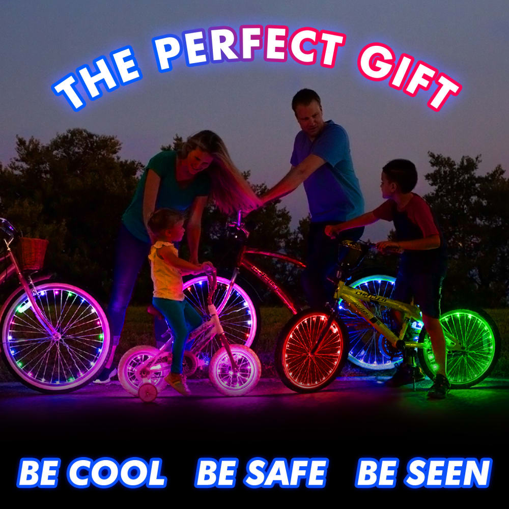
39 Responses to Option A
Because it actually shows the product and how it works.
A actually captures my attention. B is a very generic and forgettable stock photo
I like this because I think the lights on the bicycle wheels is cool and neat.
This image is a product I relate more too, and gives me an idea of what the gift would look like if I bought it and used it.
B doesn't show me what the product is or how it's used.
Greatly prefer A because it actually shows the product.
You have no clue what the product is in B
I like the be cool, be safe, be seen. It highlights the product function and is memorable and attention grabbing which makes me more likely to buy
You see the actual gift, I like the lights.
I like Option A because it highlights the product itself, not the models.
This one actually shows something fun. The other photo is too generic.
The viewer has no idea what the product in the other image is. It's nice to be able to see what the product is, like you can in this version.
I like all the bright colors on the bicycles being safe is very encourging
The bright lights in this image makes it very exciting and eye catching. I prefer it strongly when compared to the boring generic looking alternative.
I love this option because it shows the bright beautiful colors and I would love to have this for my family. This is very unique and the vibrant colors just make it stand out so much.
I like being able to see the colors that are available. I also like that they showing then in use.
I like seeing it being used and seeing the product in action.
IT IS MORE INDICATIVE OF WHAT THE PRODUCT IS. I LIKE TWILIT SCENES.
It features the product and corresponds well to the illuminated font that is also shown on the bikes.
I like option A because it is for a specific and useful item. Although the context of the advertising isn't known, the image B is vague, although very nice if for use as a general stocking stuffer marketing ad.
I prefer option A because the light setup looks very itneresting and fun to play with.
I prefer option A because it looks really cool. I love to see a family outside together. I also love to see all of the colors.
Option A has much more fun, adventurous, convincing picture. Option B has so typical boring composition.
I like ads when it is straight to the point with the product itself. More useful
I thought option A showed off the lights a bit better like having them on the bikes.
I chose option A, that's the only image that indicates what the gift might actually be.
are you advertising the bike lights? they are cool, i know some people who would like those!
A because it shows the product in use and it is much brighter and different looking
I would definitely pick the image that actually shows the product. I think you're better off showing your product in the hero image.
This option shows the lights in use which is appealing to me
A makes the most sense so you can actually see the item in the picture
I'd rather see the product in the ad than not see the product - I wouldn't know what product B is advertising.
I really like the visuals and colors of option A. I like that I can see the bikes as gifts in the image, gives you a sense of the item that is represented.
I prefer option A because I think that it is a more interesting and visually appealing image.
Seeing how cool the lights looks way better. Looks more fun and exciting.
I like this option because I can see how the family could all use it together.
I like A more because the glowing wheels look really cool in the dark light.
The other picture doesn't show what the product is at all. I assume based on photo A the gift is lights for a bicycle.
I love the vivid colors and how it shows the product being used.
11 Responses to Option B
B seems more traditional and familiar.
I choose option B because it feels more comforting and friendly.
Option B is better as long as it doesn't have the stock image in it. A is just too dark and hard to see.
This image is easier to relate to. I feel like it has wide appeal. Hard not to feel nostalgic when seeing a kid open a Holiday gift.
I like option B is the most appealing to me. I can see the family well and I enjoy that. Like the Christmas theme also
Choice a shows a fun family activity and colorful
I prefer Christmas time in general, so this one appeals to me more.
The image in B is the ideal scenario for a gift-giving moment in a happy family. The gifts are highlighted in the image, and the kids are so happy to receive the gift in the image. Everyone would be happy to see the image and imagine themselves in the similar scenario vividly.
maybe because it's christmas time it just seems fitting. if it was spring or summer time I might pick A because it's cool looking, but really how safe are they without bike helmets. B just fits the season
Both of these aren't especially good, but B is better than A because B is fantastic and well designed
I prefer option B. It is a warmer and more holiday friendly photo. It is more how I imagine holidays to be.
Explore who answered your poll
Analyze your results with demographic reports.
Demographics
Sorry, AI highlights are currently only available for polls created after February 28th.
We're working hard to bring AI to more polls, please check back soon.

