Poll results
Save to favorites
Add this poll to your saved list for easy reference.
Which image is more appealing?
Option E won this Ranked poll with a final tally of 30 votes after 4 rounds of votes counting.
In a Ranked poll, respondents rank every option in order of preference. For example, when you test 6 options, each respondent orders their choices from first to sixth place.
PickFu requires a majority to win a Ranked poll. A majority winner differs from a plurality winner. A majority winner earns over 50% of the votes, whereas a plurality winner earns the most votes, regardless of winning percentage.
If an option does not earn a majority of votes, PickFu eliminates the option with the lowest number of votes. The votes from the eliminated option are reassigned based on each respondent’s next choice. This process continues in rounds until a majority winner emerges.
Scores reflect the percentage of total votes an option receives during the vote counting and indicate the relative preference of the respondents. If there is no majority winner, look to the scores to see how the options fared relative to one another.
| Option | Round 1 | Round 2 | Round 3 | Round 4 |
|---|---|---|---|---|
| E | 22% 11 votes | 30% 15 votes +4 | 42% 21 votes +6 | 60% 30 votes +9 |
| C | 26% 13 votes | 26% 13 votes | 32% 16 votes +3 | 40% 20 votes +4 |
| B | 22% 11 votes | 22% 11 votes | 26% 13 votes +2 | Eliminated 13 votes reassigned |
| D | 18% 9 votes | 22% 11 votes +2 | Eliminated 11 votes reassigned | |
| A | 12% 6 votes | Eliminated 6 votes reassigned |
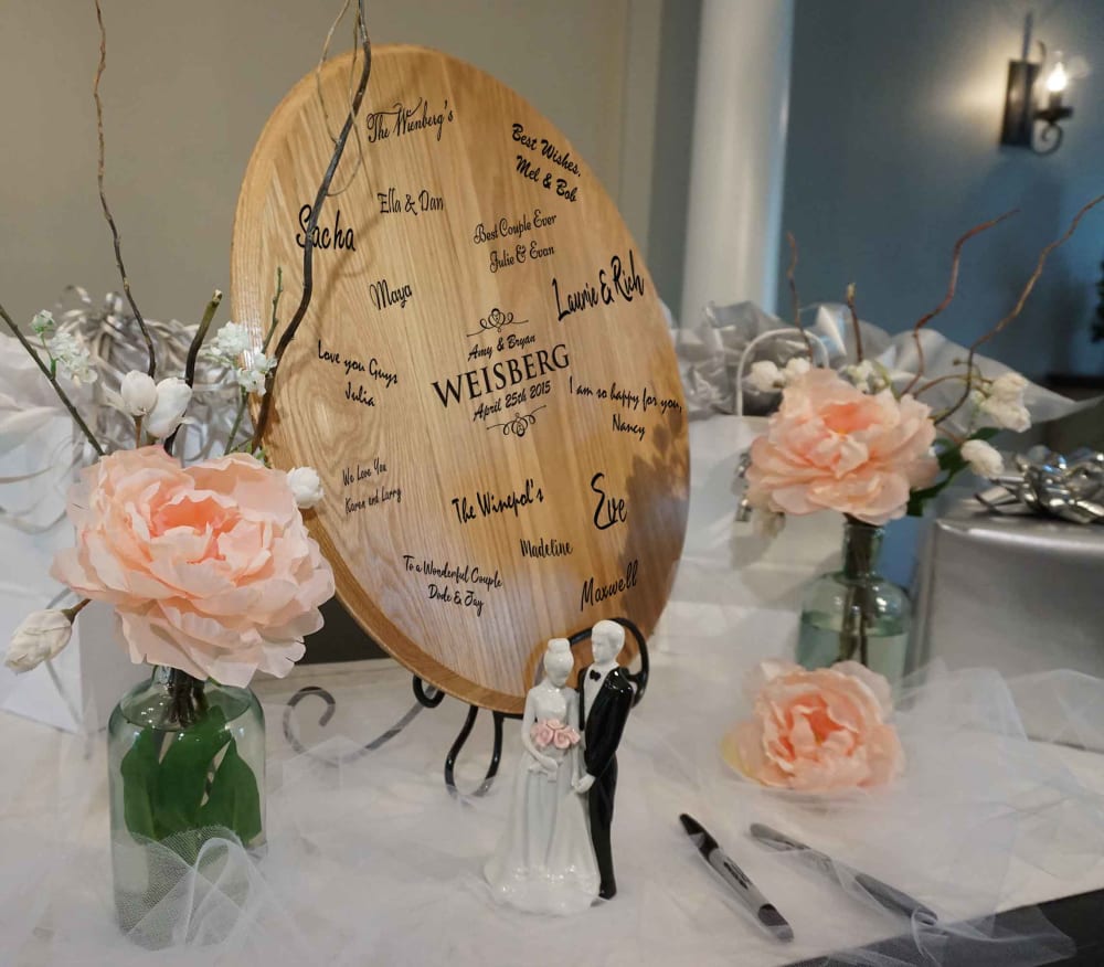
6 Responses to Option A
Showing the item around others in a lush setting is appealing. I like the stand and the frame shot in choice A
I prefer the pictures without the person, focusing on the item.
Prominently displaying the item without any things or people around it allow for the viewer to concentrate only on the item.
I think the best image was when the board was angled with the table decor. It looked the most boring when it was just the board alone.
I like the pictures by themselves. The flowers and surrounding things give it a nice aura and presentation. I didn't like the one with the girl in it. This looks like a board to write on at a wedding. I think all of the articles around it make it every clear. And I think someone would know what to do with this.
i definitely love the product in a wedding like setting and style demonstrating it but not with the girl
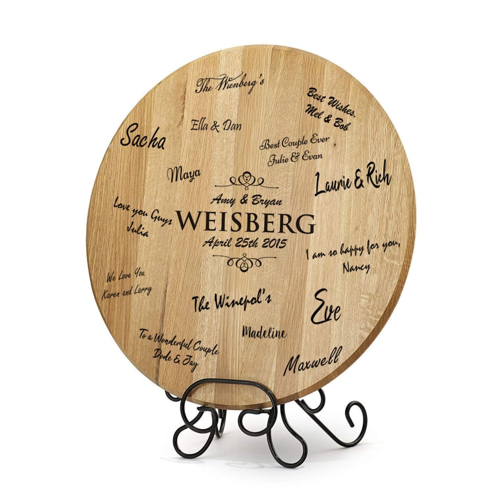
11 Responses to Option B
i liked B the best because it had no obvious background and presented itself in a better light.
Option B looks the most professionally done and is interesting without a background, it really highlights the product. The rest of these pictures are not great. Option D is the best of the rest, it is clear what it is and the product is the focus. Option E is a little too bust with all of the signatures and kind of looks like a fancy pizza stone. Option A is a bad angle and looks really amateur, I would not buy a product with a picture like this. Option C is the worst; while it does show what the product is and how ti can be used, it is awkward angling and the girl's smile looks forced.
To be honest, none of these are appealing. But the first one is the least ornate, and has the least cheesy material in the frame, and so wins by default. All of the others are quite similar, except the one with the bride in it, which is the least appealing.
I especially like choice B because it was a very simple picture that really showed off the product. It let you see exactly what you were gettting and did not have anything to distract you from looking at it. The other images were nice to look at, but as far as potentially purchasing the product, I would consider choice B to be the one I would buy.
Half of the products are too crowded and don't interest me. B looks nice as is and easy to look at as well as D. Both of them are above the others by far
I like option b because I think you can see the actual product the most clearly. I like Option C because it shows how the product is used. I don't like option A because the angle of the photo makes it really hard to see the product. I don't like option D because it doesn't really show what the product is used for,
I like the basic look of B. No clutter. I like the clean look of the wood on D. The angle on E is more preferable than A. I don't like seeing a person in the picture on C.
B is the best one because it is a clear view without any distractions. The others are ordered by aestheticness. Choice e is similar to B but with a background
I picked in that order because for B i liked that you could see the names and there wasn't anything to distract you. The one I picked last the sign was ajar.
I chose option B first because the staging in the other photos is just WAY overdone to me. It loses the idea that you're supposed to sign it, but maybe with some sharpies on the isolated background it might work?After that, I ranked Option E second because it has all the elements for the message that you're trying to make. All the staging, tho... Option D came next because I think it needs the writing, but that's missed here. Option A - you can't really see the whole product from that angle. It's probably turned too far. Option C - The staging seemed like too much stuff to me and now there's a person, too.
I just like it plain and simple
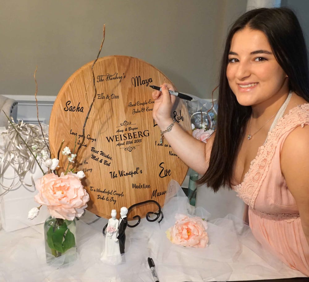
13 Responses to Option C
I like this image best where the woman is drawing on the plaque, it’s more endearing and personalized, very beautiful images.
I have used one of these at a wedding, so I instantly knew what it was, but other people might not know, so I selected the images that gave away the most what this item was, and made it look nice.
I like the woman in the picture
Obviously like the one with the pretty gal most.I then liked the ones with more words than the ones with less.
C is the best, because seeing the woman use the product makes it very clear what the product it used for. The signatures on the plate also do the same. E and D follow because the wedding setting is attractive to look at. B is a tad boring, but it does the job. A just has a very poor angle to the photo.
Seeing a human using the product makes it much more personable and unique. Looks like a fun product that people will really enjoy at weddings!
E & D look like they have a stain on them. C shows whats going on the best....i didnt know until i saw the woman signing the board
women help sell products. E has a good presentation with those flowers. I don't really like the angle look on A. B could use some decoration. D looks too small
C HAS THE BEST IMAGE AND THE WOMEN IN IT DRAWS YOUR ATTENTION TO IT.
Option C shows the product size relative to a person as well as in use which is useful and appealing. Option A and E show the product next to everyday objects which is useful for determining how it will look in real life. Option B is next appealing as it shows how the object might look on display after use. Lastly, Option D is least appealing as it does not show the object in use or after use.
C makes it seem more real and personal by showing someone signing it.
I ranked all the ones with signatures highest because it wouldn't have occurred to me otherwise to use it for signatures. I chose C first because having someone in action is useful. E next because I liked the final presentation. A next because the larger detail of the flowers was pretty.
I think it is most important to see the signatures on the piece. Then I really liked seeing it in use in Option C so I really knew how it worked. .
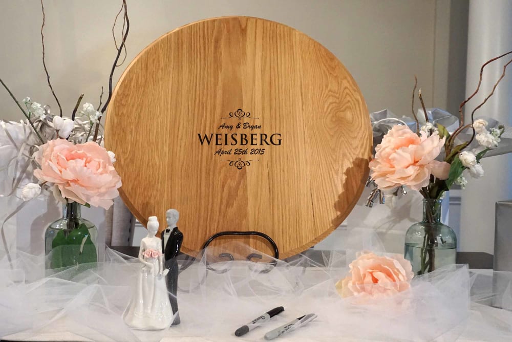
9 Responses to Option D
I like seeing it without other people in it so i can better envision myself using it or what it would look like in my own setting
Very well and good image very like of this.
It's prettier when it's in it's natural state.... I'm not a huge fan of this concept but I like the round version much more than the oblong/oval.
I chose the first one because it had a nice background, and there were no signatures on the piece of wood, which made the photo look very simplistic. Option A was ranked second because it still looked very simple and clean, followed by option E, which was also simplistic. However, I had a preference for the angle of Option A because it gave me an idea of how big the item was. B and C were ranked last because the photos looked very cluttered.
i chosen with different style vice
Those are the ones that caught my eye in the best order I could put them in.
The straight on pictures give better visual of It than the sideways picture. The picture with the white background is clear and clean.
Option D is the best lit. It has a crisp feel. It also showcases the product in the best manner.
I like D because it shows the product up close, without any distractions taking away from the product, and before anyone having written on it. C because it depicts a guest signing the product which shows the consumer what it's actually for without even saying. E because again it shows the product nicely and without many distractions. B because it shows the product by itself which gives the consumer an idea of how the final product will look on display. A was my least favorite because of the odd angle the product was being displayed in.
11 Responses to Option E
the options showing the finished product
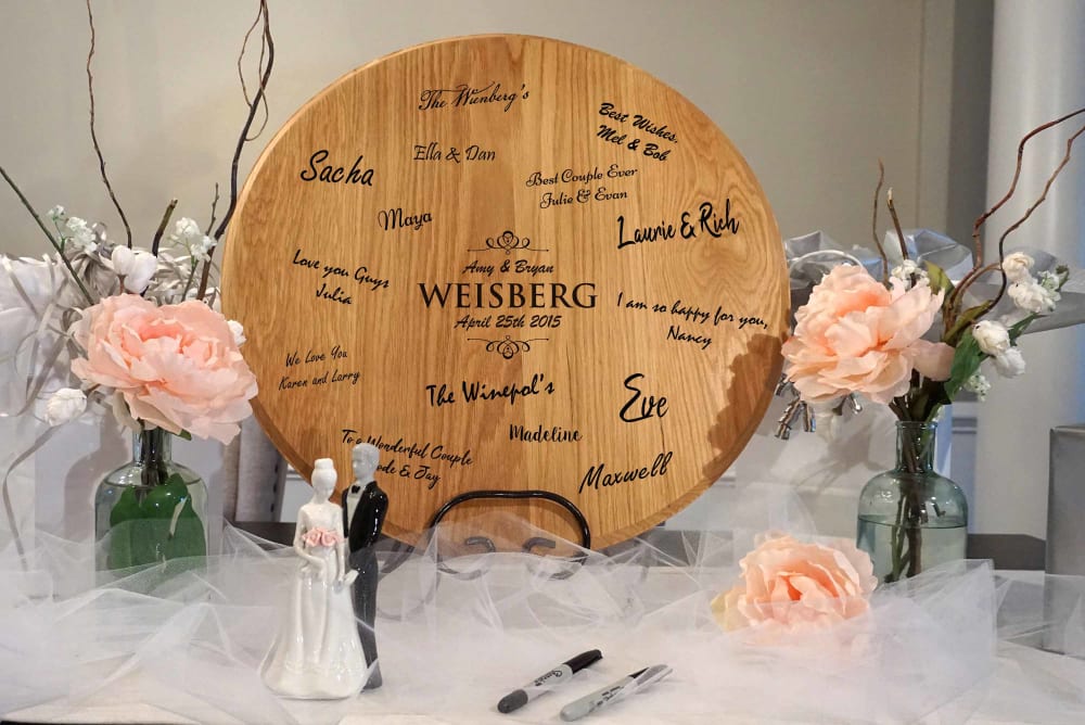
I prefer the photos where the purpose of the product is very obvious. Thus, I like the photos where the writing is added to the plate as without the writing it is unclear what the wooden sign's purpose is. I really like picture E because it's surrounded by nice wedding decorations so a consumer can see how it might look at their own wedding.
I liked choice B and the direct and straightforward approach of the picture. Choice B looks the most appealing and catches my interest since the picture shows me the potential of this product with a nice background and items used with it. I wasn't a fan of choice C and how the person in the picture made it more distracting.
I voted based on what displayed the functionality of this the best, while also giving it an appealing background. Option E was the best for this. I did not feel like the image of the woman in option C helped as it draws attention away form the object, but it was still better to have the background. Option B displayed the product well, but had not background. The angle of Option A made the product difficult to see. Finally option D, being bare, did not look very appealing.
First of all, I prefer just the product (No person in it), but I do like seeing the usefulness (signatures) as well as clear photo - frontal, not angled.
I think Choice E looks the best among all choices. I like that it showcases the approximate size of the product, what it's used for, and I also enjoy the surrounding decorations as well.
I think Options E, B, and A are the better ones because it shows the full product. I like the background in E that's while I ranked it over Option B. I like that Option B shows the full product. The angle that Option A has is why I ranked it below the first too. I don't like that Option D is kind of plain. I also don't think that a person is needed in the picture to advertise the product in Option C.
Option E is more appealing. The design of option E shows the functions of option E. Option E is also well lebelled which makes it easy to read what is written on it.
E and C were most descriptive of what the product is and what to do with it. D was not clear at all that you’re supposed to have people sign in.
I think that E is the most appealing. I like that the product is visually appealing in the picture. Moreover, I think that it looks good in all of the pictures, E is just the most visually appealing. I think that the product looks great in all of them though.
I like E because it shows a completed product in use. C is next because I like that it's currently being used. D is okay but doesn't show that it is being completed. I dislike the angle of A. B is boring and generic.
Explore who answered your poll
Analyze your results with demographic reports.
Demographics
Sorry, AI highlights are currently only available for polls created after February 28th.
We're working hard to bring AI to more polls, please check back soon.

