Poll results
Save to favorites
Add this poll to your saved list for easy reference.
Which image is more appealing?
Option C won this Ranked poll with a final tally of 26 votes after 1 round of vote counting.
In a Ranked poll, respondents rank every option in order of preference. For example, when you test 6 options, each respondent orders their choices from first to sixth place.
PickFu requires a majority to win a Ranked poll. A majority winner differs from a plurality winner. A majority winner earns over 50% of the votes, whereas a plurality winner earns the most votes, regardless of winning percentage.
If an option does not earn a majority of votes, PickFu eliminates the option with the lowest number of votes. The votes from the eliminated option are reassigned based on each respondent’s next choice. This process continues in rounds until a majority winner emerges.
Scores reflect the percentage of total votes an option receives during the vote counting and indicate the relative preference of the respondents. If there is no majority winner, look to the scores to see how the options fared relative to one another.
| Option | Round 1 |
|---|---|
| C | 52% 26 votes |
| D | 28% 14 votes |
| B | 14% 7 votes |
| A | 6% 3 votes |
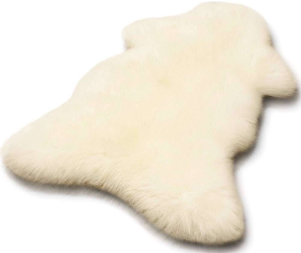
3 Responses to Option A
Option A is very quality i choice the option A Option D is very better than i choice option D Option B very attractive i choice option B
A is better than others
i found these mates more wool and its look more beautiful
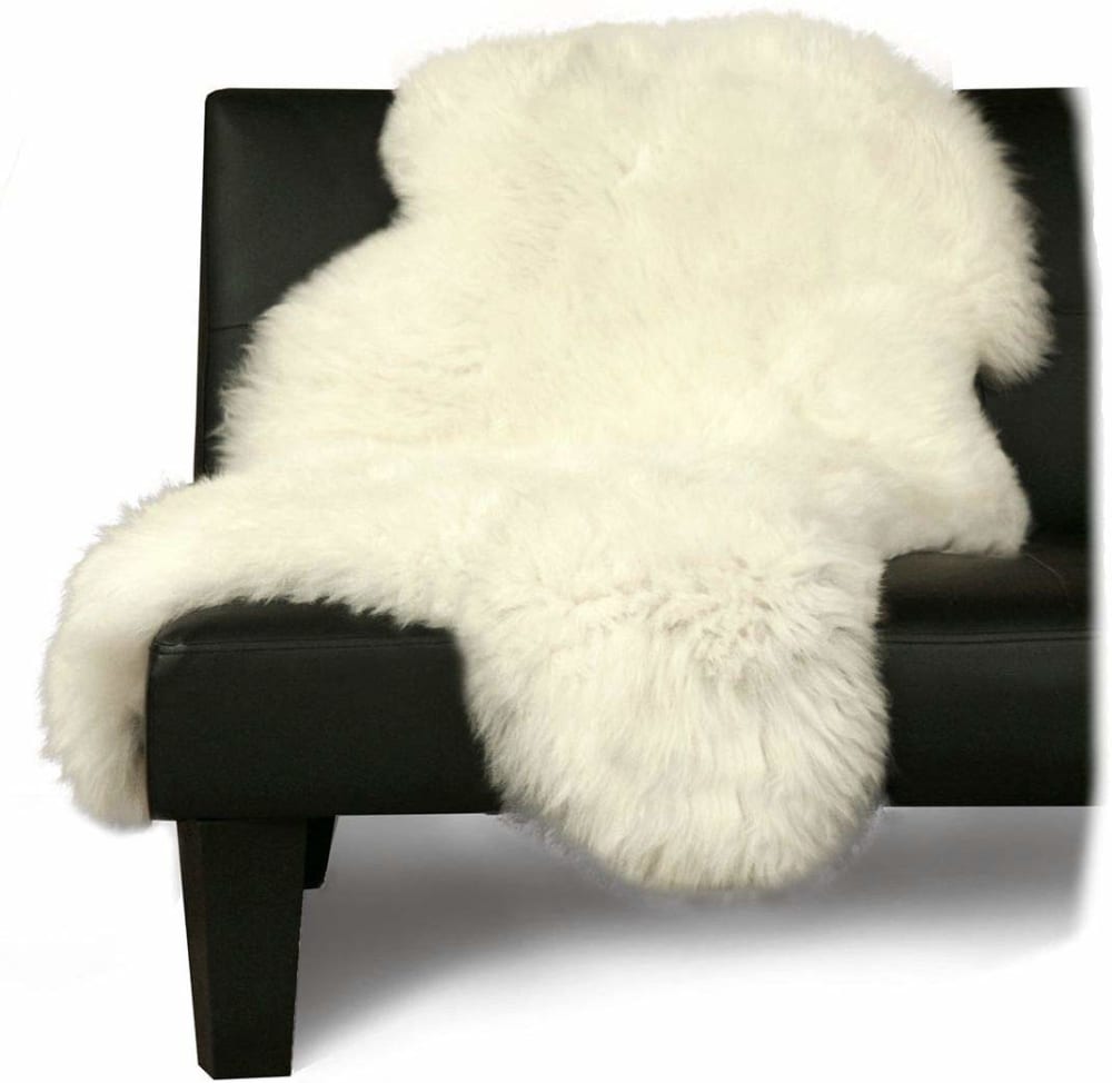
7 Responses to Option B
I picked the ones that show you what how it looks inside a house or on a chair. The one I left out A ,just shows a shapeless thing.
Option B is the very quality I choice option B Option C is the very better than i choice option C Option D is very attractive i choice option D
Choice B-the contrast in colors laying over a black chair makes the white cloth pop out the most, followed by choice c the gray chair made the white cloth pop, choice A shows it in a more fluffed out appearance
B shows off the product best. The angel of the picture, the black chair in the background helps the product stand out.
B, I like that it looks like one of my cats sitting upright on a chair and falling off. The cats would love this thing. C, because that's what I'd do with it and then wonder why I never got to sit in the chair cause it's covered with cat hair. But that's the fun of it. And A because it's better than the ugly thing lying on the floor. I have similar but probably less expensive lying all over my house - yeah, for the cats.
I think products, such as this furry rug are always better placed in a home setting. You get a better feeling of the piece and can imagine it in your own home. The options where it's just displayed with nothing around it are boring and unimaginative.
I like the size portrayed in this order. Then I chose on how the shape looks when draped, or laid, on something.
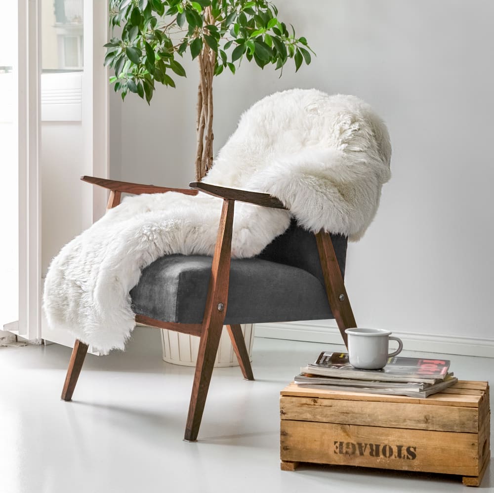
26 Responses to Option C
Option C is the most appealing because it looks very homey.
Option C and A and B is better than others
Option C looks the most appealing, it looks very well detailed, with the chair sitting at a nice visual angle, additionally the decor looks professional, yet a true home vibe.
ABC is best
Option C is the best image, by far. It gives context for the product.
C looks most inviting with the nice cup of coffee nearby, and the fur is part of a bigger scene. B looks cozy on the chair, but just kind of plain. D is okay because there's also a nice inviting feeling about it, but two is too many. Doesn't make the fur look special any longer.
Option C is more appealing. I like the way part of the room is displayed.
I really dig how much this has a cool look to it
I like the way the rug is portrayed in these three
Seeing it on a chair helps me understand how its used
This image is more appealing because it clearly shows a clear example of how to use this product and Option D is also another way to use it at home.
In Option A, it's hard to tell what the product even is, but seeing it with other furniture makes the rug stand out and it give the buyer some ideas and inspiration.
I prefer the cozier pictures of how it will be used.
Nice to see in possible use . Great pics
C shows a great way that the item is used and displays the item fully, D shows another way the item is used and shows the item fully whereas B shows the item in full although a different color.
I chose the images that had more design in them instead of just a product.
Option C shows how the product can look good in a room. Option D also shows how it can compliment other furniture.
The first two make the rug look most white and plush
I would prefer option C in this instance because it shows the product in a real setting however, A and D are viable but not my favorite. A offers me a view of the shape of the product while D does something similar but a set photo environment.
Showing the item as it should be intended for use shows the consumer that this rug or blanket is comfortable. And see how it looks great on your decor. You need this item and it something that will enhance your life.
They looked less fake then the other choices. The ones I did not select appeared to be computer generated images made by a novice.
I like the ones that do not look like an animal.
I chose the white ones that looked more plush
Option C shows the product in the most appealing way and looks classy and high quality. The layout and design look the most sophisticated.
The first one looks the softest, and i like the way it is draped over the chair, and I like the rest of the picture
C-beautiful palm in background, A- love how it lays on the floor like a puffy star, D-love how the throw blanket can be used on a chair or placed on a floor.
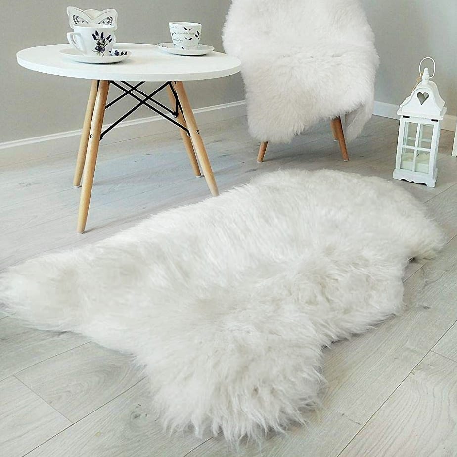
14 Responses to Option D
I like seeing the different way it may be used
love the pure white
I like option D best because of the homey space and cute little knickknacks surrounding the rug. It gives a warmth to the image that isn't present in any of the others. Option C is my next choice because it's a cute setup and I like the little tree. Option B gives a nice contrast between the white rug and the black chair.
I don't know if it's a rug or a throw/blanket, but I like it as a rug so I like D the most. A & B look kind of fake/unreal/photoshopped, so I chose C next. Between A & B, A looks a little less fake.
I love these rugs, I see them at Costco every week. I like the pale white as my first pick, although the cream in my second pick is nice as well. My last pick is a default pick - I didn't like it, but didn't dislike it as much as the remaining choice.
I like the images in the rooms because the camera is high quality and you can really see how soft it is.
These give you the best idea of what to expect
I chose based on my initial viewing
These show the item in a typical use.
The settings really help show it well
I like option "C" the best. It shows how thick and comfortable it looks, more than the others
These ones look like i would a tually use this 8n a house. My letter C and the last one just give no context to show size or use. They just look like a dead animal :-(
I like to see how the blanket sits on furniture and floors, which shows the application.
The isolated pictures of the carpet are really awkward. I like the natural setting of the blanket sitting on the wooden chair with a landscape behind it. It's easy to picture myself in it.
Explore who answered your poll
Analyze your results with demographic reports.
Demographics
Sorry, AI highlights are currently only available for polls created after February 28th.
We're working hard to bring AI to more polls, please check back soon.

