Poll results
Save to favorites
Add this poll to your saved list for easy reference.
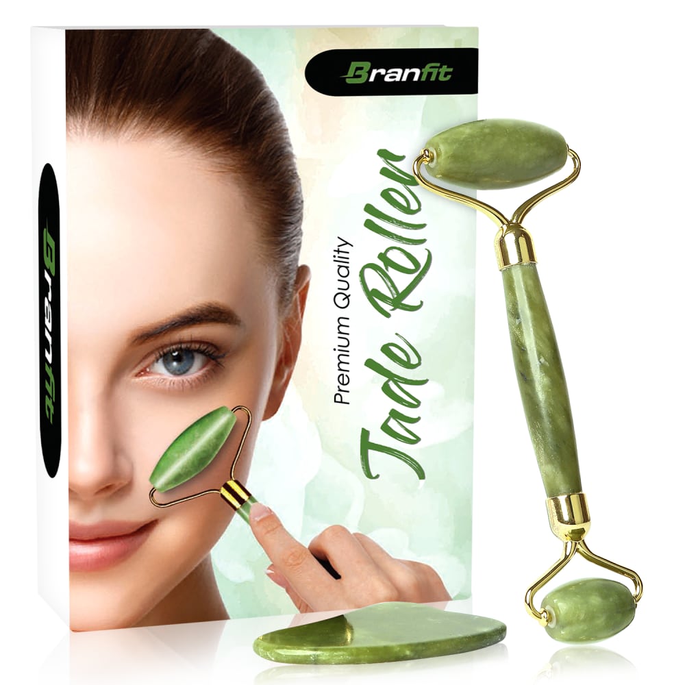
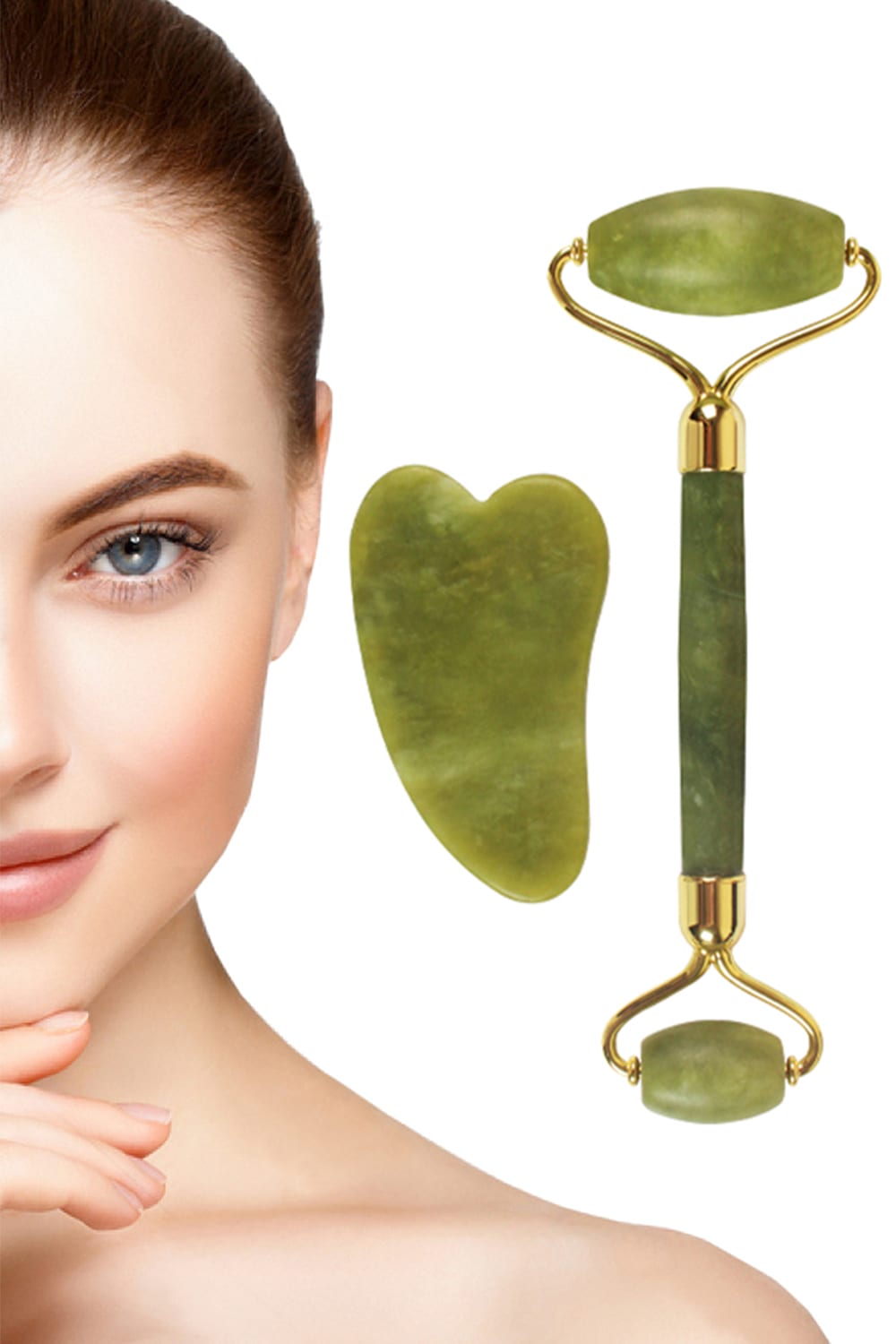
Which image is more appealing?
Age range
Amazon Prime member
Education level
Gender identity
Options
Personal income range
Racial or ethnic identity
78 Responses to Option A
I prefer the one with the package and the product. It is more interesting.
I like choice A because it shows how the product can be applicable.
I think option A is more appealing. Option B is confusing to the viewier.
I do really like them both but chose A because it shows the actual size of the product held up to her face.
I liked seeing the box in the image so I can get a really good idea of what the product does.
This one looks a bit more put together and less scattered.
A because you can see how to use it.
I chose A because I generally like seeing the box, and on this box you get to see the model using the product. In B it doesn't show that, so if you don't know what a jade roller is, you may not know how to use it.
I chose option A because the whole package is there. The beautiful woman, the roller and stone and the packaging that they come in. Option B seems colorless and dull (even with the beautiful woman).
Option A has a nice kind of symmetry to it, where the jade roller is shown both on the box cover and leaning against the box. Also, I think the green heart-shaped object in the center of B is ugly, but the reflective flat green object in A is quite pretty. A is also better from a marketing standpoint because it actually shows a picture of the product's packaging.
I like seeing the items organized like in A, in B they just look outright photoshopped into the air.
I like Choice A best because it says what they product is. Choice B just shows it to you but doesn't explain what it is.
Seeing the box for the products let me know what I will be getting once it gets here
I like that it shows what brand of roller it is.
the option A is most appealing for me in one viewed...this image is very super and It is well understood what it means and what it has to say
A is well balanced as it shows me how to use the product, the product itself, and the jade stone. The photo is well balanced and the product and stone has a nice little sheen to it too. The lady's face is a good size to show me how the product is used and she is pleasant to look at. In B, the lady's face is much too large and also the jade stone itself is too large, and I would have to guess how to use the product.
I like that you can see the product in use and that the product is also shown on the side
Option A has a clear image on the product use with brand name so it is better than option B.
When I'm looking to buy products like this, I like to see how they are to be used. The one I picked is more helpful because of that.
A nice looking product! Option A makes its use easier to understand however.
I like the packaging in the photo, it shows the product in use and says what it is. This would be helpful to someone that is new to using a roller.
I went with A because it includes an important piece of information that the other doesn't: it identifies the product (jade roller). Additionally, it shows it being used on the model's face, which at least gives a clue as to what it's for. I still don't have any idea why someone would use it or what its benefits are, so I don't love either option, but A is the better of the two.
The extra stone doesn't look like a puddle of liquid product. The box shows that the roller is used for the face
I like the image more with the woman using the product, it’s very captivating.
Choice A is more appealing because it shows you the product, the packaging, and use all in one image. I think the packaging helps give the consumer an idea of what to expect when purchasing this product.
I like seeing the box, it gives me the impression of what I would get in the mail
I prefer A because the information is pretty similar but A provides more and I really like being able to see the whole image to get a better idea of the product
In B when you see the green flat stone thing it just looks like a big blob...you can't really figure out what it is. And there is no reason to see her bare shoulder. The picture on the box at least shows you that it is a massager of some sort..maybe to help get rid of wrinkles.
A says it all, the brand, the product ,and everything is clear and well shown.
I like seeing the packaging and brand name. I also like the the woman's face isn't so for lack of a better term in your face like the one in A is.
I think demonstrating the product is always better. Also, what is the extra piece of jade for in both options?
I think Option A is more appealing because it has a better composition/layout. It also shows how the product is used and the packaging of the product. Option B is just a face with the product floating next to it; it doesn't provide any real context for people who are not familiar with what this product is.
I like that I can see the box, the product and the visual of it being used on the box. The image also seems to be of higher quality. The shine on the stone from that angle shows it off much better than the direct view in B. Looks like a very nice and soothing set, A shows that off in the best light.
It shows what the product looks like.
I think A is more appealing because it shows the product in use and also describes the product. I wouldn't have known what the product was if I was just looking at image B.
I like that A also shows the box and seems to have a more relevant design compared to B.
i chose option A as it gives a description through the photo of how to use the product versus option B does not.
I like the packaging included, as it seems to illustrate the use of the product better.
I chose option A because it is more aesthetically pleasing. The other option made the product seem less appealling to me as a consumer.
I like Option A better because I like seeing the person use the product. This lets me imagine myself using it. I don't like Option B as much because the person's face is just there, and they are not using the product. It is harder for me to imagine myself using it.
It describes what the product is and shows it being used.
The left image seems more balanced from an artistic point of view.
Option A image is more appealing.
I chose A because the picture provides context for how the tool is to be used. With B, I would not able to know simply by looking at it, what the roller is for. With A, I could immediately tell that the jade roller is for rolling on skin. So A is a superior picture as it is better at informing the reader.
I don't care about the packaging. I just want to know that the item I get is usable. I love how this option shows a close up of the women's face and items you are receiving.
i prefer seeing how the product is used. otherwise my mind goes to weird places with how that device could be used.
I chose A as I liked the presentation better. It states the name of the company as well as what the product is. I also like the images better for choice A.
Option A shows how to use it and makes it easier to visualize what the product does.
This images on Option A are more appealing with the extra green-and-white mottled background. However, I do not like the hand being used to hold the object on the model's face - it does not look realistic at all. It is completely at the wrong angle and does not really match her skin tone. Also, the large splotch of jade looks much more attractive resting on the table than it does in Option B when it is floating in the air like a bad paint swatch. The greens in Option A also look less like a puke forest green and more jade green - which makes them more aesthetically pleasing to look at.
OPTION "A" shows how to use it.and option "A" is brighter and shows detailed information than "B". so i choose "A".
I chose A as my first choice. The box behind the women helps with the design and makes it look better. The colors from the box are nice.
I like that choice A shows the product in use. The image also looks brighter.
I like seeing the packaging and knowing they will be shipped with it. It makes me think the product and brand are more trustworthy and higher quality.
Love seeing the box.
I choose A because I like that the packaging is included in the image. It gives consumers a visual of what exactly the product is and what is included.
A looks more delicate and it shows the package of the product
more professional looking view
You can see how to actually use the product.
I like that the photo shows using the product.
I like A because it showed the product in use and what it is used for.
I like the closeup of the stone and utensil in B, but overall I had to go for A because it actually shows the product being used. I feel like a lot of people might not know the purpose just by looking at B. I also prefer the coloring of B, the filter looks better but I like the product placement of A.
I prefer option A because it has the packaging to show exactly what you are getting.
I prefer A because the packaging shows the product being used. The woman in B just looks like she is thinking about something and the items are randomly placed next to her
I like how A shows how the object is used. I do not think it is intuitive, so this is important for perspective buyers. I think the model also looks prettier in picture A than B.
I like how A actually shows the jade roller being applied to the woman's face. In B I have no idea what the jade roller is supposed to be used for
I prefer A because I feel like it provides more information. A shows the packaging, which shows the product in use and explains what it is.
I think that I like option A a little more because it kind of shows you how to use it in the picture. I think that for a consumer that would be new to this, it would be confusing as to what to do.
I prefer the image in option A. I like seeing the box that the product comes with.
You can see the product better in the 3D image
I like to choose option A as a more appealing image than option B. where in option A product name also presented with picture of the fade roller.
Even though it looks like there is a phantom hand using the roller on her face, I prefer to see the roller in use on a person than just sitting next to a picture of a person.
I chose A because it shows the product being used and it is less confusing to those who might not be "in the know" about such things. It was also visually well balanced where as option B made me feel as if I were missing something or not seeing the whole picture.
I definitely like A because it lets you know it’s made of jade, provides the company name, and is just generally way more appealing. It looks more complete and polished where the other choice appears to just be a portion of an ad.
I like how the model is demonstrating how to use the tool, without the written how to use manual, I already have an idea as to how to use it. it is also aesthetically pleasing, gives me a realistic idea as to what to expect when I purchase as well.
I like option A better because it actually shows an image of a person using the roller which seems way more beneficial than the roller just being next to someone's face.
I chose A because not only does this image tell me what the device is, it also shows me the intended usage. I am not exactly sure what the flat jade piece is for, but Option A leads me to believe that it's where you 'store' the rolling device (I can't even begin to imagine what that heart shaped piece is in Option B). Also, the image in Option A just seems more "complete" - as it includes the box, the name of the device, the name of the company and especially - some depth to the image.
The image in A is more appealing because it includes the packaging.
this shows you on the box how ot use the product
22 Responses to Option B
I liked that option B, kept it simple and focuses more on the product and doesn't include like the packaging box.
Definitely with the box. Choice B looks very naked with just the product and sometimes people are not sure what it's for.
I prefer B - I like that it gives me a good close up look at the product so I can easily evaluate it, and I think including the box in A is kind of distracting. I also think that B shows off the appealing contrast of the green jade and gold accents on the roller a little better.
Prefer B I like that its a close up of the product and the model's face
I think B is better looking. Sometimes the product may look a bit less appealing with the packaging present. And I think B showcases both of the pieces better than A.
Option B is more appealing. The image is larger and it is easier top see the product up close.
It shows a clear picture of the result
The product includes 2 pieces and which is clearly shown in Option B whereas in option A he 2nd piece of product is shown lying it flat which makes it harder to view the shape which makes it harder for the buyer to see what exactly is it.
I like this closer up view
Choice b is more zoomed in.
I like Option B because it has a more detailed view of the products. It also seems more like a nice spread of a magazine spread. The woman's face makes me feel like such flawless results are achievable if I use the the jade roller and stone. Option B doesn't give as good a view of the stone and the hand holding the roller seems odd, almost like it's coming from the wrong angle.
This shows the texture of the roller well. I like the way that it is on the ground as well. I like how it shows the smooth skin.
I like seeing the heart shaped stone which I do not know the purpose of. Perhaps it is to rest the roller on. It is still a nice feature to see that you get with the product. It is not really shown well in A. I do think having the box is a good option though because it shows how to use the product. Overall though I think seeing the heart stone is more important than the box because if someone is researching jade rollers, they probably know what they want to use it for.
Based on the image, which product would i buy is option B it is more appleaing to me
I choose B since I like the image being larger of the 2 products that I am getting. I could understand why some people may want to see the packing but I don't find that necessary if the items I'm getting in the packing look like what was advertise and as long as they haven't been used.
The hand in option A looks awkward and out of place. This one looks more natural.
Option B is larger, it’s less crowded, and the face is uncovered.
Image B is more appealing, because I like that I can see how the gu sha is shaped. I also like that I can see how wide the jade rolller it.
I like choice B better because I can see the product more clearly. I also don't think showing the box/packaging is necessary for the item.
It looks weird because you can kinda tell it's not her hand on the other image.
I prefer without having the roller on her face, though I feel like the blob on the choice I picked isn't that attractive either - but it does look more appealing than her face being slightly covered.
I like how the second option shows the pieces that come with this in detail and showing her face helps to know how to use this. You can see the colors and shapes better.
Explore who answered your poll
Analyze your results with demographic reports.
Demographics
Sorry, AI highlights are currently only available for polls created after February 28th.
We're working hard to bring AI to more polls, please check back soon.

