Poll results
Save to favorites
Add this poll to your saved list for easy reference.
Which image is more appealing on the search result page?
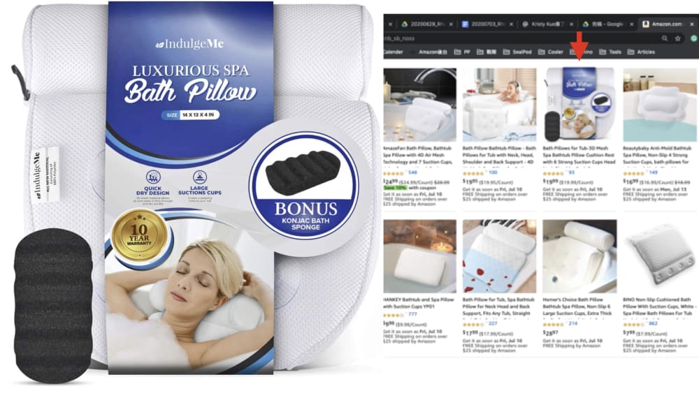
Option B won this Ranked poll with a final tally of 30 votes after 3 rounds of votes counting.
In a Ranked poll, respondents rank every option in order of preference. For example, when you test 6 options, each respondent orders their choices from first to sixth place.
PickFu requires a majority to win a Ranked poll. A majority winner differs from a plurality winner. A majority winner earns over 50% of the votes, whereas a plurality winner earns the most votes, regardless of winning percentage.
If an option does not earn a majority of votes, PickFu eliminates the option with the lowest number of votes. The votes from the eliminated option are reassigned based on each respondent’s next choice. This process continues in rounds until a majority winner emerges.
Scores reflect the percentage of total votes an option receives during the vote counting and indicate the relative preference of the respondents. If there is no majority winner, look to the scores to see how the options fared relative to one another.
| Option | Round 1 | Round 2 | Round 3 |
|---|---|---|---|
| B | 32% 16 votes | 40% 20 votes +4 | 60% 30 votes +10 |
| A | 34% 17 votes | 36% 18 votes +1 | 40% 20 votes +2 |
| D | 24% 12 votes | 24% 12 votes | Eliminated 12 votes reassigned |
| C | 10% 5 votes | Eliminated 5 votes reassigned |
Age range
Education level
Gender identity
Options
Personal income range
Racial or ethnic identity
17 Responses to Option A
After considering the options, I prefer the Option A. It looks better and it attracts me to it. I love its design and appearance. Its beautiful to behold and looks so appealing to me.
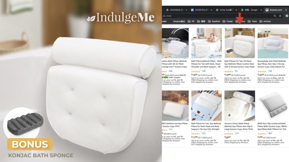
I chose A first, because seeing the product in use in the image makes it immediately clear to me what this is and how it would be used, which would draw me in. I chose D over B for second, because the background colors in that image make the pillow stand out more and draw my eye to how it is attached to the tub. C was my least favorite, because it is a little hard to picture how it works without a visual and it blends into the white background.
A - I like having a model in the picture. She looks relaxed. D - No model but at least there is a nice color background of a bathtub. B -No model, background nice but only in black and white. C - nice bright white but no model and no background.
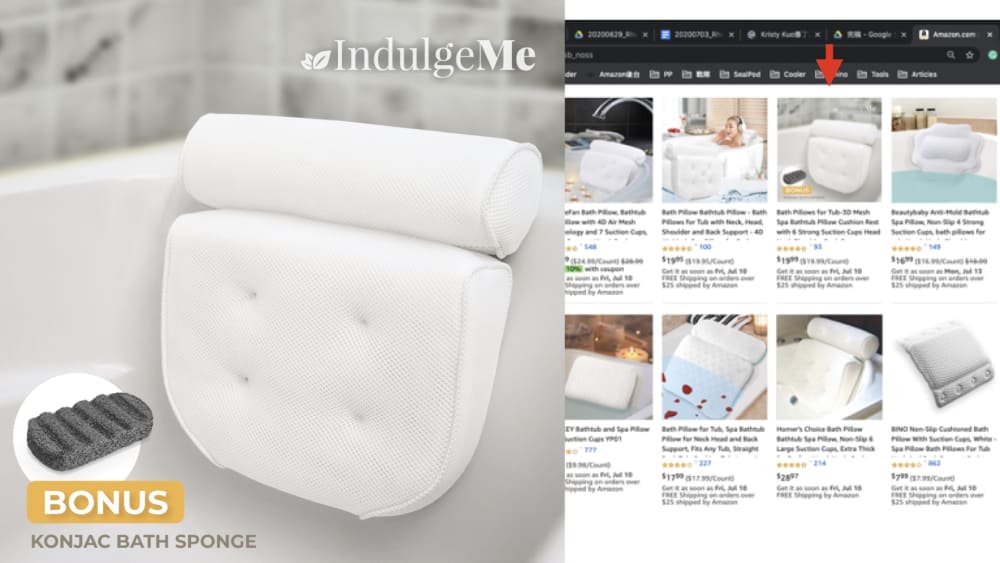
love the blue packaging and it gives me an idea of the actual size
I like A's main picture
All these pillows contain images with a lot of detail, but I was immediately drawn to option A, not necessarily because of the features, but because of the label design and large-scale imagery. The image of the woman relaxing instantly conjured feelings of comfort and relaxation. This is the first product I would have focused on in a store or online, and it is most likely the product I would have ultimately selected for purchase, because it got my attention right off the bat.
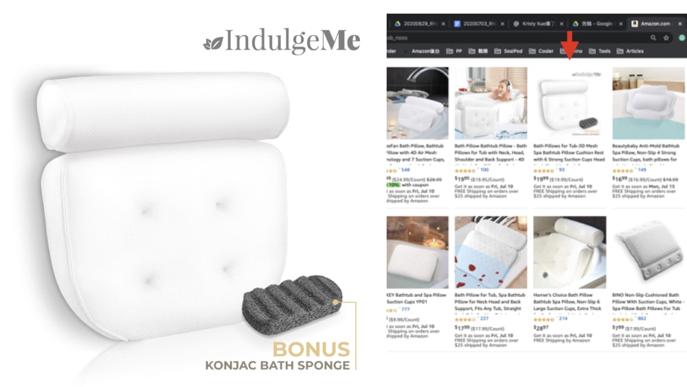
A - clearly displays the product without showing any clutterB - Shows the product well, with less clutter than D, but more clutter than AD - shows the product better than C, but more cluttered than option B C - hard to see white item on white background
The packaging on option A shows you what the product is at first glance. With the others, I am not 100 perfect sure, especially with C.
Option A, I can clearly see what this item is used for. Option D, the brown behind the IndulgeMe logo makes it pop, easier to read. Option B, less attractive than option D with tiled background. Option C, very plain, very white, unattractive.
its good to see a product in use and in places where it can be used do not like a sterile background on this product
The lovely model image on the packaging draws the eyes right to it.
A bc it showed the woman enjoying the bath. B and D looked like the same exact thing, C had no appeal
in option C its unclear how the product is used
A looks the best because you can also see the packaging. D and B are largely the same too with the background of the bathrooms. C is a plain white background.
I like choice a because it shows the packaging.
Choice A tells you right away it is a bath pillow. the others are nondescript.
I chose A first because the product is clearly labelled on the product. The bonus is clearly denoted in the center of the product as well. I chose D second because the words are clearly denoted in white. There also is a bonus noted i n the lower left hand side. Item B is third choice because the product description is blended in the background (gray) which makes it hard to read against the bathroom tiles. Option C is last because the product isn't clearly identified. The product is not placed in a tub not certain what it is used for.
16 Responses to Option B
the adverts are so good
I chose B because the lines are cleaner and the photo is easier to see exactly what I would be getting. I also like the way it clearly marks the bonus.
I personally prefer seeing the pillow in use as it gives me a better idea of what to expect and how I would use it. B is better for me just because the background is all right and it gives a cleaner feel than D. C is next because I like how the focus is on the pillow itself and I can clearly see what it looks like whereas in A, the pillow is covered by the packaging.
I went with what I felt gave me the most information from the picture.
Demonstration of use is best, especially in a spa like setting.
it has good material and looks like so pretty.
The darker background such as gray seems more pleasing to the eyes and looks more attractive to a potential cinsumer due to the added realism.
All pretty similar products, the layout was what set these apart. From B down to C took the front in this pack, everything else was nothing more.
I like the aesthetics better
I liked choice B the best since it shows the product being placed in it's natural setting. I wasn't a fan of choice C and A with just showing me the product being boring.
the first two are more clear of what the product is on a small scale. the last two are not as enticing and at first glance, i thought they were chair cushions.
The clear picture of the item in use seems like the most useful and most appealing of the images.
None of the images were really that appealing to me but I chose them based on how much they popped out to me.
Options B & D are very clear on at least one use of the product and A has the packaging itself. C doesn't show anything other than product itself and no uses
It can recline whatever positions we sleep
None are all that appealing here but I did go with choice option B first because that image at least gives me a visual idea of what the product is about.
5 Responses to Option C
Very like and good quality of the way.
i chosen with different design vice
I look for the brightest and clearest first. The last choice I couldnt tell with just a glance what the product was for.
I ranked based on quality and comfort
I like the simpler images with less distracting backgrounds.
12 Responses to Option D
The more I can see the product in use, the better. I went in order of how well the items eye-caught me.
I chose D first because the background photo behind the pillow was more of a visual contrast so that I could envision the item being used in a proper bathroom setting. I chose B second because the bathroom setting was there behind the pillow, but the coloring was not a good enough contrast. I chose A next because seeing the label on the product would be helpful for the consumer who enjoys reading about the item's features. I chose C last because there was no label or background to see the item being used.
Definitely D. It gives me a look at what the product does. The background is dark enough to make the foreground pop like a poke to the eyes. B is close, but not good enough with the background. A just has it wrapped in the packaging and doesn't give a very good view of said pillow. C stinks. Blank white sterile background! Ditch that!
Very like and good quality of the way.
Option D and B are similar and they both show how the product is used. I like the packing in Option A that includes a model in the front looking comfortable. Option C is plain.
D gives me a nice "in use" picture and I like the darker wood background. Obviously B is similar but with a different color of tile but I dont think it blends well. C gives me a clear picture of the product and A is just too busy.
Option a looked too busy and too confusing to look at. The other 3 were easy to look at and did not have a bunch of stuff obstructing the picture
I like seeing the product used in its environment
I prefer the more realistic ones that show me how it would look in real life, especially when compared to furniture so I imagine it in my living space. The contrast between the background in Option D makes it preferable to B because it stands out more and makes it clear what the focal point of the image is, as well as adds some much needed color to the scene.
I prefer D and B because they look the most realistic and show the product being used. D has a slightly more clear and natural looking background that contrasts well with the cushion.
The products which are been sold must be attractive and provide surety for the customers in their quality and quantity
I prefer C first because the font shows with the brown background color and the rest of the image shows up nicely alone without more things scattered around and distracting. This image is more streamlined and brings my attention right to the products. I like the ones that say indulge me and I like the ones that just show the pillow on its own without all the extra info first. I chose B last because it's very hard to read the light gray don't without trying.
Explore who answered your poll
Analyze your results with demographic reports.
Demographics
Sorry, AI highlights are currently only available for polls created after February 28th.
We're working hard to bring AI to more polls, please check back soon.

