Poll results
Save to favorites
Add this poll to your saved list for easy reference.
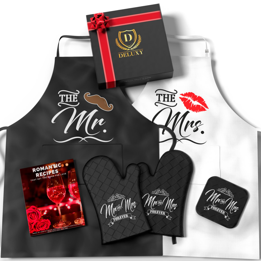
Which Image is more likely to grab your attention and get you to click on the product to purchase? Which Image looks better as the main image (1st image) for our Amazon listing and why?
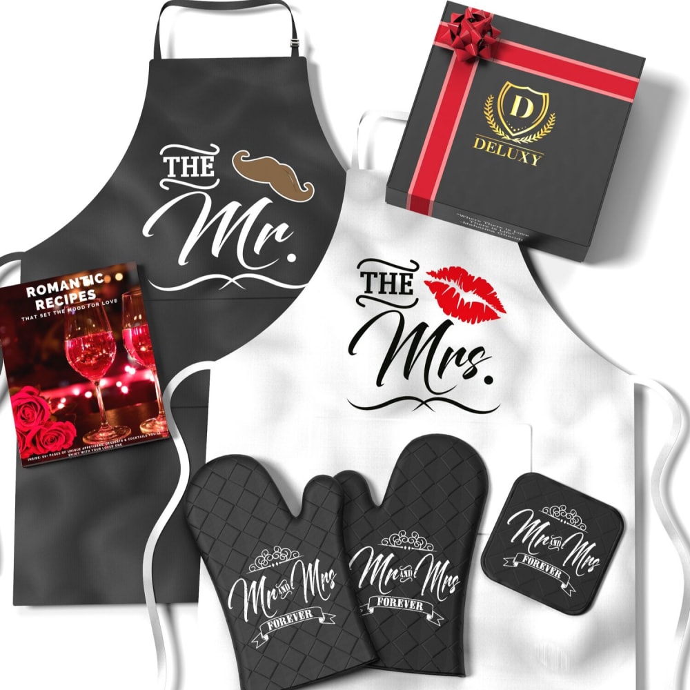
31 Responses to Option A
I chose A because it appealed to me more than B did.
The arrangement of A breaks up the image, getting rig of hard lines, so it's more appealing.
I like it when products like this, with a lot of things included, looks a little bit disorganized. It makes the setting look more natural that way.
i like the layouts better
They are both fine, but the book looks to be in a nicer place in this one.
The black apron seems to block out the white one which is why Option A stands out more for me... I also think the woman (Mrs) would be the one purchasing the product, so it should probably appeal to her more. Not having the aprons side by side also feels better on the eyes.
The slight angle placement of the box in Option A draws the eye more. The oven mits stand out more on the white in Option A, with Option B they kind of fade into the background and do not pop as much.
I chose Option A because the layout of the aprons and mitts is presented in a more artistic manner. Off-setting the two aprons (rather than having them parallel) is more eye catching. The mitts show up better since they're in contrast (dark on the background of the white apron). The jaunty slant of the box in the upper right corner is a better fit with the overall design.
this one because the Mrs. is prominent.
I think the lack of symmetry encourages one to look at choice A more than choice B. It looks more active.
i figured a woman would be buying this, so i preferred the womans apron positioned on top
I prefer Option A because like the way the products are angled better. In addition, I really like the black oven mitts against the background of the all white apron.
The white apron is very eyecatching so I am glad it is in front of the black one.
This one is very similar, but I think the white apron being on top creates a better contrast with the oven mitts. I also like the staggering up and down better than placing them side by side.
i chose the second one on the right because everything is more spaced out and looks better to me
The arrangement of items feels more natural whereas the other image is "posed" and seems forced.
I think that the black oven mitts over the black apron in B kind of blends together, making it hard to pop that the oven mitts are included. Against the white, they stand out much more.
I prefer this image, I think the placement of the recipe book makes more sense and I think the color of the box is less gold
The black gloves on the white apron show up much better. You get to know what is in the package. The Black on black is not as noticeable.
The placement of the gift box is more prominent
Option A grabbed my attention first because of the layout of the merchandise. I liked the staggered look of the aprons. I also think Option A should be the main image because it is more noticeable because of the placement of the items. The items are placed so that they do not blend in and get lost.
A is better the contrast is better with the black smaller items on top of the while. B blends together to much with the black items on top of black items. Also the book looks better more centered in the image.
I prefer Option a because you can more clearly see the black oven mits when they are laid atop the white apron. Also, I prefer that all of the items in Option A are not perflectly lined up with each other, as they are in Option B. It makes the photo feel a bit less staged. In Option B, the box is top center, which feels too prominent of placement for that item. I don't think your eyes should be drawn to the box first, but rather to the logo on the apron.
I chose A because the placement of the Black apron on B overpowered the product overall. To me A was a much cleaner option.
I like the oven mitts over the white apron better.
I like the way that A looks. I like that it has the book in the middle and that it has the ties coming down.
option A looks really beautiful it stands out more
I chose option A because I like the contrast in colors more with how the products are laid out in option A compared to option B where it's harder to differentiate between the items.
Honestly, I would click on neither, as I am not hetero. But choice A is more visually appealing with the staggered aprons. Seems less cluttered.
The are so similar, but I guess I prefer the one where the Mrs. apron is on top of the Mr. apron. In the other one the Mr. apron is covering the Mrs. one.
The layout is brighter and more appealing
19 Responses to Option B
centering the black makes it look better
Arrangement just works a little better, aesthetically, in B.
The placement of the aprons and the color of the advertisement are more attractive to my eye in B. I also like the placement of the book in B better, as it draws my attention across the ad.
I like the organize here. It is cute and open. I was sold on this product by this image
this one look more organized
Looks better with the box in the middle.
I chose this option because I like the items closer together. It makes everything look like a cute package deal. Love the color out line on the mitts too.
B seems to have a more pleasant layout, even though it's subtle. It also looks like Option A's colors are a little more washed out, Whereas Option B has sharp, vivid colors.
They both look the same so I guess I like B because the present is in the middle like it is connecting mr and mrs?
This looks more organized to me
This arrangement looks clearer and the setup of display is more inviting.
These are all a matter of personal preference and I prefer B, no real reason
The items are a bit closer together and gives off the idea that you have a lot more in the bundle, and also just has better lighting on the darker colors.
I think Option B is more compelling than Option A. Option B has a nicer layout and angle than Option A making it draw your eye in more. The clean layout is also more professional looking and makes it easy to see all of the products you will be receiving.
I like the placement of the box and book to the set better in my choice.
It appears to fill the screen more than the alternative.
I like the black apron more than the white
I like B better as I really love the black apron.
The emphasis seems to be more on the left side of the picture, which has a more natural feel to it. Also, the black apron being on top connects it more to the image of the black box, and makes both the apron and the box stand out more.
Explore who answered your poll
Analyze your results with demographic reports.
Demographics
Sorry, AI highlights are currently only available for polls created after February 28th.
We're working hard to bring AI to more polls, please check back soon.

