Poll results
Save to favorites
Add this poll to your saved list for easy reference.
Which image on an Amazon search would make you want to click to learn more?
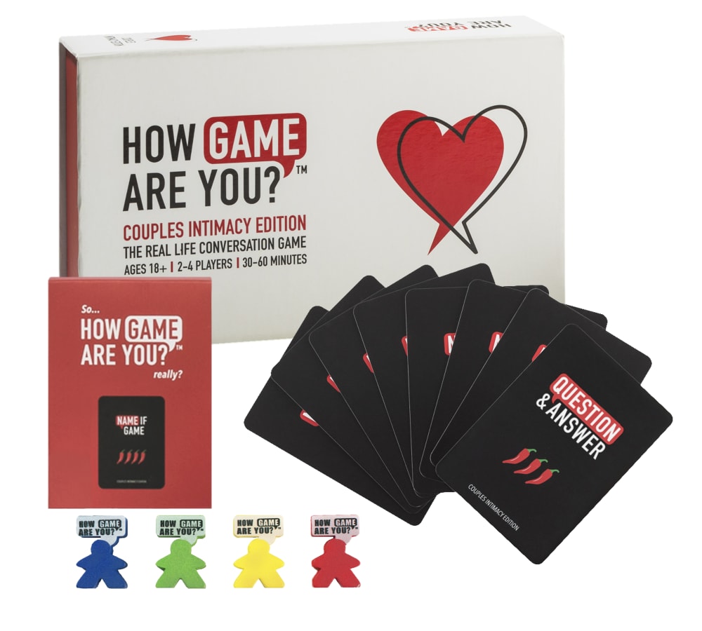
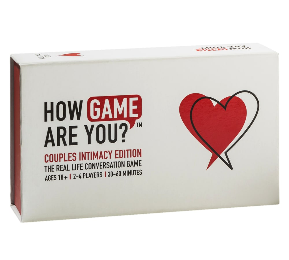
Option A won this Ranked poll with a final tally of 32 votes after 5 rounds of votes counting.
In a Ranked poll, respondents rank every option in order of preference. For example, when you test 6 options, each respondent orders their choices from first to sixth place.
PickFu requires a majority to win a Ranked poll. A majority winner differs from a plurality winner. A majority winner earns over 50% of the votes, whereas a plurality winner earns the most votes, regardless of winning percentage.
If an option does not earn a majority of votes, PickFu eliminates the option with the lowest number of votes. The votes from the eliminated option are reassigned based on each respondent’s next choice. This process continues in rounds until a majority winner emerges.
Scores reflect the percentage of total votes an option receives during the vote counting and indicate the relative preference of the respondents. If there is no majority winner, look to the scores to see how the options fared relative to one another.
| Option | Round 1 | Round 2 | Round 3 | Round 4 | Round 5 |
|---|---|---|---|---|---|
| A | 34% 17 votes | 36% 18 votes +1 | 36% 18 votes | 44% 22 votes +4 | 66.67% 32 votes +10 |
| F | 26% 13 votes | 26% 13 votes | 26% 13 votes | 30% 15 votes +2 | 33.33% 16 votes +1 |
| B | 12% 6 votes | 14% 7 votes +1 | 20% 10 votes +3 | 26% 13 votes +3 | Eliminated 13 votes reassigned |
| C | 14% 7 votes | 14% 7 votes | 18% 9 votes +2 | Eliminated 9 votes reassigned | |
| E | 10% 5 votes | 10% 5 votes | Eliminated 5 votes reassigned | ||
| D | 4% 2 votes | Eliminated 2 votes reassigned |
17 Responses to Option A
The organization and detail of the display of option A would make me want to click it first to learn more!
I think the simpler layout that focuses on the main box looks the best
I like the simple and uniform look of the box. I think option F and option D are overwhelming and busy. I prefer simple and clean look of option A, where you can see all the pieces.
I picked the ones that showed a lot of the items that came with the game, it was more eye catching than just the plain box.
The images that show the entire set of the game are the best. you should show what will be in the package before people buy it.
A. Shows exactly what you get when you buy this game.It takes all the guessing out of what is included.Looks like a very fun game to play.The heart on the box is great.
Option A is the best picture shown because it shows a close up pic of the game box and the components.
I chose these based on the items shown. I like seeing what is in the box.
When something is displayed, I like to see as much of it neatly organized for my perusal. A couple of the entries are just bland. Another one just looks like a pile of stuff. The ones that I chose look more like a complete set of the game. I like that much better.
Options A and B let me see what's included in the whole concept and make me want to learn more about this product. I like a little bit Option C and Option F wouldn't make me want to learn more about it.
I like the way that the image for Option A was laid out; it is asymmetrical which keeps the image from being boring, but also balanced. Also, it shows enough of the product elements to make it clear what the game is. Option D did not have nearly as much detail; however, the composition is eye-catching and makes you want to click to find out more. Option F shows all the game elements, including the blindfold, the instruction sheet and the cards not pictured in Option A. It's not a bad layout, but almost provides too much detail. I wasn't a huge fan of Option C because the composition does not seem very balanced and the positioning of the cards is done in a manner that almost seems suggestive but not in a well-done way.
Seeing that the game has more than just cards gives me a better idea of what type of game it is and how it would be played.
Choice A looks better at making you want to play the game
I prefer the choices that show the items inside the box. I like choice A the best because the items are shown closer than the others. Choice C is similar to A, but a little further away. Choice F is third because more of the items are shown, but they are further away and I have a hard time seeing them. Choice B is my last choice because the items are outside of the box, I would just like if there were more.
I like presentations that give me an idea of the product but don't overwhelm me with too much. On the other hand, I don't like presentations that are too simplistic and don't really tell me anything about the product.
I like the pictures that show a wide variety of the pieces that come with the game, it gave me more of an idea of what types of elements the game would have. I rated from first to last based on which picture made the game look most fun to me.
A strikes a surprising balance between good display, but without giving out too much info. This game has rules and boards and other things that can only make sense after you purchase and learn it. This does a good job at pinning down what you need to know; there are cards, game pieces, and rules. B and C both do this but at much more unflattering and harshly lit angles. not to mention B shows off less info that could be nice to see. F is exactly what i mean when i say too much info. it IS cool to see all that stuff don't get me wrong, but it's not going to make me buy it, it's going to confuse me. stick with simple but efficient.
6 Responses to Option B
I like the first option the best because it shows the game and the cards very well put together and displayed very well. I also like the second option too because it shows everything else that comes with the game.
I didn't like the pictures that were too plain or too cluttered. I like the options that have more content than just the box, but also that are organized.
I think the images that re simple are the most attractive (especially B and E). Buyer don't need to see everything that the box contains in order to want to click on the product.
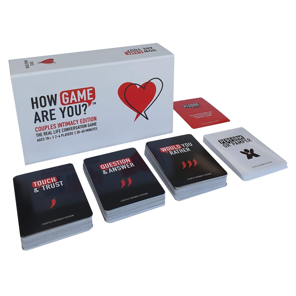
Option B is my first choice of product that I would buy or try out because the cards are neatly stacked and you can see them clearly, and the box they come in. Option C is another good choice, in this image, you can actually see the playing pieces that you can use( I am assuming that's what those are) which is pretty awesome, and also the cards are set up in a very unique and eye catching way. I would definitely buy C also. Option A isn't a bad choice, it actually is displaying a booklet that comes with the game, the game pieces, and also it has a neat set up for the card display in front of the packaging, which is again fully visible to see. Option F is an excellent choice to go for, it is a tough choice between that one, and option B because, it has everything out of the box, showing you what all that you will be getting with the purchase of the game. That is what people want to see when they buy a product, exactly how it looks unboxed.
These images are clean and organized. Easy to read the brand name and understand what the product is. Simplicity in these make the eyes to draw in more to find out more about the product.
I like seeing the decks of cards neetly stacked. It's a pretty well put together picture which shows the majority of the items in the game. A does that as well and includes the pices, but I feel like you don't need to see everything. It doesn't add anything to my desire to buy the game. C shows everything, but it has a weird layout. F shows a lot of different parts, but with all the text it's pretty intimidating. Overall B gives the best image of the game and give you an understanding off the type of game play you can expect. It's the best picture overall.
7 Responses to Option C
I like these because they show more then just box. The first one has a nice aesthetically pleasing layout, as does the second, the third looks nice with the card contrast around the game. I keep looking at them and i think those first two are the ones that entice me to buy
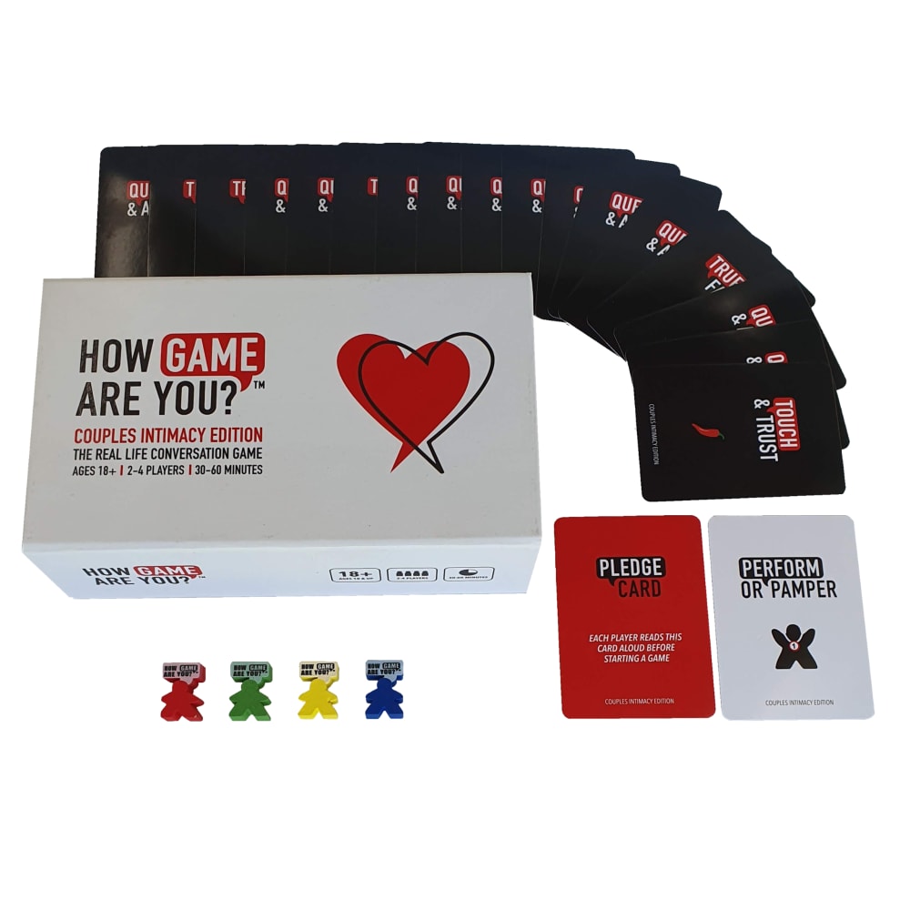
I voted the way I did due to how all the pieces of the game were shown nicely laid out. The way that the game was shown in option C & A looked most appealing to me. being able to see the question and answer cards made me curious to know what the cards said on them.
I like the most option C because I can see perfectly what is in inside. Option B gives a good understanding about inside set too. Absolutely same is about option F. They are so good. Option A is little bit worse than previous 3 but better than D and E.
I voted based upon the set up of the image. If the image includes objects that are in the game I am more likely to buy them.
C shows most of the elements of the game without overwhelming the customer and without making the font so small that the text is unreadable. Too much can be overwhelming and detract from the pitch. C is the right combination, showing the box, a sampling of cards, and the tokens (which indicate up to 4 players can play). B shows a better variety of cards but is missing some of the other elements. A doesnt show much of the card variety but does show the tokens. F is too much information but is better than D and E which really show nothing.
The pictures that show the full content are more intriguing. More engaging
these are my favorite options because they allow for me to see whats actually in the box instead the box itself.
2 Responses to Option D
The angle on the first picture draws me in and then the ones that how all the different game pieces would make me curious.
This order is the most visually appealing for me when I look at it. They look like professional pictures and make me want to click on them and learn more about the item.
5 Responses to Option E
These choices are most eye appealing which would direct me to them first to purchase. The logo is designed wonderfully and clean. I like these images best.
I chose this sequence because it caught my eyes. E is very interesting, bold and very thrilling. B,C and A were organized and pleasant.
Option E was close up. I could read what was actually on the box. The picture wasn't "cluttered" with other things. I could focus on the product itself.
I think with this sort of game, the less you show about it and the more visible the box art is, the more you're going to get people to click to learn more about it. The individual game components aren't really what brings people in to this.
Choice E has the most clear information about what is in the package I would be interested to see what the game was about from that image. I like how choice C and A both show the components but it is harder to see the text to figure out what the game is about.
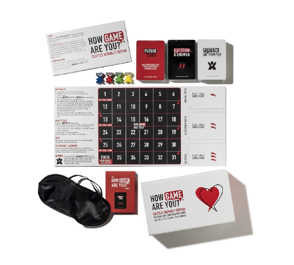
13 Responses to Option F
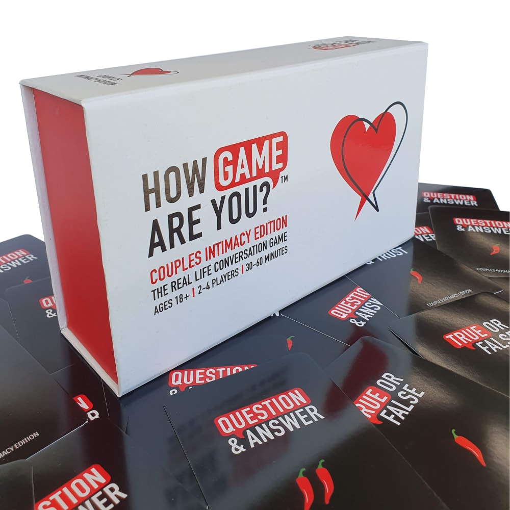
I chose F because you can see all of the contents of the game, and it is laid out very nice. I chose A, C & B next because you can also see the layout but the display is lesser attractive with each choice.
I prefer Option F because it gives a better view of everything you're getting in the game set and doesn't try to hide anything. Options A and C have a good amount of pieces showing, but certainly not as much as F. Option B is the best among the remaining because it shows more than just the packaging.
I like showing all the contents og the game
F CUZ YOU KNOW I LIKE THE BLINDFOLD.. Then the other three because I Like the layout with the cards and everything spread out.
i like how it show it contents and it look like a really fun game to play and learn more about
I like how you can see everything inside so you know what you are buying.
F is my first choice. The layout shows the most clearly everything I'd get with the game, and the layout attractive and interesting. B is my second choice. It doesn't show what all comes with the game quite as well as B, but shows the type of questions and gives me a good idea of what the game is about, and the layout is attractive. A is my third choice. It doesn't show all the types of questions as well as the other two, but I like the layout and everything shown gives me a good idea of what the game is about. C is my 4th choice. It shows the types of questions and what the game is about as well as A, though I slightly prefer A's layout. E doesn't really show anything that is included in the game, just the box which is boring and off-putting, and D's layout seems kind of sloppy and unattractive compared to the others.
I like to see everything that is included. I don't like just the box.
I chose option F first because it showcased all the pieces of the game. I chose the subsequent options because the game was pictured in a way that would allow us to know how many people could play and what is to be expected once we open the box the ones with the clothes boxes don't really give a lot away to whats inside.
I preferred the choices where all the pieces of the game are shown so I would have an expectation of what the gameplay would be. My top choice showed that it was much more than a card game and had some complexity which might make it more entertaining. There was enough of the outer package detail in this choice to let me know that it was a couples intimacy game which is important to know as well. Though the cover stating this was more prominently featured in other choices, I prioritized knowing more about the game play than being able to read everything on the outer cover of the game itself.
Choice F is the best picture. There was a sense of curiosity when seeing the eyemask. It makes you feel like there is going to be some intimacy to share with your spouse.
I chose F as my first option as I feel the fact that this shows the blindfold with the game gives the customer the feeling that this is going to be something exciting and intimate. I think this automatically gives you added excitement for what you are buying and adds mystery to the game. I chose option D as my second choice as the display of the game where it shows the box up close and then the cards spread across the bottom makes the product look very appealing. I also like that it shows a close up of the box so you can read in detail what the game consist of. I then chose A as I felt that display was the next most attractive option and nicely displayed the contents of the box and allows you to see what you will be receiving. Lastly I chose C because I felt that the display of the cards makes the product look more appealing. I don't see a lot of differences but I do feel the way the cards are spread around the product gives it a attractive look that would draw in curiosity from consumers.
images F, A, C, B are the images that I wold like to learn more about. Image F consist of cards, game board, and tab with full instructions. The games seem interesting and fun. This game seems like suitable for the entire family.
Explore who answered your poll
Analyze your results with demographic reports.
Demographics
Sorry, AI highlights are currently only available for polls created after February 28th.
We're working hard to bring AI to more polls, please check back soon.

