Poll results
Save to favorites
Add this poll to your saved list for easy reference.
Which image would grab your attention better in Amazon's result page?
Age range
Amazon Prime member
Education level
Gender identity
Options
Personal income range
Racial or ethnic identity
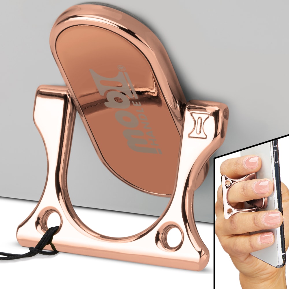
18 Responses to Option A
The mirror in the background of the other option made it seem confusing.
I think the 3 image split on the other is more confusing and would rather it be simpler.
I think the top image serves as a distraction here
A is less busy and is easy to see exactly what the product can do.
Option A would grab my attention with the single frame. I think that this does not overpower the main product. It is easy to capture how the product will work. This image display would make me want to purchase the item.
A is better. The two pictures are identical other than the extra insert frame at the top right of B. I do not think the frame adds anything important and clutters the image. Therefore I prefer A. It is a clean looking and uncluttered and free of superfluous inserts
The extra image at the top right on B is confusing. It distracts me from thinking about the possible usefulness of the product.
I chose A because the image of the hand is subtler and preferable.
I think I like option A better, but neither is really drop dead gorgeous. A just seems more professional and simpler which is appealing. I like that there isn't quite as much going on as in B. I don't necessarily need to see all of the features in the main image; it would be best to have the other images be separate and the main image just the actual product.
The image on the top right is small and clear and I think it's a bit distracting, so I think the ad does better without it.
There is too much in the way of pictures on B
I voted for A-this seems less cluttered, so I would be less likely to tune it out
This image would grab my attention better in Amazon's result page. I find it more appealing, less cluttered, and more intriguing. I feel it allows me to better process the image.
I think A would because it's a nice clear image. B is okay too but a bit cluttered with both the inserts. I don't think they're really necessary.
My choice seems simpler and more streamlined so a much better choice
I chose A. I was a little distracted by the hand in the other photo.
Image A includes one more photo (on the top right side corner) to show the product. The additional photo clearly shows the usage of the product. Customers would be easier to make a purchase decision.
I prefer this one because it doesn't have the extra reflection that is distracting and doesn't have anything to do with the product that I can tell
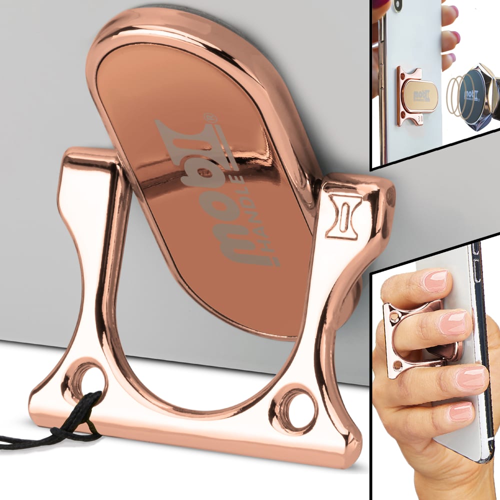
32 Responses to Option B
I like seeing multiple angles
I like products that have multiple images or different view points. Option B has an extra picture that caught my attention more than choice A.
The more angles and perspectives the better.
Definitely choice B. I love the extra set of images and that instills confidence in me and it stands out to me.
like hte side image. can see it in action more
more views and easier to see what it can do.
This option has a clear example of what I should expect from a product like this one. It would make me want to click on it and learn more.
Option A looks "empty" in the upper-right hand corner.
B has another picture to grab your attention.
I like the B one because I get a close up of the item and how it attaches. This is better as I like to see more detail especially these small details.
I like the 2nd inset photo in B
It better utilizes the ad space and makes more sense the more I look at it.
The more pictures, generally speaking, the better. I like having the extra angles here.
Not sure what's going on in the top image in B but it provides additional insight and information and an additional angle of the item.
B tells me more about the functionality of the product rather than A. I like an image that tells me as much as possible. That way I can make the best decision on the product.
B is better for me because it gives the additional viewpoint of the back of the item. I can appreciate that as a visual always keeps me from wondering what I'm not seeing or missing. you want your photos to be as close to being able to pick up the real thing and turn it over as possible.
The "magnetized" image is eye catching because I want to know what is happening; and it also shows more about how the product works and how it is set apart.
Option B is nicer because it is helps visually explain what the connecting mechanism does.
This image shows a more descriptive detail of what this product does. It not only shows how to attach it but how to use it as well.
B shows the magnetic feature. B is the best image to show all the features.
This image shows that this is multi-use. I would much rather have something with multiple functions. I may have scrolled past if I didn't see the extra pictures.
i like them both. depending on pricing for option b if it would be a good investment. why because the magnet that comes with this one would make all the difference in pricing.depends if you can afford the extra or if you really necessarily wanted the extra accessory.
I like the inclusion of the extra detail in the upper right hand corner, which adds more complexity and character to the image. Very cool!
The additional picture in the top right draws my eyes a bit more.
this one has more detail so it should be the default one
Seeing two smaller pictures on the right hand side makes it more eye catching.
It shows more displays
I like how this one shows you exactly how it would work on the phone.
Would like to pick option B is the best design which is more attractive image, excellent color, viewing all the option which is grab more attention.
I think that knowing that the handle is also magnetic is very important for potential buyers.
Shows the additional functionality of the tool/phone stand.
Option B shows how it works a little more clearly.
Explore who answered your poll
Analyze your results with demographic reports.
Demographics
Sorry, AI highlights are currently only available for polls created after February 28th.
We're working hard to bring AI to more polls, please check back soon.

