Poll results
Save to favorites
Add this poll to your saved list for easy reference.
Which image would grab your attention to CLICK ON and why? Which choice looks less attractive to CLICK ON and why?
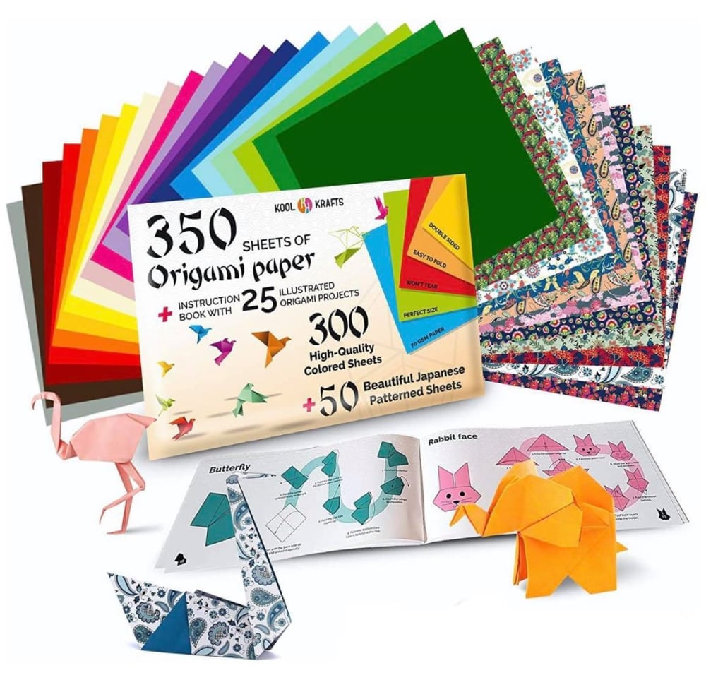
33 Responses to Option A
A is a bit more vibrant and colorful, and draws my eyes immediately. That's the sole reason.
A shows the inside of the book and more examples of the origami. So I think A is a better picture since it gives off more information.
there are more sheets with plenty more colors on this image
Because it shows me everything that I get when I order it, as well as some of the shapes it makes, and the process of making them inside the book.
A's colors are much richer and would be more attractive for people to click on.
I chose Option A because the insert paper and the papers themselves looks more appealing and better draws me to the product as Option B looks a bit more generic.
The origami showed here has nice color and design
I would say that choice A would grab my attention more because it has a lot more going on with the various colored papers and multiple origami designs that are clearly visible. Choice is less attention grabbing because it seems plain in comparison to choice A.
The folded animals have more detail in A and seem more intricate. The animals in B seem so simple and plain that they don't seem like masterful projects at all.
The extra designs are eye catching. I also liked that we get a peak of the origami instructions. The fact that the paper comes in more than just flat colors is very appealing.
I like choice A because the photo shows me everything that is included in the package and it shows me the book opened.
choice A because of the text style on the main product packaging would make me click faster
I chose option A because it shows the inside of the book. I would want to see more of what I am buying.
Option a gives a much higher quality feel to the product.
The patterns as well as the plain colors look and seem the best, as well as the book with the patterns/designs.
I like the asian looking lettering in A it makes it look more authentic
I'm not a fan of the high contrast colors. I dig the warmer ones and the ones with patterns.
I like A because it seems to have more sheets with patterns that I really like. It just looks more interesting than B.
Option A catches my attention more because I feel like it's overall more "bright" in terms of the colors. Option B could use more colors.
A is the most attractive because of the various examples shown compared to B.
While showing a wider array of papers and colors, Option A's biggest selling point is the examples of the folding instructions for the butterfly and the cat. Having tried my hand at origami before, those illustrated, step-by-step instructions would be the most important part of this package.
I think A has a great assortment of origami paper and a booklet for people to learn to make origami. It also has a nice display of things that have been made with the paper.
Shows off more about the product.
I love all the patterns for A. They're fun. And origami is all about shapes anyway, so needing accurate colors for designs isn't necessary.
The patterns on display look much more fun and vibrant compared to choice B.
This shows a lot more supplies. You can see the instruction book and look at one of the pages to see how the directions are laid out. The more details the picture had the better.
Tough choice. Both are very good. I am choosing A because I love the variety of papers shown - I really like the ones with designs. I don't like the placement of the paper animals though it is hard to see them. B shows the animals perfectly but the colors look bland and simple.
I like seeing the variety here and it looks like its just a better selection overall.
Choice A is more attractive to click on because it features patterned paper, as well as an instructional booklet. The font of the text is also more eye-catching.
I think that option A is the better choice for origami. I like that it comes with 300 sheets which means that I wouldn't run out of paper anytime soon and I like all of the different color options for the paper. I also like that there is some patterns on the paper.
I like this one because the paper is more attractive and grabs my attention. The patterns, designs and animals all look nicer. I also like that it shows over 300.
The colors were more interesting as were the shapes in A. B looked more boring and did not have as much color ad A did.
More interesting colors and papers as well as variety of paper. Also gives a better idea of how it helps make the origami.
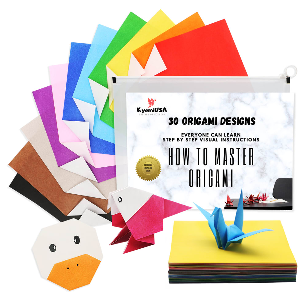
17 Responses to Option B
I love the animal display in front of Option B especially. The cow face is the reason I chose this option.
B grabs my attention because it looks neat and presentable.
I feel like the colors shown on the papers are a lot more vibrant although not as varied
I actually prefer B more because I see everything I need to know and I like how sleek and professional it looks. I like the coors that are offered and there are just enough choices for me to feel happy whereas with A, I feel overwhelmed by the paper designs.
This would grab my attention more than the other choice because of how colorful it is. The other choice is more muted in comparison.
Option B is the more appealing option to me because I prefer the more simplistic visual design elements. First, I like the crane as the primary example because that's what comes to mind when I think origami. Next, I like that only a few folding sheets are displayed and that they're in primary colors. Finally, I prefer the font in choice B. In choice A, there are simply too many folding paper designs and it kind of clutters the image. Also, I'm not a fan of the font of the numbers in option A, although I do like that it shows instructional booklets.
I think this one brings much more value than A does
This looks higher quality due to the fonts overall.
Option B is more modern. This feels more hip. I feel like this will be more attractive to a younger crowd and the use of the graphics here seems better. Option A feels like a classic set for origami. While this works, I do feel that option B is a slightly better image to sell the product.
I prefer Option B because my kids would be happy if I made them a duck like the one in the picture.
The bright colors attract my attention more as well as the origami with faces.
This would be my choice because I like the duck and the bird shown in the picture here. The other image the animals look to generic in my opinion.
B looks more attractive because the colors are simpler and more vibrant. A looks too complicated.
I would click on B because it looks smooth and clean. A is less attractive because the font is a little too stereotypical.
very clean and not clumsy
I like B better because I think the use of the Oriental font on Option A is offensive and tacky. However, I do think that the items in the background of A are better than B. I like that the book is open to instructions and that you can see all the different colors and patterns of the paper. I would prefer A if only the font were different.
I voted for choice B because I love the colors! It is more colorful and attractive and it grabs my attention, which makes me more likely to click and purchase.
Explore who answered your poll
Analyze your results with demographic reports.
Demographics
Sorry, AI highlights are currently only available for polls created after February 28th.
We're working hard to bring AI to more polls, please check back soon.

