Poll results
Save to favorites
Add this poll to your saved list for easy reference.
Which image would you be more likely to click on?
Age range
Education level
Gender identity
Household income range
Options
Personal income range
Racial or ethnic identity
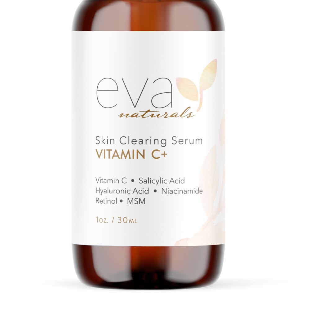
14 Responses to Option A
Choice A has a smoother overall look to the packaging/bottle.
I would be more likely to click on this because of how shiny it is. It looks much more clean and high quality. It grabs your attention more so than the other option
The lighter background makes the text easier to read.
I like option A the best because the darker bottle stands out to me more and grabs my attention.
A had a nice look. The design was pleasing and it seemed interesting to me.
I like that Option A’s packaging leaves more room to view the inside of the bottle. The sticker takes up a bit too much space in Option B.
A's image looks better lit and shows off the product better.
I like how the emphasis is on the label itself, as Option B, in contrast, shows slightly more of the clear bottle.
I like how the bottle is darker, sticks out more to me.
I prefer Option A because it is clearer and crisper and it looks more serious and more professional.
I would click on this one because the label is more centered on the bottle.
I can see more of it
The bottle in option A looks more sleek and appealing.
This image is very shinny and well edited. It makes it look like a clean and well lit product. The whole bottle looks captivating and i love how bright the whole image looks. Everything is visible.
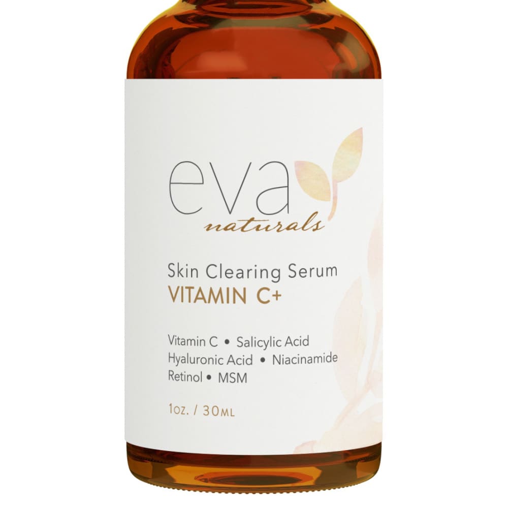
36 Responses to Option B
The color of the serum was a lot clearer. A's looked so dull and blurry to me.
I like these stouter bottles, and I think the label looks a little more bold on them.
The label is more centered and the font used is more bold in B. I choose B.
Contents of bottle appears more realistic
The larger label of Option B makes the product look more premium.
I like that the bottle is not blurred, it seems more natural and less manipulated.
I picked B because A seems a little out of focus and not centered properly.
The bottle looks more expensive and is better framed.
I like the bigger font size on B.
Option B is easier to read. Option A almost comes off blurry with the shininess of the bottle and label
This images is less blurry and you can see what you are getting.
This image shows the liquid inside a bit better so I have a better idea of its consistency.
The glass of the bottle in B is more interesting and draws my attention more than A. The bottle in A looks a little fuzzy or out of focus.
Going to go for image B here, because the text looks crisper and easier to read.
These are too similar. I only chose B because the bottle looks cleaner
I would like this one. It is very nice and attractive. It is attention getting and cool. Thank you.
I like the look of B I like the font and design better
Choice B is the one that I would click on because I like the lighter color that the bottle has. I also like how it is clearer to see as opposed to being fuzzy looking. I like how the white label part is larger as well.
This one looks like there is an oily liquid in the bottle. It makes me think it would be better for my skin.
I think the lighter bottle gives it more character and makes it look less medicinal and more like a helpful product.
The image is clearer and easier to see the product
The blur applied to Option A is distracting
The Option B image have a better quality making it look more clean and attractive to the eyes
This one stands out to me more. I think the text is a bit darker.
I really like the little leaf symbol and feel like it is either larger or more prominent in Option B. I do see that the label goes further down to the bottom of the bottle in B and that there's less of a view of the top of the bottle in A, but I'm neutral on those things. I just feel like the little plant symbol, which I quite like, shows up better in B.
I am most likely to buy option B.
B has a better bottle color and looks more natural.
B has a larger label and a larger Font. It's more attractive and easier to read
I like option B because the product looks more matte in its design.
i would be likely to click on option B because you can read the ingredients easier
B looks like a more realistic bottle and less blurry
This image feels more natural. The blurring on the other one feels way too "doctored". Outside of that I also think the label looks cleaner on Option B.
This may seem like an odd reason but I would choose B because it looks like a real product to me. In option A the bottle is softened too much and it looks fake to me (like any label could be superimposed on the bottle image). Even if A is the actual product it left me questioning it. I like to be able to know what I'm getting so I would trust the image in B more.
This label has a more natural look to it that I prefer, it seems more pleasant to me
B feels more balanced and easier to read. A has a feeling like it is cut-off -- more so than B.
I picked B as my top choice as I like how clear the bottle is.
Explore who answered your poll
Analyze your results with demographic reports.
Demographics
Sorry, AI highlights are currently only available for polls created after February 28th.
We're working hard to bring AI to more polls, please check back soon.

