Poll results
Save to favorites
Add this poll to your saved list for easy reference.
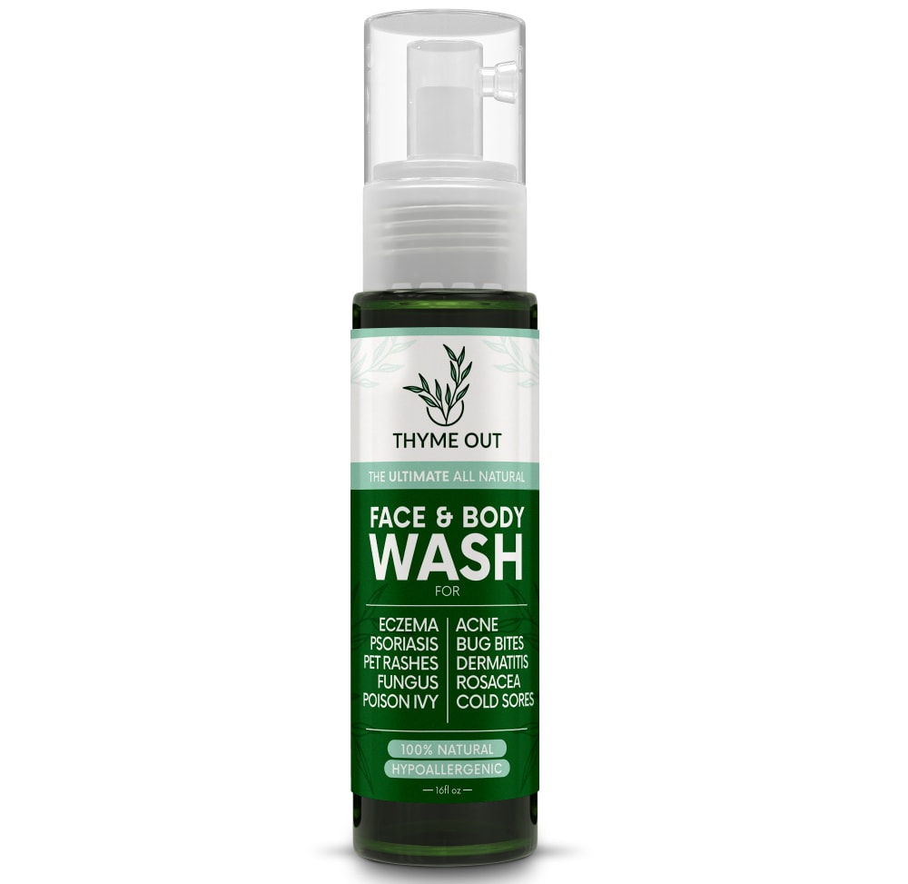
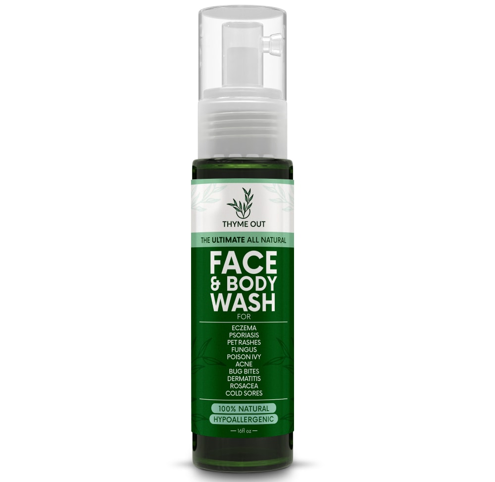
Which label design do you like the most for a Natural Face and Body Wash that uses thyme tincture as a main ingredient?
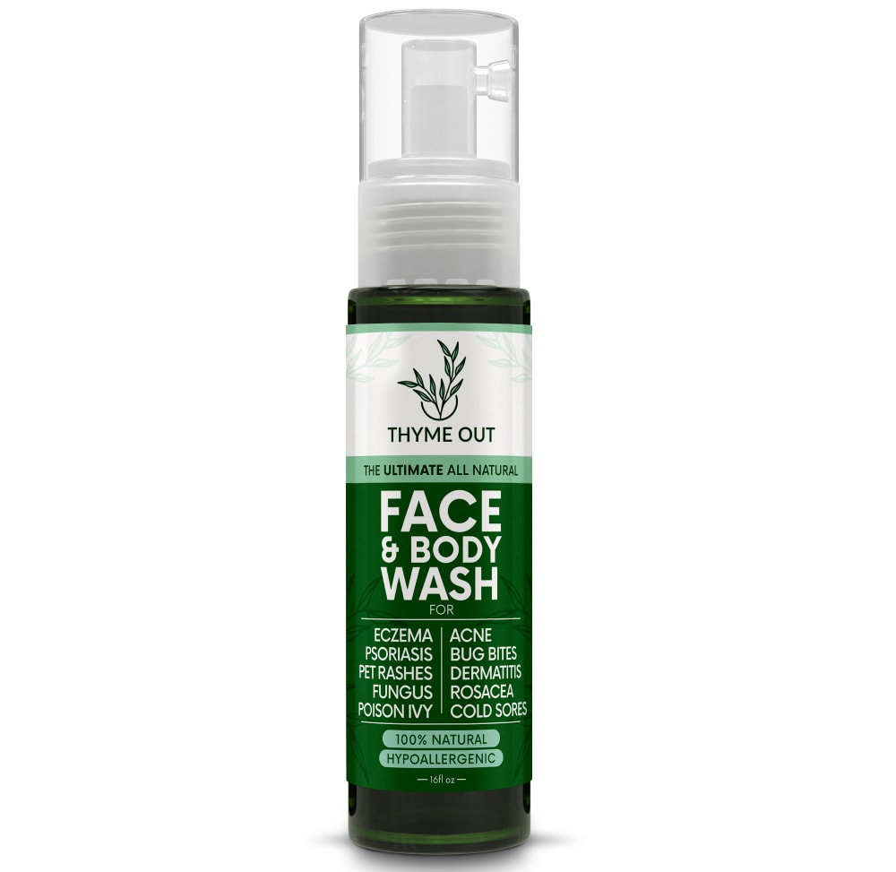
Option A won this Ranked poll with a final tally of 29 votes after 1 round of vote counting.
In a Ranked poll, respondents rank every option in order of preference. For example, when you test 6 options, each respondent orders their choices from first to sixth place.
PickFu requires a majority to win a Ranked poll. A majority winner differs from a plurality winner. A majority winner earns over 50% of the votes, whereas a plurality winner earns the most votes, regardless of winning percentage.
If an option does not earn a majority of votes, PickFu eliminates the option with the lowest number of votes. The votes from the eliminated option are reassigned based on each respondent’s next choice. This process continues in rounds until a majority winner emerges.
Scores reflect the percentage of total votes an option receives during the vote counting and indicate the relative preference of the respondents. If there is no majority winner, look to the scores to see how the options fared relative to one another.
| Option | Round 1 |
|---|---|
| A | 58% 29 votes |
| B | 22% 11 votes |
| C | 20% 10 votes |
Age range
Education level
Gender identity
Hobbies and interests
Homeownership
Household income range
Number of kids
Online shopping marketplaces
Options
Personal income range
Pet owner
Racial or ethnic identity
U.S. geographic region
29 Responses to Option A
I like the labeling on option A and how it lists the details of the wash on the label as well.
I like option A the best because the text on the label stands out the most and grabs my attention.
The single narrow list in option C makes the ingredients harder to read vs. A or B.
Option A's label looks the most clear and professional.
I like the label in option A the best. I like the larger size of the text as it looks more appealing and is easier to read.
I chose option A first because it's natural and hypoallergenic.
I like the bottom part split into 2 columns. And I like the text being black at the top, makes it easier to read.
I think options A and C are best, both look well balanced with their logo and font sizes.
I like that face is larger on the label on A and C. I feel as though the package is too small to really want to use on the body. I like the size of the logo on A.
This label makes bold this product and makes me feel confident that the quality is good and it's a real natural face and body wash that uses thyme as a main ingredient.
I like the layout of the benefits in A/B. A is more eyecatching and the product name is easier to notice.
the colors and labels look really well on this option
A is the most balanced. I like that B and A both have the lower wording divided in half. C looks too vertical and top heavy.
I like the "condensed" look. Especially in A. I think it's as equally proportioned as possible to be able to read it clearly.
I prefer option A because I think that it is the most premium and visually appealing product label design and color scheme out of the three options.
I like how it's broken up visually and the text is easier to read.
A is good. It has enough information and the label is a good size. B lacks information and C just looks too small.
The design in Option A looks very nice and the most appealing to me
the write up are written bold and its not constraining for one to read out the text
I like A the best, but all three a very good at letting me know what to use this for and feeling knowledgeable about the product.
This design has very big and bold text that is easy to read and makes it very attention grabbing while also clearly highlighting some of the products key features
A has the best combo of logo and wording. The wording should stand out more like in A and C but the logo is better in A and B.
I like the way the ingredients are listed side by side. Also, having the 100% natural in black looked better than white like in pic B.
easier to read from product pictures
I like the spacing on option B best, the name stands out the most. In Option A Face and Body wash sticks out and the rest kind of withdraws to the background. Option C everything seems tiny because of the layout of the bottom.
Choices A and B are the two designs that I like the most because I like how they have the white area with the logo and name of the brand be so big. It makes it so that you know it, which is important since thyme is the main point of it. Choice A is ahead because I liked how it had the face and body wash wording ordered better and some of the coloring better compared to Choice B. Choice C is last because the thyme out part is too small.
I like how the logo is big and what its used for and the coloring. B, is same as A but the colors for little different hard to read. C) is just really hard to read
Top choice has the best balanced font size , which clearly displays the product function in a readable size
Option A is the best choice by a large margin because it's less cramped and the logo/product name is readily seen as well as the ingredients. Option B is the second best choice because it's similar to A but the details toward the bottom are harder to discern.Option C is the worst choice of all because it looks too cramped and just too busy to make heads or tails of at a glance.
11 Responses to Option B
I like B the best because the size of the firm logo is large and easy to read.
I find B is the best balance of emphasizing the thyme logo and being legible. A is similar, but I don't like how much space the "face & body wash" text takes up in the layout. The product attributes in C are written in a font size that is too small to see well, therefore it is my last choice.
The layout for Options A and B (which appear to be identical) are better than the one-column layout of Option C.
I think B is the most appealing and is the easiest to read at a glance.
I think option B stands out from the rest. The font on the bottle is very eye-catching and memorable.
B is the least wordy and does not look cluttered
I like when the wash part is accentuated more, it makes more sense to me.
the name and the face and body worked best on B for me...on the others teh first impression is its either face or body
I like option B because it provides the most information which is important for the consumer!
I prefer option B label design looks clean. I choose this because it stands out more.
I think this option shows the product in a way that gets your attention and it's easy to read.
10 Responses to Option C
The print seems to fit the best on C, but isn't your face part of your body?
I like C the most because it is the least cluttered and easier to read
C looks very sleek, A looks professionally done and B looks similar to A (could not tell much difference)
I think C is the most well organized and looks the best aesthetically to me.
A and C are interchangeable in my book, The FACE part being big is the important part that would catch my eye.
Very little difference
A. Put the bad stuff in small type, so I don't get reminded every time I see the bottle.
I like A and C first because they have bigger font for the product label.
I went with option c compared to the other because the design on the label stands out more compared to the other's and the descriptions better
Options C and A are equally good. I like the bold font, help me make a decision quickly when I am browsing. Option B may be the same product, but the smaller font requires slowing down why shopping. I prefer Options C and A over Option B.
Explore who answered your poll
Analyze your results with demographic reports.
Demographics
Sorry, AI highlights are currently only available for polls created after February 28th.
We're working hard to bring AI to more polls, please check back soon.

