Poll results
Save to favorites
Add this poll to your saved list for easy reference.
Which label design do you like the most for a Natural Skin Treatment Brand that uses thyme tincture as a main ingredient?
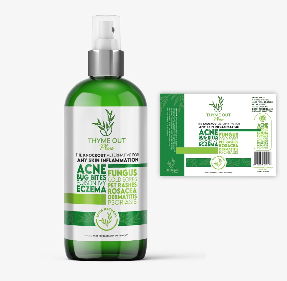
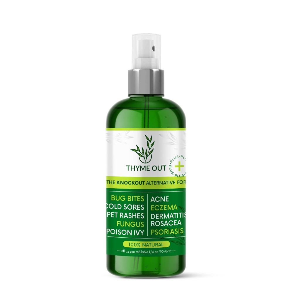
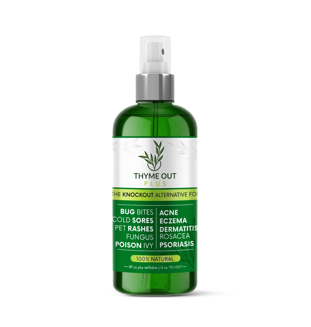
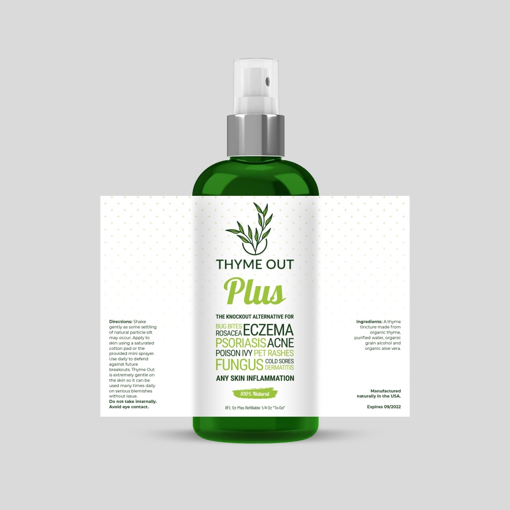

Option A won this Ranked poll with a final tally of 27 votes after 7 rounds of votes counting.
In a Ranked poll, respondents rank every option in order of preference. For example, when you test 6 options, each respondent orders their choices from first to sixth place.
PickFu requires a majority to win a Ranked poll. A majority winner differs from a plurality winner. A majority winner earns over 50% of the votes, whereas a plurality winner earns the most votes, regardless of winning percentage.
If an option does not earn a majority of votes, PickFu eliminates the option with the lowest number of votes. The votes from the eliminated option are reassigned based on each respondent’s next choice. This process continues in rounds until a majority winner emerges.
Scores reflect the percentage of total votes an option receives during the vote counting and indicate the relative preference of the respondents. If there is no majority winner, look to the scores to see how the options fared relative to one another.
| Option | Round 1 | Round 2 | Round 3 | Round 4 | Round 5 | Round 6 | Round 7 |
|---|---|---|---|---|---|---|---|
| A | 20% 10 votes | 20% 10 votes | 20% 10 votes | 24% 12 votes +2 | 30% 15 votes +3 | 36% 18 votes +3 | 54% 27 votes +9 |
| E | 14% 7 votes | 16% 8 votes +1 | 16% 8 votes | 18% 9 votes +1 | 24% 12 votes +3 | 36% 18 votes +6 | 46% 23 votes +5 |
| B | 10% 5 votes | 12% 6 votes +1 | 18% 9 votes +3 | 22% 11 votes +2 | 24% 12 votes +1 | 28% 14 votes +2 | Eliminated 14 votes reassigned |
| F | 16% 8 votes | 18% 9 votes +1 | 20% 10 votes +1 | 20% 10 votes | 22% 11 votes +1 | Eliminated 11 votes reassigned | |
| C | 14% 7 votes | 14% 7 votes | 14% 7 votes | 16% 8 votes +1 | Eliminated 8 votes reassigned | ||
| D | 12% 6 votes | 12% 6 votes | 12% 6 votes | Eliminated 6 votes reassigned | |||
| H | 8% 4 votes | 8% 4 votes | Eliminated 4 votes reassigned | ||||
| G | 6% 3 votes | Eliminated 3 votes reassigned |
Age range
Education level
Gender identity
Household income range
Options
Personal income range
Racial or ethnic identity
10 Responses to Option A
I really like A. It stands out the most, it looks like other products but it also doesn't look so weird that it would be out of place in the Health and Beauty section.
I only really like A out of the whole group. They all (in varying degrees) look generic to me, so I would question the quality. Only A looks least generic and might be good for me. I also can't tell the difference between B and H, so I just guessed.
I picked option A because the text on the packaging against a white background is the most appealing.
My top three choices most clearly define the product ingredients and purpose which would most likely catch my eye.
A is the best option because it's very nice looking with the best label. Other than that, the deep green is very nice also.
Option A has a lovely silver label and color scheme going on. The shininess of the bottle itself in the advertisement is a great representation and really drew my attention in. It’s not over the top or bland and feels just right in the middle while serving it’s purpose. E & F have a similar style but I do like the gold on option E as it makes it seem a bit higher class like the silver on A. C has a style of its own but it seems like a lot and very cramped on the label itself. D - H all have similar styles and they do not stand out compared to option A on its own. All together they don’t have the zest to them with the white labels, even with the gold borders/trim.
I prefer option A. It has a nice uncomplicated look. I like the different tones of green on the label.
I feel that A looks nice and organized. I really like the way the spacing and the font looks like. E,F and C are decent but they feel a bit bland and unoriginal. They don't really stand out the same way as option A. B,H,D and G look a bit off and I don't really like the overall appearance of the labelling design.
First choice was option A, because the lettering is easy to read, the bottle makes sense, it's not too cluttered, and the more white on the label (as opposed to the more green) makes the bottle look more slim and pretty.Second choice is option G due to the fact that again the label is easy to read and there is more white on the label than green. Third choice was option D, as again very white label. However, the green block over the lettering doesn't let you be able to read the label very well.Fourth choice was B and fifth was H, due to the fact that again the label is extremely green. The lettering on it clutters the label and makes is extremely hard to read.Sixth was C, because the entire label is just works and doesn't make any sense. I assume that is what the bottle will treat, but the way the label is on this bottle - it would seem the name of the product is "THYME OUT ezcema psoriasis".Seventh and final choices were E and F, because again the label is completely dark green. It's really hard to read, but at least there is a division between the brand name and the illnesses it can treat.
I THINK OPTION A GIVES THE MOST INFORMATION AND IS THE EASIEST TO READ AND UNDERSTAND
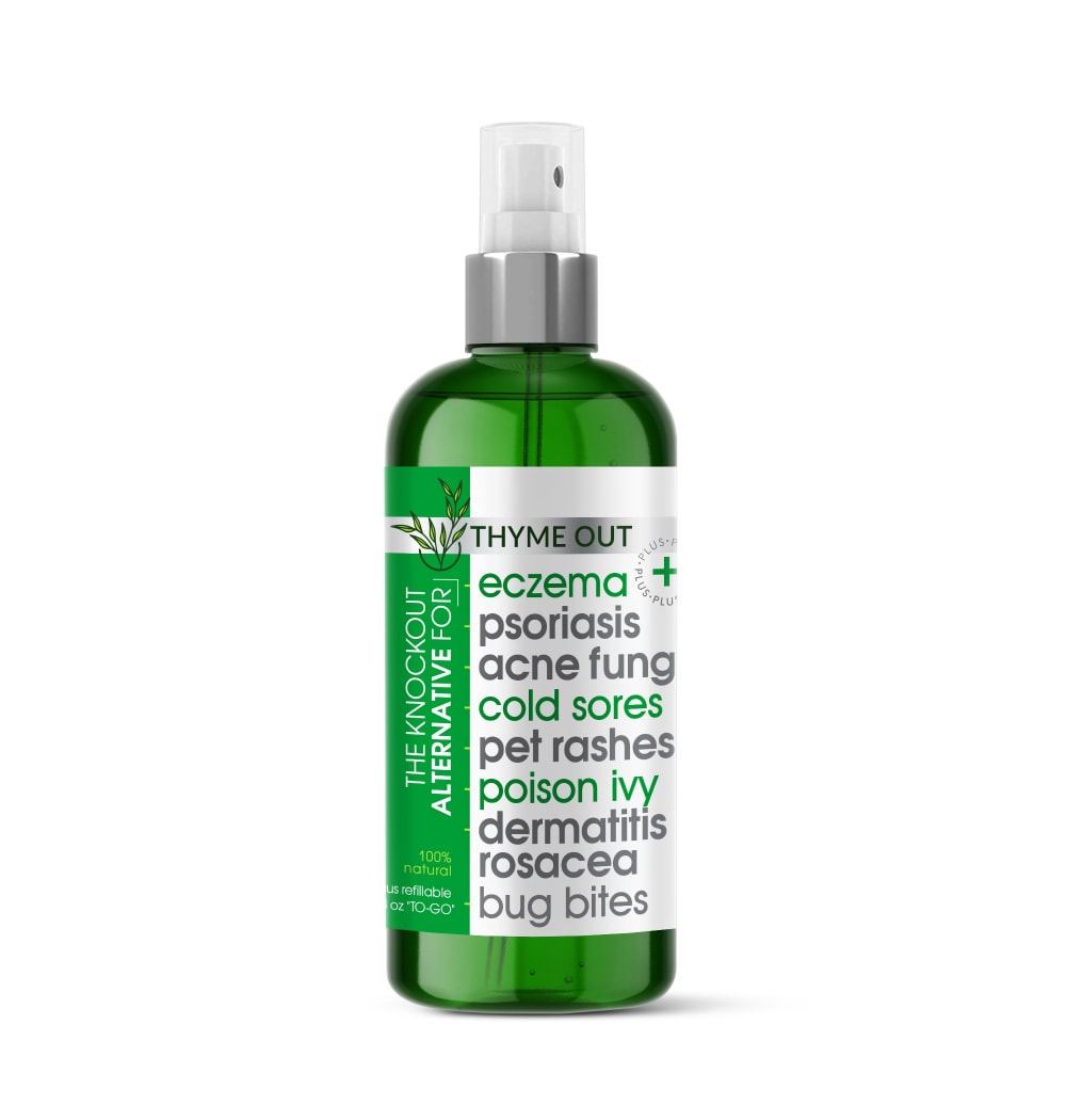
5 Responses to Option B
the name really stood out to be on B first. On C it gets lost...i would have put it last but didnt realize there were two more options.
I ranked based on the option details
I like the options that help you see the label better and I also love when it is clear that thyme is in the product
Shows in details that will be best used on the skin and meet the needs of others.
I selected the label designs that I found to be the most visually appealing, eye catching and beautiful.
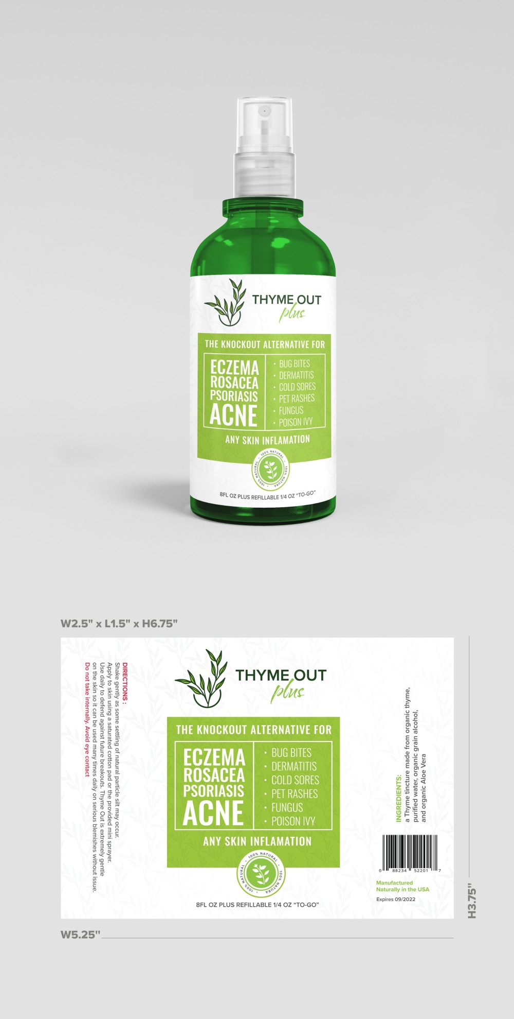
7 Responses to Option C
C has such an easy to read indication label, I feel like I'm saving money buying this with the multiple uses.
I chose my answers in the order that I liked them. Option C was my favorite because it has the easiest label to read.
C because I think that it is a fantastic play on words and has a very strong brand presence in the coloring and wording.
I picked these options in this order according to which one had the most attractive design and gave me the most information. I picked the ones that were easy to read and were vibrantly colored
It felt easiest to read the benefits and uses in c
The font with the names of the conditions the product addresses is attractive. It has a fun vibe.
This one is the easiest to read because the font is bigger and it tells you exactly what it is used for.
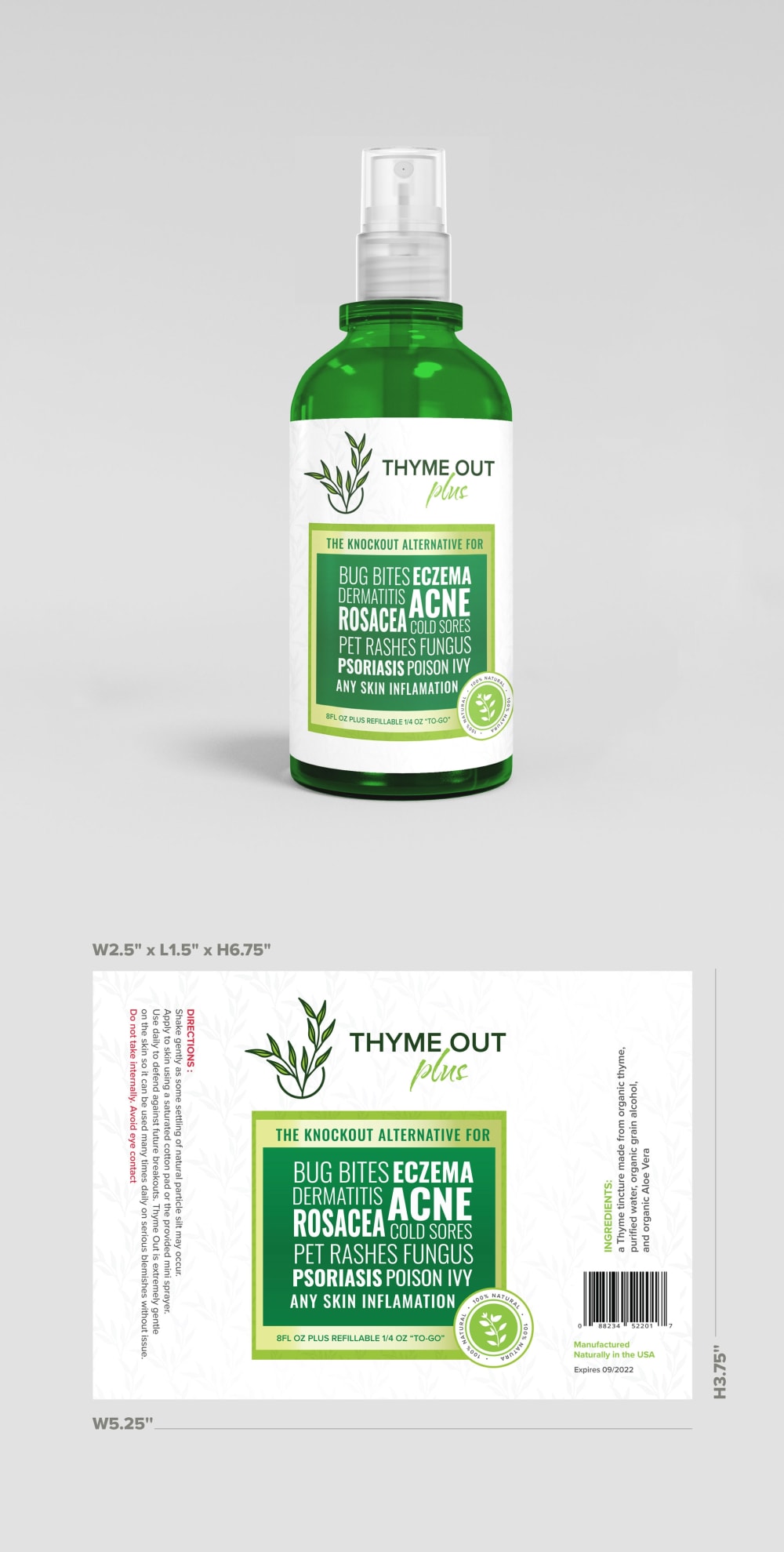
6 Responses to Option D
The font was too large in C and looked tacky as a result. I liked the options that featured lighter and brighter label colors with more subtle and delicate fonts as these seemed more refreshing, cleansing and elegant. I disliked the options with heavy dark green hues.
The label design I like the most for a Natural Skin Treatment Brand that uses thyme tincture as a main ingredient is Choice D because of the white and bright green color used in the labels, which pops out from the darker green of the bottle. The design elements of the label are very appealing and incorporates the coloring of the main ingredient, which is very clever.
Option D, looked the best. It had nice color tones and the overall look was nice. Option G and B looked good but I prefer the lighter green look of D more. Option H looked similar to option B. Option A and E looked design wise didn't look as nice. Option F, looked a bit too busy in terms of the design. Option C looked a bit cheap in terms of design which is why I ranked it last.
My choice is option D as rank 1 because of the product package design is described the product details very well so i choose this as my choice and also the skin care product i use daily in my house is this type of product oonly.So i eagerly bought this product.
I preferred the products with the lighter label. These seem more natural and easier to ready. Options B, F, E and C were too bold for me. C was last, because it seemed like the product was shouting at me.
I like option D the best because the logo looks fresh and clean. I think the white background with green text makes me think of nature and cleansing my skin. I think all of the logos look nice and appealing for the product.
7 Responses to Option E
I like the darker design. It’s simple yet effective and eye catching.
I like E because I like the white at the top and the darker green on the bottom with the thin neon green band. I also like the neon font on some of the conditions it treats. It stands out for me above the others. I like F a lot too but not quite as much as E. The rest for me are just okay.
i put them in order of what i thought was the easiest to read cause i feel like that would be more eye catching if they are easy to read. i like the ones that are listed in a nice order with nice colors cause its easier to read.
This option is my favorite because the design on the label is bright and very detailed. I think that my next two options had the same features but did not catch my eye as much.
I like the amount of green on this one the most and I love the pattern and the design the most on this. It pops out a lot.
I think that choice E is the best because it is simple and straightforward without a lot of frills and fluff.
I prefer the darker green labels. The text is too cluttered on all of them though.
8 Responses to Option F
the greener ones look better than the whiter ones. the whiter ones seem too plain. the green add more personality to the brand
I feel like less is more for natural products. I like the simplicity and color blocking of options F & E
I like the clearness of the single bottle. Overall though I think there should be clearer descriptions. They are hard to read.
I chose option F because it looks more professional and it states the most important things I want to read right on the front.
I like F the most. I like the coloring on this label the most. I like that this picture really just has the bottle in the picture and let's the focus be on the product instead of distracting us with the label
I ranked based on the layout design
I ranked these in the order of which labels I think are more organized. F,GD,E and A, I would definitely click on and probably purchase. The rest start to look a bit disorganized and the words get jumbled up, it just looks confusing. I chose C last as I don't like the large list of what it does, it is like yelling the words at you lol.
I ranked them based on how high quality each one looks. It was mostly based on intuition and what my eye was drawn to.
3 Responses to Option G
it looks like a higher end product
I like this one the best it stands out the most , I like the information on it
Option G has the information I'm looking for while keeping everything in a layout that I can follow. It's visually interesting, not boring, yet not too overwhelming.
4 Responses to Option H
I feel like this one is the most aesthetically pleasing with the green background and white text. I like that some of the more "important" words are larger
H and B are the best labels, in my opinion, as I find them to be the most visually organized. They share a lot of information without the label looking overwhelmed and cluttered.
I really like the labels that are listed below the actual bottles, it lets me look at it I want or can choose to skip and proceed to the listing.
I think the first two are the easiest to read ones. I would choose those because I don't like to have to try and deduce what something is saying.
Explore who answered your poll
Analyze your results with demographic reports.
Demographics
Sorry, AI highlights are currently only available for polls created after February 28th.
We're working hard to bring AI to more polls, please check back soon.

