Poll results
Save to favorites
Add this poll to your saved list for easy reference.
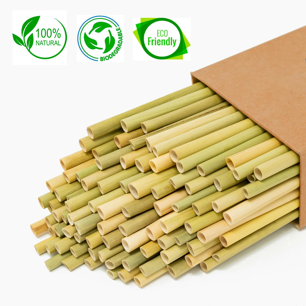
Which listing photo and Why would you click first to explore more about product "Premium Grass Straws"? - Could you please suggest improvement for photo A and B?
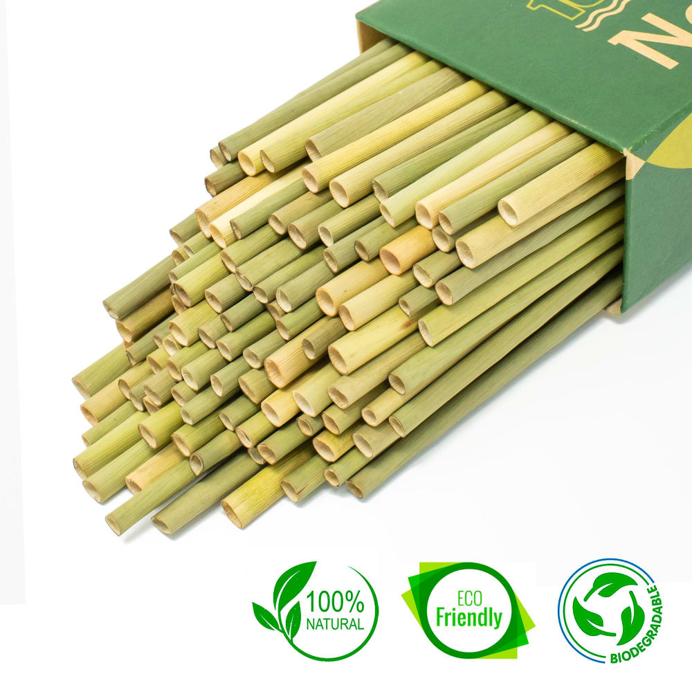
Option B won this Ranked poll with a final tally of 28 votes after 2 rounds of votes counting.
In a Ranked poll, respondents rank every option in order of preference. For example, when you test 6 options, each respondent orders their choices from first to sixth place.
PickFu requires a majority to win a Ranked poll. A majority winner differs from a plurality winner. A majority winner earns over 50% of the votes, whereas a plurality winner earns the most votes, regardless of winning percentage.
If an option does not earn a majority of votes, PickFu eliminates the option with the lowest number of votes. The votes from the eliminated option are reassigned based on each respondent’s next choice. This process continues in rounds until a majority winner emerges.
Scores reflect the percentage of total votes an option receives during the vote counting and indicate the relative preference of the respondents. If there is no majority winner, look to the scores to see how the options fared relative to one another.
| Option | Round 1 | Round 2 |
|---|---|---|
| B | 50% 25 votes | 56% 28 votes +3 |
| C | 40% 20 votes | 44% 22 votes +2 |
| A | 10% 5 votes | Eliminated 5 votes reassigned |
5 Responses to Option A
I think the closer-up shots of the straws looks the best; you can see the color variety and texture better.
They're all super enticing, bamboo straws are huge right now w/ good reason
interesting layout and presence of seals
I like the color of the box in A. I can't really suggest a better photo I think these are pretty good but maybe a glass of water with ice and a straw in it. That way you can show the product being used so people know for sure what it is when they glance at the photo.
All three are the same. I find plastic better.
25 Responses to Option B
I really prefer the greater geometric complexity of my top choice. It makes it more apparent at a glance that it is not chips or pasta (my first two guesses).
I like the green box the best, I also like the labels stating that the product is all natural.
I feel I ranked these in the order which not only shows a good picture but has the ECO friendly, 100% natural and biodegradable stamp at eye level and catches my eye.
I chose option B because I like the contrast between the straws and the green box. I'd like it if one or two of the straws were out of the box and you could see the entire straw.
i guess B or A to see what all those certification circle are about
I like the color choice of the box, it helps bring the colors of the straws out. I also like the multi length of the straws coming out of the box. Option C needs to be lit better, there is too much shadow on the straws.
I picked based on most appealing colors and then level of detail.
Photo B looks great. Placement is perfect, product and packaging look very nice, and the environmental logos are easy to see. I feel similarly about A but, I don't care for the plain brown box. It needs a logo or something to be visible
I like the greener tone of the packaging.
I was very confused by the photo so I had to read the details. I am not real sure how I feel about grass straws. Option C could really use more detail. I liked the detail of B and A but thought the color of B was best.
much better layout
"B" looks like a bigger package and more "clean" than the others.
B looks the best since there are so many of them, then C I didn't like A due to the fact that you can't see the box as much
I think the images either need a different background color or something because the white background makes it dull and unappealing
I like B because it shows the openings of the straws and prominently displays the symbols for them being eco-friendly. I like A because it shows the same things as B, but somehow I feel like the symbols are displayed better in B. C doesn't show the openings as well and only has one symbol.
I would click on option B first to get more information. For A and B improvements I would show more of the packaging while keeping the 3 green labels that are on both.
I like the green. I like the green box and the green labels. I find this one more appealing and eye catching
The green label and extra information really help it stand out for what it is.
I like option B it just really looks eye catchy. The box and the product are both green which makes it more appealing to the eye. I think displaying the whole box can better give the buyer a good idea of what the product is about and the size.
B has more information and I like the green box. C has more information than A.
looking good and well
I liked B and A that give a close up on the straws. It looks like there are a lot in the box.
I like the color of the box and the position of the product in Option B. I think it is important to have the banner of stamps of certification. Having three stamps is better than one but is not overwhelming.
option B seems like a better value assuming they are all the same price looks to have more included option C is my second choice having branding on the package
The green box gives a direct indication that there is something that is recycled and healthy about the enviroment for these straws. I can see right away that a consumer would be able to choose the green box because it would be best for the enviroment. And then labeling the straws upfront show the responsibility of the manufacture that gives the consumer that little hint that buying this product would be the best thing for the Earth.
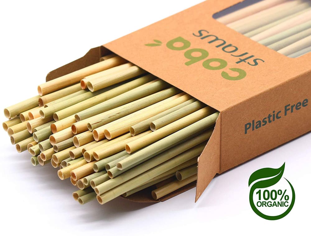
20 Responses to Option C
its good to see the writing on the package, encouraging to see organic and plastic free.
I went based on the images, rather than the logos, and the order I picked was just the most pleasing to my eyes
I like seeing the box there. I think that makes it easier to know the product and brand name with that showing there. Looks more balanced and that Coba stands behind the product as well.
I like the packaging with the letters on it.
i think C is the most appealing based on the color packaging and the layout
Voted based on overall presentation and which photo showed the product in greatest detail.
A and B pictures should give more information about a box, now they are almost invisible. Also good to know weight of this box. C is the best option here.
C: Shows more of the product box and the 2 contrasting colors (green/brown) make it more interesting.B: Looks like more product in image but specifications are too manyA: I cannot tell what the product is
I prefer the angle on C the most, and that you see more of the box. Out of the three it's the one that drew my eyes to it right away
My first choice looked the most "real".
C- looks the neatest with good quality strawsA- enjoy the packagingB- straws stacked too tall
C has the best pic of the product. It shows the product, the box, and the brand.
C the carton has a clear see thru on the front and natural colorA The carton has a natural colorC THe carton is green and I would perfer natural color
All choices look good, but I like the ones that show more of the packaging a little better
It shows it is organic free and such but I would know what material is used so I would click to find out.
I like being able to see more of the box so I can get a better sense of the size of the straws. I also like the lighter, undyed looking boxes.
one of these images look like traditional straws to me. The only reason I knew C was straws was because of the text on the box. B & A should also have visible text. I don't think people would know that these are straws. The almost look like pasta to me.
I think Option C presents the product in the most positive light. You get a fuller view of the product and a better understanding of what it is and how you could use it. I think seeing some more text about the product on the image would give you better idea of what the product is and how it is useful. Option C would gran the attention of the widest audience of people and would make them more likely to click further to learn more.
I'd recommend that the box does away with the green color. It makes the product look more natural if it's in a brown box.
A and B look like something to eat, like pasta. The word "straws" needs to be in the photo.
Explore who answered your poll
Analyze your results with demographic reports.
Demographics
Sorry, AI highlights are currently only available for polls created after February 28th.
We're working hard to bring AI to more polls, please check back soon.

