Poll results
Save to favorites
Add this poll to your saved list for easy reference.
Which listing photo and Why would you click first to explore more about product "Premium Grass Straws"
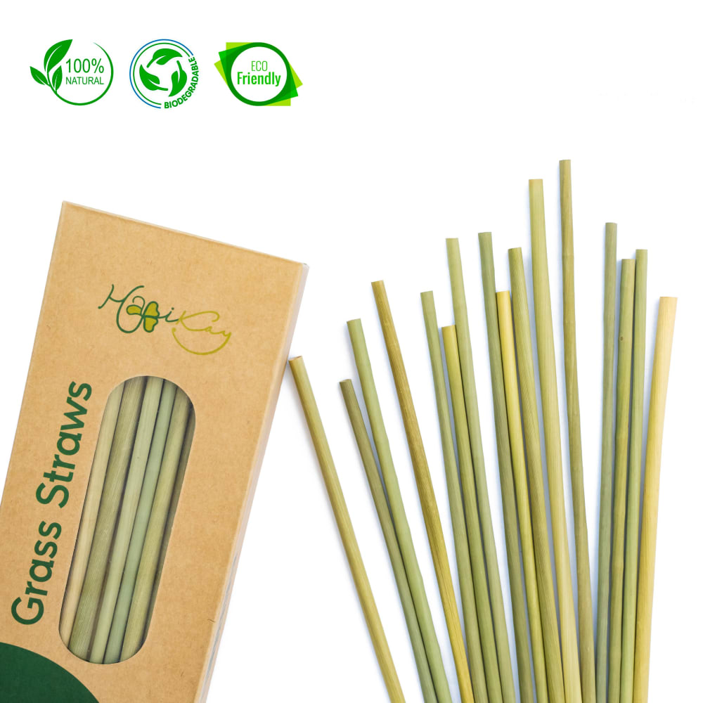
Option C won this Ranked poll with a final tally of 30 votes after 4 rounds of votes counting.
In a Ranked poll, respondents rank every option in order of preference. For example, when you test 6 options, each respondent orders their choices from first to sixth place.
PickFu requires a majority to win a Ranked poll. A majority winner differs from a plurality winner. A majority winner earns over 50% of the votes, whereas a plurality winner earns the most votes, regardless of winning percentage.
If an option does not earn a majority of votes, PickFu eliminates the option with the lowest number of votes. The votes from the eliminated option are reassigned based on each respondent’s next choice. This process continues in rounds until a majority winner emerges.
Scores reflect the percentage of total votes an option receives during the vote counting and indicate the relative preference of the respondents. If there is no majority winner, look to the scores to see how the options fared relative to one another.
| Option | Round 1 | Round 2 | Round 3 | Round 4 |
|---|---|---|---|---|
| C | 32% 16 votes | 34% 17 votes +1 | 42% 21 votes +4 | 62.5% 30 votes +9 |
| D | 22% 11 votes | 26% 13 votes +2 | 30% 15 votes +2 | 37.5% 18 votes +3 |
| A | 22% 11 votes | 24% 12 votes +1 | 28% 14 votes +2 | Eliminated 14 votes reassigned |
| B | 14% 7 votes | 16% 8 votes +1 | Eliminated 8 votes reassigned | |
| E | 10% 5 votes | Eliminated 5 votes reassigned |
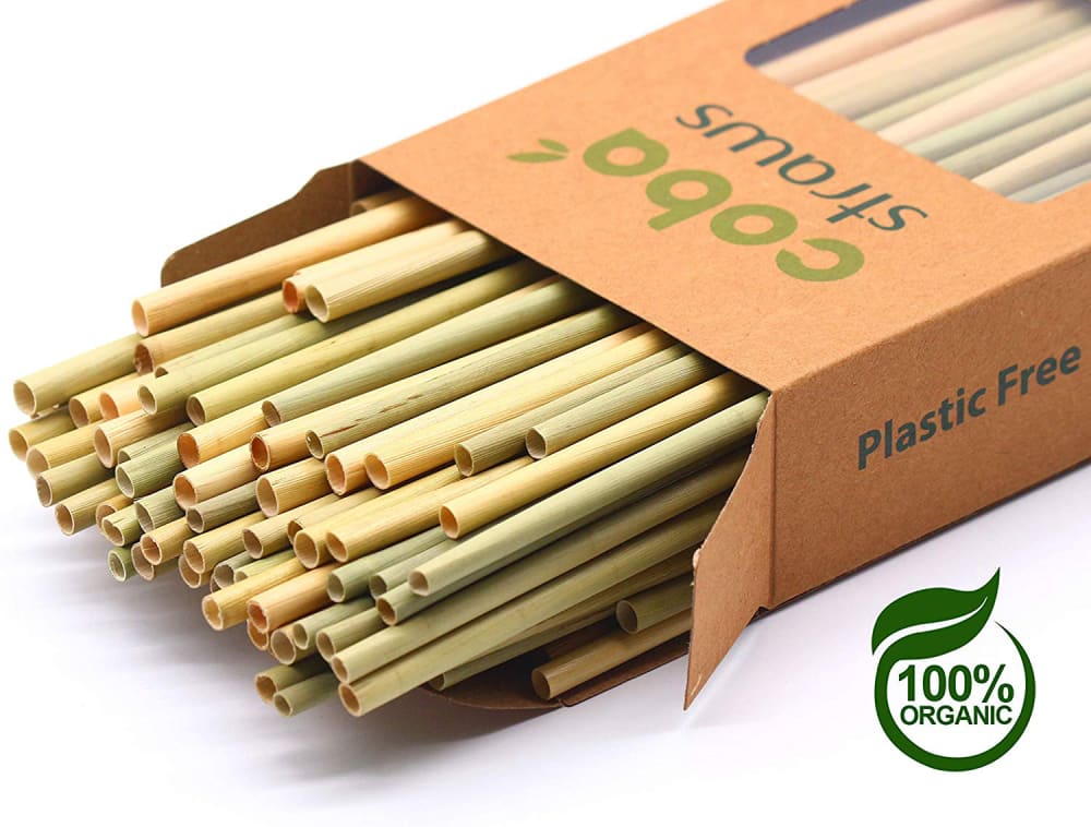
11 Responses to Option A
I chose option A first because the image is very clear and allows me to see the product a lot closer than the other images. I chose option D second because the product in the glass allows me to imagine the size of the straws as well as get a good look at the product with its intended use. Lastly, I chose option B, because I can see the product in its packaging and it looks as though I get a decent quantity.
Option A provides the best, closest view of the straws.
I was attracted to the imagery of the straws coming out of the box. It gave me the feeling that this is something I would be using. I liked option A best because I found the color of the box to be more appealing. On option C and B they were both the same color box but the organic symbols etc. were larger and easier to read making it my second choice.
A is the best for me because I can see the lumen of the straw the best in this one. It looks like I could use these the easiest. I think these look the most natural as well. This is a good product and helps the enviroment
I like the box in A. It is lighter color and it is appealing to the eyes. My second choice is C because it does not look all bunched up. I like the image because it does not look cluttered. My last choice is D. I like how the straws are fanned out. They are arranged artistically.
Just chose what looked most athesticly pleasing to me.
I prefer the choices that are closer up so you can see the product better.
A lot of these photos look like boxes of pasta.
A. I like the close up of the straw. I can see it and picture myself using it./ C. I also like that I can see the straws, the green on the box is nice./ B.I like that I can see the straws. Grass label on the box catches your eye.
feel like these give the best close ups of the paper straws to help you determine how quickly these will dissolve in your beverage
Options A and C have the best photo for seeing the actual product in a good way. E is okay when it comes to showing what it is as well, but I like how they are in the box still and have a close up of shot of them.
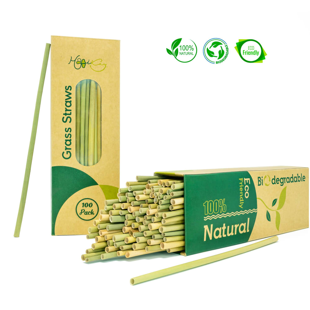
7 Responses to Option B
these would be the images I would be more interested in and I would click to learn more as well
These images show the straws in multiple uses
I much prefer the brown box over the green. I also don't think that it is necessary to include a glass to show how said straws might be stored or displayed. I think B offers the most information and highlights the product well.
I chose option B because of the 3 circular labels, the layout of the boxes. I think the symbols are very important and the display just looks great.
the straws look upscale and interesting and are aligned in an original way.
I would choose B first because of the set up of the images. Honestly though I would select any, because I have never seen these before and I I very curious. I love the glass with the straws in it for option D.
option B is the most visually appealing, its showing me the packaging structure, I also really like the coloring of the box, makes me believe this brand cares about the environment perhaps using recycled materials for the packaging. I also like the grass straw being showcased next to the box, giving me the sense of the length of the straw. I also like the three messages, 100% natural (which the coloring of the box confirms), ECO friendly, and biodegradable. before even reading these three features, the structure of the box and the coloring of the straw it gave me most of the information.
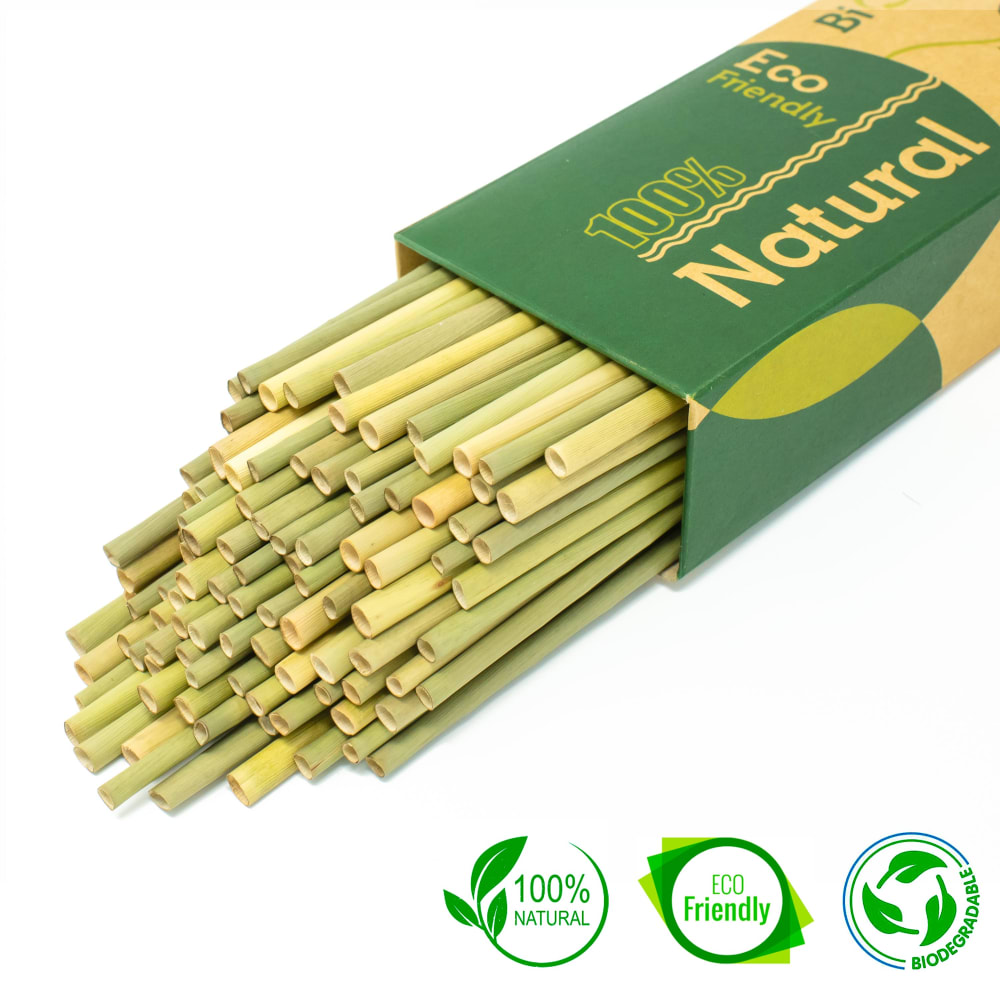
16 Responses to Option C
this one c is a good choice for grass straws love that concept perfect, then a it is good too but c is better then d d is a really cool shot, but I like the close up
All of the three options I chose, the product presentation was good. It presents the product in a useful and clean manner.
The logos are the best when they are large enough to see. Makes you want to learn more about the product.
all are asolid I just like how the green shtuff looks... it looks better
I like seeing the straws falling from the box and the labels give me more information
All three choices show a little bit of the inner part of the straw opposed to the other choices. I liked choice C first because it included all three stamps of being natural, biodegradable, etc. The second choice is also a nice closer look at the top of the straws but only one symbol on the picture. The option B was last because while it shows the inside of the straws, it is not as zoomed in as the other pictures.
Option A has a more detailed close up picture of the product. I like that you can see it from the angle of the ends of the straws. It gives me a better idea of the size of the product. Option B is good as well, but not as close up. When looking at Option E, at first it looks more like spaghetti. I wasn't sure what I was looking at until I read the box.
I would want to find out more about the grass straws from these images because the other images make them look like edible snack or vegetable straws.
Option C has a nice close up shot of what the product looks like so the buyer knows what to expect. Option B Has a lot of information on the package that the buyer might find useful. Option D shows the size of the straws when placed in a glass which might help a buyer determine if the product is right for their need
It's a good presentation of the product without unnecessary extras, but with the useful badges that give more information. My second and third selections were based on similar criteria.
I picked the first two because the green on the straws are more vibrant. i also liked the presentation of the straws splayed out it caught my eye more than the ones in the cup.
I like being able to see the straws in the package. There is something very satisfying about it.
I think having a closeup look at the straws sticking out of the box is really engaging; it piques my interest.
These look good and make me want to learn what goes into it
On Options C, D, and E it's easy to see the straws. They also make the straws look attractive.
I like the more 'natural' looking pictures for these products. I want to have an all natural product.
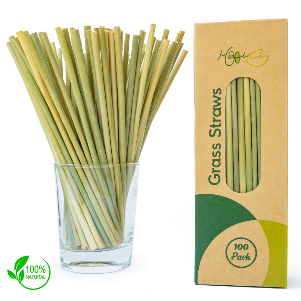
11 Responses to Option D
This product presentation has the best view and I can see clearly this product. This is why I would consider it as a purchase.
They look like they are better quality
D is artistic and that got my attention first. The straws are also in a glass. B shows the view in the box and approx number. C is a close up of the straws and shows the color variation.
D was top choice because it was clearest that the product was a drinking straw and their presence in a cup further helped illustrate that point.. E and B were the next easiest to tell, but no where near as well. The other options and even E and B to some degree kind of looked like a pasta product.An image with the package and only one straw in a beverage would be an even better choice.
I picked D as my first choice, I like the set up, it is very clean looking and pleasing to the eye, You can make out everything really simple with no second guesses. You know right off these are straws for drinking. I then picked E as my second choice, while not as pleasing to the eye as my first choice, It still is a nice display of straws and you know what your getting and the seals up the top are also laid out nice. Then for my third choice I picked B, you still get the gist of things, is it laid out nicely, the seals fill in missing details and still pleasing to the eye.
Choice D is tops purely for presentation. Same with choice B but choice D looks so much nicer. Choice C is last because of the large "100% Natural" branding on the box. It just highlights the product nicely but not as nice as the first two.
I chose the images where I could get a better idea of the size of the actual product.
I chose D as my favorite because I can see the full length of the straw. I like to be able to see the full product that I'm ordering. I like option A because the organic logo is very prominent and that's very important for this product. C is my third choice because I think the color of the straws stand out in this one.
My top choice is Option D because that image is the most visually appealing to me. I like the way the straws are fanned out in the glass and the box of straws is standing upright. I also like that you can see the entire box and the little image that says "100% Natural". That makes me feel good about this purchase. My second choice is Option C because I like the way the straws are laying sideways so that you can see the tips of the straws. I also like the symbols on the image: 100% Natural, Eco Friendly, etc.
D looks the most artful. The straws look nice coming out of the glass like that. B looks the most appealing to me next. With any eco item, I want to make sure it's something I can afford. I don't want to just get a couple of something and pay a premium for it. So B looks like I'm getting a lot. A has a nice design with the color variances and looks professional but artsy.
For D I liked the presentation best. Although it is missing some of the display badges or icons to talk about eco friendly. On C The box displaying the 100% Natural and the way they are falling out is aesthetically pleasing. Last one was simply I liked the placement of the badges plus how the straws were fanned out.
5 Responses to Option E
Choice E because I can see the product in the box and also outside of the box. I can see the product the best from this picture.
the one I chose first looks the best and advertises it best
I like the images that show the product, and also show enough of the container to show the contents and the material (grass) for proper differentiation.
I ranked them by how comfortable they made me feel.
I chose option E first because the packaging and straws are clear to see and makes me want more information. Option B has a nice color scheme. Option C has a nice large picture of straws and makes me want to know more.
Explore who answered your poll
Analyze your results with demographic reports.
Demographics
Sorry, AI highlights are currently only available for polls created after February 28th.
We're working hard to bring AI to more polls, please check back soon.

