Poll results
Save to favorites
Add this poll to your saved list for easy reference.
Which main amazon listing photo do you like better and why?
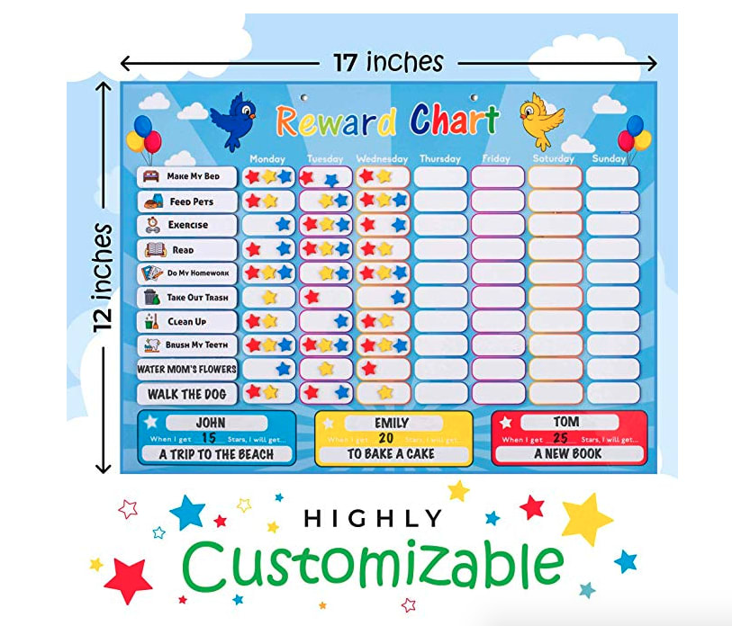
38 Responses to Option A
I love that you can see it in use and how it all works because the colored squares on B make no sense to me from a distance, you have to really see the stars in it after zooming
This just gives me a better focus on the product itself.
much friendlier looking and attention grabbing
The wording and stars make it look more attractive
A is cute and detailed!
A shows me how the product is used, which I find very helpful.
I don't understand what point the colors on the right prove. This one seems to better use the space it is given.
I like choice A much more. It is more creative, fun and entertaining looking to me.
I love seeing the example sheet filled out. It makes me imagine how I would want to use it as well.
I like A, it's a much larger image, and I like seeing the product in use. I can see how all of the components work and see how it is actually customizable.
I liked Option A because I really appreciate seeing the size of product so clearly.
This one gave me a better idea of the size and what it will actually look like. It is more exciting and eyecatching that they other one.
Shows the length and width to know how much space I would need and where to put it. Also an example of what it might look like when it is filled. I like the other choice too because it shows that it comes with a marker and a rope string to hold the chart up. Should have a blend of both pictures.
I chose A because it is more descriptive by showing how to use it and stating that you can customize it.
I chose A because I like seeing how you can use all of the pieces and that it's "customizable"
It feels more cluttered, but I like that it has the measurements.
I like this one because it has a better overall look to it.
I like A because it gives you the dimensions and it also shows the product being used which makes it easy to visualize using myself.
Choice A gives you an accurate example of how the chart will look filled in and ways to fill it in.
I like the that a can be customized
After carefully studying both amazon photos, I chose Option A as my preferred image because it was much brighter, had much more detail as to the product and had much more eye-catching appeal than Option B.
While B shows everything you can do with the chart, A actually helps visualize it more by showing the chart in use.
I like that this one is highly customizable and shows me how to use the chart. I like that it shows me the size and some examples too.
I like the image in option A. I like seeing how you can use the product and the photo is eye-catching.
I feel you get a better idea of how to use it and what it will look like hanging up with the first pic and its colorful.and eye catching
I like choice A. It shows an example of what the chart could look like, and gives a more detailed photo than choice B.
Definitely customization! To be able to pin point it directly to a certain student or child is a big plus! And being able to add extras makes it more fun.
The highly customizable label here makes me trust more in this brand and makes me think that I really need to purchase it because I see a huge benefit that I can get to optimize my current organization.
A is my first choice, it is more colorful and fun, gets my attention more because of all the stars on it and the more closer up image, and shows me the potential of what I could do with the product and makes it seem more fun.
I like that it shows how you can use the product.
I chose Option A because I like the image better. It is more creative and kid friendly.
I prefer this option because I feel that it gives a better representation of how the product is actually used.
I like the image that shows the product in use, so you can easily see the purpose and how you would use it if you purchased.I also like that it gives you the width and height of the product.
I really like option A. It is easier to read and I can get a better idea of what the smaller boxes say.
i like a better because the stars blend in with background in b option and you dont know they are stars or what they are used for. In A it shows you how big it is and shows its use. however in b its more clearly because you know what sections is the stickers unlike in choice Ai see faults in both but a is better overall
I think that this gives more information about the product overall. I think that another picture should be on the product listing with B because it shows what pieces are separated. I like showing the size of the product because someone will know immediately what size it is compared to what they're actually looking for.
I like seeing the product used with stars on it, as it allows me to see how it'll actually look like in action.
Because it is highly customized and easy to be understood.
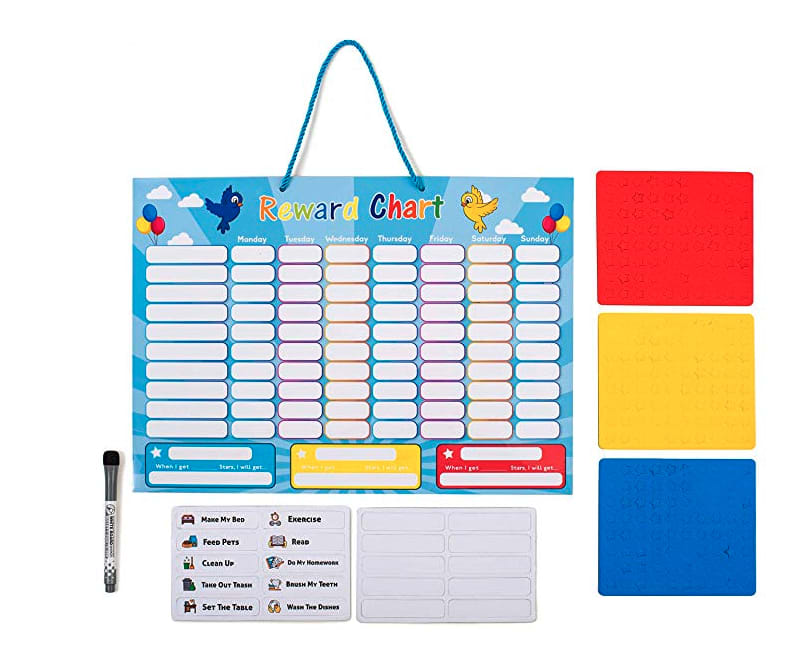
12 Responses to Option B
I don't need to be told it's customizable, I can gather that on my own
while the other image is more fun and shows the products included, the actual use of everything put together makes it visually more stunning and welcoming
I feel that A is just to conjested. B is cleaner and more attractive
I like that you can see all that is included with the product and that you can see the labels for chores or whatever you are using them for can be personalized.
This one looks like an actual product and of decent quality.
I think that this picture is more clear. It will allow me to see what I can do with the product instead of having it seem like it is done by someone else. I have the things I need in the picture and it allows me to use my mind as to how to use it.
I like that this one shows what all is included for the price I’m paying for the product.
I think it's always better to just show the product itself (and sometimes packaging) in the photos. Let the title and description do the selling. The images should just be the item itself. So I like Option B a lot more than Option A. It gives a clear sense of everything in the package. Maybe take a couple stickers off so and stick them to the board so you can tell they are stars and it'd be perfect.
I like how B lays out all the pieces so you can see them all individually first before being all placed on the mat.
It's easier to visualize what you are receiving with choice B
I like photo option B more than photo option A because in option B I can see the full product and all of its parts displayed neatly and I can also see what available colors it comes in.
B is cleaner and it is easier to tell what goes on it. It gives you more choices for what categories I can use.
Explore who answered your poll
Analyze your results with demographic reports.
Demographics
Sorry, AI highlights are currently only available for polls created after February 28th.
We're working hard to bring AI to more polls, please check back soon.

