Poll results
Save to favorites
Add this poll to your saved list for easy reference.
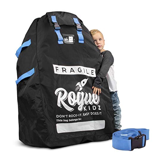
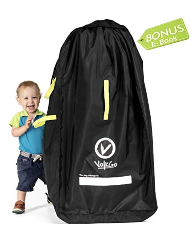
Which Main Image Do you Prefer? This would appear in Which Main Image Do you Prefer? This would appear in a search result on amazona search result on amazon
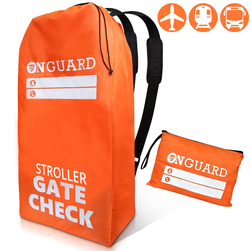
Option C won this Ranked poll with a final tally of 26 votes after 2 rounds of votes counting.
In a Ranked poll, respondents rank every option in order of preference. For example, when you test 6 options, each respondent orders their choices from first to sixth place.
PickFu requires a majority to win a Ranked poll. A majority winner differs from a plurality winner. A majority winner earns over 50% of the votes, whereas a plurality winner earns the most votes, regardless of winning percentage.
If an option does not earn a majority of votes, PickFu eliminates the option with the lowest number of votes. The votes from the eliminated option are reassigned based on each respondent’s next choice. This process continues in rounds until a majority winner emerges.
Scores reflect the percentage of total votes an option receives during the vote counting and indicate the relative preference of the respondents. If there is no majority winner, look to the scores to see how the options fared relative to one another.
| Option | Round 1 | Round 2 |
|---|---|---|
| C | 48% 24 votes | 52% 26 votes +2 |
| B | 32% 16 votes | 48% 24 votes +8 |
| A | 20% 10 votes | Eliminated 10 votes reassigned |
10 Responses to Option A
i like seeing the size of the item in comparison to a child to see how big it really is, i have one so i know but for potential buyers this is nice
I feel that Option A and B would appeal to people who are looking for this type of item because it has a kid in the image. Option A shows more caring, which I believe is the reason why parents would want an item like this. Option C is standard and feels cold compared to the other two.
A is a cute image that might appeal to people who are parents.
Option A looks handy as it has extra pockets. Option C is very minimal and identifies practical uses for it. Option B looks awkward.
I think the ones with the kids actually show me better what the prodcut is. Though I am not 100% sure why I would need this for my kids. I think more details need to be included.
Seeing the kid for scale is helpful and the kid's look is hilarious, then I don't like the other kid for scale, inconsistent I know but it just seems so fake and the scale isn't as helpful with a stock image behind the bag, I took the middle option just because it wasn't as bad as the fake kid but not as good as the real kid
I think A shows the best size of the actual bag in comparison to the stand child, I would pick this one
I like them on this order
A and B are the best since I can see the size of the product next to the child. However A is the best. It looks the most durable and as if its made of high quality materials. I like that that I can see the logo clearly on the bag
I like the images with the toddlers the best. In particular, I like option #1 best because it communicates care and fragile cargo.
16 Responses to Option B
I prefer more muted colors for luggage, and a bright orange bag for a stroller just wouldn't be appropriate for me.
I like the smiling kid, helps make the product fun and focused on kids.
I chose in the order that I did because the kids make the image look more pleasing. The orange one is last because I think it is unattractive.
i like the first best it shows the depth of size
I choose B as my 1st option because the bag looks cheaper and is smaller then the other bags. I also liked how option B was black with less wording and did not stand out as much as the orange one did.
I like the one with the boy smiling.. (B). This would definitely get m attention if I am doing a search. A would be my next choice. I like the little boy laying up against it. C is ok... I do like the color of it. but like the ones with the boys better.
I really like B the best because it does a good job of showing how the product functions/what it looks like. I also really like how the child looks super excited and happy- gives the whole image an upbeat feel. Next I like C, again because it gives a good idea of what the product looks like and how it functions. I also like how there isn't a child included in this image. I like option A the least because, although it still gives an idea of the product, the child just looks too mopey and gives the whole image a downcast feel.
I think by adding the child into the picture smiling, it will attract the attention of people. I would like to see the orange bag with the child.
In "B" the kid is smiling, a huge plus. The orange one is just... way too orange.
Option B is my first choice, I feel that it is more visually appealing. I love the smiling child standing next to the bag, the bonus E-book that it states that it comes with, and the color contrast of the black bag with the white letters and the handles. Option C is my second choice because I like the color contrasts of the orange and white colors. Option A is my last choice because the child holding the bag just looks awkward, and strange as well as the random blue strap on the floor of the picture.
The child is adorable and looks excited, shows size of item.
more fun with the children
The babies face in B is irresistable, definitely makes me look the most, even more than the orange one. It also has that tag about a bonus e book which is very interesting. makes me want to click and find out more.
B is nice because it shows the size of the product. A is least because it's weird that the kid is hugging it. C seems like a different product, but I really like the bright orange and would prefer the orange if I were to use the product for easy spotting at an airport.
Prefer the more subtle one
Choice B gives more info, like the free e-book. It has a happy kid which is always a good image. A also has a kid, but it appears a bit out of proportion. C has a crisp look about it, but not much info.
24 Responses to Option C
ok choice c is orange like that it is different from the others and a and b look huge so not sure what that bag is for, is it a bag for the kids not su what htis product is for
C is best because I can tell what it is. B is good because the kid looks happy.
I like the orange color better its more noticable
C looks very sturdy and easy to carry with the backpack straps. I like that on A it says "fragile" on it. B just looks simple and cheap.
I like the three little icons in the corner. It makes it so much easier to understand the intended use of the item.
C is definitely the best. It explicitly lets me know what the product is. The other images, I had no clue. Your eye is drawn first to the kid, and the product secondary. If it weren't for option C, I still wouldn't know what the product is!
I like C the best cause it tells you exactly what it is and is just very bright and clean. B is ok, and the kid posing is adorable, but doesn't really tell me what the item is. And A, I really don't like the child's pose in the picture. It's very off putting.
I like C because it is more clear what the product is about. I chose A 2nd because it has some humor to it but I'm not certain what the product is. I chose B 3rd because the product looks sloppy and the child is cute but it is more about the product than the child.
I chose Choice C because it is bright and noticeable when coming through the baggage claim area of an airport. Next, Option A because the bag is aesthetically pleasing and the wording on the bag is humorous. Finally, Choice B because it was not very attractive looking, but completes its purpose.
C has a good set of back straps on it and is therefore the best. It even comes with the accessory pouch. A is good too because at least it has that blue strap. B is no good from this view it looks like it just has handles. Plus I don't care about a bonus e book.
When looking at A and B, I couldn't figure out what the product even was. It looks like a giant bag that it is implied will carry a child. It wasn't until I saw C that I actually realized what the product was, so I selected that as my favorite. However, after knowing the context, I like the design of B the best, so I selected that second.
Option C is the cleanest, B is only of average legibility and A is difficult to read all of the test on the package.
I didn't have any idea what this item was. My first choice, C, suggests it's a bag to hold a baby stroller in while traveling, so it was the most helpful and I liked it best. Option B gives the information that there's an E Book included, so that's also useful. But both options B and C look to me like you're supposed to stuff your toddler in these bags, so I'm pretty unhappy with both of them.
C looks professional and like its trustworthy due to the less playful atmosphere. Option A is better than B only because it doesnt show the "bonus e-book" tag which is something I would never use and constantly think of as something that comes with cheaper products.
To be honest, I didn't even know what these bags were for until I saw option C. Between the brightly colored bag and the symbols at the top for planes, trains and buses, I finally recognized the purpose for the bags and option C made that the clearest to me so I went with that one first. Plus, the orange bag will be easily identifiable on a baggage carousel. Option A & B aren't easily identified as stroller bags - in fact, option B looked like it could be a tent and I don't need one of those. The color black did not turn me off, but it just wasn't clear as to what I was looking at. I picked option A second because it at least, on the bag, says what purpose it serves. Even if it's not a stroller, it's obviously something for a child and it is marked fragile.
Option C is totally centered on the product and provides a clear picture of what the product is thanks to the words on the product being in full view. There are also logos showing what it can be compliant for. The design of option A is more favorable because in the photo it shows the product as more structually sound where option B in the photo looks frumpy and like it could be damaged easily.
I ranked the images that I liked the most to least.
I like the black but I do not like the kid size
Choice C actually explains what the product is kind of. Choice B the kid looks happy. Choice A I don't know what the product is and the kid doesn't look happy about it.
I liked the attention the orange color draw, the baby in option b is cute but the package is bland. Option A is vaguely creepy with the baby hugging the bag. Reminds me of when Trump hugged the flag on stage.
The item in c looks easier to se and like the stroller can be folded smaller and nicely, I think the child hugging the item in A is odd, so B is my second choice
I think the bright color makes it easier to see.
The product itself should be featured the most prominently, without a child distracting consumers from the item.
Option C looks like it would protect the stroller best and looks the most durable. Option A looks bulky but easier to carry than option B. Option B looks loose fitting and not protective of the stroller.
Explore who answered your poll
Analyze your results with demographic reports.
Demographics
Sorry, AI highlights are currently only available for polls created after February 28th.
We're working hard to bring AI to more polls, please check back soon.

