Poll results
Save to favorites
Add this poll to your saved list for easy reference.
Which Nootropic (Cognitive Function) Product Would You Buy and WHY?


Age range
Amazon Prime member
Education level
Gender identity
Nutritional supplement use
Options
Personal income range
Racial or ethnic identity
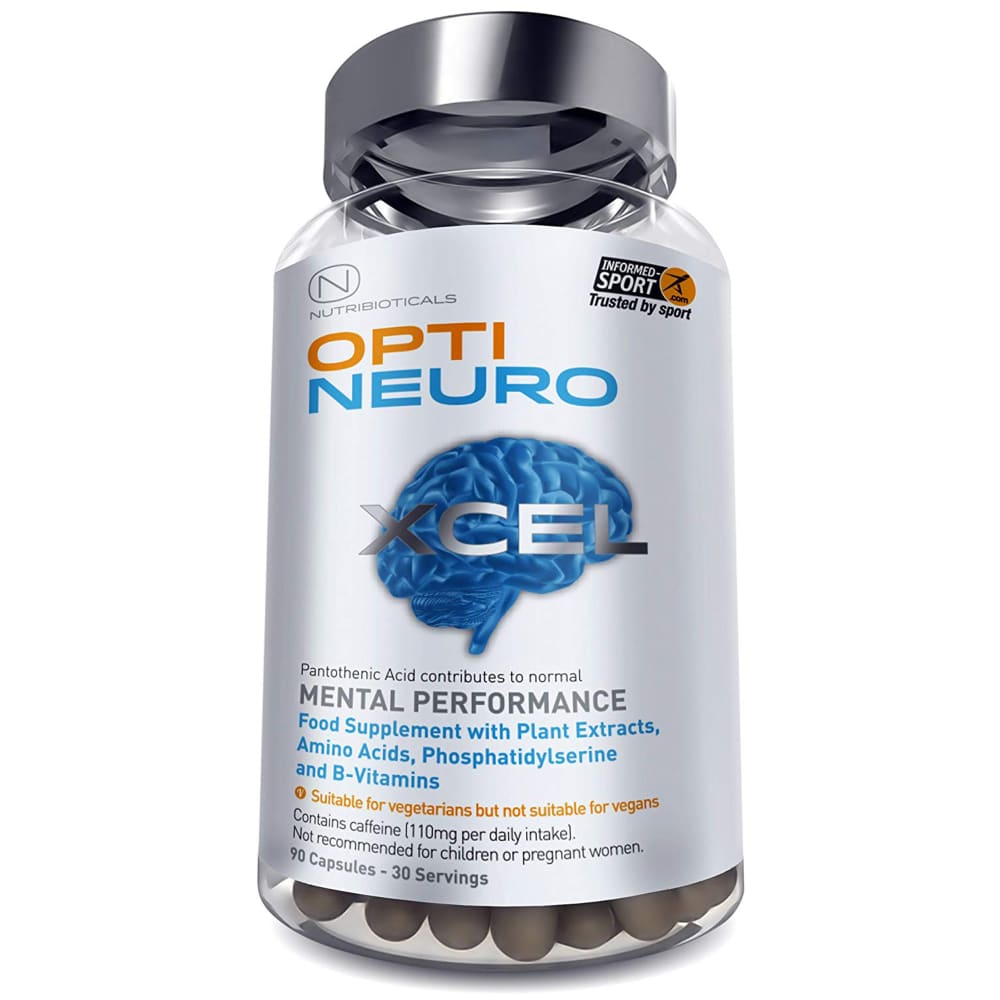
27 Responses to Option A
its more healthy for people
This seems more bold and interesting package wise
I like the name and the picture of the brain on the bottle. I also like how it states that it will help with mental performance on the front of the bottle.
I like the packaging in A. It is very slick in appearance and includes a lot of relevant product information on the front label. I like that it is not too crowded, though.
i like the look of the bottle and i like it helps mental performance
The brain on the label is very cool and sleek. Looks like a good product!
I like that it has a picture of a bigger brain which shows what it is meant for compared to the other picture. The blue color to me is a eye catcher compared to green too.
I like that all a good amount of necessary information is right in front and in a font size that is easy to read without having to zoom in on the image.
I prefer this image because of the blue brain in the background. It seems to align better with the product's function than the alternative selection.
The bottle "A" is a bit more descriptive, which I like.
The brain on the bottle seems more convincing.
I like the photo of the brain in blue. I think the blue lettering with gold to help vegans know it's not for them is good thing. Also the Excel in silver is nice addition because we all want to Excel. B bottle looks disorganized and all over the place and sloppy.
A gives more detailed information I would want such as what it has such as B vitamins, plant extracts, amino acids etc. I like that it tells you there is caffeine in it. I like the looks of the bottle more too looks more professional. The mental performance on the bottle really stands out more.
Like the style of the packaging, the picture of a brain (tells me instantly that it is good for my memory) and gives a quick run-down of what the product contains.
Option A, because it says "mental performance" on the label.
I would buy choice A because there is a lot more information packed onto the label. It does a good job of giving a description of that is contained in the product as well as giving some hot button issues such as caffeine info. I would pick the A bottle before I would pick up the B bott.e
I chose A because i like that it lists all of the things it is good for
I like that it has an image of a brain, for brain function. I like that it has the word mental on the packaging, making it easy to know what these supplements are for.
I'd purchase this Nootropic product. I feel it would best benefit my cognitive behavior and be more beneficial. I find the packaging design more appealing as well.
The color of the label stands out and looks more professional
I LIKE THE GRAPHICS AND YOU CAN SEE WHATS IN THE VITAMINS BETTER
I like that A gives information about exactly what vitamins are in the product on the front label.
i often feel tired and unfocused so this would entice me
I want to improve my mental strength and capabilities.
I could read more of the info and what it does right on the front of the bottle. If prices were included that may change.
quality and eye catching
The blue brain on label seems to be more appealing, than the green-one on the other. I also, like the color of the bottle-cap better.
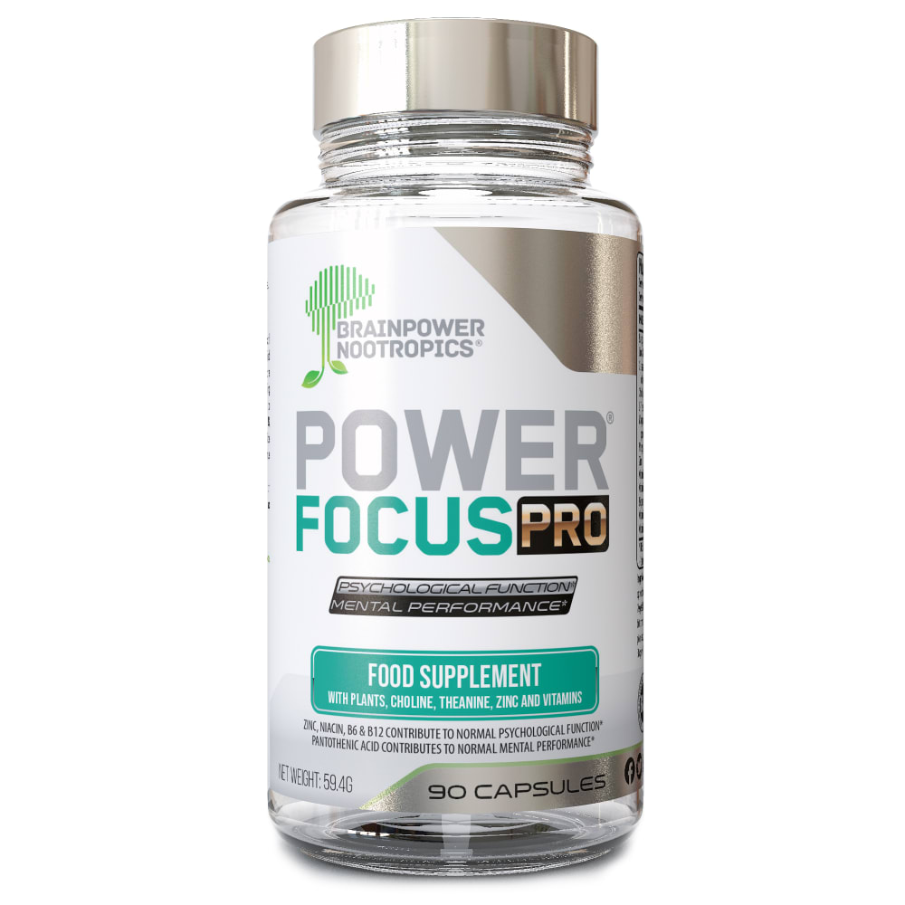
15 Responses to Option B
B looks more legitimate. The packaging looks professional. The graphics on A look kind of silly.
I really like the power focus name. I like that you are give information of what is in the capsule.
I picked B because the brain on A is creepy. B has the info needed without a grphic.
I think the blue brain on the other design looks kind of weird
The image of the brain on A is an amateurish attempt to convince me it'll improve my brain function
This design for the bottle looks more legit.
B is focused on the benefits and science.
I chose option B because it does not appear to contain caffeine like option A.
Option A looks like its overreaching with its "mental performance" and image of the brain front and center. However, the logo brainpower nootropics also has brain and image of it as well...
Like the use if food supplement
I like B better because I think the brain/tree graphic is more appealing and my favorite color is green. A is too high tech looking for me. I like more natural products.
I liked Option B the most. I thought the overall design had me feeling impressed immediately. I think it is easier to understand what it is and does.
I don't know a lot about some of the ingredients in these two products and which ingredients are better to take. I see that A has caffeine in it. I do not want to take any more caffeine so I chose B because it does not appear to have caffeine.
I like the design of the bottle much better. The way it highlights the food supplement and the ingredients involved in plain sight. Can't go wrong with either.
The design on the label on B looks much cleaner. The formatting of the words draws the eye. On A, the words sort of look jumbled together, rather than listed neatly
Explore who answered your poll
Analyze your results with demographic reports.
Demographics
Sorry, AI highlights are currently only available for polls created after February 28th.
We're working hard to bring AI to more polls, please check back soon.

