Poll results
Save to favorites
Add this poll to your saved list for easy reference.
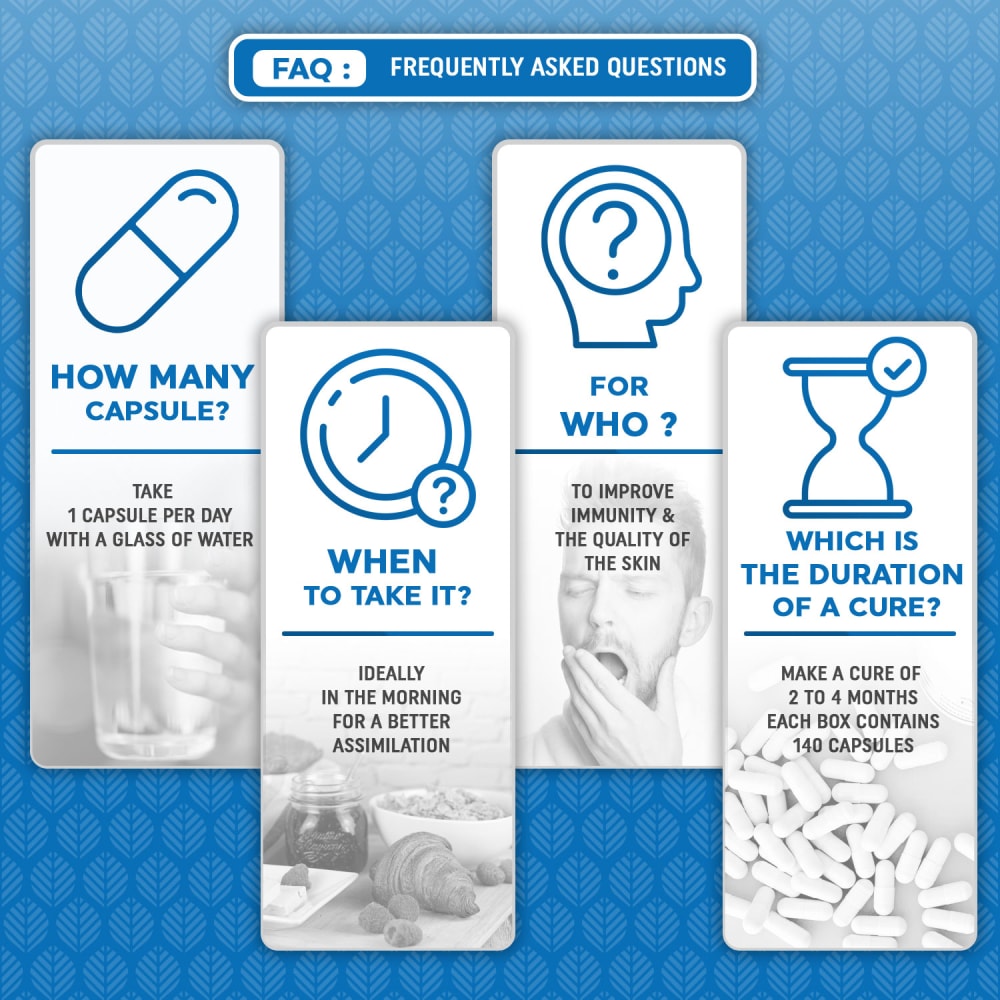
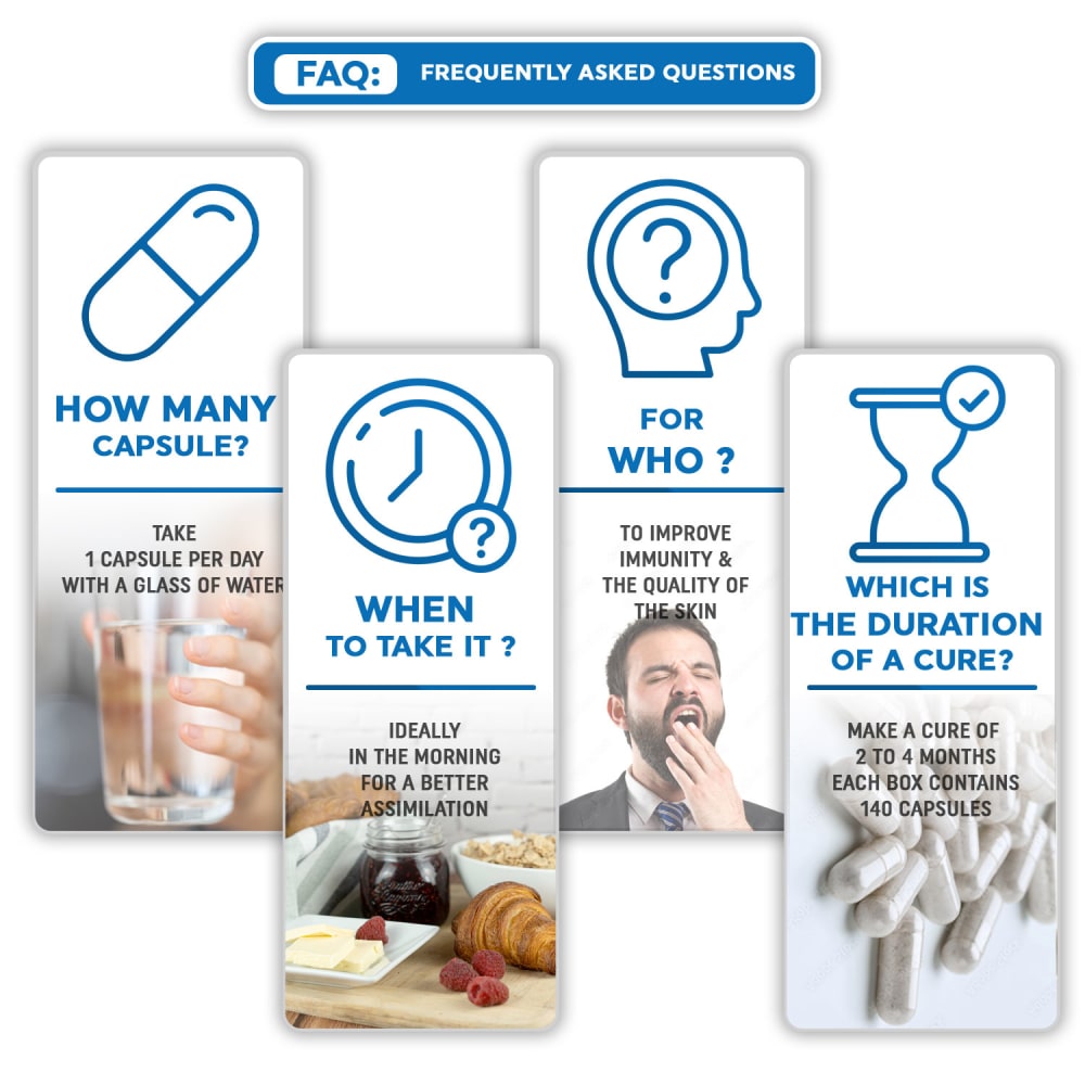
Which of its 4 FAQs images looks better for you ?
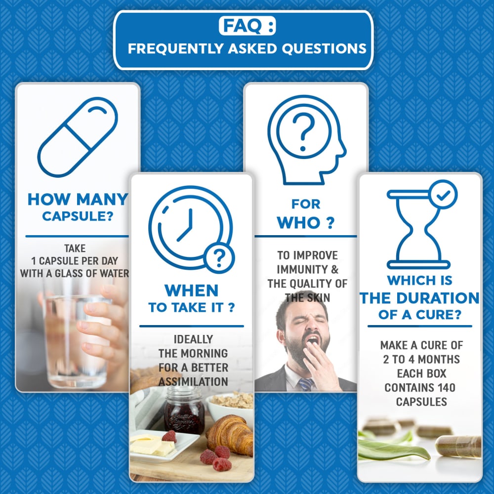
Option B won this Ranked poll with a final tally of 37 votes after 1 round of vote counting.
In a Ranked poll, respondents rank every option in order of preference. For example, when you test 6 options, each respondent orders their choices from first to sixth place.
PickFu requires a majority to win a Ranked poll. A majority winner differs from a plurality winner. A majority winner earns over 50% of the votes, whereas a plurality winner earns the most votes, regardless of winning percentage.
If an option does not earn a majority of votes, PickFu eliminates the option with the lowest number of votes. The votes from the eliminated option are reassigned based on each respondent’s next choice. This process continues in rounds until a majority winner emerges.
Scores reflect the percentage of total votes an option receives during the vote counting and indicate the relative preference of the respondents. If there is no majority winner, look to the scores to see how the options fared relative to one another.
| Option | Round 1 |
|---|---|
| B | 74% 37 votes |
| C | 16% 8 votes |
| A | 10% 5 votes |
5 Responses to Option A
I think option A is the best because it is the easiest to read.
My first choice is because it is easier to read the answers with the images not so prominent. The wording on the image is clearer
i prefer the graphics in a, they are less distracting
This one is easier to read and doesn't get lost in the image.
I find these helpful to my day to day living, I ranked A because its the easiest to read on my eyes which means I can get the help I need right away, followed by B and C! as my next two in that order.
37 Responses to Option B
B - the combination of the color photos and the larger font works well. It's the easiest to read and understand quickly.
I prefer with colors, B is the best. C with the white image on the right looks a little creepy. A is just too pale
I chose B because the solid blue background makes the image easier to read
I like the blue background and I like that the images use color in option B.
Color is always easier to see.
I like B, the pictures under the questions are crisp and clear and seem helpful. A is nice too the black and white is less distracting. C is okay i don't love it.
Option B seems easier to read with the more vibrant colors.
The blue background and the colored images paired together make it an excellent presentation to read.
I prefer option B image looks vibrant. I find it easy on the eyes.
I think B is the most detailed and looks the best. The background color and color on the individual pictures really makes it stand out the most.
I like option B the best because the pictures stand out more on the blue background.
I think that the actual FAQ images look better in options B and C than they do in option A. However, I think that option B has a more visually appealing background color.
The color imagery breaks up the copy and the blue background makes the FAQ stand out, so Option B gets the big first place.
I prefer the blue backgrounds as it makes the image pop. The color imagery also helps on Option B
I like option B the best. I like the pictures use in the advertisement. they make sense and are very intuitive
Option b with the color photos stands out the most ans also to me gives the most information about the product.
This one contains the most color. THerefore, it is the most visually appealing. That is why this is top
I prefer the panels with the blue background best. It adds contrast to the image. With the color images in the info-panels my choice is option B.
I prefer darker backgrounds with the questions in white to make it really stand out and catch the eye.
I would choose B because1. Questions on the blue background is looking so prominent and clear2. Image representation is eye catchy
The darker background certainly helps your 4 FAQ cards stand out. Same thing with a lighter background helping darker text stand out. So yeah, I think option B is about as close to ideal as you're going to get.
the blue background on B and A looks well designed and C did not stand out at all for me.
I prefer option B because this image looks the most effective and memorable, attention demanding, information resonates well.
The color contrast is much better. It makes it easier to read and stands out well.
I like the realistic images in each panel against the blue background. It is easy to read.
Option B, with it's bolder colors, illustrates the significance of the information, especially as it's contributing to towards the health of the reader/client.. Option C, as it's toned down, and lacking blue seems indifferent.. Option A with no image color seems pointless.. It also looks like something out of a high school from the 50s..
I prefer B as I like the color in the FAQ images. I picked B over C as I liked the image of the last image in B better than the one in C.
I like the contrast of the blue to the white but also the pictures having color
B and A are both great but B looks a little bit better, C just looks far plainer and has way too much white on it which can strain eyes
This option looks better, the blue textured background highlights the images. Option C looks nice, but the white background makes the whole design a bit boring. In option A the images look highlighted, but the design of the images makes the contents look muted, unappealing.
I like option C because of the green next to the pills. I think it adds color and makes the image look more plesant. I also like option C because of the colorful images. I do not like opiton A because the black and white picutres look a little depressing.
i like the imagery in option a and at least option a had a background. option c looks too plain
I chose b because the blue background made the text stand out more. I also liked that the pictures were in color, so that my eye could be drawn to them
Option B was the most compelling with its colorful images and bold background color. Option C was acceptable but a little muted. Option A was too plain.
Option B has the best color background and 4 pictures - rank 1.Option C has the same pictures but worse white background - rank 2.Option A has the worst pictures and despite of good background got only rank 3.
The FAQ image shown in option B has the best background to make this section remarkable and easy to read and understand.
i like the colored background better on choices B and A the best.
8 Responses to Option C
The images in option C are the easiest to understand, so those are the ones that look better to me.
The coloring in option C looks the best and i like that the whitespace is very clean and professional looking
The background is distracting and not that appealing to be honest
The white background makes it easier for the text to stand out.
I like C best, the other two the blue with pattern distracts me from the information.
The pattern on the background is too distracting. It would be best as a solid color or nothing at all like C.
No background blue with a pattern in it seems better. The darker blue in B is slightly worse than the lighter blue. Overall, the background is extraneous and distracting from the information.
i like the faq images in option C the most because it has good colors that make the text easy to read
Explore who answered your poll
Analyze your results with demographic reports.
Demographics
Sorry, AI highlights are currently only available for polls created after February 28th.
We're working hard to bring AI to more polls, please check back soon.

