Poll results
Save to favorites
Add this poll to your saved list for easy reference.
Which of these labels would you choose based on design only? Why or why not?
Age range
Education level
Gender identity
Options
Personal income range
Racial or ethnic identity
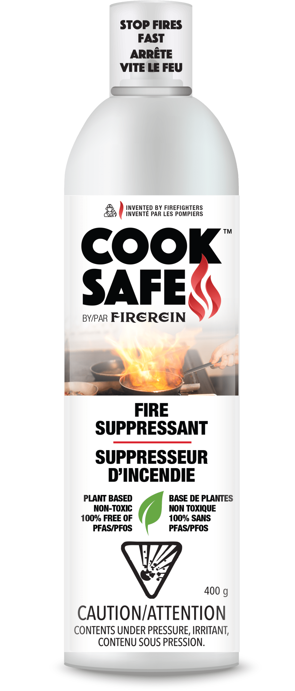
35 Responses to Option A
this looks like a safer more contained fire
because the product is made for cooking fires I choose A as its more representative of a kitchen fire.
I would choose A. B looks too much like a dangerous fire and is therefore not appropriate.
With the name "cook safe" the label showing someone holding a frying pan with fire in it is better than label B just showing fire.Helps to know that it's more for kitchens and cooking.
The Fire on B seems out of control. Not sure how that craziness is a good thing.
this one has the best label, it shows what the problem is and makes it obvious what to do
this container looks most authentic and like it would work well and easiest
I like option A the best. I like the skillet on fire the best
I like showing fire in pan
if this product is designed for cooking or the kitchen i think having the pan fire in the pic is a must. otherwise it just looks like any other fire prevention product
I like seeing the picture of someone actually cooking, I think it's a more apt picture for the product.
I chose A because I think the fire independent of the pan looks weird and disjointed.
B has an expensive and dark look where the faded label looks kind of cheap.
I prefer A because the image shows a practical use for the product.
I liked choice A since the image on the label looks more relatable and fits what the caution is. Choice B looks more generic with a big flame on the label.
I wouldn't ever scan the QR code to watch the video of the product in use before buying, so option A would be my choice.
I like A for the more realistic cooking fire. B looks like paint spilled.
The image in Option A seems to fit a bit better with the product than the image in Option B, but that preference is not super strong.
A looks more under control and also provides context for how it could be used. B is just too much fire.
I like seeing an actual fire or the circumstances where this product would be used on the label.
The fire in the other one looks too big to be handled by a spray can.
I would choose A because the image of a fire while cooking is something I could see a real need to address, whereas the image of flames in B is more abstract.
Definitely A, the image is more impacting and makes the product stand out more
This photo tells me that it was designed specifically for kitchen/grease fires. The other one doesn't really give me any context for what I would use it for.
I think this one is the better option because it shows a kitchen setting on the label rather than just flames.
I like the image with the pan on fire since the product is called "Cook Safe."
I prefer the image of the fire in the kitchen, that implies that this product is intended for use indoors for kitchen fires.
Showing the cooking context seems more relevant for the product.
A's image on the label makes me think of kitchen fires, and otherwise the bottle seems simpler, which makes me feel like it's more legitimate and not trying to look overly official or effective.
I like the view of someone cooking. It helps make it more realistic. Applies to more people.
I like the picture of option A because you can see how to use the spray in the picture of a label. I would pick option A.
It show a pan, and the product refers to cooking.
Like the bottle design to A best as most cook fires happen with a flame up with a pan. The photo in A drives that home.
I prefer A because it specifically shows me what this product is for.
If I have to use it, it will probably be a stove fire, so A is a more helpful image.
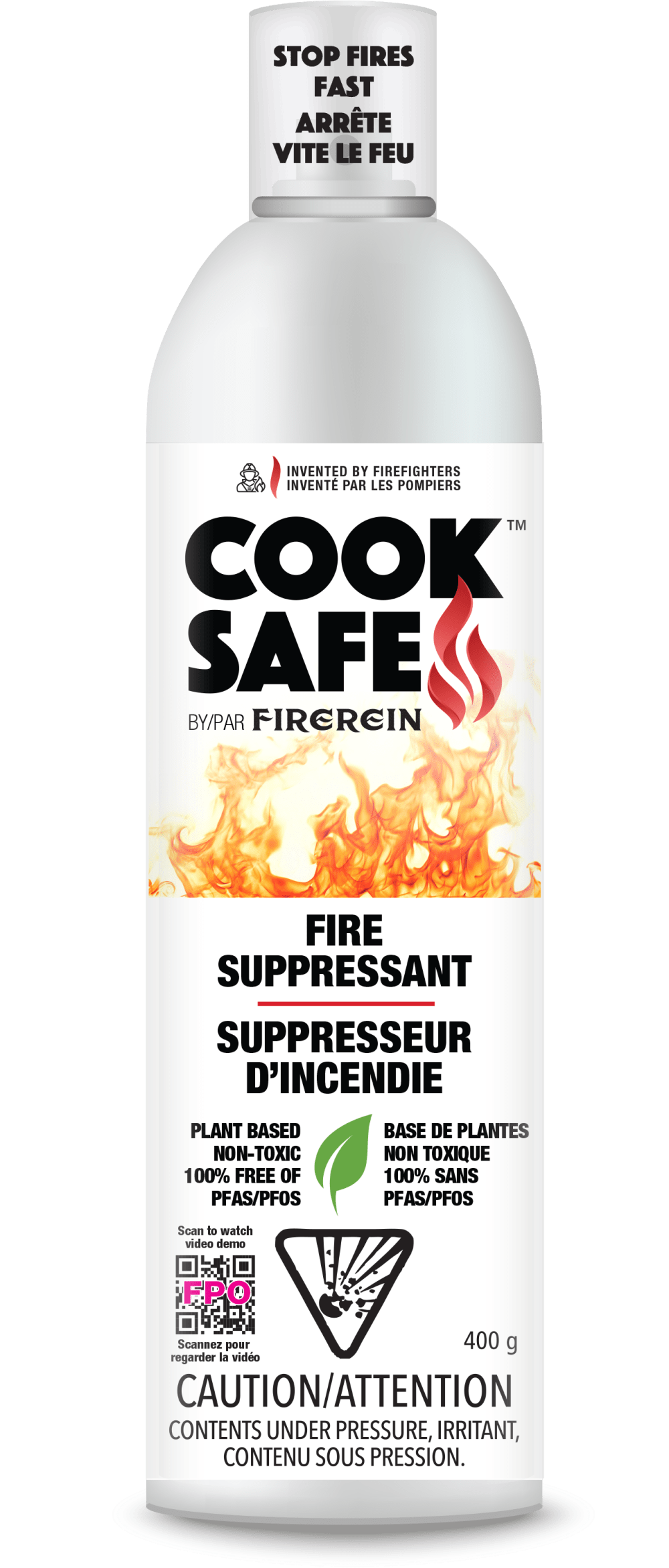
15 Responses to Option B
LIke them both and 100% a product I would buy since I do cook a lot with gas etc and have had issues before. I think that B has a better color to it but they both are really very good.
Option B is more attention grabbing and dynamic. The ambiguous fire, as in it is not in a pan as option A, and the vivid colors makes me think preventing a fire is more urgent and I should buy this.
The fire all by itself really stands out. I like that it also has a QR code that you could scan
I like the graphics of this bottle the most
The design looks better, has QR code to see a demo.
I prefer the option B product label design because I like the bright flame colors and how one can quickly watch a video demo of the product by scanning the code on the bottom left of the product label.
I liked B because the picture was much more fiery and as a fire suppresant, I found myself thinking that's the kind of fire this product should be used for.
I think the fire looks more dynamic on option B, so that's my choice.
I thought this looked more informative and helpful.
I like how you can scan the product's code to watch a demo.
B has the most directional format that shows it's product function and how it operates
Option B is more eye catching. It gets ones attention right away. Option A is not any less appealing or effective, it immediately conveys that one should have this on hand in the kitchen where a fire might originate. However, Option B is very effective.
Option B seems to indicate that it can be used for all types of fires, not just cooking or kitchen fires.
I LIKE THAT THIS OPTION HAS A SCANNER TO WATCH A VIDEO ABOUT THE PRODUCT
B looks more like a fire. A could be a fire or a cooking technique.
Explore who answered your poll
Analyze your results with demographic reports.
Demographics
Sorry, AI highlights are currently only available for polls created after February 28th.
We're working hard to bring AI to more polls, please check back soon.

