Poll results
Save to favorites
Add this poll to your saved list for easy reference.
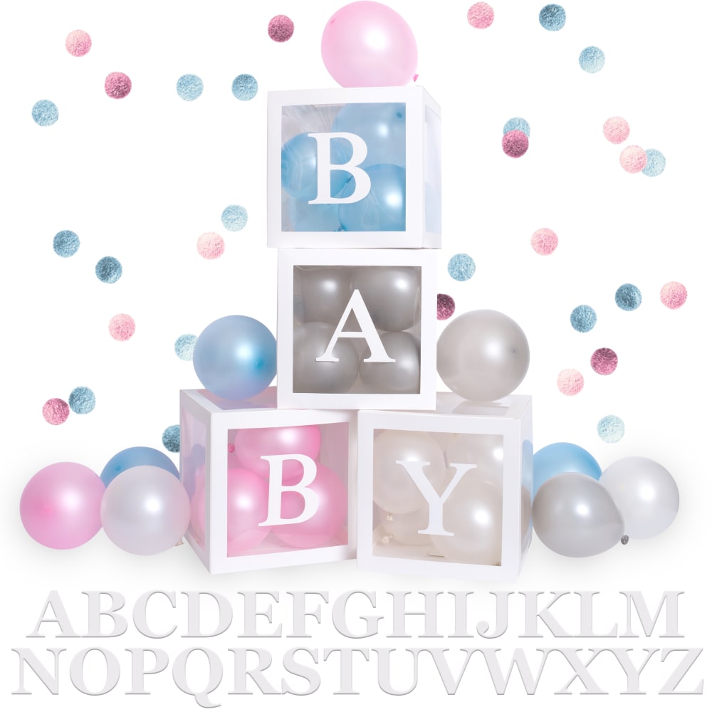
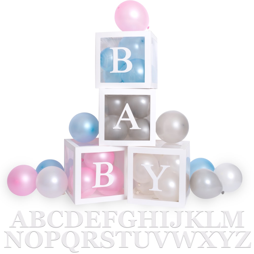
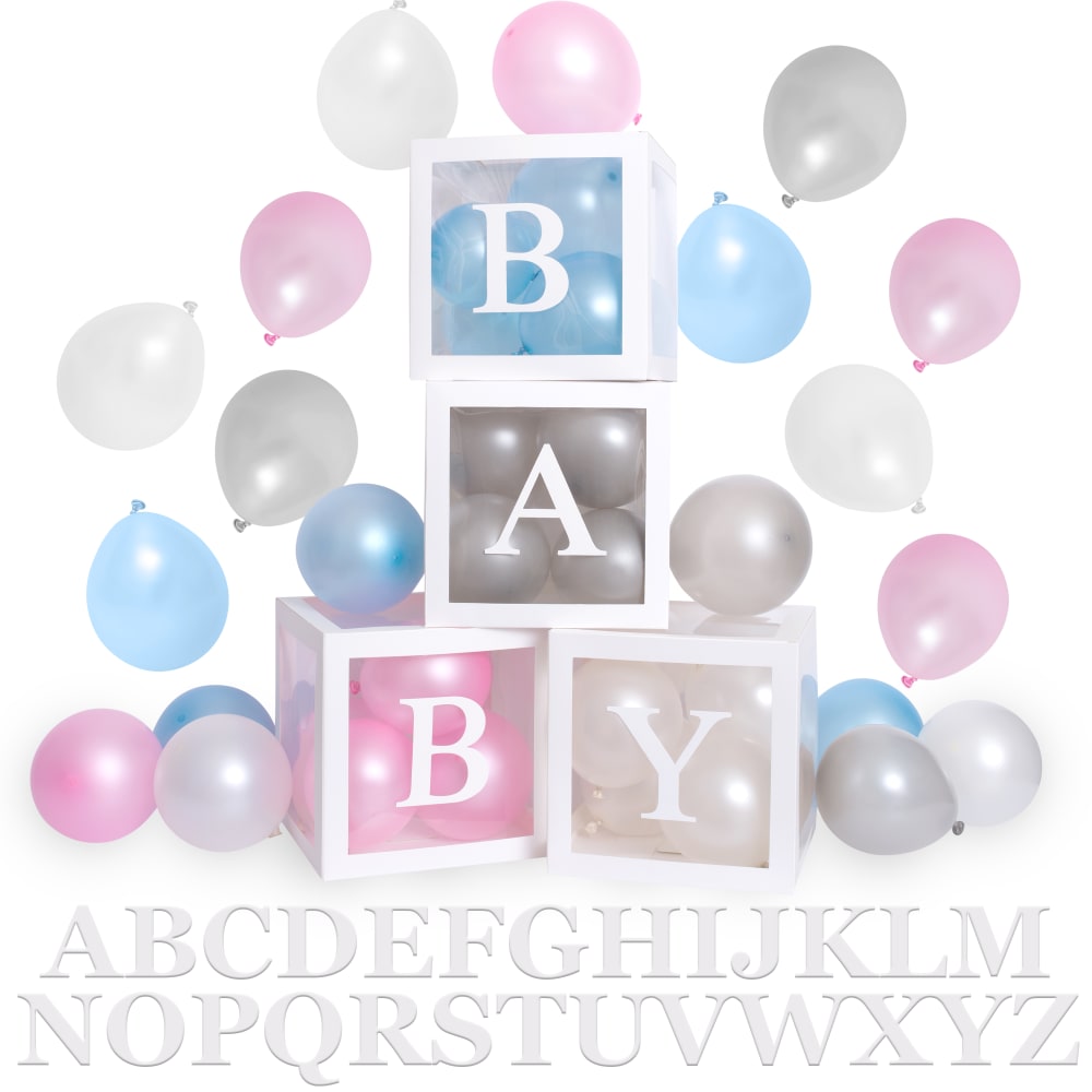
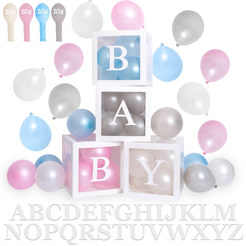
Which one main image are you most likely to click on?
Option G won this Ranked poll with a final tally of 45 votes after 7 rounds of votes counting.
In a Ranked poll, respondents rank every option in order of preference. For example, when you test 6 options, each respondent orders their choices from first to sixth place.
PickFu requires a majority to win a Ranked poll. A majority winner differs from a plurality winner. A majority winner earns over 50% of the votes, whereas a plurality winner earns the most votes, regardless of winning percentage.
If an option does not earn a majority of votes, PickFu eliminates the option with the lowest number of votes. The votes from the eliminated option are reassigned based on each respondent’s next choice. This process continues in rounds until a majority winner emerges.
Scores reflect the percentage of total votes an option receives during the vote counting and indicate the relative preference of the respondents. If there is no majority winner, look to the scores to see how the options fared relative to one another.
| Option | Round 1 | Round 2 | Round 3 | Round 4 | Round 5 | Round 6 | Round 7 |
|---|---|---|---|---|---|---|---|
| G | 29% 29 votes | 30% 30 votes +1 | 33% 33 votes +3 | 35% 35 votes +2 | 36% 36 votes +1 | 41.84% 41 votes +5 | 50.56% 45 votes +4 |
| H | 31% 31 votes | 32% 32 votes +1 | 33% 33 votes +1 | 35% 35 votes +2 | 38% 38 votes +3 | 39.8% 39 votes +1 | 49.44% 44 votes +5 |
| B | 9% 9 votes | 9% 9 votes | 9% 9 votes | 10% 10 votes +1 | 14% 14 votes +4 | 18.37% 18 votes +4 | Eliminated 18 votes reassigned |
| A | 7% 7 votes | 8% 8 votes +1 | 8% 8 votes | 10% 10 votes +2 | 12% 12 votes +2 | Eliminated 12 votes reassigned | |
| F | 6% 6 votes | 7% 7 votes +1 | 9% 9 votes +2 | 10% 10 votes +1 | Eliminated 10 votes reassigned | ||
| D | 6% 6 votes | 7% 7 votes +1 | 8% 8 votes +1 | Eliminated 8 votes reassigned | |||
| E | 7% 7 votes | 7% 7 votes | Eliminated 7 votes reassigned | ||||
| C | 5% 5 votes | Eliminated 5 votes reassigned |
Age range
Education level
Gender identity
Options
Personal income range
Racial or ethnic identity
7 Responses to Option A
I put these graphics in the order that I would be more than likely to pay attention to them.
Option A gives the best representation of what the package has to offer without being too cheesy or boring. Options G and H are a close second and third because they represent a more accurate example of what the consumer would be getting. I do not like the options showing the number of balloons in deflated form. It looks mildly phallic and just cheap.
I was drawn to the most colorful, festive designs
I felt like they were the nicest as far as the display. They showed me a god sense of placement and the overall look was pleasant to me.
I prefer the images that show me what things will look like already put together. The deflated balloons just make me think of work. I like to think of what it will look like to my guests, not what it will take to get it there. I need help envisioning it.
I chose in the order of my preference, as I would in a real life situation.
I chose A because it is the most visually appealing of all of the images. I could see this being used as a backdrop or printed on a card. G and H were chosen next because they are the more realistic setup of the objects. I could picture myself walking into a baby shower and seeing these items. I chose C and E next because they are visually appealing for a backdrop.
9 Responses to Option B
this is giving you the idea that you can spell out anything youd like with this product
I love the images where the boxes were centered. I felt they were most captivating. Then I liked the clean design of Options B, E and C. I also liked the 4 balloon colors in those images.
I like all my choices about the same. The reason I didn't include G is because it looks like it's specifically for a baby girl. And I didn't include H because I wasn't sure what exactly I would be purchasing.
I believe these choices are more attractive and visually appealing, the colors are more bright and vibrant.
I like B the best because it is the cleanest of images. My second choice for G was because it was cute and an actual photo. I really didn't like the ones with the deflated balloons; they didn't make sense to me.
Option B is a less "busy" visual of what the product is. Options H and G give a real life visual of how the product will look when being used. Options E and F give an idea of the product and identify how many balloons are included.
I think that order is the best to me.
I like the aesthetic of the photos with out the descriptive info about the # of balloons included.
I did NOT like option D... the balloons with the 10x symbol on them in the upper left corner are way too small. It looks like there's a writing on the balloon itself. I chose option B ad the best because it's a nice clean image and clear on what the product is. Most of the other options just had too much clutter in chaos going on in the picture.
5 Responses to Option C
I believe this orderis what will stay in the minds of people and think of it as exciting and wanted to take pictures and tell there friends about.
I honestly didn't like any of the choices, they all feel gimmicky and like overkill - but I picked the ones that were the least awful.
I wanted just basic designs and no extra balloons. It looks cleaner and simple. Nothing too fancy
I like the fullest image, balloons and color all over the page. Animations are better than the photographs that seem dull in comparision
I choose these choices because there were many small details in each of the photos that captivated me and grabbed my attention the minute I observed these photos.
6 Responses to Option D
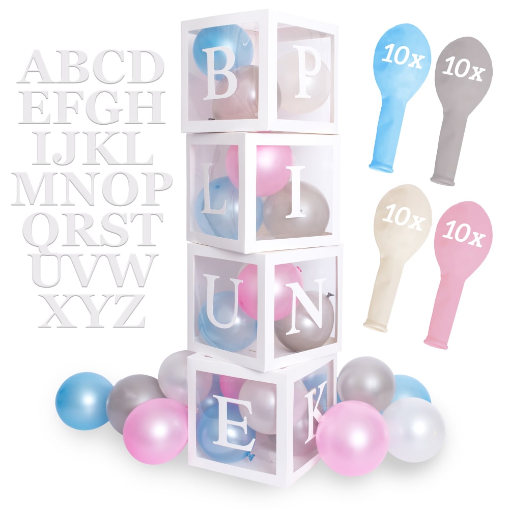
I chose the ones that actually spelled out the word baby. A few options did not which made the option very confusing. I also chose option D first because I liked how it showed you that it came with the balloons as well and how many of each color balloon you would get in this option. I also liked that that colors were unisex in the first option i chose. This would be better for a gender reveal party instead of the option that showed pink balloons. You could also reuse the boxes in the future for other baby showers in the option was unisex instead of pink representing a baby girl.
I like the background a bit because it really compliments the product and the colors next to the letters. The balloons really make this ABC letters pop out and is very appropriate vs Option H and G look hastily put together.
I have a fairly strong preference for the images that have more information on them. For example, the first few choices that I made include the number of each balloon color that will be included with the product which I appreciate a lot and think it would be nice to know right off the bat without even having to click on the listing. If I were scrolling through and looking for baby shower products/balloons I would definitely be more likely to click on one that has the information I need right off the bat.
I picked the one I thought was the cutest. I would like that for my party. It is cool. Thank you.
I clicked on all the ones i thought showed the best images of what you actually will receive
I like this one the best because it has a very elegant look to it.
7 Responses to Option E
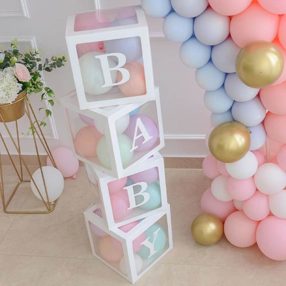
I like e the best because it gives a clear idea of all of the things in the set. I like G and H because they will give me an idea of ways I could actually use them. F and A are ok.
I like the real pictures, the fun pictures. I like being surprised and I like cuteness in the pictures.
I like my top choice because it shows what you are getting (in terms of the amount of the balloons). But aesthetically, I like the second and third choices more. The pictures are much nicer. It would be great if you could use picture two but somehow incorporate some more details as in picture one.
I chose the options which all illustrate and explain what all comes in the pack. All my choices have the number or balloons and the letters that come with the boxes you are buying. The order is not really important other than the placement and to me they all look the same. I really do not have a preference of placement for this particular item. I just do not like the ones that are remaining though, it tells you nothing about what is actually included with your purchase.
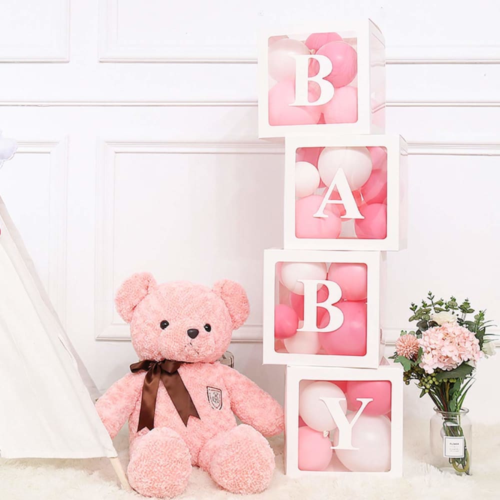
My favorite picture is the one with the pink bear and no balloons. The pictures with the balloons were too congested and seemed overwhelming to look at and focus on. But, the picture with the pink bear and matching bouquet was very soft and aesthetic. I felt comforted and relaxed when viewing it.
I chose E first because I would be interesting in what this offer was. I see that you get 10 of each balloon and the colors of the balloons. It catches my eye the most. I chose D second because it is similar to E but just has the amount of the balloons shoved in the corner and is not as nice as E. I chose G third because the pink teddy bear caught my eye and looks cute with the pink and white balloons. I chose H fourth because I like seeing how the balloons and blocks look styled in a room. It gives me an idea of how mine could possibly look. I chose F fifth because I like how it shows the possible letter combinations on the blocks as well as the amount of balloons that come with the package.
I love my first choice, option E! The color scheme, the way it's designed and the way it's presented is very pleasing to the eye. I love that it gives a super cute example for how the blocks can be designed and I really like that it tells how many of each color balloons are included. Option F and D are both a close second. They both have all of the same information, it's just laid out a little differently. Option B and C don't tell how many of each color balloons are included so they would be my last choices.
6 Responses to Option F
I love all the options because they are definitely all pink and blue oriented. I think showing all the items in the product is best.
I like Option F the best because it is (1) clear what the product is and how many balloons you are getting (2) could be used for something besides a baby shower or something baby related. I like Option D & E as other options the best because it is clear exactly what the product is and how much you are getting. In some of the other options is much less clear what the product is and exactly whats being advertised
I like the images where you can clearly see what you are getting, the number of balloons, the colors they come in, the letters, so you can get an idea before you even click on the product description, the staged images with the teddy look nice, but you dont know what you are getting until you read the description.
Option F had more blocks so Vote#1. OptionH looked beautiful so vote#2. OptionG had a teddy bear, so vote#3. The other 2 options were very similar. Went for OptionD for Vote#4 as it had more balloons. Option A was the last one for Vote#5
The ones that tell you how many balloons of each make it the clearest as to what the product even is. G and H it's really hard to even tell what the product is. A feels cluttered.
I liked F, E, and D the most because they are the most clear photos of the items and clearly show what is included in the pack. I like C and B also because it shows what is included in the pack and gives nice display of the items.
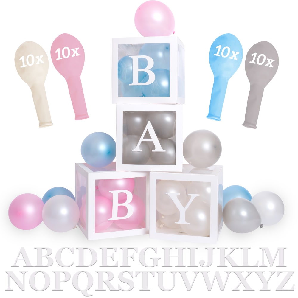
29 Responses to Option G
The designs of the letters plus the color schemes make them the most visually appealing
I chose G because it caught my eye first. I liked the different colors in H. The other choices look sort of cheap. They look like they are images made on a computer rather than photographs.
G and H come across as most authentic, they seem realistic and genuine and as though there's a thorough and intended purpose to them. Of the others, they're similar but F D and E have some nuance which makes them seem more authentic, and not just a digital piece. That's kind of my main reasoning, what comes across as most authetnic and genuine
I prefer the photos. I like the one with the bear. It's really cute. I like the other photo next on the carpet. I like the ones with the letters if they aren't cluttered. But I prefer the bear the most because it's adorable and I like the pink.
I chose the pictures that were in a real setting. I didn't see the purpose of the un-inflated balloons and the alphabet on some of the pictures.
I like the positioning of the blocks and coloring in the options that I chose. I also like the shadowing of the boxes and the way the letters are written on them.
G is so cute, it's aesthetically pleasing and it shows how it could look. H is also aesthetically pleasing and it catches my eye more than the rest other than G. I love the confetti background in A, it makes it more cute than C & D. I like C it's cute but not as aesthetically pleasing as G & H. D would be my next choice, it shows how it looks and how many balloons it comes with but it's a little overwhelming.
G makes me think a bear is included. It isn't but who says misleading can't sell? H shows me the product in the realest form. A, E, and B are ranked by how aesthetically balanced it is overall. One advice I'd give is make it more obvious there are letter stickers, I almost can't see them and they're a huge selling point since you can personalize the boxed with them
While option G does not show the individual pieces of the package, it does look appealing the way the boxes are displayed with the teddy bear. It gives one an idea of how to display the product. Option E shows all the pieces of the product and I like how they are displayed. Options C, A and E all look similar and very basic. I feel it is important to show the balloons with the 10x on them so one can see how many balloons and what colors they are actually getting.
I liked G the best because it was the least crowded the most color coded and the easiest to understand what was going on. I liked option E the second best because it shows you exactly what you are getting with the package but did it in a way that did not make it look overcrowded like the other choices. There more balloons that are shown out of the boxes the more crowded and sloppy it looks.
They are more visually appealing than the other choices.
I judged each photo as I liked to see it. I actually only liked my first two choices. They were cute and different. All the others looked basically the same.
I like the lighting and how put together the color scheme and decoration is, above the rest. It is pretty, attractive, and eye candy. I will get one for my little one with a click.
I like the realistic and colorful images of G and H. The others seem washed out, and far too grey for a baby celebration. I like that the other images give a better idea of what's included, but the colors are dull.
I think G was the best because its shows the finished product in the best light, though it doesn't show the assembly instructions. The others decline in quality of the product but give enough instructions for the buyer to make sense of how to assemble.
The first pick is not trying to advertise so much, it's just an adorable picture of the product. I like it simple when it comes to an ad, so I prefer the images that don't show how many balloons you are getting, meaning the empty balloon pics in the ad.
I like the teddy bear. It catches my eye. On the next choices, I preferred options with something in addition to the stacked blocks. Finally, the tiny deflated balloons were awful. They ruined the picture, so I didn't vote for any with deflated balloons.
I chose the pictures that were more appealing to me. I liked the ones that showed the products in a usable way.
I liked the first two options because they look less cluttered than the other options. I like the last three options because I like all the color variety
i do not like the correlation of the alphabet with baby. that is more for a toddler stage. that ruled out most. with the assumption this would given to the new mother of a baby i believe choice one to be one appropriate for any given person. the balloon were the best complement to new life.
I like G and H because they are simple and pretty. For D, E, and F I like how they have the balloons, more information on them. The order I put DEF in was also because of their design from best to least favorite. D looks organized and it is kinda good.
I like G best because it looks clean and you can tell you are having a girl. the flowers are a nice touchI like H second because it looks clean. this is a good option if you don't know if you are having a boy or girlI like b because it looks clean and organizedC and A are also clean and organized. I don't like the pictures of the balloons. they look weird.
G- the image is inviting. it more than likely is showing exactly what I want to buy.F- Shows the options of the package clearly enoughD- The image draws you in, shows balloon amounts and alaphbet as wellE- easy to see everything included, the lack of mixed colored balloons makes it less inviting than other optionsH- Image shows what you are trying to make in a real setting that looks good
i put in order on how i think people would like it
The first image honestly looks perfect and should be used accordingly. The rest I'm not really too much of a fan of, other than the design of the bigger balloons with the smaller balloons in the background.
I like G the best because it is simple and pretty. The rest are all equally attractive, but I prefer less in the background so B was my second favorite.
My number one option was option g because I like the reality of the picture what baby does not like a beautiful teddy bear plus it just lightens up any room. The flowers also are beautiful and would make any room smell fresh. The baby blocks with the pink and white balloons are proper colors for any boy or girl. I believe the fact that the colors are very neutral and would go great with any baby bedroom. I really like the simplicity of the picture and it makes me feel welcomed and loved.
I choose G as my first choice because I think the picture looks the most realistic and is the cleanest looking. I think option D shows all the options and the choices in a nice way that isn't cluttered. Option F is nice but I don't like that you can't see the balloons as well. You can see the options better though. Option E is a little more cluttered than F but it still shows all available options. Option C is the least descriptive but it still have a clean look that the others I didn't choose are missing.
Option G just looks the "cleanest" to me. It looks realistic and very classy. With option A, I think it looks really well put together and I like the little balloons floating around in the background. Option C and F actually look really similar to me. I don't like them quite as much as the others but I do like them more than the other options I didn't choose. I like option H because it's a view of what it could really look like while in use.
31 Responses to Option H
I like the standing letters best, they catch my eye most plus the colors used were nice
really the like the design of the first choice, 2nd one is not too bad
I prefer light colors and I like stuff animals. I find stuff animals to be more inviting
I would most definitely click on Option H first. I think it's the most presentable out of all, and it nicely demonstrates how the decoration can be used.
Option H is by far the most unique and practical image. I like H most because of its three dimensional attributes and how well it is presented and layed out.
I like the colorful images the most, followed by the simpler ones. Sometimes less is more, and I think this is true in this case, since I have little context (for example, in choice #5, I'm unsure what the "10x" balloon-like objects are, so they detract from the overall image, which is why this is my last choice).
I like the ones with the balloons and the boxes.
I like Option H best be cause it shows all the colors available in the balloon pack blown up. It is also set up in a way that makes the product look attractive and the purpose is clear. I like seeing it in a natural setting. Option G is also cute and has a cute teddy bear but only shows pink. I do not prefer the other images as much because I don't understand why they include an alphabet in the image.
The 5 first options I choose were the least busy and distracting options
my first preference is(H) because it is very beautiful
I like the gold accents and the way blocks are arranged in H. G looks more professional than the rest, like a real photo. Beyond that, the last few options I like more because they don't have the graphic with the number of included balloons in them or the balloons look more realistic without helium.
I chose the first two because they are actual pictures and so much more eye-catching. They show what the product looks like and are much more appealing. I picked the next 3 because they didn't have the uninflated balloons in the picture. I didn't know what they were when I first looked at them, and they brought the quality of the picture down.
Everyone of the displays is beautiful and exciting.Love the displays and the colors.Every Mom and Dad would get excited over seeing this.It's the perfect way to celebrate a new born baby
I would immediately click on choices H and G without question. I prefer the way they look and how real they look. They do not look staged event though they are meaning a staged photo shoot. Where as all of the rest of the choices ot me seem fake and not all that interesting.
H was most aesthetically pleasing
H was my first choice because it shows the items in context instead of just by itself. It is more colorful and stands out more than all the rest.G was second because like H it shows the items in context which makes it stand out better than just the content against a white background.F was third, because of all the remaining choices it shows everything larger than the others.A was fourth, because it has the most festive look of the remaining choices.C was fifth, because it looks more festive than the remaining choices.
H is my first choice. The layout is extremely attractive, and the pink/blue/green/gold color scheme is very appealing and gets my attention. G is my second choice. While the layout doesn't draw the eye into the picture quite as well as H does, the pink and green color scheme is very bright and attractive and gets my attention, and seems more warm and inviting than all the other choices but H. A is my third choice. It's not as clear and bright as H or G and seems a little too pastel to get my attention as much, but it's attractive and I like the layout. C is my 4th choice. I like the layout and its attractive, just not as interesting as A. B is my 5th choice. It's not quite as colorful as my first 4 choices, but the layout is attractive, and the image is pleasant and gets my attention somewhat. I really don't care for the layout on the other three and they don't get my attention much, the uninflated balloons in them are really unattractive compared to my top 5 choices.
I like option H because I can actually see the decorations instead of just a drawing of them. I can imagine what it would look like in my house, or during a baby shower. Options E, D and F are all right. I like that they give me an idea of everything I will get in the set, but I wish they had actual images instead of just drawings that don't look as good as the real thing. Option C is passable, but it doesn't tell me how many items I get and it's only a drawing.
I chose option H because I like the idea of showing the product in use. It's good for stimulating ideas for how to use.
I think the first choice is the best looking because it has really appropriate balloon colors and the gold ones ad something extra. I like how the letters are stacked vertically from top to bottom so compared to other options the word is not broken up. I love the teddy bear and flowers in my second choice and the fact that it is tailored for a girl, which I would want if I knew I was having a girl. Option F was my least favorite because it is hard to read the word pink due to the white text on white balloons. My last three choices are not different enough to make me really strongly prefer one over the other but I like the ones that do not show the deflated balloons because those sort of take away from the prettiness of the display. I first chose the most festive looking images.
My first choice is the most aesthetic and makes me want to click so i can re create the image. The second one is the same, its adorable. The next one is good because it shows what is in the listing. The rest were just all really similar.
I like option H because it is a real picture and I can really see what the product looks like, that's the best looking one and the blocks are displayed well and look nice with the balloons. The same with option G, I think a real picture is the best, the blocks look good with the cute teddy bear. Option B is a nice and neat display and looks the best of the ones that aren't a real picture, it's not cluttered. Option A is good since it's similar to B and just has a dot decoration. Option C is good, it has a nice display of balloons around the blocks. I didn't like any of the ones with the non-inflated balloons.
For me, it was helpful to see the product in a real life setting. My top two displays also allowed me to see the size in relation to other objects. After that, I really liked the displays that showed the balloon color options. I picked the ones that seemed most organized and pleasing to my eye. I liked when the balloons were arranged around the boxes as if they were really there, not just all over the place.
I chose these in this particular order because I like seeing the display in a realistic setting. It helps me to picture what it would look like in my own home. As for the last two choices I chose those because the other options had how many balloons were included and I felt it detracted from picture.
I like H and G best because they show the product being displayed in a home like area. They show what it would realistically look when you displayed it in your own home. And H is my favorite because the coloring and all the balloons along the side make it most appealing. I picked D and E for 3rd and 4th because they show the size of the balloons and show off the items nicely. C I picked because the many balloons in the background make the item look more fun and impressive.
I didn't care for the visual of the uninflated balloons. The letters are more visually appealing. I liked the real world application photo as my first choice. Seemed warmer.
I made those choices because to me, they were more pleasing to the eye. The choices I made seemed less cluttered and more organized. Some of the other choices seemed too busy and I didn't like them because they seemed messy with too many things in the picture. I liked the pictures that looked more organized and clean.
I chose the more realistic looking photos as my top options because they show how the items would really look. My other choices were, in my opinion, more attractive pictures than the ones I did not choose.
I like H because it I like that it is a real picture and a really cute idea. It gives me inspiration for a gender reveal party. C is very cute and simple. B, again, is very cute and simple. I just like C a little more because there are more balloons. I like D because it is also similar. G is really cute because gives me inspiration as well. I just wish that it had some blue in there.
I think the more realistic display is best just as if it were in your home
H - is a great example of what can be done with the balloonsA - is attractive but doesn't go overboardC is simple and is a little more detailed in the productG shows a way that it can be done in real lifeD is more detailed in the product selection but not too crowded
Explore who answered your poll
Analyze your results with demographic reports.
Demographics
Sorry, AI highlights are currently only available for polls created after February 28th.
We're working hard to bring AI to more polls, please check back soon.

