Poll results
Save to favorites
Add this poll to your saved list for easy reference.
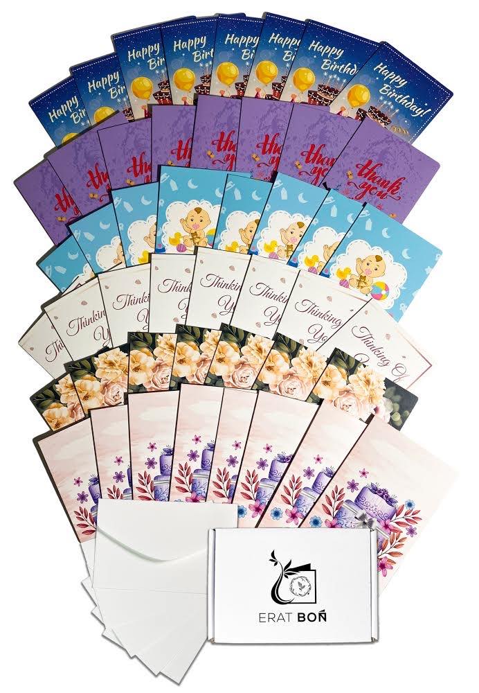
Which one these two images are good for my main image on amazon. This is a assorted pack of all occasion cards that includes (Birthday, wedding congratulatory, sympathy, thinking of you, thank you, baby shower) Let me know what you think :)
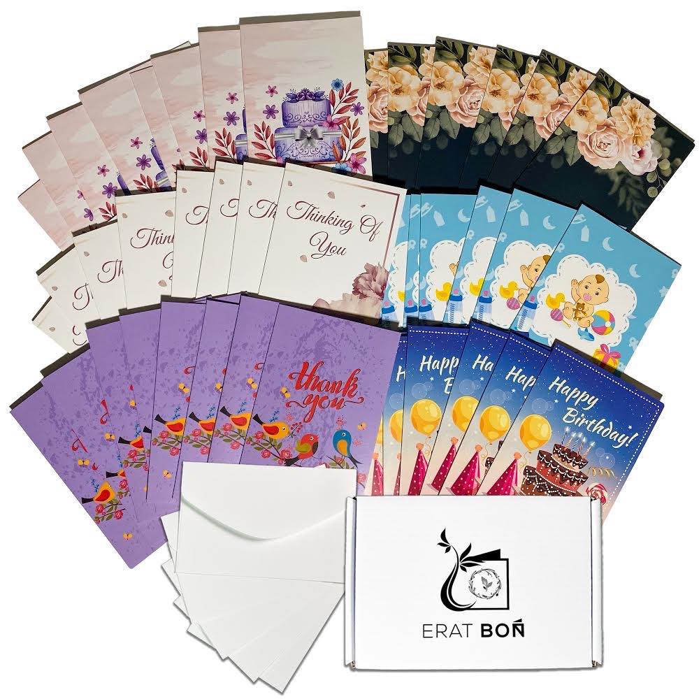
24 Responses to Option A
I think it's easier to look at a picture that's more squarish vs. such a long rectangle like Option B.
I like how the colors are set up in A. The card pattern looks nice.
I thought the darker cards near the bottom made it easier to look at and moved my eyes around.
Option A is more attractive in my opinion.
Like this bundle more.
There is too much going on in option A.
I think the tighter layout of Option A is better. It makes for less scrolling and is easier on the eyes, easier for the eyes to take in all the different designs than the more spread out version in B. Option A is also better because you get a clearer view of each card.
I like choice A because you can see more of the front of the cards at first glance
I like choice A because it is more condensed. I can see how many of each card I get and a brief glimpse of what they look like. Option B loses my interest very quickly because it is to long of a picture and I had to scroll down to see it all.
You are more easily able to see the designs and text on option A
More compact, while still giving a good impression of the variety available.
PREFER THE WAY THE CARDS ARE DISPLAYED IN A
You can see each design better
I prefer Option "A" because you can see more of the cards in the shot. They are pretty and people would want to see them.
Option A shows a better view of the cards. You can see them better with the close up.
This arrangement looks more pleasant and artistic to me. It looks like more cards.
I like option A better because you can see more of the cards. So if a customer is scrolling past they are going to see more of the product which have a greater chance of drawing them in. Also if they are looking at the listing then they can get a better idea of the assortment they are getting. Lessens the chance they will be unhappy with that they get as well.
i like them grouped together like this. I can see the cards more easily. It is a good assortment.
Not as overwhelming as the other presentation.
I like this array. It showcases the options beautifully.
I prefer option B because I feel like I can see the options for the cards easier and more clearly.
Option A shows the cards in a more concise, yet equally as effective way.
the other option is just a little too overwelming, the first picture just just a fine job of showing what can come in the set
I prefer the layout of option A for the cards- better able to focus on the individual designs.
26 Responses to Option B
Option B is better because I see everything that I am getting. There is no guessing. Seeing more is always a perception of getting more value for your money.
It looks more organized and pleasing to the eye.
I liked the option where I could see more of what was on offer
This offers a wider variety and the colors are better here.
This one seems to be more than A and a better value.
this one just seems like more with the way its spread out
I like image B better. Even though they are the same products just arranged differently, B looks like more cards. The cards are attractive and I would buy them.
better presentation i think
I prefer B, the layout looks nicer and much more neat
I chose B because I like how the cards are panned out the way they are and that they are in the center of the photo. It looks more aesthetically pleasing this way.
I like option B. The layout is very nice as well as the artwork. These are items that everyone should have on hand.
I think B is the best one for me because of this layout, I can see the majority of the cards and I think this is very similar to the pack that costco carries. I buy that one but these are a lot nicer and I would buy this one for sure. I am always using these because there is always an occasion to be celebrated.
I like the layout of this one more.
veru nice and unique looking. Nice colors
The fan shape allows for my eyes to go downwards in a synchronized color fashion.
picture shows more product detail
I like the assortment of cards shown on B
I like the variety of cards shown in option B and the layout. The image is closer than option A.
I think choice B is the better choice because less is more. I like using less card designs and spreading them out across a full row instead of having double the card designs.
I prefer this option because I think a single card type in each row is easier to see.
definitely choice B. it makes it look like it has more, I can see more of what the cards actually look like. I like the assortment.
Better organized than the other option
I found quality in Option B because the way that this all occasions cards are presented makes me feel attracted to them and purchasing it.
I like things to look fairly symmetrical, so I prefer choice B; they are nicely laid out and you can get a good idea quickly how many of each cards there are in the set.
I like how each card type is positioned so that there are layers. Makes it more pleasing to the eye.
I preferred the option B better because it look so much better with the organized outline of the cards and it makes it easy to see all the cards design with that option.
Explore who answered your poll
Analyze your results with demographic reports.
Demographics
Sorry, AI highlights are currently only available for polls created after February 28th.
We're working hard to bring AI to more polls, please check back soon.

