Poll results
Save to favorites
Add this poll to your saved list for easy reference.
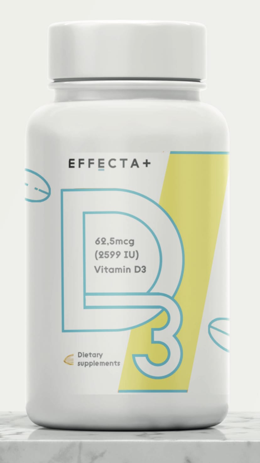
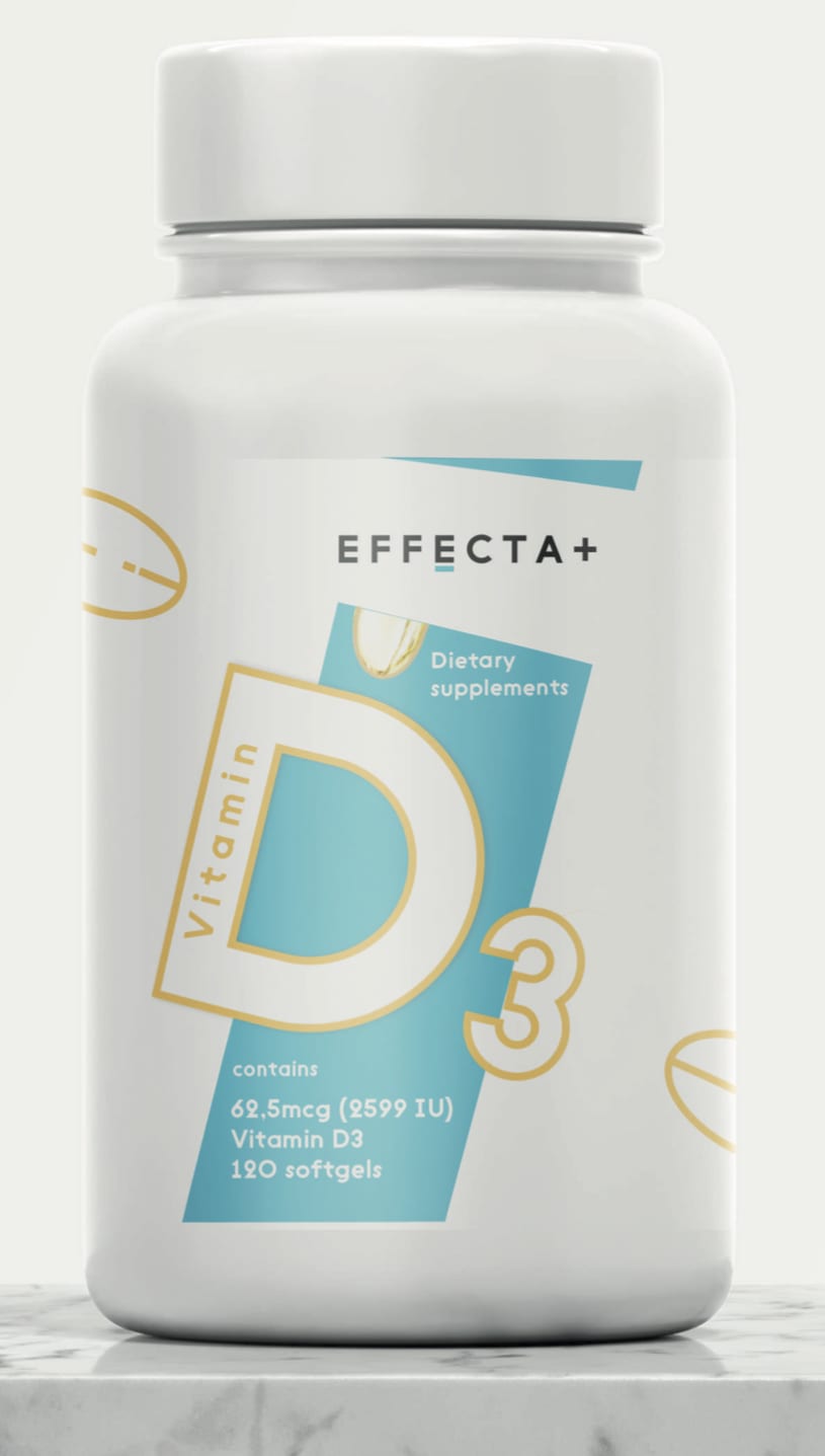
Which package design for supplements do you like more?
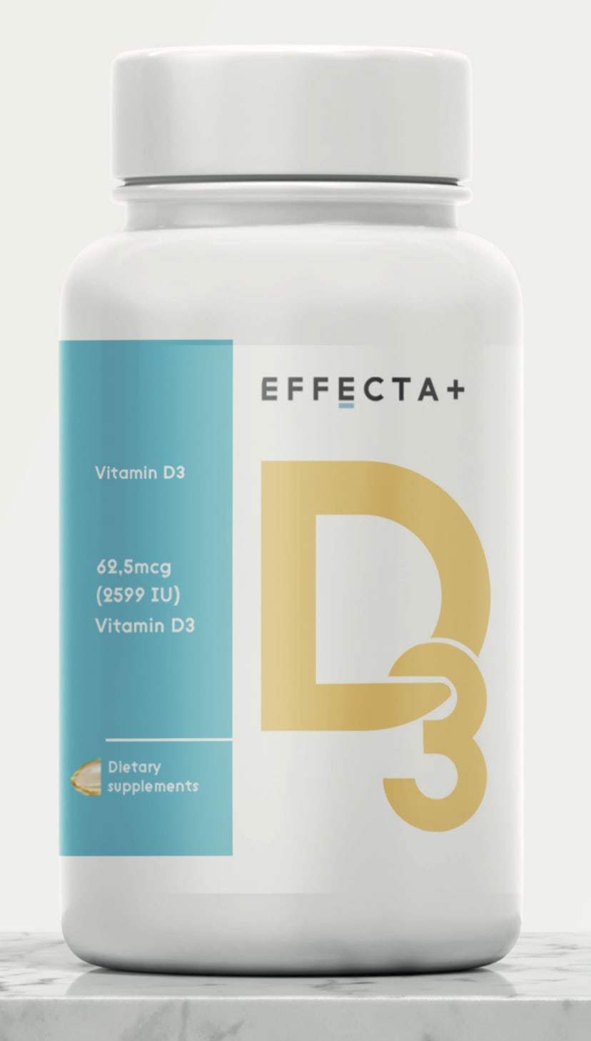
Option A won this Ranked poll with a final tally of 67 votes after 1 round of vote counting.
In a Ranked poll, respondents rank every option in order of preference. For example, when you test 6 options, each respondent orders their choices from first to sixth place.
PickFu requires a majority to win a Ranked poll. A majority winner differs from a plurality winner. A majority winner earns over 50% of the votes, whereas a plurality winner earns the most votes, regardless of winning percentage.
If an option does not earn a majority of votes, PickFu eliminates the option with the lowest number of votes. The votes from the eliminated option are reassigned based on each respondent’s next choice. This process continues in rounds until a majority winner emerges.
Scores reflect the percentage of total votes an option receives during the vote counting and indicate the relative preference of the respondents. If there is no majority winner, look to the scores to see how the options fared relative to one another.
| Option | Round 1 |
|---|---|
| A | 67% 67 votes |
| C | 18% 18 votes |
| B | 15% 15 votes |
Age range
Amazon Prime member
Education level
Gender identity
Nutritional supplement use
Options
Personal income range
Racial or ethnic identity
67 Responses to Option A
I think option A has a more clear layout that makes it much easier to read without being distracted.
I like that choice A has a great packaging design and like the emphasis on the text.
I voted for A because I think I am drawn to the way that D3 looks on this bottle the most.
A is the most visually appealing and easiest to read due to D being in gold. B is the second easiest to read because the yellow bar draws the eye in. I don't like C.
I like A because the design appeals to me most, clean and colorfulThe second choice jumps out a little because of the angled text. And 3 I just didn't like
I feel like the first two that I picked have very catchy labels. Also they lay out the ingredients in a very easy to understand way
I like option A best because the D3 is not slanted, and it is filled in and most visible in my opinion.
The orange color on the "D3" looks best because it offsets the white surrounding it and brings the buyer's attention more towards the product.
A is the most visible and easiest to read out of the three. The bold color of D3 lets you know immediately what it is. It's harder to see the D on C and B.
A is my favorite label and packaging. I like how easy it is to read the label and how clean the presentation is. B and C are similar in the minimalist style I like, but I overall thing A is the easiest to read and the one where the "D3" stands out the most.
I like A better, it seems more solid and trustworthy. I don't like how B has the description inside of the D, it is distracting somehow.And C seems immature with the crooked D
I think the old gold coloringand the interlaced D and 3 look really really good together.
I chose A because I like the design of the D3 on the bottle. I like how to the left of the bottle is has whats in the bottle and how it is sectioned out. I chose C next because I like its design better then B.
A- I think this is the best choice. The label is a nice simple design and is easy to read.C- The design is okay, but the I don't like the how the is offset and angled.B- I don't like the D3 design. It doesn't look very professional and the color tone of blue and yellow doesn't blend well together.
The big yellow "D3" is bright and inviting. Hard to go wrong with yellow for lettering, as it's very fun for sure!
Choice A is the easiest to read the label. The D3 is in a dark enough shade of yellow that you can clearly see it, the font is simple enough, and the white on the turquoise rectangle has a good contrast making it clear to see. Choice C looks a little cramped with all of the information in the one area, and the D3 in choice B is kind of distracting with how the 3 looks.
I think having vitamin bottles look clean and professional is important. It's not that they have to be boring but I don't like the tilt in option C and the filled in font of option A seems more serious.
I just like the overall design and color choice of A the best. I don't really like the graphics of the pill on the other two. I do like choice C as well as far as the color and design of the label. I like B the least.
I chose option A as my favorite. The D3 stands out the best and is easiest to read. The color of the D3 brings it out, you can tell instantly what it is. Option B you have to look at it for a second or two it isn’t instantaneous.
The packaging design of A is the best
Initially I was going to rank Option C highest because the angled layout was interesting. But going the unique route might not be the best option if this product is attempting to appeal to a larger swath of demographics. I also really preferred the D3 design of Option A and it's design layout of the label just spoke "stability". So what I'm trying to get at is that Option A seems nicely structured and solid in it's design so that would translate well to many types of consumers. The block of teal color is a nice touch too. Option C is very cool looking and it's definitely the most attention getting. However, I'm not as much a fan of the D3 on that one. Option B just didn't have any design or visual elements that appealed to me so that was ranked last.
The upright D3 looks the best to me
I like the normal looking one better. To me it is more familiar and looks more reliable
I chose option A because I like the filled in characters more than the outlines. It looks less cluttered to me.
This is purely a personal preference. A - I like how the 3 hangs off of the D. C - the D3 looked interesting not as much as my 1st choice though. B - did not care for the yellow streak.
A looks more visible and is more pleasant to the eye to look at. C Is nice looking and looks professional and the colors are good. A is the most boring because it has little color and i dont like the text for the D3.
I like the color of D3 on option A the best. Reminds me of sunshine. I like that the letters in c are outlined in the same color as A
It looks the most effective and I don't understand the tilting one
I like B the best because the label has a nice balanced look to it that I like. I think A and C both look a bit odd. I don't like the D3 outlined in blue and I don't like the angle of the label on C. They both look a bit cheap.
These three are all pretty bland in color. But my choice has the nice gold on the front. Adds a little spice to the product. I guess this is vitamin D. It should be made clearer on the label. It is there, but the information about the product is pretty sparse. And it doesn't stand out. Put more info on the label.
I like the solid design of the letter and number here
"A" looks bold and strong. "B" looks weak and ineffective.
Choice A is the most visually appealing. I like the sold yellow D 3. Choice C looks nice with the color scheme but the outlined D 3 isn't as eye catching. I do not like the yellow color in choice B I feel like it clashes with the blue.
I like the idea of intertwining the D and the 3, so I ranked A first. Unfortunately, the intertwining looks absolutely terrible on B so I ranked it last. Option C looks pretty average, so I ranked it second.
Ranked A is more vivid in color and stood out more to me then C and B. The Effeta word is more pronounced and also bigger than the other 2 bottles. Overall Ranked A is the best one for my eyes and one that stood out more than the other 2.
The solid D3 in that orange on a white background looks professional, almost pharmaceutical. The second is still fairly striking, but not quite as easy to read at a quick glance while walking through the vitamin aisle. The third option is just boring and would not be easy to read at all from any distance.
i like these labels ranked in this order. The first label is easier to read and more appealing to the eyes because of the way the D3 is gold so its the first thing that draws my eyes to the label itself
I love A the best. I like the D font, colors, and how easy it was to read. C was ok but its doesn't stand out and its kind of hard to read the amount of vitamins in there. Option B I don't like at all it looks to weird and cheap.
I think A looks the most visually pleasing among them.
I like choice A package design for supplements is eye-catching. Choice C the design is bad quality. Choice B it is unattractive.
This packaging is clearer and nicer. I like that the letters are bolder and bigger. It seems to allow the person to see what the benefits of the product is and what is in it.
My first choice is A. I like how the D is connected to the 3 and the important information is neatly listed to the right. Very nice and easy to read. B is my next favorite because I like that the D and the 3 is connected, however I prefer the solid letter D as in A and the information to the side, instead of inside the D. C is my least favorite because you have to look all over the place to read the information. I prefer it to be together in one spot. I also prefer the yellow color over the blue of this label.
A: I chose A as the best one because of the golden D and 3 which made it standout compare to the other three. B: I chose B as the second best because the giant D and 3 with the yellow band really brought some attention to it C: I chose C as the last one because it seems pretty generic and a copy of the other two.
Option A - This was ranked as my first choice. The coloration of the solid orange + blue is pleasing on the eye, and having the “D3” logo separated out from the rest of the product information made it more distinct than the other options and clearly separate “branding” from technical information about the product. The text alignment of the dosage is better in options A+B than in Option C. Option B - The blue and the yellow blends together with the border only “B3” coloration. For both options B + C, the “pill” graphic in the upper left doesn’t really add anything to the product branding. Option C - The only thing option C has that’s better than A or B is the number of pills clearly listed. Adding “contains” doesn’t add value to the packaging. The angled design of B and C is fairly distracting.
it looks durable
A: Straight forward,easy to understand and view the descriptions.C:The design is good,visibleB: Very confusing design,not focusing on the main character.
I like the large D centered and straight alined with the bottle. I don't like the one that is slanted. It doesn't look as high quality and looks too juvenile to me.
I like the way that the D is connected to the 3
I ranked the design for the D3 vitamin supplement bottles that I liked the most. I like the way the bottle looks in option A the most followed by option C and followed by the design of option B.
Contrasting colors make the lettering stand out a lot more, especially when there is a darker background or block of color and light coloring next to it.
Option A is my top choice because it has the sleekest, most professional design out of the three. I enjoy the color scheme a lot and I think the full-color block lettering (as opposed to the other stencil lettering in the others) is much more appealing. My second choice is Option C because although I enjoy the slanted design, the overall vibe of the labeling looks a bit childish to me. Finally, Option D is my last choice because I think the color scheme is extremely childish, and I really don't understand the layout of the font since it's hard to tell the actual product is called "D3."
For me "A" is the easy pick. It is quite simple to see the D3 with the solid gold design. The Turquoise color ads some splash and overall it has nice shelf appeal. C and B are not as easy to grasp mentally with just a glance. The hollowing out of the letters doesn't give you the immediate identification that this is a Vitamin D3 product. Keep it simple for vitamins is probably the safest way to go.
A stands out more with the D3 filled in with color. C is 2nd b 3rd
Option A is my favorite. It's easiest to read, I can clearly tell it's for D3, and it looks clean and high quality. I would probably buy this one over the others.
I think the message that this product is Vitamin D3 comes across much clearer in A, with the solid coloring.
B is a little more difficult to read than the other two so not it!
I like the label with the bold D in it as it is eye appealing.
Option A is more appealing and it has a packaging design which is better than option C.Option B is not much attractive and has a simple design.
A - the orange, solid letters stand out the most to me so it is the msot attractiveB - These letters are bigger than C so this is 2ndC - The letters are too small and not solid letters. I'd change both
The design for Option A looks clear and complete. The information and brand are all clearly displayes and look elegant and beautiful on the packaging. Option C looks discordant compared to Option A. The brand name and text that aren't angles with the graphic look too crowded to me, especially at the top. Option B is the worst. At a glance it looks like a urinary tract supplement, or a teenager's deodorant packaging. The colors and design don't appeal to me at all.
A looks a bit more professional, like a medication you'd see in the pharmacy. The slant on A is a little disconcerting to me for some reason - i just don't like the way it looks. B is okay but I don't like how the '3' is stretched to make it fit better in the D.
I like the gold letters on Option A. Makes the D3 really stand out. I also like how the information is in the blue box right next to the D3. For Option B I don't like the colors of D3, but I do like that the information is right in the center of the bottle. Option C is just okay.
A - The orange of the D3 works well! I also liked how the D3 logo is chained together. C - I enjoyed the use of colors on A over C. The way the D3 is chained together isn't as appealing either. A - I feel this design isn't as dynamic as A or C.
Option A is eye-catching and also easy to read.
For me, I prefer the words to be straightforward because it's easier for my eyes and it makes more sense instead of having to tilt my head in one direction. The reason A is better than B is because I like the letters being colorful as it makes it easier for me to see and decipher rather than white text.
A looks very appealing, it has a great design and is more appealing, C comes next, it has a good design as well, looks okay, B coms last, it looks okay but not as good as the others.
choices a & c the center text is easier to follow and is more aligned.
15 Responses to Option B
B is best, because the strong yellow shaft of light which grabs the 3 below brings to mind the Vitamin D you get from the sun, A is good for a similar reason, the D3 part is yellowish orange, sunny.
I like the whimisy Design of Option b. It stand out as being something that maybe help me too bounce off things
The brighter the label the better
Like the yello contrast. each color is good to go. looks high quality
Option B is easy to read and see what is in the product. Option A is harder to read how much of the vitamin the product provides
I like option B the most because I think the light yellow scheme plus the outlined logo looks really sleek and professional and stands out from the rest.
Option B looks like an effective product -the yellow stripe is eye catching. I like the gold on Option A. Option C looks like the label is crooked at first glance
I prefer option B because I think the dosage right in the middle of the label is the most easy to see.
PREFER THE DESIGN OF LABEL ON B i FIND IT EYE CATCHING
B uses the space on the label wisely (details were written inside the letter "D"). C is very close to B and it clearly states the product is Vitamin D; also, the blue stripe makes information easy to read. A is just to plain compared to the first 2.
How easy I find the labels are to read
I love the abstract look of option B. It is bright and has more variety. I slightly prefer A to C because I feel the logo of C is too small and not bold enough.
B - Professional, visually effective, like how the amount and vitamins are displayed in plain sight inside of the letter D. My eye focuses on that portion first.
I absolutely love how the 3 goes into the D in option B. It looks so cool and stylish. Option A has that going on a bit, but not as cool.
Option A is the most attractive because of the color scheme and the organization of the images, which is more professional looking than the other options. I feel that these types of products do not need to have a "fun" theme with crooked images and small graphics everywhere, as this is an adult product.
18 Responses to Option C
I like the teal rectangle design on the bottles better than the yellow. I put C ahead of A because I think the white letters look better than the yellow. B is last because of the yellow rectangle
The "3" in choices B and A are harder to read than option C. I prefer the color scheme in B the most, but readability is most important.
I actually like the silly angled design more as I think it catches the eye quicker
I really like the layout of option C. The color scheme is really appealing to the eye and modern. The logo is modern and stands out well. I like the design of the bottle and the logo. The bottle is clean and able to be read easily. Option A is more expected. It is what I would expect from this kind of product.
I feel that choice C has a whimsical quality to it and is marketing its product in a playful fashion but still remain professional.
I really like the look of C, especially with the clear D 3 superimposed on the cyan block. B and A look more generic and less interesting.
I ranked these in order of how attractive and professional I thought the designs were. They were honestly all really good, but I think that C is the best and B is the worst.
I liked choice C the best because the blue strip in the package catches my interest and looks the most appealing. Choice A looked the most generic and wasn't appealing to look at.
blue background stands out more and looks energetic
The colors work well together, I really like how the D is outlined but still in the middle of the color so the D pops out, I think there is just a little too much white space with this one but the second similar color options seems disconnected and lacking in both spaces.
I like C because the D and the 3 to be separate in the logo. It is easier to read . I love the teal and yellow color combination as well
While A is easiest to read it doesn't stand out and looks dated. The contrast of the yellow letters with the blue behind a good portion, helps it to stand out and also be interesting. The angling of the graphic also helps it to stand out when I imagine it on a vitamin shelf at the store.
For me, it's all about how much the package stands out and C really catches the eye to draw customers in,the graphics are great. A follows a close second with how bold it is while B is just too subtle and needs to be seen from farther away.
More blue generally looks better, but the all-yellow lettering isn't as nice as the white with yellow outline
I voted for Choice C first because it's design was interesting and visually appealing. It also clearly tells what it's used for and how many tablets there are. I then chose Choice A because it was easiest to see the difference points of the bottle, which was the type of vitamin and what it's used for. Choice B was my last choice because it could get a little confusing with the characteristics of the vitamin being located inside the "D", some may find it hard to read or understand.
The option D packaging design is better. It looks sleek and fun. It would represent the product well. It inspires me to buy the product. It looks very original. The color combination and design is sleek. I prefer it.
I liked Option A the most. I found the contrast of the D on the blue bar made it really easy to see. I also liked the tilt of the design because it was just a little bit more modern, yet very easy to read.
the colors on the bottle jumps out. with c a is bland and option B is very plain as well
Explore who answered your poll
Analyze your results with demographic reports.
Demographics
Sorry, AI highlights are currently only available for polls created after February 28th.
We're working hard to bring AI to more polls, please check back soon.

