Poll results
Save to favorites
Add this poll to your saved list for easy reference.
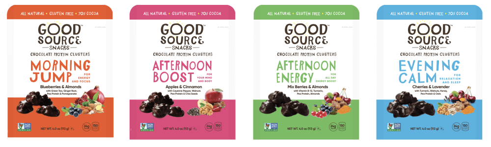
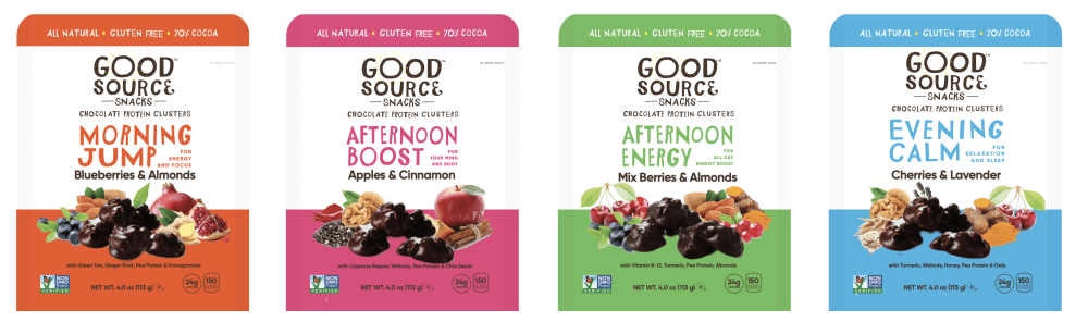
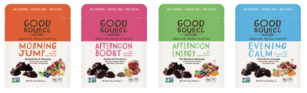
Which packaging do you prefer?
Option B won this Ranked poll with a final tally of 32 votes after 2 rounds of votes counting.
In a Ranked poll, respondents rank every option in order of preference. For example, when you test 6 options, each respondent orders their choices from first to sixth place.
PickFu requires a majority to win a Ranked poll. A majority winner differs from a plurality winner. A majority winner earns over 50% of the votes, whereas a plurality winner earns the most votes, regardless of winning percentage.
If an option does not earn a majority of votes, PickFu eliminates the option with the lowest number of votes. The votes from the eliminated option are reassigned based on each respondent’s next choice. This process continues in rounds until a majority winner emerges.
Scores reflect the percentage of total votes an option receives during the vote counting and indicate the relative preference of the respondents. If there is no majority winner, look to the scores to see how the options fared relative to one another.
| Option | Round 1 | Round 2 |
|---|---|---|
| B | 36% 18 votes | 64% 32 votes +14 |
| C | 34% 17 votes | 36% 18 votes +1 |
| A | 30% 15 votes | Eliminated 15 votes reassigned |
Age range
Education level
Gender identity
Household income range
Number of kids
Options
Personal income range
Racial or ethnic identity
15 Responses to Option A
The order is best to worst in my liking.
I can see the images and the font in more vivid detail on option A, it is also pretty similar to option b. Option c has too much color.
I ranked the design of the packaging that I liked the from the best to least. I really like the bigger font color scheme in option A the most compared to option B & C.
I believe that the brand name in white is more visible and obscured a little by the colors, even though the colors are eye-catching. The flavors listed in larger font are also easier to see. For those reasons, Imy choices are ranked as follows: (A), (B), (C).
i like the text on white background its a clear contrast and more appealing to the eyes
The colored background on the bottom of the bag looks better and A has the bigger font seemingly.
C I don't like how the words are in different colors and not as easy on the eyes. A is the best look with the style and layout of the packaging. B is fine as well but think the lettering of A is better
I feel like you can read the name of each one better because the writing is bigger in Option A. Option B is a close second, but the printing seems a little smaller and harder to read. I'm not a big fan of the color blocks on the tops of Option C.
I like the colors and like the more open look of choice A and B. I like A the best because of the way they have the ingredients laid out
The vibrant coloring and the font styles really point out to me the quality of this product!
Looks easier and much cleaner than others
I like packaging in A the most because the color is balanced on the top and bottom, which makes me want to read all of the information on the packaging and not just the top logo info.
I like choice a because the color is spread out nicely.
A and B are easy to read against a white background.
A and B look far better than C. C looks weird with only one border on the top. I prefer A to B because A has a bigger, more prominent text that stands out more.
18 Responses to Option B
I really enjoy how choice B has a great level of product representation and that the layout is super clean.
I like how the food product in B is together in the middle. I like that the middle has a white background over the colored one.
The photos on b made them look more abundant than a. The color blocks on c made them look top heavy.
I prefer Option B because because the text is just the right size and the variable of colors looks balanced. I chose A because the it has the same as B except the text is larger. I liked C the least because of the huge colorblock on the top of the package.
i think color at the top and bottom looks better for people to see the logo
The strip of white with color above and below looks better to me. The images of C made me think of vitamin water labels and other similar things. B is best because the ingredients look like they are in a big pile, so people think they are getting lots of things. The A image spreads the food out more, which reduces this effect, but they design is still pretty good.
I liked B the best because the density and lack of separation between fruits made the product look more complete and full. I didn’t like the abundance of white space that the other options had on the main section.
B is the most elegant and stands out the most to me.
These seem to have the most catchy graphics and font that would get me interested in picking up the product off the shelf
Option B has the best design because it lets me see clearly the product content and its description. I disliked options A and C because I don't feel the same about them.
Color, white, color layered makes the words pop out better, thus grabbing attention better.
B- shows all the materials in this that it is made of. Color is well placed.A- separated materials in front can make it hard to get for consumer.C- Too colorful for my liking.
Would like to pick option B is the perfect package design which is more appealing and likely to click on the product
To me I don't like my 3rd choice because the words are blocked by the colors. I like the words against a white background. That left me with my top 2. I like the smaller writing so I picked that one as first.
With the animals at the bottom, your eyes naturally draw to the writing that is above them.
bold colors and graphics that stand out in a big way
I prefer choice B and A because I think the colors on top and bottom of the package makes the product standout better than choice C.
The non gmo symbol sticks out as well as the food looks really delicious in this.
17 Responses to Option C
I think that the bolder color is more exciting, and definitely would catch my eye faster.
The larger bar of color on the product is bright and eye-catching.
it looks super bold and noticeable compared to the others
the print seems bolder
I love choice C the best. I like that the packaging is very colorful. I don't like the color at the bottom on choices A and B because it takes away from the picture of the fruit.
I chose C as my top choice because I like the filled color at the top, I think that makes the packaging stand out more compared to the other ones.
just went with guy instinct
The combination of chocolate + "real" healthy ingredients is what would make me want to purchase these, and I ranked packages in the order that I think the ingredient photos are most clear and easy to see at a glance.
Option C has a very eye-catching package due to the color at the top of it, while Option A has larger font than Option B.
Option B was the most difficult to read at a distance so it is clearly my least favorite. On option C I noticed the word chocolate quickly because it was on the darker background. That is why it is my first choice.
the white background makes it easier to see the product, option B i preferred because there was plenty of product shown just did not feel as cheap as option A no need to skimp on showing it in a picture
I voted in order of product details given in the shortest amount of words and the most interesting color combinations. Choice C is the best option that met the stated criteria. It uses a good color palate and is not cluttered with information that is hard to understand. It gets the point across quickly. Choice A is my number 2 choice because the colors do not look as good and it is more cluttered. Choice B is last because the colors are not well used and is too cluttered.
I like this packaging very much in the order I chose as the colors really stand out and are vibrant
Easier to read, and most eye-catching.
The colorful headers at the top of the product are more exciting and inviting. White background is boring!
I prefer this packaging. I find it more appealing and enticing. I also feel it's more modern and it resonates with me more.
i like these packages.
Explore who answered your poll
Analyze your results with demographic reports.
Demographics
Sorry, AI highlights are currently only available for polls created after February 28th.
We're working hard to bring AI to more polls, please check back soon.

