Poll results
Save to favorites
Add this poll to your saved list for easy reference.
Which pattern do you prefer when buying a gender neutral diaper changing pad?
Option D won this Ranked poll with a final tally of 27 votes after 1 round of vote counting.
In a Ranked poll, respondents rank every option in order of preference. For example, when you test 6 options, each respondent orders their choices from first to sixth place.
PickFu requires a majority to win a Ranked poll. A majority winner differs from a plurality winner. A majority winner earns over 50% of the votes, whereas a plurality winner earns the most votes, regardless of winning percentage.
If an option does not earn a majority of votes, PickFu eliminates the option with the lowest number of votes. The votes from the eliminated option are reassigned based on each respondent’s next choice. This process continues in rounds until a majority winner emerges.
Scores reflect the percentage of total votes an option receives during the vote counting and indicate the relative preference of the respondents. If there is no majority winner, look to the scores to see how the options fared relative to one another.
| Option | Round 1 |
|---|---|
| D | 54% 27 votes |
| C | 24% 12 votes |
| A | 18% 9 votes |
| B | 4% 2 votes |
9 Responses to Option A
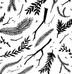
The nature design is most neutral to me. The design touches all of us and the colors are nice and neutral.
I liked the illustration the most on A, as well at the color. It would be easy to match it to other things in the room. I liked the illustration on A better than D, but preferred illustration to a simple pattern. The cartoony-ness of D made me like it for this purpose. I preferred B over the remaining option because I both liked the pattern and color of B over the other option.
I chose A first because the pattern is appealing to me and it is also pretty trendy right now. I like the feathers and the branches. I also like that there aren't any gender stereotypical colors. I chose C next because I love the color. I am female, and that is my favorite color. It isn't the stereotypical gender neutral colors, but the pattern and the colors are really pretty and trendy. I love the watercolor look to it. I chose D last because it meets the gender neutral stereotypes very well. The animal pattern is very cute and the color yellow is generally used as a gender neutral color.
I picked A because if I didn't know the gender of my baby I would like this pattern and color. It would fit nicely with a baby boy or girl. you can never go wrong with black, white and gray.
I liked the pattern for A. It's truly gender neutral. I liked the color on C. It's also pretty neutral. D is kind of cute. It's not my thing, but it's cute and neutral. I don't see D as neutral so much, which is why it's last.
All of the choices are pretty neutral color, and pattern wise.
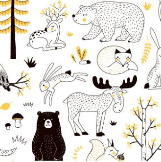
Option A is definitely my favorite for a gender nuetral changing pad because it's a simple black and white. The feathers work for both genders. Next, I would choose option D because the colors and of course animals are gender nuetral.
Both blocky images looked like kid's art. Option A was least kid like.
I like the black and white because it is the most "adult" and also the most gender neutral. I like things for babies to not look babyish.
2 Responses to Option B
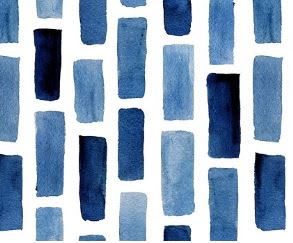
I did not like A because it has no color and the objects in the pattern are not something a baby would recognize. I liked C and B because they're colorful. I liked D because it shows images of animals that a baby might recognize, so it might be possible to talk to the baby about what the animals are and what they're doing.
I like these more.
12 Responses to Option C
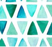
I like the colorful one that is still gender neutral then the features. Than animals are okay but feel they could have been done a little better.
The green pattern is definitely the most gender neutral. I also love Choice 3, the blues, but it is probably more for boys.
The greenish color triangles are both neutral attractive. I think the pattern is quite appealing and the color variation makes it interesting for the baby to view also. The characters in my second choice are adorable and it would have been my first choice if it had more color. I do not prefer the black outlining of the characters with no color filled in. It should be bright and interesting for the baby visually
I think these choices are truly gender neutral, based off of their design, color choices, and patterns. Additionally, these would grow with the child, they are not too childish
i like it very much
C is the nicest and most aesthetically appealing because the colors are calming and the design has a nice flow to it. It is not chaotic or confusing like the other options-- the other options have patterns that are too overwhelming.
I chose these based on the basic gender neutral colors. The multi colored teal can be an ideal color for both genders as well as a great pattern. The second i picked this one because of the cartoonish design of the pattern as well as yellow being a neutral color for both genders. The third I picked this one because of its basic qualities in a stylish form that is great for both genders.
I like Option C the most because green is a good gender neutral color, especially for babies because it is bright. Option D is cute with the animals and could work for either gender, though I think it would be more boyish. I did not selection Option B because it is blue and blue is almost always associated with boys.
Chose based on color preference
I feel they look really plain or don't bring too much attention to gender. Also they are cute designs which are fitting for a baby's diaper changing pad.
I like the colors and flow. It blends well
I certainly prefer C as it seems gender neutral and would work with most decor. Option B is ok, but I would think more suitable for a boy unless it coordinated with a blue theme for a girl's room. Option D could go either way, but it looks like it would be more for a boy's room.
27 Responses to Option D
The animals are super cute. Secondly, i like the colors in the next two options.
The colors of these are more obviously gender neutral.
D is so cute! It's a modern look with the perfect colors for both boys and girls. it's adorable enough to be for a girl but not over the top that it could be for a boy. A is my next favorite, it's not incredibly well designed, but it's simple and would look nice with any general neutral decor.
For gender neutral I prefer colors or patterns that are black and white or even yellow. The patterns I chose were also not overly specific to one gender or the other.
I like the designs. Colors were also important. Even black and white is attention-grabbing. Makes me think of a design for fabrics, probably sheets.
I picked the three I liked the best. I don't care if B is for boys. Blue has always been my favorite color and I think it's fine to use it for girls, too. I never liked saying girls had to be pink and boys had to be blue.
I chose D because I think that all animals are good for gender neutral items. The feathers also are very good for gender neutral items. I don't buy in to the whole colors that are for boys or girls. However, the pattern of the green triangles jus seems more neutral when comparing it to the blue.
I like the animals, they are cute, so that's my number one choice. I didn't like the image in black.
I think Option D would be the best choice since animals are typically gender neutral.
D: The woodland animals are in neutral colors and are cute - would be a cute theme for girl or boy. C: The triangles are a nice modern pattern and I like the shades of blue and green. A: The nature print would also make a good theme for a neutral nursery. I prefer more color than black and white, but the print is appealing.
I chose the patterns that I liked the best regardless of whether or not they seemed gender neutral. Cute animals are great on anything.
I think option D is very Gender neutral and something I would pick for either a boy or a girl.
D is so cute for kids, I love it. I really like the colors in C, and A would be ok. I think D is more appropriate for a diaper pad because it looks like it is for kids. I don't like option A because it is not colorful. Also, D is saying it is something for the baby, less likely anyone would use it for anything else.
These just seem very friendly. D speaks to all babies. B and C are similar to each other. The last one is just kinda ugly.
I chose D first because I like animal prints for babies, whether the baby is a boy or a girl. I like the subdued colors on that one as well. I chose A second because I like the black and white, and I like the leaf pattern. It reminds me of Autumn, which is my favorite season. I chose C last because I like the pattern of the triangles better than the blue rectangles on B. I don't like B at all and wouldn't choose that one for a boy or a girl.
Option D is cute and appropriate for a child, boy or girl. The child will enjoy looking at the animals. Option A is the next interesting choice, it has a pattern that is imaginative and dynamic for myself and a child to look at. Option B is a little boring, but it is a pleasing abstract pattern that I could stand to look at.
My first choice definitely gender neutral love the animals... Green is definitely gender netural and simple pattern... and i just preferred the blue because i dont like the branches at all for any baby product
The animals are very cute, and what kid doesn't love animals?
D would be my favorite for a gender neutral gift because it is in black and white versus blue. The general population associates the color blue with boys. B is also in black and white but it is more boring than D. The animals in the image seem general neutral having both types of animals that are associated with both sexes (Bunny-girl, dark bear-boy, etc.)
Option D was the most gender neutral and I liked the animal print on it.
Option D is the most appealing for a neutral gender print. I really like that incorporates the color yellow. yellow to me represents sunshine, happiness, brings a brightness to the print. Also the animals look sweet and add an element of of character. Not a boring print. Option A is a nice print too, but I am not a fan of the black and white personally, I would like some sort of color to bring more character to the print. Option C is my favorite print but I did not choose it as my first pick because I feel its oriented more for a boy, not so much appealing for a girl, not gender neutral in my opinion.
I like D the best because it is animal-themed. I love animals and think that is a great gender-neutral theme. I picked A as the second choice because I like nature and think nature is also a great gender-neutral theme. C would be my third choice because I personally prefer animals or objects for a baby over just color patterns. However I like this one because the colors and shape remind me of beach glass and I would be happy to have that for a baby boy or girl.
D-Animal pictures are always loved by kids and mothers .
I think the design will capture baby's attention and be unconforming
For gender neutral yellow is a good color to go for any gender. I prefer choice D as the best if I was picking. It has a design and animals on it. Choice D is the best option!
Option D would be my first choice when buying a gender neutral changing pad; I really like the animal design, it's super cute. The second design that I chose, that I like is option A, I like nature and think the leaves make it a pretty cute design. My last choice is option C, I like the colors used in the design and the design itself is simple, and I like simplicity.
I chose D because of the animal print because it's cute. I like C 2nd because the pattern is simple and gender neutral. I chose A last because its better then the B image.
Explore who answered your poll
Analyze your results with demographic reports.
Demographics
Sorry, AI highlights are currently only available for polls created after February 28th.
We're working hard to bring AI to more polls, please check back soon.

