Poll results
Save to favorites
Add this poll to your saved list for easy reference.
Which photo would you click on if you want to buy a Vitamin C serum on Amazon if prices are equal?
Option D won this Ranked poll with a final tally of 35 votes after 3 rounds of votes counting.
In a Ranked poll, respondents rank every option in order of preference. For example, when you test 6 options, each respondent orders their choices from first to sixth place.
PickFu requires a majority to win a Ranked poll. A majority winner differs from a plurality winner. A majority winner earns over 50% of the votes, whereas a plurality winner earns the most votes, regardless of winning percentage.
If an option does not earn a majority of votes, PickFu eliminates the option with the lowest number of votes. The votes from the eliminated option are reassigned based on each respondent’s next choice. This process continues in rounds until a majority winner emerges.
Scores reflect the percentage of total votes an option receives during the vote counting and indicate the relative preference of the respondents. If there is no majority winner, look to the scores to see how the options fared relative to one another.
| Option | Round 1 | Round 2 | Round 3 |
|---|---|---|---|
| D | 34% 17 votes | 36% 18 votes +1 | 70% 35 votes +17 |
| B | 24% 12 votes | 24% 12 votes | 30% 15 votes +3 |
| A | 20% 10 votes | 20% 10 votes | Eliminated 10 votes reassigned |
| C | 20% 10 votes | 20% 10 votes | Eliminated 10 votes reassigned |
| E | 2% 1 votes | Eliminated 1 vote reassigned |
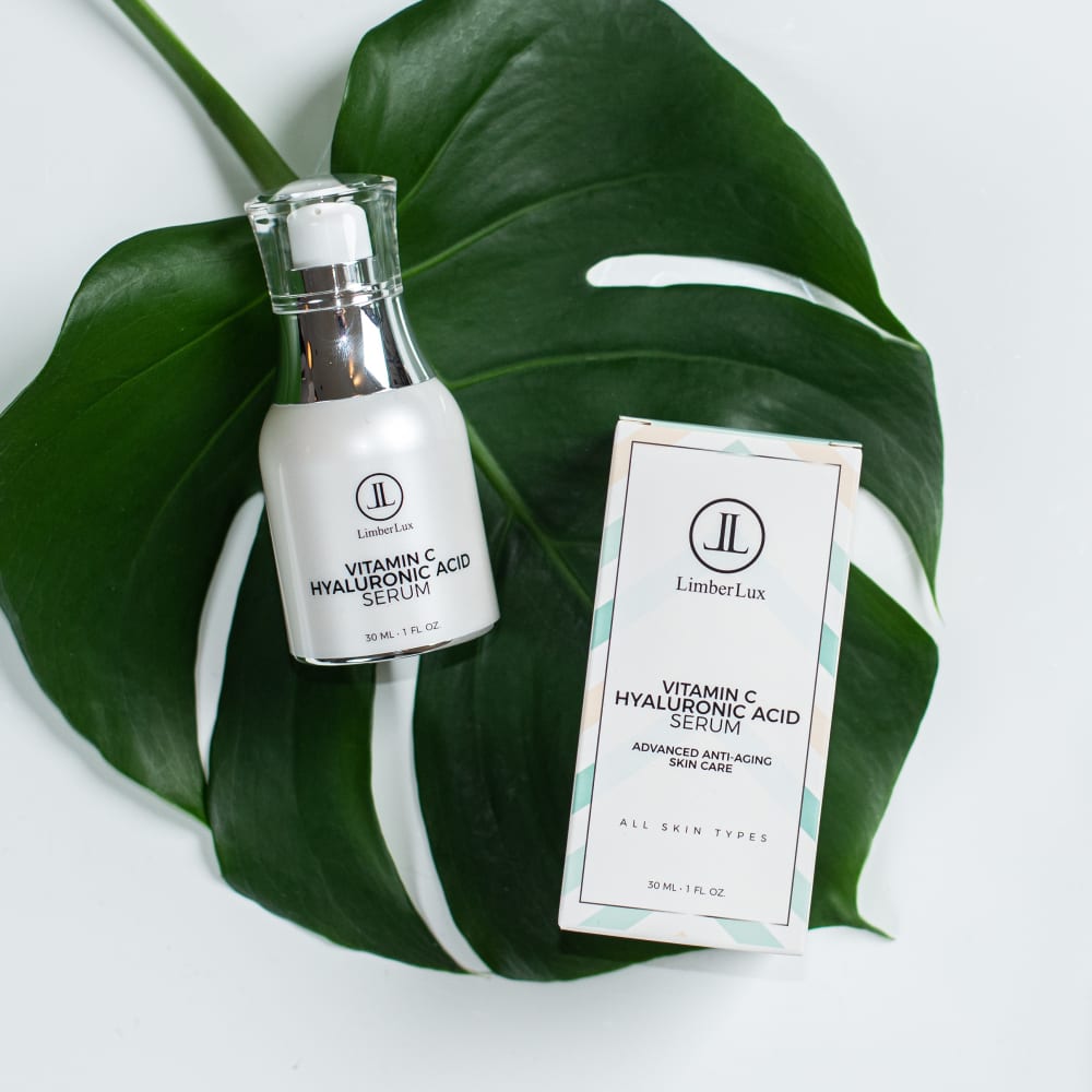
10 Responses to Option A
A is a gorgeous pic, it looks like a magazine editorial. Great sense of image. C and D are pretty equal because they both contexualize the product unlike the remaining options
I like the classed up displays with the plants visible. Makes it feel more hippy friendly.
If all prices are equal I'd click on option A as my first choice to purchase, because I really like the way it's displayed and makes the serum look so natural and organic. My second choice would be option D because the image makes the product look really relaxing to use. My third choice would be option C because the image makes me have the thought of a day at the spa, which could also be very relaxing.
I like the green associated with the product it not only gives the natural status most crave but beautifies the product.
these ones make the product look way more interesting and more relaxing.
A is presented in a somewhat novel fashion. C has the next most attractive presentation. D is the third best presentation.
I really like the backgrounds surrounding the products, they add to the product rather than detract, and I picked out the ones I prefer in order (A,D,C).
made my choices based on which were the most appealing and would make me likely to click on it
The presence of plants and greenery really helps present the idea of the product being natural and the overall healthiness and benefits of the serum. It also helps promote the idea of luxury as it appears in a spa-like setting.
I picked based on which looked most useful and professional.
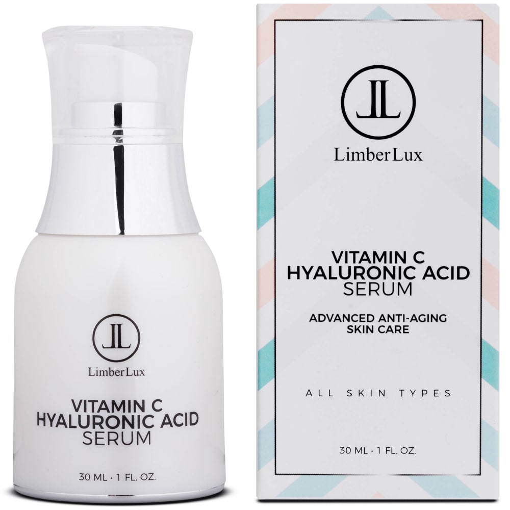
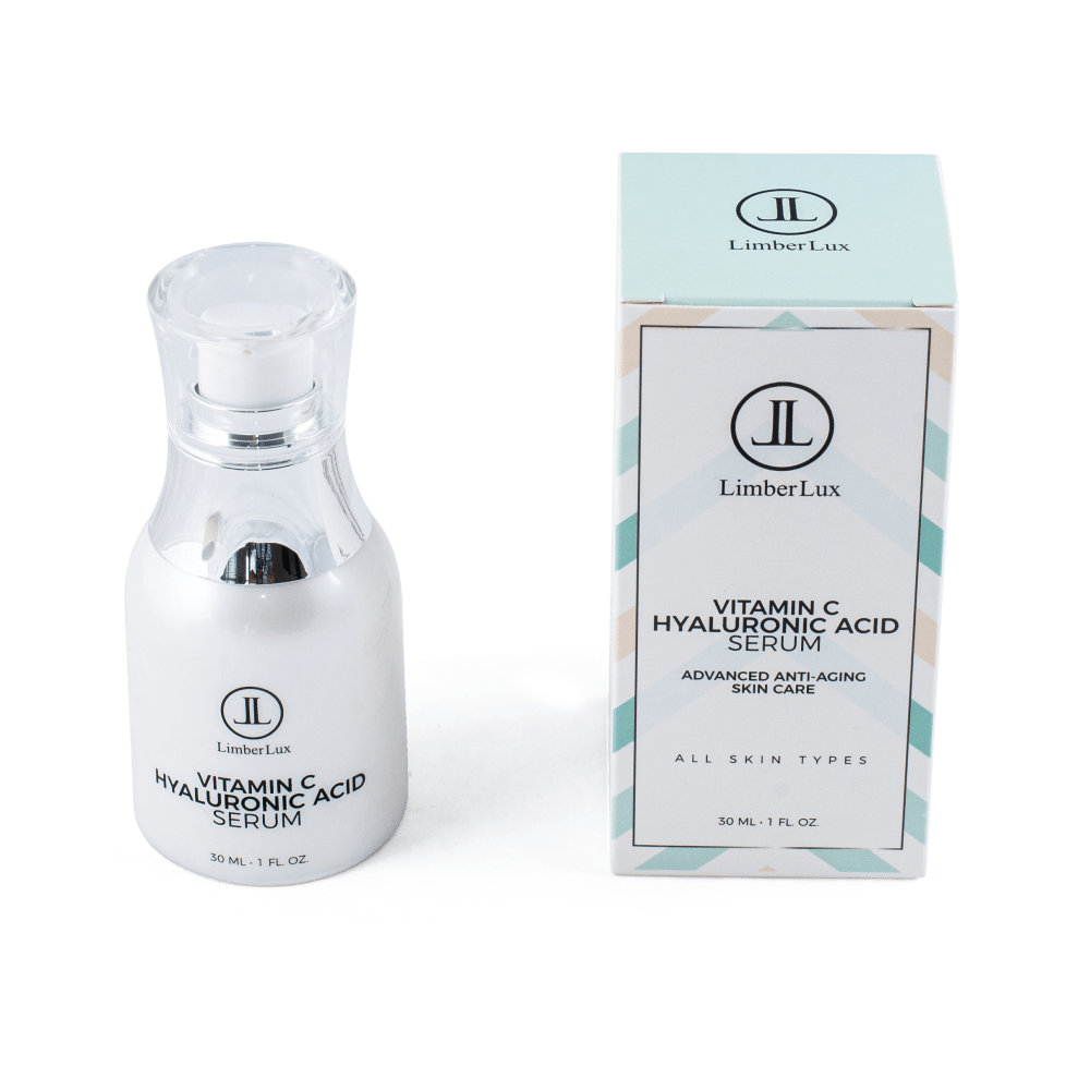
12 Responses to Option B
the first choice I made best showcases the product packaging
b d and e are all equally visually appealing and premium looking
just showing the product is better, does not need the background stuff
I chose B first because the product is clear and focused so you can read it. It's straightforward. I chose A & D because you can clearly see the product & label in the photos.
I like option B the most because it displays the product head on. You are able to easily read the label and are not distracted by the background. The background of A and D are more aesthetically pleasing and are still easy to read.
I like when I can see the product packaging properly
B is the best for me because I can see all the information clearly and everything about the product that I would want. I would buy this one.
I like how these options show me the true size of the bottle compared to the box that it is packaged in. Also I like that I can see all of the bottle and there is not anything taking attention away from the product
Option A is better because you're able to fully see all the information of the serum easily. You don't have to click on it and zoom like you'd have to do for some of the other options. It's simple and straight to the point of the serum. Option C is nice too because it does the same thing as option A; however, the picture has other visual things included. I'm assuming it's aloe and aloe is what is in the serum to help your skin. My last option does this too, but the bottle and box are farther away so it makes it harder to see what it says. If I was scrolling on Amazon for serums, Option A would be the best because I would be able to read it without clicking on it and has no other visuals in the photo that I would be distracted or misled by.
I chose the image with a pretty background and with the box it comes in because it just looks like a better presentation.
The best product photos emphasize the product and minimize other items
The products look trustworthy and I like their display layouts.
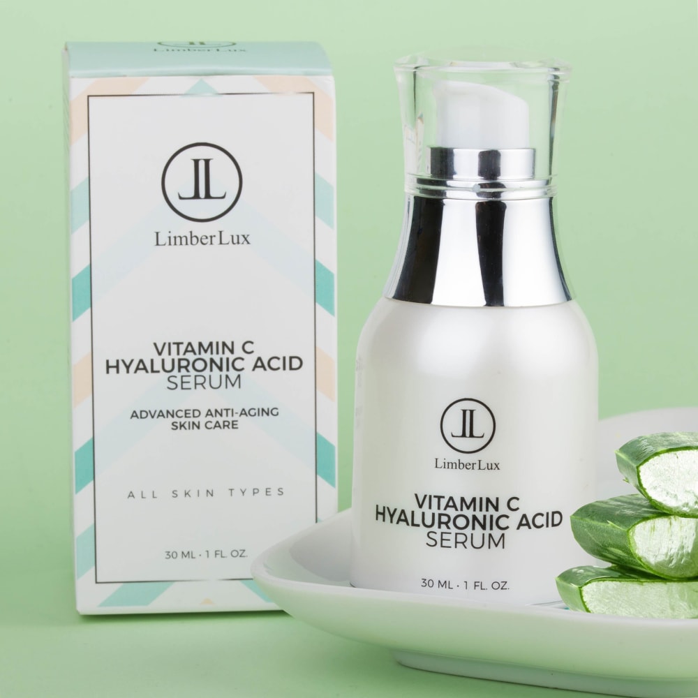
10 Responses to Option C
I want the bottle and box large with some small setting props, which is why I liked Options C and D the most.
I chose C because green is a very soothing and relaxing color. It makes me think the product is very natural. I also like seeing the bottle as well as the box is comes in.
I LIKE THE SETUP OF THE PICTURE. YOU HAVE THE PRODUCT IN FRONT. YOU HAVE THE TOWELS AND THE ALOE VERA PLANT, WHICH THE PRODUCT HAS IN IT. IT MAKES FOR A VERY GOOD PICTURE.
My first choice was Option C because of the way that the product was prominently displayed in the picture. I chose Option A as my second choice because the green leaf pattern in the background caught my attention. Option D was my third choice due to the plant and the rolled towels that were strategically placed in the picture.
Choice C is my top pick because the green color is an attractive backdrop and it includes the box. Choice D looks like something that can be spa quality. Choice B is my third choice. It is not as an attractive image as the first two, but it provides sufficient information for the product.
I like the mint green color. I like being able to see the label of the product
The three options I chose gave off a spa vibe without being overly cheesy or bland. The colors and brightness of option C were why I picked that one first.
C first - it shows the product simply - you can see the box ( it says all skin types, which the bottle doesn't not say), and the aloe implies healthy, freshness, moisture containing.d looks like a spa setting, which would help imply skin care places woulduse this product in their facial packages.b because it's a simple product shot - showing the product size and label
I chose option C as the first choice because I like that it is close enough that you can see the wording on the bottles. I also like that there are things in the background to make it look nicer.
I like C best for the color scheme and inclusion of sliced aloe. D is also an attractive photo with aloe and towels. B is a good third choice because it clearly shows the product and packaging.
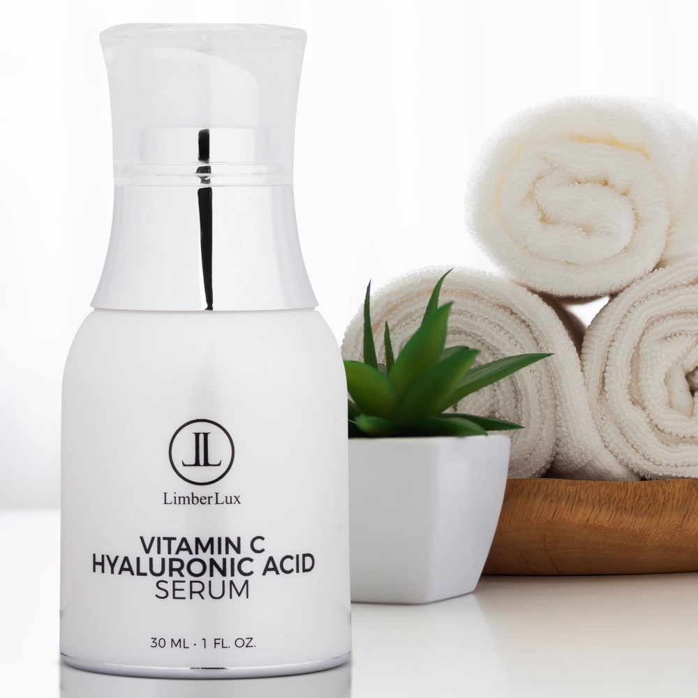
17 Responses to Option D
I like how the product is being displayed, it really pulls me in and it looks pleasing to the eye rather than having the product on a white background like option E and B.
these look like the highest quality products
Choice #1 was the better picture as it shows the product more clearly and is more appealing. Choice #2 is the second most appealing and is visually nice making it more appealing as well. Choice #3 is a clear picture describing exactly what the product is making this the 3rd best choice.
Choice D will be my pick since it is elegant looking and high class. It has a white background which makes it look more luxurious.
this one is in a better setting
D would be my first choice because the photo represents tranquility, which would appeal to the part of me that is tuned into self care. B would be a good second choice, as would C, as these both represent simplicity.
D makes you feel like you're getting the whole "spa" experience with the towel and aloe plant. A is the chic-est one.
I would click on D first if I wanted to buy a Vitamin C serum on Amazon (if prices are equal). This photo speaks of quality, I like the background, it makes me think of a spa. I like the green in C.
I chose D first because it looks like the product is in a spa setting, and that makes it pleasant, and makes me want to look at it longer. I chose C because it also looks like it has been put into a spa-like setting and I like the green background. I chose B because it gives a nice large image of the product itself and I can see what the main ingredients are and what size it is easily.
The backgrounds of these two images I chose first are really nice, but the towels one is more realistic. No background is great too.
The background of all three pictures appealed to me.
The plants and props with the product make it look much more aesthetic, professional, and eye catching
I chose in order of how appealing the pictures are, and how likely I am to click on them in real life.
Option D out of the 5 has the most appealing picture. It looks professional, and you can clearly read the product while looking at the picture. Option C is also very appealing and professional, but lacks a bit on being able to read the product. Option B is clear and strait to the point and I really enjoy that. I would definitely click if I saw it.
Option D would be my first choice because it places the product in a prominent position, making it easy to read the primary ingredients, while still incorporation appealing natural elements, such as the plant and wood/bamboo bowl, in the background. Option C would be my second choice because it still allows for easy viewing of the product packaging, while still adding the natural element of the aloe slices. Option A was initially my first choice because of the natural appeal of the leaf framing the product, but on viewing the others I designated it my third choice since the product labels are less easy to read.
D puts the focus on the product in an attractive setting.
Option D is more spa-like. Option C is good. I like the backround seafoam color. The other 3 are boring.
1 Responses to Option E
Do not use a dark green leaf behind Vitamin C serum. Use something yellow etc.
Explore who answered your poll
Analyze your results with demographic reports.
Demographics
Sorry, AI highlights are currently only available for polls created after February 28th.
We're working hard to bring AI to more polls, please check back soon.

