Poll results
Save to favorites
Add this poll to your saved list for easy reference.
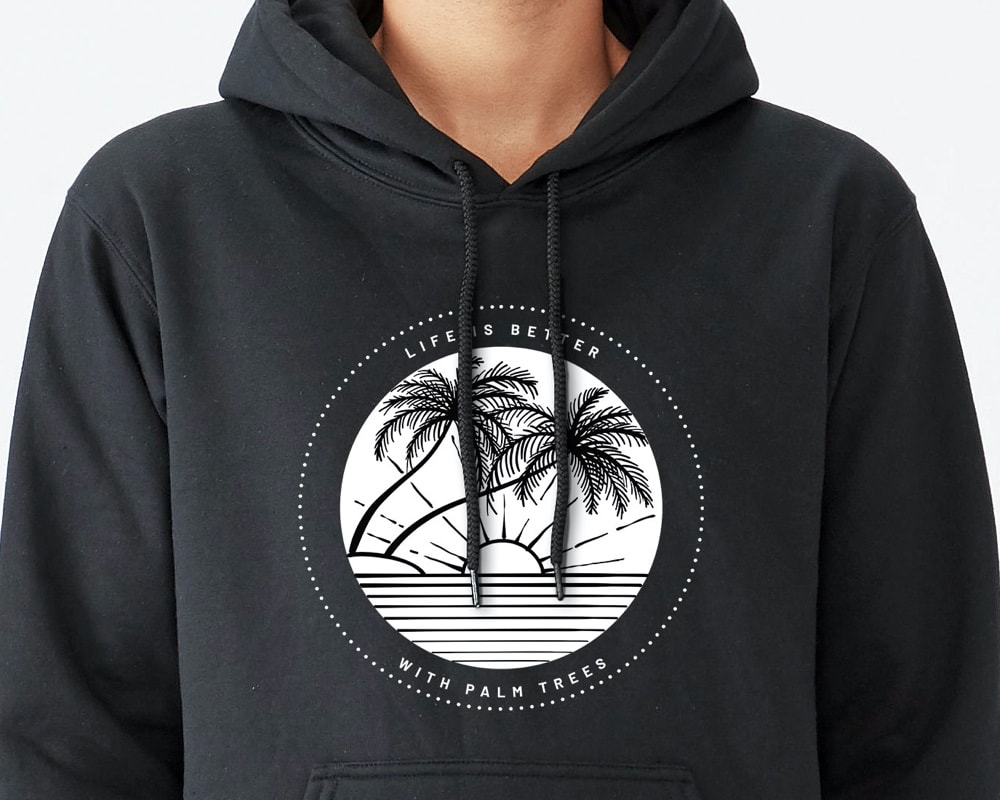
Which photo would you rather click on to see more details?
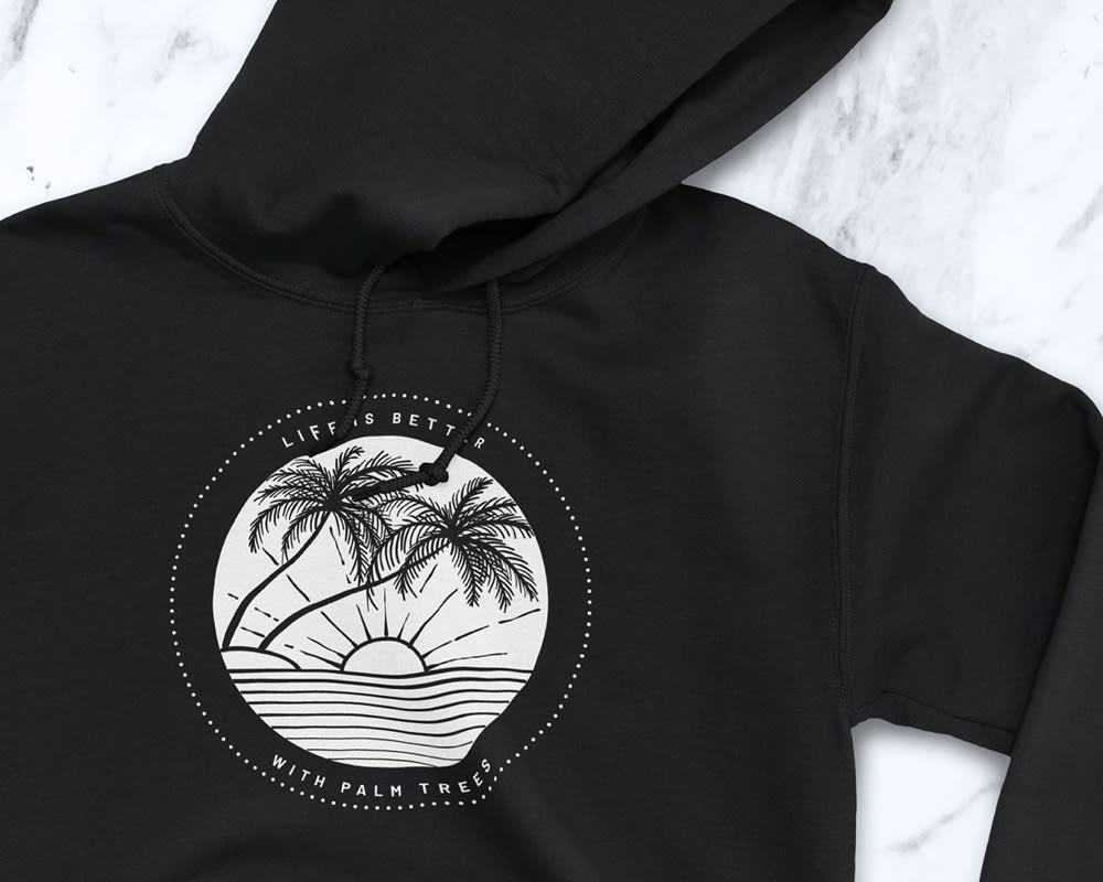
10 Responses to Option A
The model detracts from the hoodie pic.
It looks better without being worn.
It helps me envision it better on myself
I chose A because I can see the full image. B has the strings covering the image
Have to say A here. Usually I go for the people but this person looks to nervous and frightened in the shirt. A shows movement and I can imagine a person in it.
this picture is more clear.
Backround looks more attractive
I would choose A... it is a clear picture to be able to see the detail. B has strings in the way.
the color (even though its black) looks more saturated and nice in this picture
I like that the emphasis is on the logo. I would click on this one because it is the logo that attracts my attention
40 Responses to Option B
Option B is best because it shows someone wearing it.
I think it looks best being modeled but I like how the logo isn't covered in Option A.
Shoeing it on a person is best
Photo is straightforward and concise showing a neat version of the item, otherwise they are the same.
Someone is wearing it. Looks like a nice fit
B is centered and catches the eye more than option A.
It gives it shape to see it on a body. Makes me think how good it would look on me.
Seeing the model in the photo really enhances the product. It shows the consumer that you are able to wear this nicely and how it fits.
It has a human being in it, which makes it seem move lively than the picture without a person.
Option B is very quality and attractive I choice Option B
I chose B because I was able to see a human wearing the shirt with a message on it.
I prefer to see the sweatshirt on a person, rather than laying flat on a surface.
I like the second photo because the item looks much better when you can see it on a body instead of just lying flat. I would be more willing to buy it knowing how it would look on someone.
I like seeing it in use that makes it more appealing.
Your product centered in the page looks better than off centered. I can see details better this way.
I like B where it is on a person. This gives the garment more life and easier to imagine when it has some depth. Otherwise just laying flat, it isn't near as interesting.
I like B betger because you can see it on a person and get a general idea of how this will fit and look. It's always nicer to see a real person wearing something when you buy online.
I like this option because it shows the consumer what the product looks like when your wearing it
I prefer B, and like seeing the hoodie on someone actually wearing it, rather than just by itself. YOu can see how it fits and how the hood, drawstring, etc. lays
This one looks better, I'm not sure why. Maybe because it's on a person.
I like seeing the hoodie on a person. It helps me to understand how it would fit and look on me.
I like being able to see where the photo sits on the sweatshirt while be worn
My eye was drawn to B even though the draw strings are there, I prefer seeing it on a person
the sweatshirt stands out more being actually worn rather than just laying there
B looks more professional and I think the potential psychology behind it being worn might make people more interested in it (than a photo of the item not being worn, like A). In other words, seeing someone wearing the item might make others want to wear it too.
I like this image better because it shows what this would look like on a person. That's how the item would be used and I would like to get an idea of how it fits. The image B is better because it gives me a preview of what it would look like if I were wearing it. It also gives a personal touch that looks caring, to use a person as a model.
there are no wrinkles on this sweatshirt, which makes it easier to read than the other option
I like that B shows a person wearing the sweatshirt.
prefer B I like the closeup of the picture on the sweatshirt
It good to see what the sweater looks like on a person. If you look at it just laying down, you don't get the full picture of what the sweater will look like.
I prefer this picture because it it shows the hoodie being worn so I can imagine what it feels like to own it.
nice clearer, crisper pgoto as to see the complete logo
I chose B because with the sweatshirt being worn by someone it looks better than the one that isn't. You can see the logo on it clearly and there are not wrinkles in it that you have to try to see around. It's a cleaner looking sweatshirt and you can see how it hangs on a person.
Choice B. Even though the hood strings are in the way of the design, the grey color makes it look cleaner. The white color of the logo and font pop on this hoodie. Having someone wear the hoodie helps to show how the fit would be as the fit could be really tight. Choice A has a logo that is not laying flat and cannot see the opening of the neck where the hood is attached.
I love seeing clothing on people so you can see how it fits. The other one just doesn't look natural the way it is positioned with the hood. I like that you can clearly see the design in B. In A the image is wrinkled around the image.
I like seeing the fit of the hoodie on an actual human, it makes me think it might fit me as well.
It took me awhile to spot the difference, B has a symmetrical circle. Really there is no appreciable difference in my opinion.
I feel like I can see the sweatshirt better on a person that off.
I prefer being able to see the logo more clearly in choice B. It looks neater than choice A. Choice A just looks messy and like it's been flopped down in a crumpled heap.
"B": the image shows the product more effectively -- i.e., it's clear what the type of product is.
Explore who answered your poll
Analyze your results with demographic reports.
Demographics
Sorry, AI highlights are currently only available for polls created after February 28th.
We're working hard to bring AI to more polls, please check back soon.

