Poll results
Save to favorites
Add this poll to your saved list for easy reference.
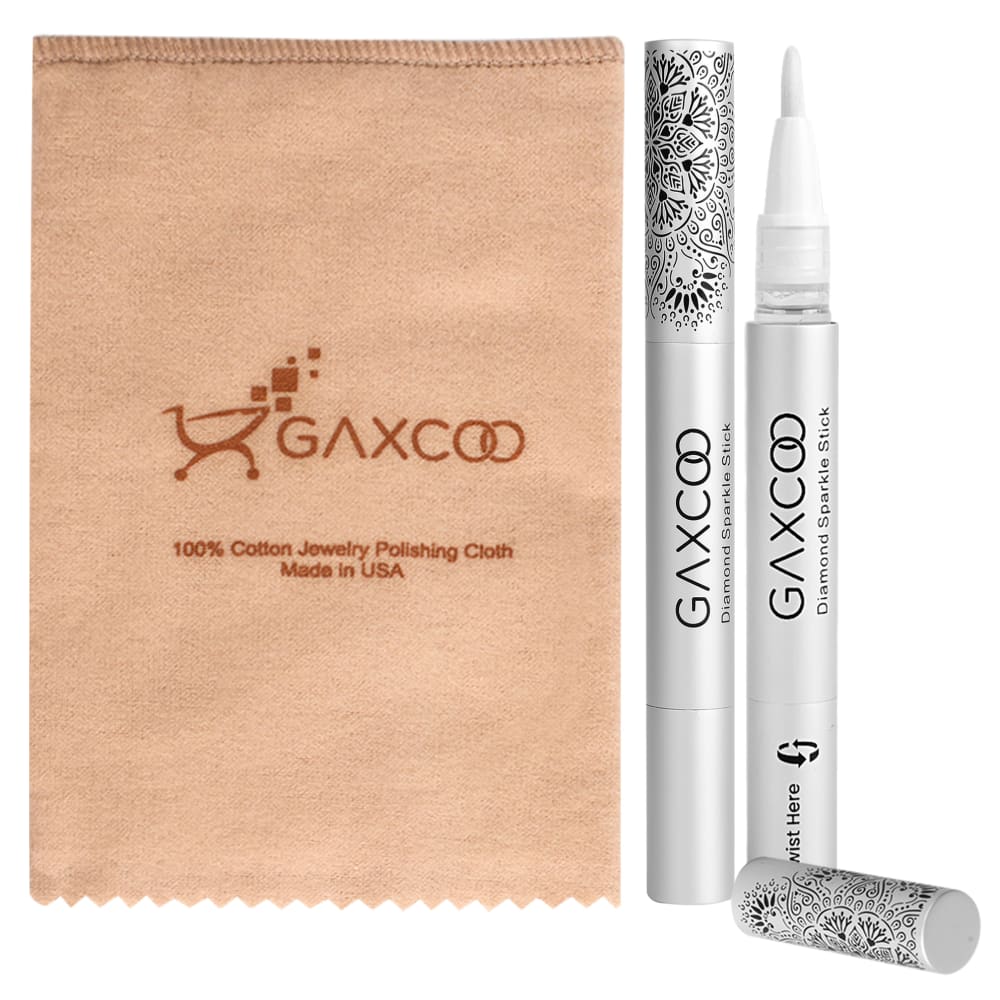
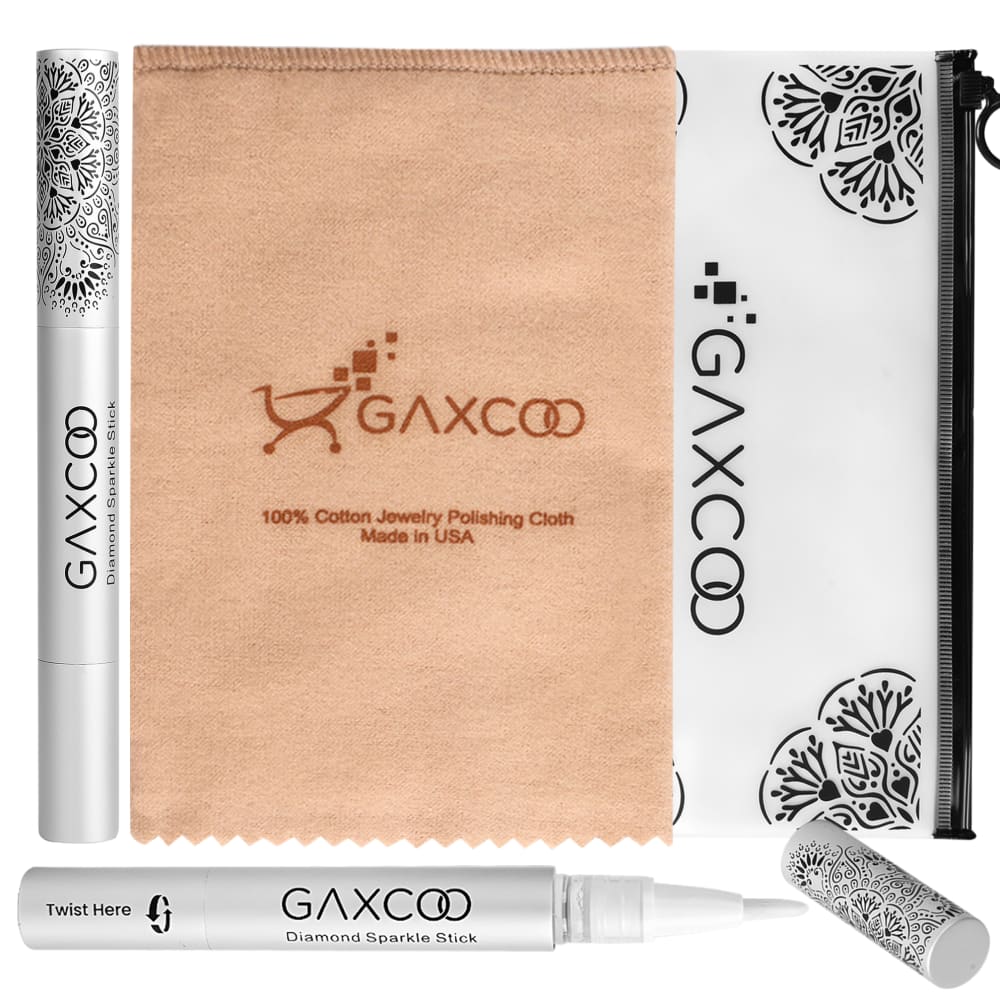
Which photo would you rather click on to see more details?
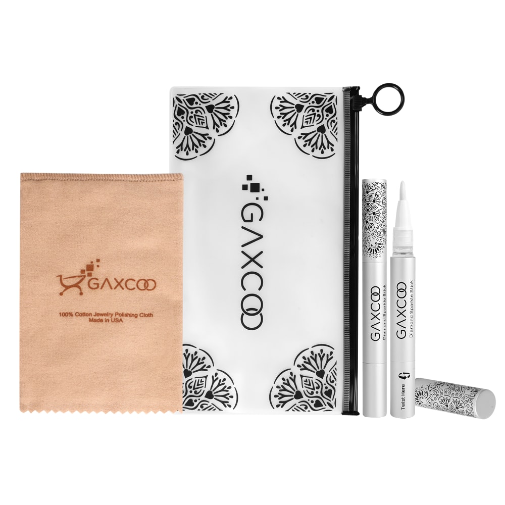
Option C won this Ranked poll with a final tally of 28 votes after 2 rounds of votes counting.
In a Ranked poll, respondents rank every option in order of preference. For example, when you test 6 options, each respondent orders their choices from first to sixth place.
PickFu requires a majority to win a Ranked poll. A majority winner differs from a plurality winner. A majority winner earns over 50% of the votes, whereas a plurality winner earns the most votes, regardless of winning percentage.
If an option does not earn a majority of votes, PickFu eliminates the option with the lowest number of votes. The votes from the eliminated option are reassigned based on each respondent’s next choice. This process continues in rounds until a majority winner emerges.
Scores reflect the percentage of total votes an option receives during the vote counting and indicate the relative preference of the respondents. If there is no majority winner, look to the scores to see how the options fared relative to one another.
| Option | Round 1 | Round 2 |
|---|---|---|
| C | 42% 21 votes | 56% 28 votes +7 |
| A | 34% 17 votes | 44% 22 votes +5 |
| B | 24% 12 votes | Eliminated 12 votes reassigned |
17 Responses to Option A
Photo A looks more attractive than the others.
I'm not really sure what this is, but option A shows the cloth plus two other things that you will receive better than option B.
I like A. It is the middle in size, and looks better that way. I like that it has the bag.
I like this presentation I feel like the other options add clutter
A does the best job of displaying all of the products in the package and the size of the products.
A is the best choice as you can see the product up close better in the picture! You are able to read the information easier.Option A is the best.
I like the images that show all the product in one way, it makes it easier to read.
A stands out.... B does as well.... C is a bit small.
I like A the most, as it gives me a good look at the cloth I'd be using to polish. B is also good. C, the products is too small and far away to really study and appreciate.
LIKE THE CLOSE UP IN A , AND THE TWO PENS STANDING UP
I prefer the options that show a closer up view of the product. The difference between my first and second choice is purely eye appeal and that I prefer the less cluttered look.
I like seeing the product uncapped at a zoomed in size. It is more defining and attractive
I would click on A because of the simplicity of the photo. The other two are too busy. It would have been nice to somehow have the zippered pouch in A, but even knowing that it is in the other two photos, I'd still choose the simplest one.
Option A shows me all of the visual details of the product that I could need while still being close up and easy to read/see at a glance. The carrying case seen in the other two options is not a huge draw for me nor is it a main selling point of the product's function. B is my next preferred option because I can still clearly see what the product is and what the product package entails. I think A is a more simple layout than B, while B is more creative, but harder to read at a glance. C is easy to read, but is smaller and laid out in a less pleasing way for so many items.
i much prefer how the first one is laid out. it's not too overwhelming to look at. i also like that the pen has the cap off, so you can see what it looks like. the second one is good because of how it's neatly laid out as well, though the packaging is a bit overwhelming with the pattern. the last one has much too much going on, and there are just too many colors and patterns all over the place.
i like the image with the markers stood up next to the bag, i think this is the most organized image.
The first image I think looks the most appealing.
12 Responses to Option B
The arrangement of the items is pleasing.
I prefer being able to see everything included, and also like the close up view.
B was my first choice because it provided the largest image of everything this kit includes.C was second, because, even though A had larger images, it didn't include everything and I'm more likely to click on something that gives me the best idea of what I'd be gettingA was third, because it didn't contain everything that's included.
Option b seems to show everything off and is more eye catching. I would like to buy this product because it shows everything that I'm buying and what it looks like.
The bag display is nice. But I also like the perpendicular look to the ad.
in order of preference
They're honestly just more visually appealing and well designed
I would rather click on photo B because there is close up detail of the brush on the end and everything included in the package. I would choose C secondly because you can also see the contents of the package unlike option A which only shows the item, not a close up and not everything included.
I chose B because all of the items were fairly clear (as long as that was their true size in relation to each other). If they products are stretched to fit the image frame, i would rather choose C. I chose C over A because it shows a carry-pouch, not included in A.
I chose B first because you can see all of the size and shapes of products available clearly.
I like option B. First, the photo is closer making it easier to quickly see each item. Also, all the items are in the photo. Secondly, I like how the one item is uncapped and laid out front. It shows me exactly what the tip of the item is like. Option C is also nice. It shows all the products but not as close up. The only thing I liked more about option C than B, is that I can see all of the white and black carry case. Option A is fine. I do not like that it is missing the carry case though. That is a big selling point in my opinion and you would be missing out on potential revenues due to lack of perceived value.
I like that it has the products, cap off one, and the small bag showing. I think it fits with the person seeing what is coming
21 Responses to Option C
i like how c shows all the components of the products
this one shows off the product and the design the best
I like C because it gives you a clear picture of everything you get in an attractive way. I like that B shows you everything, but not the way it shows it with some of the items laying at the bottom. A is okay, but a distant 3rd.
C gives you the best view of everything. Eventhough B is zoomed in a bit it blocks some things so it goes to second place. A doesnt show everything
My first choice is my best choice. I like how all the products are laid out and it is not so confusing what I am getting if I purchase. Plus it's better laid out and more pleasent to the eye.
I chose based on which images showed the most detail on the items included.
Option C is easier to see everything included in the kit
I feel like A is a bit incomplete; it doesn't really show what you get. C does the best job of showing everything in an attractive manner, which makes it most intriguing. B is ok, but looks rather cluttered and is visually less appealing.
i prefer option c
i would click on C. the layout and packaging is really attractive
Option C shows the items in relation to one another so that you can tell their sizes. Option B shows everything but makes their sizes seem weird compared to C. Option A leaves out the zippered pouch thing.
Would have gone with A but it does not show the bag like C does. C is organized unlike B where it looks like the product is very unorganized.
choices c and a show the product much better than b
I really enjoyed the first two.The third option, my last choice, it was hard to see the bag on the right.
I would be more apt to click on option C. I think that the layout of this image is appealing. The size of the items seems appropriate.
C looks good to me because they are a bit back and show all of the products nicely. They are organized well. The brown cloth or bag isn't so large that its taking up the photo as a main point. I chose A next because it doesnt look as cluttered as B..I do not like the product laying down in B, BUT A doesnt have the zip back in the photo. Believe C is the best and I am more likely to click on it.
I like Option C because it shows the bag in the center. I liked Option B the last because everything almost seemed too lined up and not naturally positioned.
because the font size is smaller
I like Option C because it shows all the products in the picture. It also looks very attractive and I like the way it's organized in the picture frame. The other Options either don't include all the products or the picture looks messy. As a result, I think that Option C is the best option out of the three.
C looks like you get more items because it highlights the zipper bag. I also like the scale view of the pens in this configuration. I do not like B with the pens along the left and bottom sides - the ad looks cluttered and less clear.
I think this image looks organized and makes the products easier to see. I like that it includes the bag to carry the polishing sticks and cloth. I like that the entire bag is visible so that you can see how big it is.
Explore who answered your poll
Analyze your results with demographic reports.
Demographics
Sorry, AI highlights are currently only available for polls created after February 28th.
We're working hard to bring AI to more polls, please check back soon.

