Poll results
Save to favorites
Add this poll to your saved list for easy reference.
Which picture do you like best?
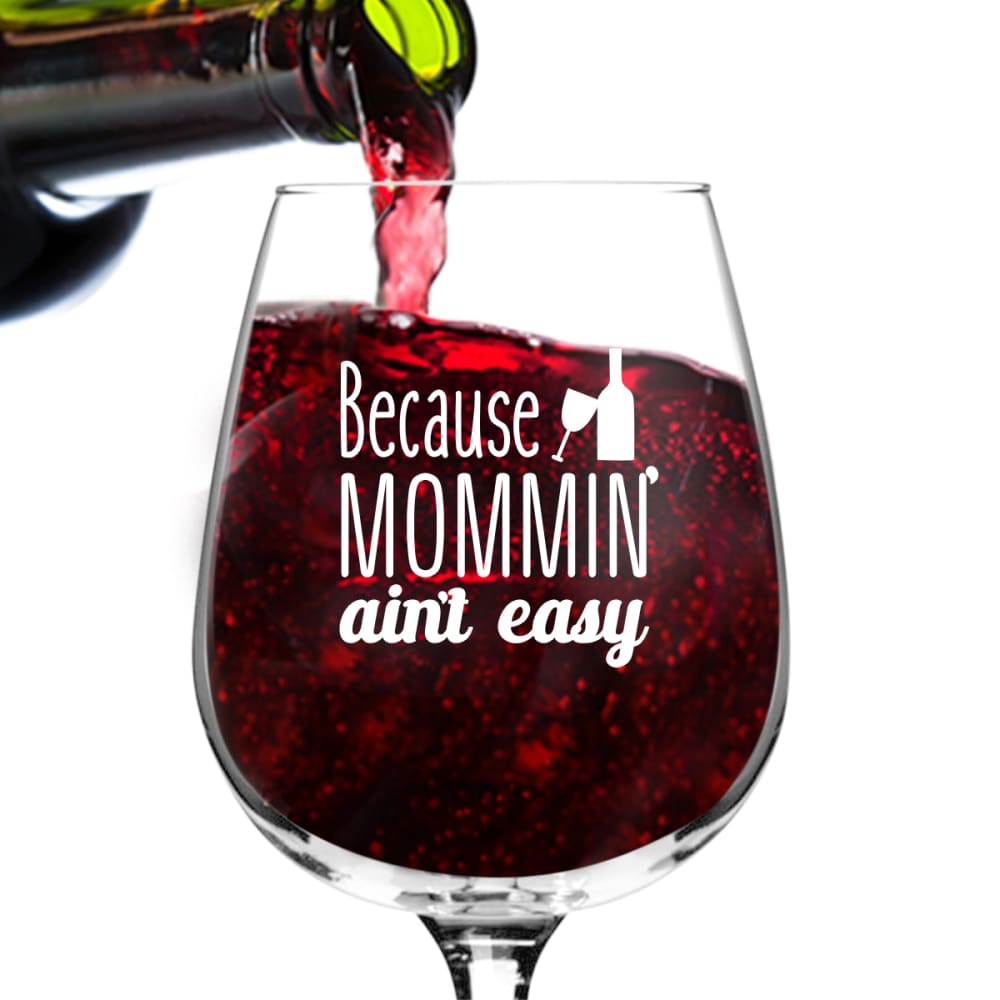
38 Responses to Option A
Showing the glass in use - like "B" - seems best and more fun.
Option A is best showing the wine being poured into the glass.
looks more like the real thing.
choice A it looks more realistic in a real environment, where choice B looks photoshopped
it is more appealing to the eye
The color of the wine looks much more realistic.
Option A looks more realistic with the pouring wine and even the coloring of the liquid within the glass.
The wine bottle in the photo looks better than the other photo.
I definitely love this. Looks inviting and the wine being poured in the glass makes it look more appealing. The wine looks more appealing as well.
Option A looks more dynamic than B. I like that the wine is being poured in A. A gives me a better idea of how the product will look in use. A is more memorable than B to me.
i know it's wine in the glass, but showing the bottle just makes it a tiny bit easier to understand. And it give the picture a little bit of action.
Seeing the actual texture of the drink makes it a lot more appetizing. The other option looks like tomato soup or blood or something. I like the fluid movement with it being poured in the glass.
More action in the shot
I like the action in this shot. It's more exciting to see it being poured
Option A looks more realistic and natural. it actually looks like a glass of wine being poured as compared to Option B
It's action picture. I even feel this taste lol
I like this picture the best. I feel that the wine being poured in the glass would resonate with more people and the product because "mommin ain't easy" so fill that glass to the rim, multiple times!
In A, it is easier to picture myself or to someone I am gifting the wine glass to with the image of the wine actually being poured in the wine glass. It is more appealing and makes me want to purchase it because I want to drink out from it.
The pouring of the bottle shows action which I enjoy
This has more depth and looks better I think.
This choice makes the glass look more 'lively'.
I love the glass it is so true
it is more catchy
I chose A because I like how it appears an actual bottle of wine is being poured into the glass.
I like seeing the wine poured into it.
I like the wine being poured
I prefer A more because B seems to lack personality and motion to it.
wine bottle looks more realistic
B looks too artificial
It looks more desirable
This picture looks more unique and is very interesting to look at.
I like seeing the wine being poured.
The pour makes the picture look more interesting and desirable
good and nice to use
Choice A - This looks authentic as the liquid is flowing into the glass form a bottle. The bubbles are soothing. The font stands out more on this glass than Choice B. Choice B - not sure what it is holding but it does not look tasty. The color looks painted on.
The beverage in choice A looks more appealing and seems to be fresher coming directly from the bottle. The action and movement of the liquid pouring into the glass made me thirsty.
this looks more realistic
I prefer this option because of the deep coloration of the wine in the glass, and the more detailed imagery of the bottle pouring the wine and the texture of the liquid in the glass.
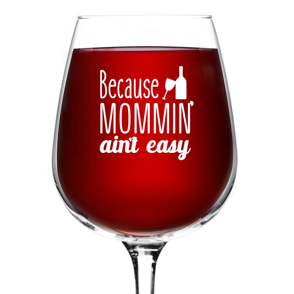
12 Responses to Option B
Both options are nice. I like the wine glass by itself and that signifies the same thoughts as option A. But it is cleaner and easier to see the image there. I would use that as the picture here for its clean and simple design.
I like B more. It is simple and more easily digestible than choice A. It is simply more appealing.
I like the simplicity of Option B, it's clean and clear and more natural than Option A. I like the pouring of the wine bottle in Option A, but there's something with the sparkly stuff in the wine that seems weird.
its more clear, and the stem is easily defined
the solid color looks better behind the graphic.
The text is much easier to read with Option B.
It's hard for me to read the text of the other picture with the bubbles in the background.
This is more versatile and could be used in different mediums. Also this is help with mommies that believe about the saying "one cup a day keeps the doctor away". Plus the color red is a lot richer and more vibrant.
Although A is more dynamic it's a little hard to see the top part of the logo. B gives you a much clearer view of the logo and product and makes it look more professional and higher quality.
I like choice B with the clear wine already in the glass. It allows you to see the message painted on without the distraction of the dark liquid being poured.
Option B is brighter and makes the drink look more appealing to drink than A.
The other one looks more like grapejuice to me. The other looks like wine. Have not seen a wine that pours like the one in A but it does remind me of grapejuice.
Explore who answered your poll
Analyze your results with demographic reports.
Demographics
Sorry, AI highlights are currently only available for polls created after February 28th.
We're working hard to bring AI to more polls, please check back soon.

