Poll results
Save to favorites
Add this poll to your saved list for easy reference.
Which picture do you like best?
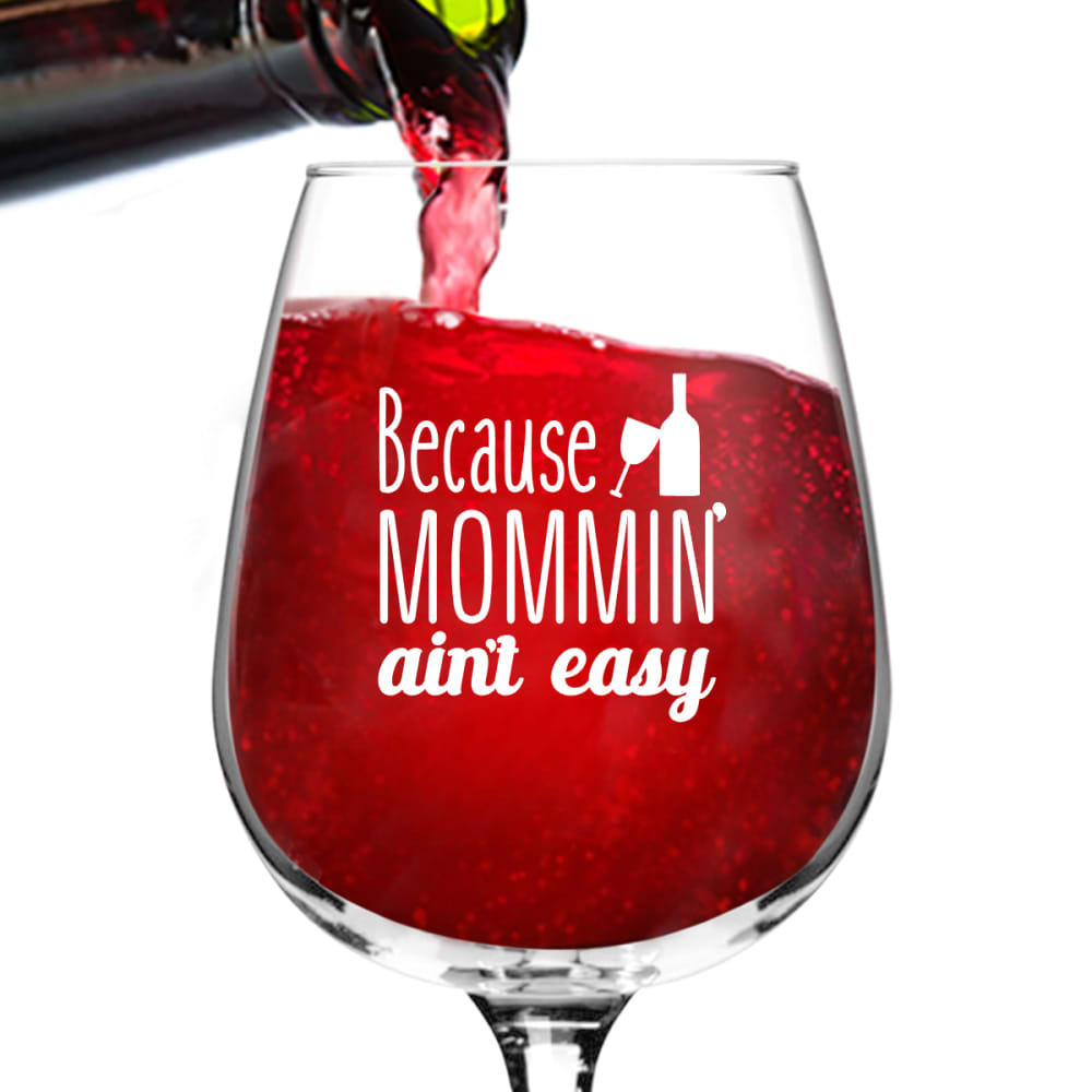
16 Responses to Option A
like the red bettr
The light red makes it look more magical
I chose Option A because it appeared to be much brighter and sweeter.
The brighter the color the more it caught my eye.
This color makes the white lettering really pop and draws my eyes to it instead of the liquid itself.
I didn't think that either color really looked like wine because it almost looks carbonated in the glass but A shows the text on the glass better.
The difference between these two images is the color of the drink (I think it's wine). I selected the lighter of the two drinks because it looks better to me than the darker drink. I feel the lighter drink goes better with the glass and I am able to differentiate easier than the darker drink.
i like the color of the drink best, the other one looks too dark
I prefer option A because of the brighter color. Option B is too dark and almost looks like blood.... yuk! Also, option B cuts off the top of the bottle in the picture. A is further down and looks better.
I like A the most because the strong red color makes the product really stand out and become more appealing to me.
The brighter red gives off a more positive feeling, in my opinion. The idea behind the picture ('Mommin' aint easy, have a drink') seems like it's trying bring a more positive feeling to someone's day.
I really like the saying on the wine glass. I also like the that the wine is a lighter color in the photo
I Chose A because I like the brighter color drink and the words show up better.
I like picture A more, is more captivating.
Nicer red and looks much better.
The brighter wine looks more fun and more inviting. Cool product!
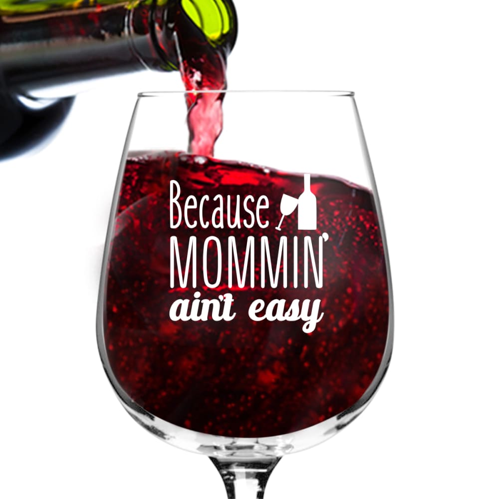
34 Responses to Option B
the letters stand out, help the phrase pop and just look more like a product that can grab your attention quickly
darker color better contrast
The color of the wine looks more realistic and gives a better picture of what the actual product will look like
B is more of a wine color
I think the darker color of the beverage makes the text easier to read.
I think wine is usually a deep red color.
They are both a turn off for me. The unnaturalness of the "wine" in the glasses is weird and doesn't make sense, it's fake. I chose Option B because at least it's closer to the color of real wine.
"B" looks like red wine, which makes more sense, because mommin' ain't easy. A looks like cranberry juice.
The darker color in the glass makes it pop and stand out.
this one really shows off the glass, love it
I think the white text shows up much better or the darker red wine in Option B than on the brighter red in Option A.
Option B looks more like sparkling wine and less like fruit juice.
The wine in the glass is more realistic
The darker wine is more appetizing. However both of these products are exactly the same.
Choice B has a more accurate red wine color, while A almost looks like juice to me.
I like the darker red because it ore accurately portrays a red wine. It also makes the writing and picture show up better. The only thing I would suggest is try to get rid of some of the bubbles as they are distracting from the text.
B the drink color is more indicative of red wine with the deeper red color.
I like this image the best because I feel the wine's appearance is most appealing and accurate. I believe it best complements the physical product as well.
the color scheme of b is more appealing.
I chose B because I like the darker wine in the glass. It looks more like wine.
I prefer the darker red. Seems like it will be tastier flavor.
i like the texture of the darker wine more, go with that one
I chose B. The darker wine looks very refreshing the that wine glass.
Choice B shows a more realistic red wine color being poured. Choice A looks like Kool-Aid.
I adore the rich, deep blend of the beverage. It is looks like higher quality
Because I prefer darker wines like Merlot is the only reason I chose B.
B looks more like red wine, and makes a better contrast with the lettering.
I like the more natural looking colors.
The color of the liquid appears to more accurately depict wine. Choice A looks like Kool-Aid.
more realistic color for wine
Choice B has more balanced cropping than choice A and the bottle of wine is easier to see. Choice A also has more variation in the color of the wine which makes it more interesting to look at and holds my attention better.
I like the color of the wine here, it seems more natural to me.
I like that one because the beverage looked darker and fuller to me. It looked more inviting to drink and enjoy to me.
I like the darker looking wine
Explore who answered your poll
Analyze your results with demographic reports.
Demographics
Sorry, AI highlights are currently only available for polls created after February 28th.
We're working hard to bring AI to more polls, please check back soon.

